Given that 2013 is coming to a close, a very common question analysts get asked around this time of the year is:
“How did we perform against our targets / expectations?”
Typically, this kind of question helps business reflect on what worked well during the year and what did not, which then leads to next year’s plan and strategy.
Typically, there is Variance due to multiple factors / reasons, as the businesses today continue to compete in an ever changing landscape. Unexpected regulatory changes, better than expected Sales during the festive season, are just a few examples of how things can vary from a plan.
Whenever I get a question like this from business teams, I typically explain the divergence with the help of Waterfall chart. This chart is also referred by following names:
- Bridge Chart
- Mario Chart
- Progressive Chart
[stextbox id = “section”] What is Waterfall Chart?[/stextbox]
The waterfall chart is a one of the finest examples of data visualization. This indicates how an initial / reference value increases / decreases by various factors and reaches the outcome.
Waterfall charts are used widely in:
- Sales Analysis (Comparison b/w target Vs Actual, identify GAP)
- Financial Analysis (Profit and Loss)
- Inventory Analysis
[stextbox id = “section”] An example: [/stextbox]
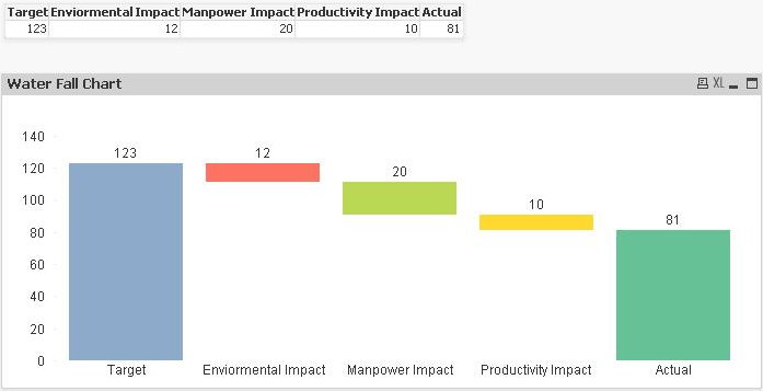
Let us say, you expected Sales of $123 Mn in 2013, but you actually end up selling $81 Mn, a shortfall of 42 Crores. The obvious question from business is why is this difference?
You create a list of all possible hypotheses, reject some of them and see the impact of the remaining ones. Let us say this is how the impact looks like:
A shortfall of 42 is due to three reasons and this is their volume impact:
- Environmental (external) impact drop is 12
- Less manpower (capacity) strength cost to 20 and
- Overall productivity (efficiency) cost to 10.
How would you present this information? In the past, I have seen people using some of the representations below:
As you can see these charts have problems and are not intuitive for business users to understand. This is where a waterfall chart comes into the picture:
Compared to previous representations, this view is a lot more intuitive and provides all the necessary information in a single view.
[stextbox id = “section”] How to create a Waterfall Chart in Qlikview: [/stextbox]
I started using waterfall charts in Excel ~ 5 years ago and have been in love with them since. So, when I started using Qlikview a couple of years back, I badly wanted this visualization in my dashboards. Unfortunately, this information was not available in any of the tutorials I had access to. Hence I thought to contribute this article for the benefit of other analysts like me who are struggling with similar question.
Let us go back to same example we started with and plot a waterfall chart in Qlikview. In Below representation, “Target” and “Actual” are initial and final value respectively.
[stextbox id = “section”] Method to Create A Waterfall Chart in Qlikview: [/stextbox] Step 1:
- Right Click on new sheet and select Bar chart from new sheet object
- Click next and skip Dimension, because we are not going to use any dimension
- Click next and write the formula as “=sum(Target)” and Label it as “Target”
- Repeat similar formulas for Environment, Manpower, Productivity and Actual and click on finish
Now, we have chart like a normal bar which has a different bar for Target, Environment ….
Step 2: Now we need to shift the Bar of intermediate values i.e. offset the position of bars
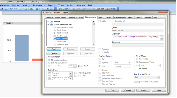
- Right click on chart –> GoTo expression –> Click on ‘+’ sign of expression “Enviormental Impact” to expand properties of expression.
- Select one of the properties called ‘Bar Offset’ and write the definition as:
=sum(Target)-sum([Enviormental Impact])
- Repeat similar steps for Manpower and Productivity with “Bar Offset” definition as:
=sum(Target)-sum([Enviormental Impact])-sum([Manpower Impact])
=sum(Target)-sum([Enviormental Impact])-sum([Manpower Impact])-sum([Productivity Impact])
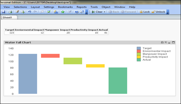
- Click on apply, Intermediate bars have moved above by equivalent cumulative differential value compare to target.
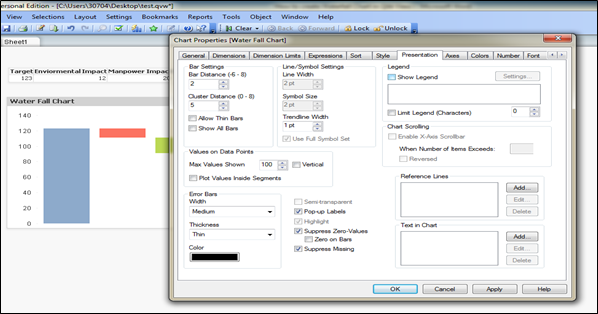
Step 3: In Above Chart, Bar’s definition is referred by the legends at Top-right corner, if we want to put the bar definition below each bar:
Right Click on chart –> Properties –> Presentation –> Check off Show Legend
[stextbox id = “section”] Finally, we have Water Fall Chart: [/stextbox]
This is an example where we have brought out methods to create Waterfall chart in Qlikview. Do you use waterfall charts in your roles and visualizations? If yes, how do you create them? Do you think this tip is useful?
Do let me know your thoughts on using this chart in Qlikview.


Hi Sunil, This post is very useful and thanks for spending your time in helping the other users. I have few more questions as a follow-up. 1. Let's say I have something like Actuals + ReasonA +ReasonB = Target and ReasonB in this equation is negative. Now i want to present this with all positive numbers are Blue and Negatives as Red, instead of using so many colours that QV provides with 2. Secondly I want to show connectors between the columns i.e the ending of one column to be connected with a dotted line to the starting value of the next column (the typical waterfall that we see in presentations) Regards Harikrishna
Hi, I have a coulmn named type which is having 5 values "type1", "type2","type3","type4","type5". I want to create a new dummy column which will be having two values typeA refers to type1 type2 type3 typeB refers to type 4 type 5 Please help me to get it done. Thanks & Regards Amit S
Hi, I have a coulmn named type which is having 5 values "type1", "type2","type3","type4","type5". I want to create a new dummy column which will be having two values typeA refers to type1 type2 type3 typeB refers to type 4 type 5 Please help me to get it done. Thanks & Regards Amit S