Introduction
In quality management, Statistical Process Control (SPC) charts are the key for organizations to help oversee, control, and improve their processes. Through statistical methods, SPC charts highlight variations and identify patterns to ensure consistent product quality. Let’s explore the types of SPC charts, their mechanisms, and their applications.

Overview
- Understand the fundamentals of SPC charts
- Learn about their types.
- Explore the benefits of using them in quality management
- Discover how to implement them effectively
- Learn to create SPC charts using Python and Excel
Table of contents
What are SPC Charts?
SPC charts, also called control charts, they help in visually displaying data points (over time). They distinguish between common cause variations (inherent) and special cause variations (unusual). This separation aids in maintaining process stability and pinpointing improvement areas.
Types of SPC Charts
SPC charts come in various types, each suited for specific data and process characteristics. The main types include:
- X-Bar and R Chart: These charts monitor a process’s mean and range. The X-bar chart tracks the average of subgroups, while the R chart monitors the range within subgroups.
- P-Chart: It’s Designed to monitor the proportion of a process with defective items. This is useful for categorical data where each item is either defective or non-defective.
- C-Chart: This chart counts the number of defects in a single unit of product. It is ideal for processes where the number of defects per unit is counted.
- U-Chart: This chart is similar to the C-chart, but it accounts for varying sample sizes. It monitors the number of defects per unit, allowing for more flexibility in sample size.
Benefits of SPC Charts
Implementing SPC charts offers several advantages to organizations:
- Improved Quality Control: They help monitor and control processes, consistently ensuring products meet quality standards.
- Early Detection of Issues: They enable prompt identification of deviations, allowing for immediate corrective actions to prevent defects.
- Data-Driven Decision Making: They visually represent process data, supporting informed decisions based on real-time insights.
How to Implement SPC Charts Effectively?
To successfully implement SPC charts, follow these steps:
- Select the Right Chart: Choose the appropriate type of SPC chart based on the data and process characteristics.
- Collect Data: Gather data points systematically, ensuring accuracy and consistency.
- Calculate Control Limits: Based on historical data, determine the upper and lower control limits to identify acceptable variation ranges.
- Plot Data Points: Plot the data points on the chart, marking any points that fall outside the control limits.
- Analyze and Act: Analyze the chart to identify trends or unusual variations. Take corrective actions for any points outside the control limits.
Example of SPC Chart in Python
Here’s how you can create an X-bar and R chart using Python:
import numpy as np
import matplotlib.pyplot as plt
# Sample data
data = np.array([[5, 6, 7], [8, 9, 7], [5, 6, 7], [8, 9, 6], [5, 6, 8]])
# Calculate subgroup means and ranges
x_bar = np.mean(data, axis=1)
R = np.ptp(data, axis=1)
# Calculate overall mean and average range
x_double_bar = np.mean(x_bar)
R_bar = np.mean(R)
# Control limits for X-bar chart
A2 = 0.577 # Factor for X-bar chart control limits
UCL_x_bar = x_double_bar + A2 * R_bar
LCL_x_bar = x_double_bar - A2 * R_bar
# Control limits for R chart
D4 = 2.114 # Factor for R chart upper control limit
D3 = 0 # Factor for R chart lower control limit
UCL_R = D4 * R_bar
LCL_R = D3 * R_bar
# Plot X-bar chart
plt.figure(figsize=(12, 6))
plt.subplot(211)
plt.plot(x_bar, marker='o', linestyle='-', color='b')
plt.axhline(y=x_double_bar, color='g', linestyle='-')
plt.axhline(y=UCL_x_bar, color='r', linestyle='--')
plt.axhline(y=LCL_x_bar, color='r', linestyle='--')
plt.title('X-Bar Chart')
plt.xlabel('Subgroup')
plt.ylabel('Mean')
# Plot R chart
plt.subplot(212)
plt.plot(R, marker='o', linestyle='-', color='b')
plt.axhline(y=R_bar, color='g', linestyle='-')
plt.axhline(y=UCL_R, color='r', linestyle='--')
plt.axhline(y=LCL_R, color='r', linestyle='--')
plt.title('R Chart')
plt.xlabel('Subgroup')
plt.ylabel('Range')
plt.tight_layout()
plt.show()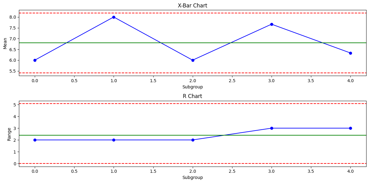
Code Explanations
This Python script helps display X-bar and R-control charts using sample data. As you can see, these control charts help track the statistical process of control of stability over time.
- numpy for numerical operations.
- matplotlib.pyplot for plotting graphs.
- Creates a 2D array representing five subgroups with three observations each.
- x_bar: Mean of each subgroup.
- R: Range of each subgroup.
- x_double_bar: Overall mean of subgroup means.
- R_bar: Average range of the subgroups.
- Calculates upper (UCL_x_bar) and lower (LCL_x_bar) control limits.
- Calculates upper (UCL_R) and lower (LCL_R) control limits.
Example of SPC Chart in Excel
Here are the examples of SPC Chart in Excel:
- Collect Data: Input your data in an Excel spreadsheet, with subgroups in rows and observations in columns.
- Calculate Averages and Ranges
- You can use the AVERAGE function to calculate the mean of every subgroup.
- Then, the MAX and MIN functions are used to calculate the range of each subgroup.
- Determine Control Limits
- Calculate the overall average (X-double-bar) and average range (R-bar).
- Apply appropriate constants (A2, D3, D4) to calculate the control limits.
- Create the Chart
- Select the data and insert a line chart for the X-bar and R values.
- You can add horizontal lines for control limits using the `Insert Shapes` feature or as additional data series.
Conclusion
Familiarity with the different types of SPC charts and their applications allows organizations to improve quality control measures, leading to superior product quality and greater efficiency. They serve as valuable instruments in quality management, providing a systematic method for overseeing and refining processes.
Frequently Asked Questions
Q1. Can SPC charts be used in service industries?
Ans. Yes, they can be applied in service industries to monitor and improve process quality, such as response times, customer satisfaction, and error rates.
Q2. What do control limits mean in SPC charts?
Ans. Control limits are the lower and upper boundaries on an SPC chart that indicate the acceptable range of variation in a process. Data points outside these limits should be considered as potential issues.
Q3. How can SPC charts aid in regulatory compliance?
Ans. They help maintain consistent quality standards, provide evidence of process control, and support documentation requirements, aiding in compliance with industry regulations and standards.
Passionate about technology and innovation, a graduate of Vellore Institute of Technology. Currently working as a Data Science Trainee, focusing on Data Science. Deeply interested in Deep Learning and Generative AI, eager to explore cutting-edge techniques to solve complex problems and create impactful solutions.


