
Introduction
Handling huge datasets can be pretty overwhelming in today’s data-heavy world. That’s where InsightMate comes in. It’s designed to make exploring your data a breeze. Just upload your dataset, and you’ll get instant insights, visualizations, and answers to your questions. What’s cool about InsightMate is how it mixes automation with flexibility. Instead of just throwing static charts at you, it offers dynamic, customizable dashboards that shift based on what you need—perfect whether you’re new to data analysis or a seasoned pro. In this article, I’ll walk you through the journey of developing InsightMate.
At the heart of InsightMate is Google’s Gemini and LangSmith keeping an eye on things, you’re assured that the insights you get are not just spot-on but also reliable over time.
Learning Outcomes
- Understand the core components and architecture behind InsightMate.
- Learn how to integrate Google Gemini for natural language dataset queries.
- Explore the role of LangSmith in AI model performance monitoring with LLMOps.
- Discover how InsightMate generates dynamic, customizable dashboards and visualizations.
- Gain hands-on experience in setting up and using InsightMate for data analysis.
This article was published as a part of the Data Science Blogathon.
Table of contents
What is InsightMate?
InsightMate is an intuitive data analysis tool that empowers users to explore, visualize, and gain insights from their datasets effortlessly. Its core functionality revolves around transforming raw data into meaningful, actionable insights with minimal manual intervention. By combining customizable visualizations and AI-driven insights, InsightMate allows users to interact with their data in real-time, asking questions in plain language and receiving relevant answers. With built-in monitoring features, it ensures that AI models consistently provide reliable results, making it a powerful ally for both beginners and professionals in data analysis.
How Does InsightMate Work?
InsightMate is designed to simplify and enhance data analysis. The tool has several core features, with a primary focus on generating detailed insights and customizable visualizations from user-uploaded datasets.
Key Features and Functionality
- Customizable Dashboards: InsightMate stands out with its dynamic dashboards. Unlike static charts, these dashboards adapt based on the input given by user and generates visualizations based on it.
- Dataset Generation: Need to focus on specific metrics? InsightMate lets you pick and choose which columns and metrics to include. You can even download this filtered dataset as a CSV file for further use.
- Automated Insights: The magic happens with Google Gemini. This feature lets you ask questions in plain language and reasonable, context-aware answers.
- LLMOps and Monitoring: By intergrating the Gemini model with LangSmith we enable a robust monitoring and performance tracking of the model. This ensures that the insights generated remain reliable and transparent over time.
Setting Up InsightMate: A Step-by-Step Guide
In case you want to check out the source code, refer to the final_app.py file in the repo : repo_link
Now, let’s walk through how to set up and run InsightMate on your local machine:
Step1: Clone the Repository
Start by cloning the project repository to your local machine to begin using InsightMate. This provides access to the application’s source code and all its essential components.
git clone https://github.com/Keerthanareddy95/InsightMate.git
cd InsightMate
Step2: Setup the Virtual Environment
A virtual environment helps isolate dependencies and ensures your project runs smoothly. This step sets up an independent workspace for InsightMate to operate without interference from other packages.
# For Windows:
python -m venv venv

# For macOS and Linux:
python3 -m venv venv
Step3: Activate the Virtual Environment
With the virtual environment in place, the next step is to install all necessary libraries and tools. These dependencies enable the core functionalities of InsightMate, including data visualization, AI integration, and more.
# For Windows:
.\venv\Scripts\activate

# For macOS and Linux:
source venv/bin/activate
Step4: Install Required Dependencies
With the virtual environment in place, the next step is to install all necessary libraries and tools. These dependencies enable the core functionalities of InsightMate, including data visualization, AI integration, and more.
pip install -r requirements.txtStep5: Set up the Environment Variables
To leverage AI-driven insights and monitor model performance, you’ll need to configure API keys for Google Gemini and LangSmith. This setup connects InsightMate to the cloud services that power its intelligent features.
Create a .env file in the root of the project and add your API keys for Google Gemini and Langsmith.
GOOGLE_API_KEY="your_google_api_key"
LANGCHAIN_API_KEY="your_langchain_api_key"
LANGCHAIN_PROJECT="your_langchain_project_name"
You can get the API Keys here – GEMINI API , Langchain API
Step6: Run the Application Using Streamlit
After configuring everything, run InsightMate using Streamlit. This step launches the application, allowing you to interact with its user-friendly interface and explore data in real-time.
streamlit run final_app.pyDeveloping InsightMate’s Features
In this section, we’ll dive into the core features that make InsightMate a powerful data analysis tool. From generating automatic visualizations to querying datasets with natural language, these features are designed to simplify data exploration and insights generation.
Initial Overview Generation on the Dataset
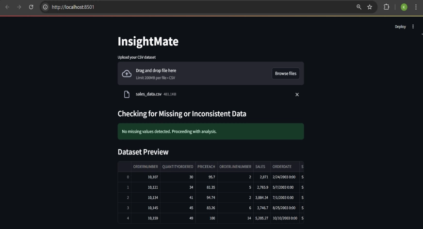
- Users upload the csv file in the file upload section in the streamlit UI and once a file is uploaded, it is read into a Pandas DataFrame – pd.df() .
- We implement a function to check for missing values and inconsistencies. If the data is clean, users can proceed to explore the dataset.
- Basic information about the dataset, such as the number of rows, number of columns, and a statistical summary using the
df.describe()method, is presented to the user, along with a preview generated by thedf.head()method.
Development of Auto-Generated Dashboard
- We extract the numerical and categorical columns in the dataset and store them in separate variables.
- For numerical columns, histograms are automatically generated to show data distribution using a custom function.
# 4.1 Distribution plots for numerical columns
        if len(numeric_columns) > 0:
            st.write("#### Distribution of Numerical Columns")
            for i in range(0, len(numeric_columns), 2):  # Show 2 columns in one row
                cols = st.columns(2)  # Create 2 columns side-by-side
                for idx, column in enumerate(numeric_columns[i:i + 2]):
                    with cols[idx]:  # Place the plots in separate columns
                        plt.figure(figsize=(6, 4))  # Make the plot smaller
                        sns.histplot(df[column], kde=True, color='lightblue', bins=30)
                        plt.title(f'Distribution of {column}')
                        st.pyplot(plt)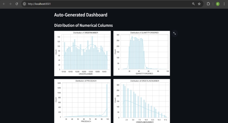
Bar plots and pie charts illustrate the distribution of categories in the categorical columns.
# 4.1 Distribution plots for numerical columns
if len(categorical_columns) > 0:
st.write("#### Distribution of Categorical Columns")
for i in range(0, len(categorical_columns), 2):
cols = st.columns(2)
for idx, column in enumerate(categorical_columns[i:i + 2]):
with cols[idx]:
top_categories = df[column].value_counts().nlargest(10)
filtered_df = df[df[column].isin(top_categories.index)]
plt.figure(figsize=(6, 4))
sns.countplot(x=column, data=filtered_df, palette="Set2", order=top_categories.index)
plt.title(f'Top 10 Categories in {column}')
plt.xticks(rotation=45)
st.pyplot(plt)
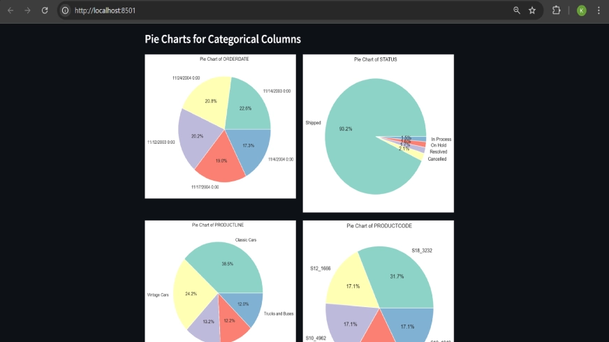
#4.3 Pie charts for categorical columns
if len(categorical_columns) > 0:
st.write("#### Pie Charts for Categorical Columns")
for i in range(0, len(categorical_columns), 2):
cols = st.columns(2)
for idx, column in enumerate(categorical_columns[i:i + 2]):
with cols[idx]:
pie_data = df[column].value_counts().nlargest(5)
plt.figure(figsize=(6, 6))
plt.pie(pie_data, labels=pie_data.index, autopct='%1.1f%%', colors=sns.color_palette("Set3"))
plt.title(f'Pie Chart of {column}')
st.pyplot(plt)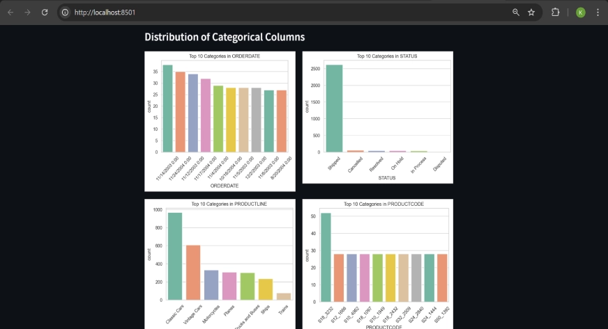
Custom Data Set Generation
- Users can filter data by selecting specific columns and unique values from dropdown menus. The dropdown menus are populated by the columns and the unique values available in the dataset.
- A dataset containing only the selected column and values will be visible and also the user has an option to download it as a csv file.
selected_filter_column = st.selectbox("Select a column to filter by", df.columns)
selected_value = st.selectbox(f"Select a value from '{selected_filter_column}'", df[selected_filter_column].unique())
filtered_df = df[df[selected_filter_column] == selected_value]
st.dataframe(filtered_df)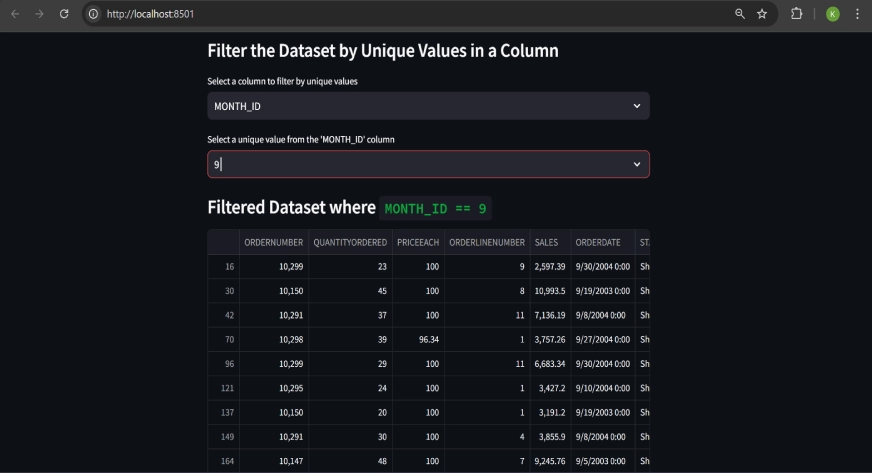
Custom Visualization Generation
- Users can choose from various plot types (e.g., histograms, bar plots, scatter plots) and specify columns to visualize.
- InsightMate generates plots based on user inputs, with different plot types handled through conditional blocks of code.
sample code showing the structure of the if-else statements:
# depending on the plot type
        if plot_type == "Histogram":
            selected_column = st.selectbox("Select column for histogram", numeric_columns)
            if st.button("Generate Histogram"):
                plt.figure(figsize=(8, 4))
                sns.histplot(df[selected_column], bins=30, kde=True, color='lightblue')
                plt.title(f'Histogram of {selected_column}')
                st.pyplot(plt)

        elif plot_type == "Bar Plot":
            selected_column = st.selectbox("Select column for bar plot", df.columns)
            if st.button("Generate Bar Plot"):
                plt.figure(figsize=(8, 4))
                sns.countplot(x=selected_column, data=df, palette="Set2")
                plt.title(f'Bar Plot of {selected_column}')
                st.pyplot(plt)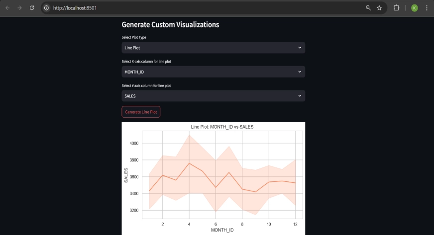
Query-Based Insights with Google Gemini
The uploaded CSV is converted to JSON format to facilitate interaction with Google Gemini.
dataset_json = df.to_json(orient='split')Users can ask natural language questions about their data, and the AI provides answers based on the dataset’s content.
dataset_json = df.to_json(orient='split')
prompt = f"Dataset (in JSON format): {dataset_json}. \nQuestion: {user_question}"
response = chat_llm.invoke(prompt)
st.write("### Gemini's Answer")
st.write(response.content)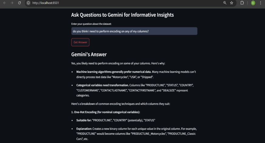
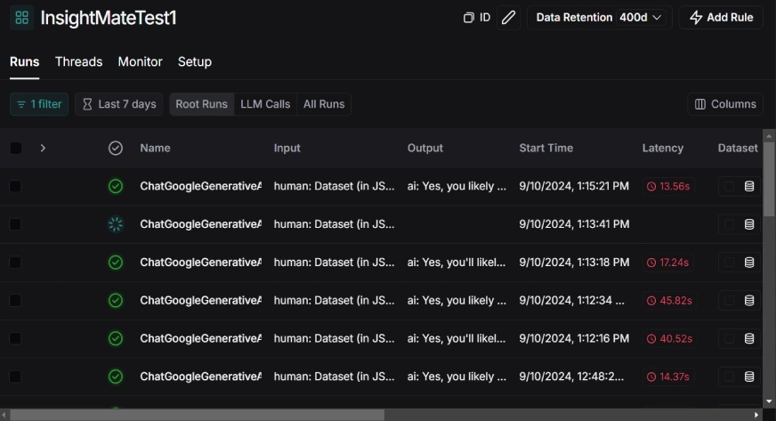
LLMOps with Langsmith
This project integrates LLMOps using Langsmith for tracing and monitoring AI model performance. By enabling Langsmith tracing, we can:
- Track AI performance: Understand how the model is responding to user queries.
- Monitor latency: Measure the time it takes for the model to process and return answers.
- Ensure traceability: Debug and audit model performance by tracking each invocation and its response.
Summary on Tools Used in Development of InsightMate
- Streamlit: Used to build the web app interface and provide an interactive experience.
- Pandas: For loading and manipulating the dataset, and providing data summaries.
- Matplotlib & Seaborn: To generate various plots and visualizations of the dataset.
- Google Gemini AI (via LangChain): To provide on-the-fly responses to user queries about their dataset.
- Langsmith: To monitor and trace the performance of AI responses and ensure quality results.
Future Enhancements
- I’m working on adding support for multiple file formats like excel, json etc
- I’m trying to introduce data cleaning features as well for handling missing or inconsistent data directly within InsightMate.
- Improve AI’s ability to understand and analyze more complex datasets.
Conclusion
In a nutshell, InsightMate simplifies data exploration and visualization, making it a breeze for users to turn raw data into actionable insights. Whether you’re a novice or a pro, the app’s dynamic dashboards and smart integrations make data analysis both easy and efficient. As we continue to refine and enhance the app, you can expect even more features and improvements down the line.
A big shoutout to Google Gemini and LangSmith for powering this project with their innovative tools!
You can check out the repo here.
Key Takeaways
- InsightMate makes it super easy to explore and visualize your data with dynamic dashboards that adjust to your needs. No more static charts—just customizable, interactive insights.
- By integrating Google Gemini, you can ask questions about your data in plain language and get reasonable, context-aware answers.
- Thanks to LangSmith, InsightMate tracks and monitors the performance of AI models over time.
- From histograms to pie charts, InsightMate lets you create a variety of visualizations based on your preferences. You can filter and plot data just the way you want.
Frequently Asked Questions
Q1. What is InsightMate?
A. InsightMate is a tool that simplifies data analysis by providing customizable dashboards, visualizations, and AI-generated insights from your datasets.
Q2. How do I get started with InsightMate?
A. Simply upload your dataset, and InsightMate will provide automatic visualizations and allow you to interact with the data through customizable dashboards.
Q3. What types of visualizations can I create with InsightMate?
A. InsightMate supports a variety of visualizations such as histograms, bar plots, pie charts, and scatter plots.
Q4. How does Google Gemini work in InsightMate?
A. Google Gemini allows you to ask questions in plain language about your data, and it provides context-aware answers based on your dataset.
Q5. Is InsightMate suitable for beginners?
A. Yes, InsightMate is designed for both beginners and experienced professionals, offering an intuitive interface and easy-to-use features.
The media shown in this article is not owned by Analytics Vidhya and is used at the Author’s discretion.
Hi, I’m Katasani Keerthana Reddy, a passionate problem-solver at the intersection of data science and artificial intelligence. With a knack for transforming raw data into actionable insights, I'm currently dwelling into the world of AI. My journey has taken me from developing dynamic AIOps systems at ThoughtData to crafting insightful data tools like InsightMate and leading AI/ML initiatives as a Google DSC Lead. When I’m not diving into data, you’ll find me championing innovative projects or connecting with fellow tech enthusiasts. Let’s turn data challenges into opportunities!
Free Courses


