Quite often I come across situations where people end up making wrong inferences based on half baked analysis. Or when people force fit data to what they already believe. A popular quote on the subject says:
If you torture the data long enough, it will confess.
– Ronald Coase, Economist
I personally disagree with the quote and firmly believe the other way “If you slice and dice the data in unbiased manner, it will reveal the truth.”
Having said that, I am aware of situations and people who intentionally or non-intentionally end up making wrong inferences. Following is an example which brings out one such case:
[stextbox id=”section”]Example of a typical error[/stextbox]
A BFSI Organization had come up with potentially ground breaking idea. It looked brilliant on paper and people internally were excited about implementing it. Since it was a strategic shift, the team decided to run a pilot in selected locations. First reads from the pilot came out after 5 months of implementation. The MIS team analyzed the data and quickly concluded success of pilot basis following graph:
Almost any metric you look at told same story unanimously. The whole project team was gung-ho about the success of the project and were getting ready to implement the strategy Pan India.
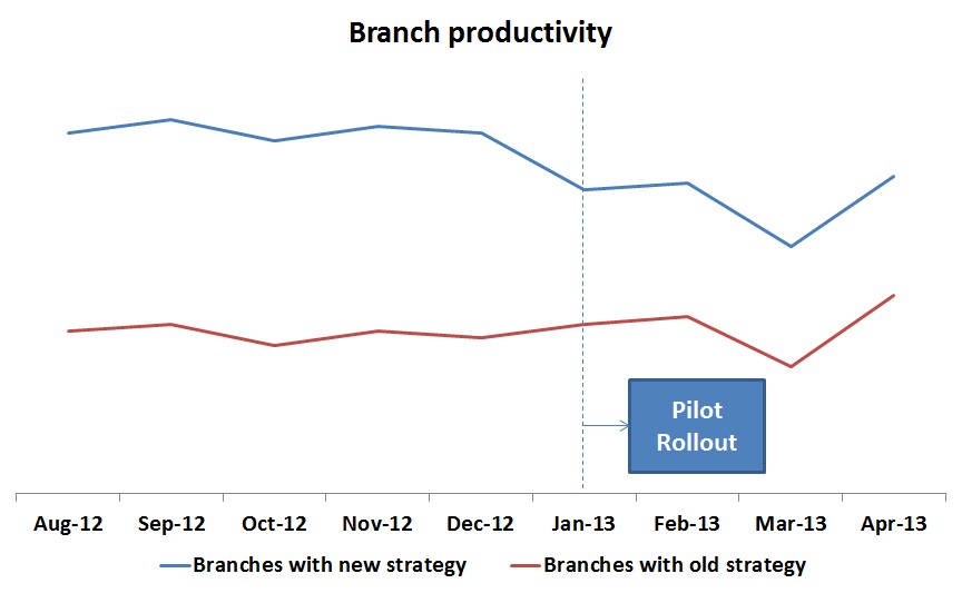
This is when a wise analyst entered and asked to look at pre and post scenario together before concluding any thing. This graph had a different story to tell:
The entire story changed after looking at this graph. A clear winner strategy suddenly turned into a loser! Imagine the loss company would have suffered, had it implemented new strategy Pan India. Actually, locations were nominated by Regional Directors and they chose locations where they had higher confidence of good implementation (hence they had better performance before hand).
The purpose of this post is to bring out some of the common mistakes analysts make and how to avoid them:
[stextbox id=”section”]1. Drawing Inferences only basis mean (without removing Outliers)[/stextbox]
If you believe that any event does not represent a normal outcome, you need to filter it out from your analysis. For example, if a friend of the CEO or a member of Board of Directors invests a big amount through one of your products, that should be removed from data. Typically used definition to identify outliers is multiple of standard definition (2x or 3x).
To put numbers on this example, let us say Sales size for your product varies between Rs. 100 – 10,000 and there are 500 such cases such that the average works out at Rs. 5,000. If there is one sale of Rs. 5,00,00,000, the average all of a sudden becomes ~ Rs. 1,05,000. If you don’t get this kind of Sale every month, you will end up concluding that average sales size has gone down.
Look at another example why looking at mean might be misleading:
Following practices would help you to make sure you are not drawing wrong inferences by looking at mean:
- Look at the distribution and filter out any outliers from your analysis
- Observe the skew of (mean/median) to figure out amount of skew coming from bigger or smaller values. Higher or lower the value (compared to 1), higher is the skew. In case of high skews, look at both mean and median before making and conclusions.
[stextbox id=”section”]2. Comparing different sets of population, segment or cluster[/stextbox]
The example at the start of the article is perfect example of this. This error can happen whenever you do not use non-random way to distribute the population. Whenever you do so, please make sure that populations are similar on all the key parameters.
How to avoid this bias / error?
It is best to stay away from comparing non-random distributed population. If you need to do so due to logistic & resource constraints, compare Pre vs. Post before you arrive at any conclusion.
[stextbox id=”section”]3. Drawing inferences on thin data (and extrapolating it)[/stextbox]
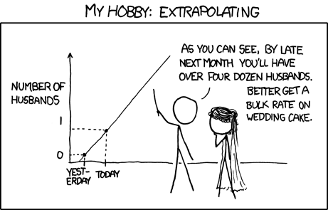
This happens when you want to bring out insights for every possible segment of data. In doing so, you end up with segments or clusters which have small population and the reads may not be statistically significant (or will contain a lot of noise). Following is another example of this kind of error:
How to avoid drawing inferences based on thin data?
Always plot confidence intervals to the values to calculate or extrapolate. This will give you a sense of whether the extrapolation is accurate or erroneous. Usual practice is to look at 90% confidence intervals before reaching any conclusion.
[stextbox id=”section”]4. Wrong applications of the inferences[/stextbox]
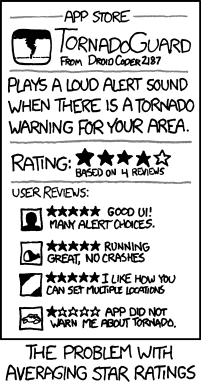
It is human tendency to generalize insights and findings. You extend or apply a learning based on different set of population or circumstances to a different set. Those insights may or may not be relevant. If your credit scoring model was based on a population coming from a particular channel (e.g. Branches), you can not apply it to a different set (e.g. Online). You will end up getting things wrong. Here is another example which brings out this error:
How to avoid wrong application of inferences?
Always check if you are extending your models to a population which it has not seen it past. If you are aware of any changes, continue to monitor the population on key variables (e.g. for credit scoring model, you need to monitor age, income, unemployment rate, credit file match % etc.)
If any of these distributions are different compared to the population on which you are basing your learnings, think again!
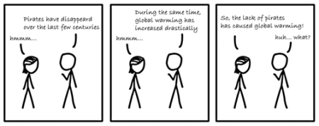
[stextbox id=”section”]5. Correlation does not mean Causation[/stextbox]
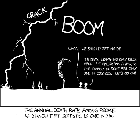
Correlation is a tool every analyst uses on a frequent basis. The biggest caution while using it is that it should not be treated as causation. If two events are happening close to each other, it is not necessary that they are happening because of one another. For example, if my age is increasing with time and my brother’s age is also increasing with time, it does not mean my age is driving his. Picture below shows another such example:
How to avoid this error?
Just treat correlation as correlation and not causation.
These were the 5 most common errors in my experience. The more you put your thought in spotting these errors, the better you become at it. Initially, I used to make these errors myself. Now, I can spot them effortlessly.
If you know of any other errors people make, please feel free to add your comments below.
Image credit: All cartoons taken from XKCD.com



Liked the illustrations in cartoons....the causation- correlation error along with non-biased sample selection are the 2 most common ones in my experience
Hi Kunal, The backward approach whether the campaign actually did benefit or not was quite a learning. Thanks
Great post - = I have witnessed the above mistakes and many more. Unfortunately, the creator of said mistake will often argue passionately in favor of the mistake to decision makers, whom often are less qualified to assess the veracity of the analysis, and they go .