Introduction
How often have we all tried to compare a value against a range, with unsatisfying results? Excel is the most common tool for data visualization, due to the fact that more than 1.2 billion people around the globe are using Excel [1]. Nonetheless, Excel has limitations in data visualization. The solution to these limitations is Tableau.
In this article, we are going to build an efficient chart that compares a single value against a range of values.

Tableau Chart showing single values against ranges.
Problem Statement
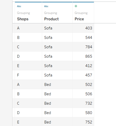
Let’s suppose that we have prices for different Products (Table, Chair, Lamp, Sofa, Bed) sold in a specific Shop (A, B, C, D, E, F). The scope is to compare Prices placed from the Shop A with those set from the Other Shops (B, C, D, E, F).

Input Data in Tableau.
Steps to Build a Chart
- First, we need to create two Calculated Fields to isolate Shop A from the others.
- PRICE_1, the price of the products from Shop A — using
IF [Shops]="A" THEN [PRICE_1] END
- PRICE_2, the price of the products from the other shops — using
IF [Shops]!="A" THEN [PRICE_2] END
- Secondly, we need to define the range’s boundaries by calculating the minimum and maximum value by product type, but only for the Other Shops (i.e., excluding Shop A).
- The upper bound, MAX_PRICE — using
{ FIXED [Product] : MAX (PRICE_2) }
- The lower bound, MIN_PRICE — using
{ FIXED [Product] : MIN(PRICE_2) }
FIXED is extremely useful as, together with MIN or MAX, it allows us to find the minimum/maximum value for each Product category. It aggregates the value at the specified dimension.
Now we are ready to create our chart!
Building the Chart
Let’s drag and drop Product in the Row Field, PRICE_1 in the Column Field, MAX_PRICE and MIN_PRICE in the Marks Field.

Note the Row Field/Column Field and the Marks Field.
MAX_PRICE and MIN_PRICE must be changed from SUM to ATTR.
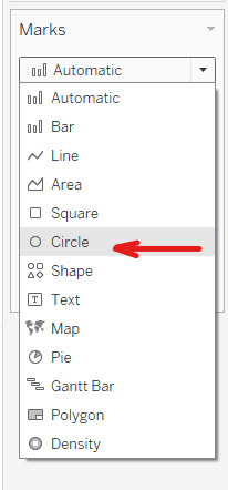
By default, Tableau will create a bar chart — which is not what we need!

Under the Marks Field, we need to change the chart type from Automatic to Circle.
Show a Range using Reference Lines

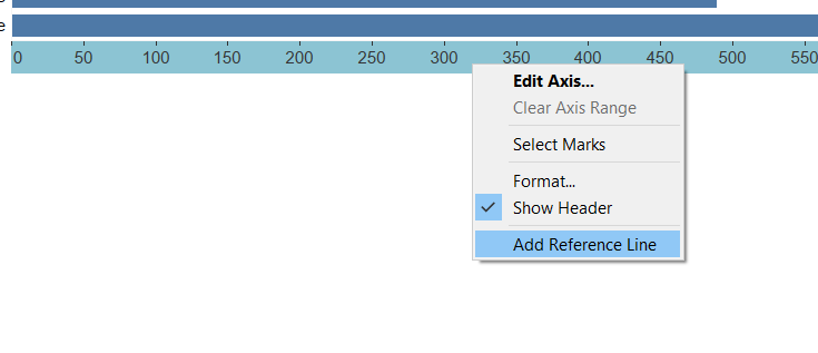
Right-clicking on chart axes will show us axis edit options.
We then add a Reference Line, by Right-Clicking on the x-axis > Add Reference Line.

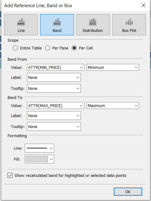
Settings for our reference line, using the Band option with ATTR(MIN_PRICE) and ATTR(MAX_PRICE)
A new window will appear. Here, select the same options as shown in the screenshot above.
The final step is to add a color indication to tell us whether the value is inside (green) or outside (red) our range.
Dynamic Point Colors
We create another Calculated Field named IN/OUT:
IF ([MIN_PRICE])<[PRICE_1] AND [PRICE_1]<([MAX_PRICE]) THEN "TRUE"
ELSE "FALSE"
END

IN/OUT is added to the Marks field
We drag and drop IN/OUT to Color under Marks — and we change the colors as desired!
Although there are several calculations, the result is a huge improvement over what we can achieve with Excel or the default Tableau charts.
I have used this chart style time and time again — it is incredibly versatile. I hope you will find it as useful as I do!
Thanks for reading.
References
[1] J. Osborne, Build 2016: the biggest news from Day 1 and 2 (2016), Techradar
About the Author

Laura is a Financial Analyst, who strongly believes that data visualization is the best way of analyzing both big and small datasets. I love learning new things and challenging myself to learn new methods and technologies to help me be a better analyst.


