This article was published as a part of the Data Science Blogathon.
Introduction
In today’s data-driven age, cloud platforms have been a boon in terms of reducing the reliance on physical IT systems and switching to a more seamless experience in terms of storage, efficiency, and scalability. As we all know, Google Cloud Platform (GCP) is one of such leading cloud providers offering a variety of services, and this article would focus on an introduction to its querying language platform BigQuery, and visual analytics tool Data Studio.
What is BigQuery?
Google BigQuery is a serverless data warehousing platform where you can query and process vast amounts of data. The best part about it is that one can run multiple queries in a matter of seconds even if the datasets are relatively large in size. If you’re familiar with SQL (Structured Query Language), it would be pretty easy to pick up. Let’s get started on basic BigQuery!
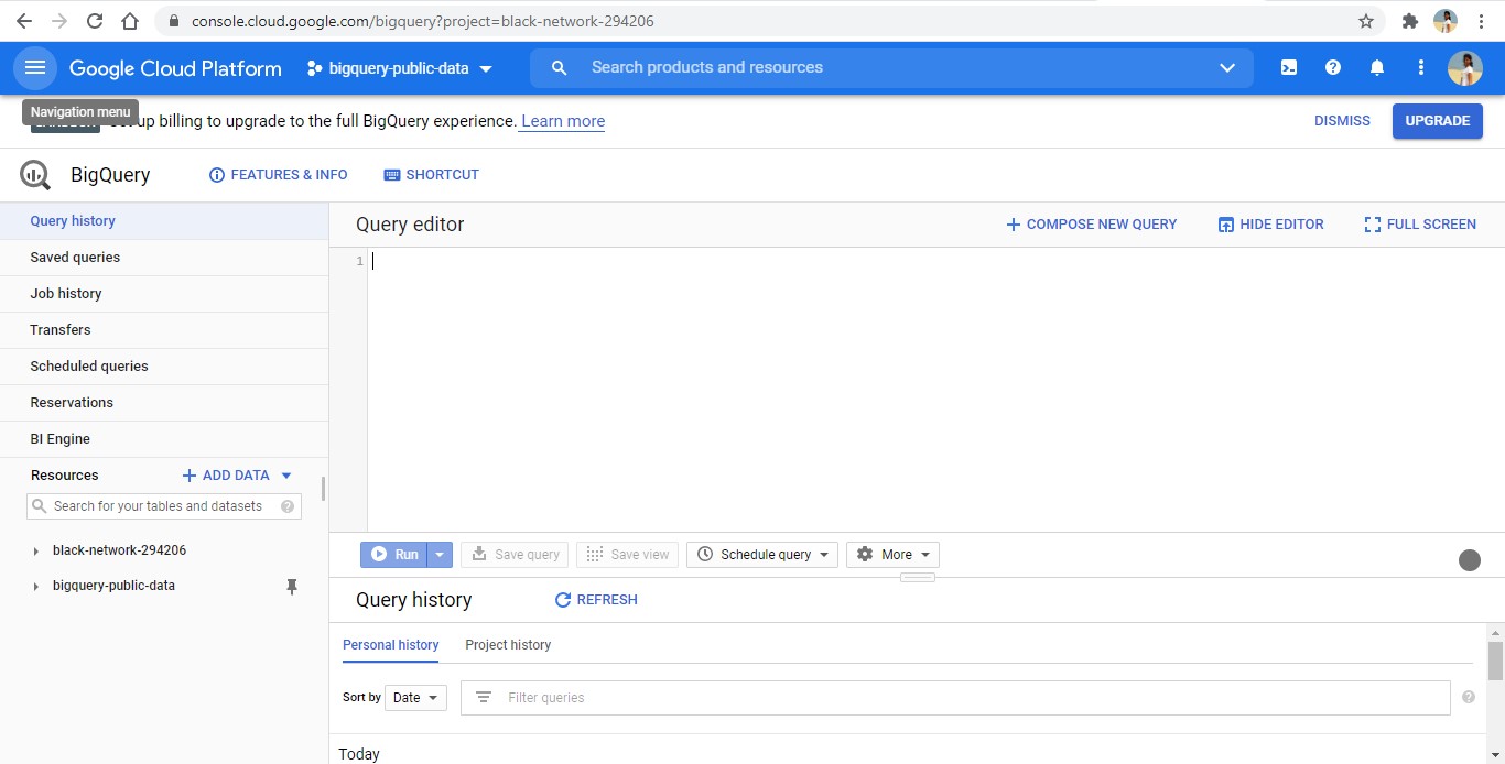
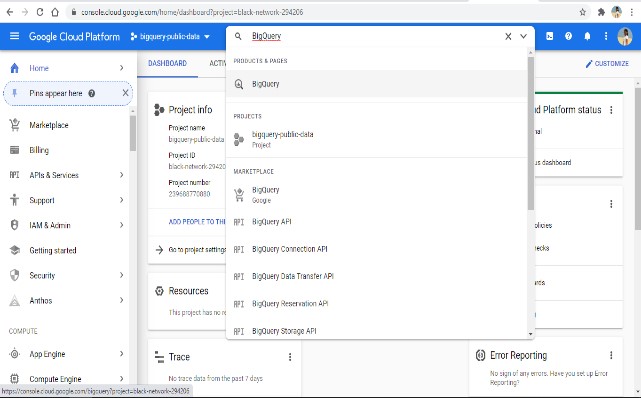
1. Open console.cloud.google.com – the GCP window will open. You must ideally have a Google account for this. In the Search tab, enter BigQuery and this would redirect you to the BigQuery query editor window as shown below:
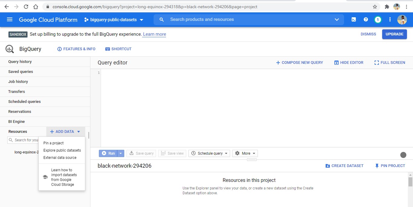
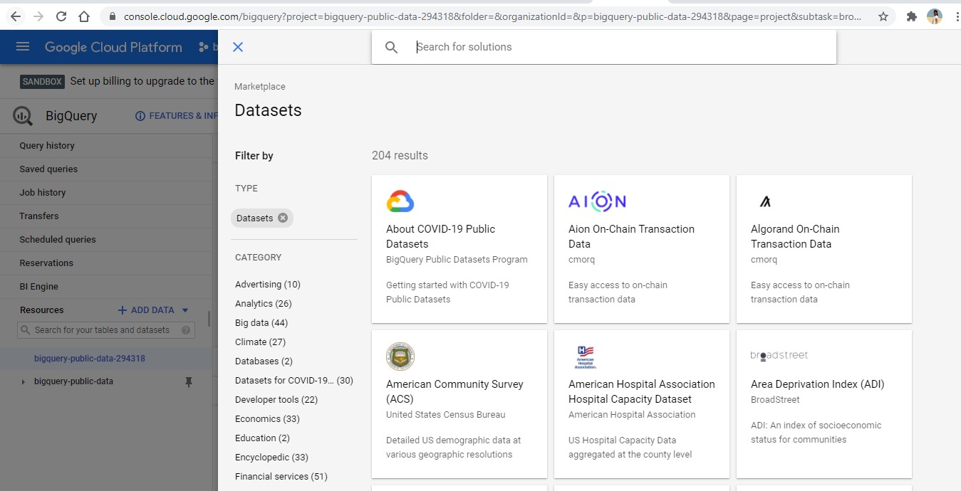
2. Let us begin first by using GCP’s existing repository of public datasets (yes! GCP has sample datasets to explore too!) Go to the left section of the window where you’ll find an ‘Add Data’ option – here, select ‘Explore public datasets’, and publicly available datasets will get listed as shown below (alternatively, one can also add their own data using ‘External data source’ option). Select the datasets you’d want to view and it will get added under the project name ‘bigquery-public-data’ in your main editor window. In our case, we have loaded the Covid-19 dataset.
3. Now that you have your data ready, you can click on a specific dataset on the left and BigQuery would give you a summary of the dataset – right from the columns used and their datatypes to a preview of the data:
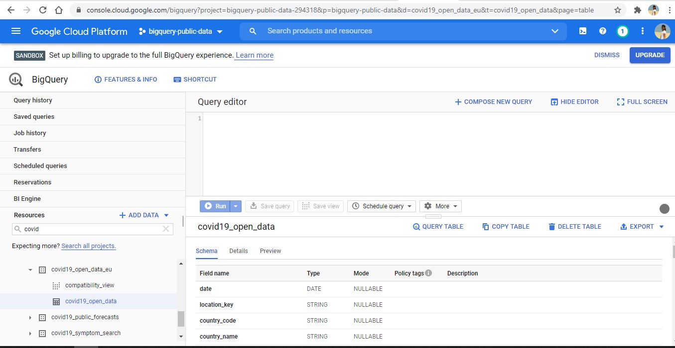
4. Clicking on the ‘Query Table’ option would display a sample query statement in the editor. You can go ahead and explore the data using SQL-based querying now!
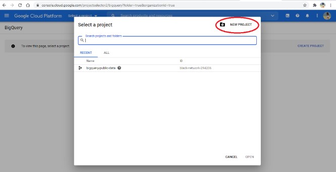
5. Let us next subset the Covid19 dataset by creating a table. For this, you would need to create your own ‘Project’ (like a folder location for your data). Go to the top left corner on the blue bar and go to ‘Select your project’. A pop-up window would open. Click on the top right option ‘New Project’, and enter a new project name as follows:
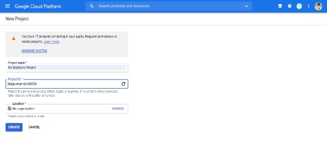
Once created, it will reflect on the left-hand side of the main editor window. We now have a project ready, and next, we would have to create a dataset under this location to store the new table we want to create.
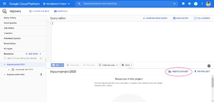
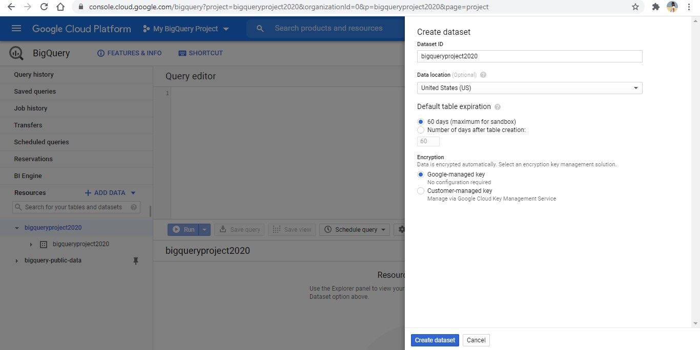
6. For this, click on the project name on the left, in our case, ‘bigqueryproject2020’, and go to the ‘Create Dataset’ option. Enter the name of your dataset and click on the ‘Create dataset’.
7. In the query editor, we will now create a table ‘myproject_covid_data’ in our newly-created location using SQL querying as follows:
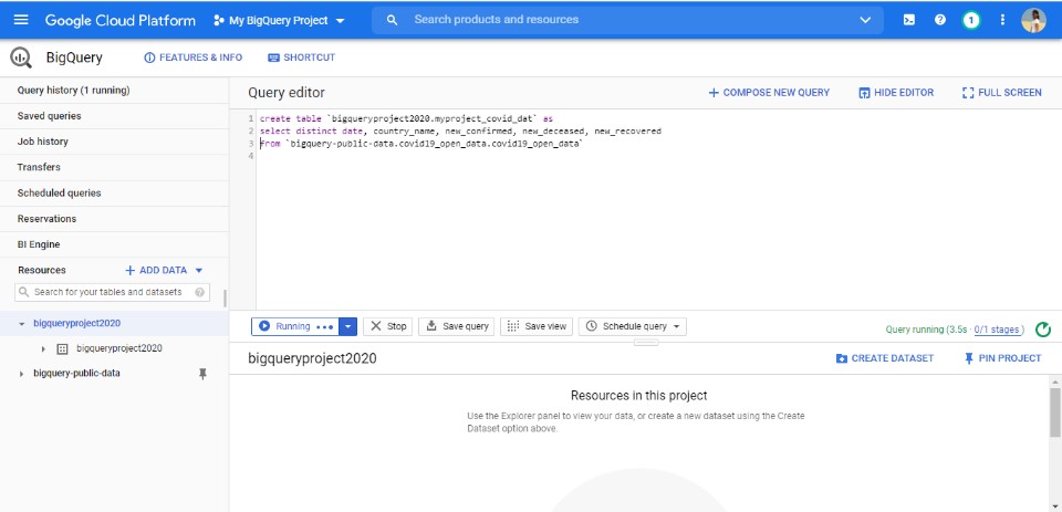
We now have the number of confirmed, deceased, and recovered Covid cases by Country and Date in our dataset. We would now want to derive some insights from this data – this is where Data Studio comes into play.
What is the Data Studio?
Google Data Studio is a visualization platform whereby you can create quick dashboards and reports from your data. GCP offers a very useful option of exporting the data on BigQuery to Data Studio so that one can start working on the insights right away! Let’s explore this in the next section.
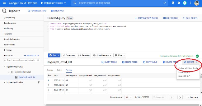
1. In our previous section, we had created the subsetted table ‘myproject_covid_data’. To visualize it in Data Studio, go to the ‘Export’ option on the query results pane below and select ‘Explore with Data Studio’. A new window would open up for visualization:
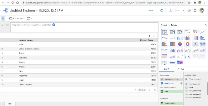
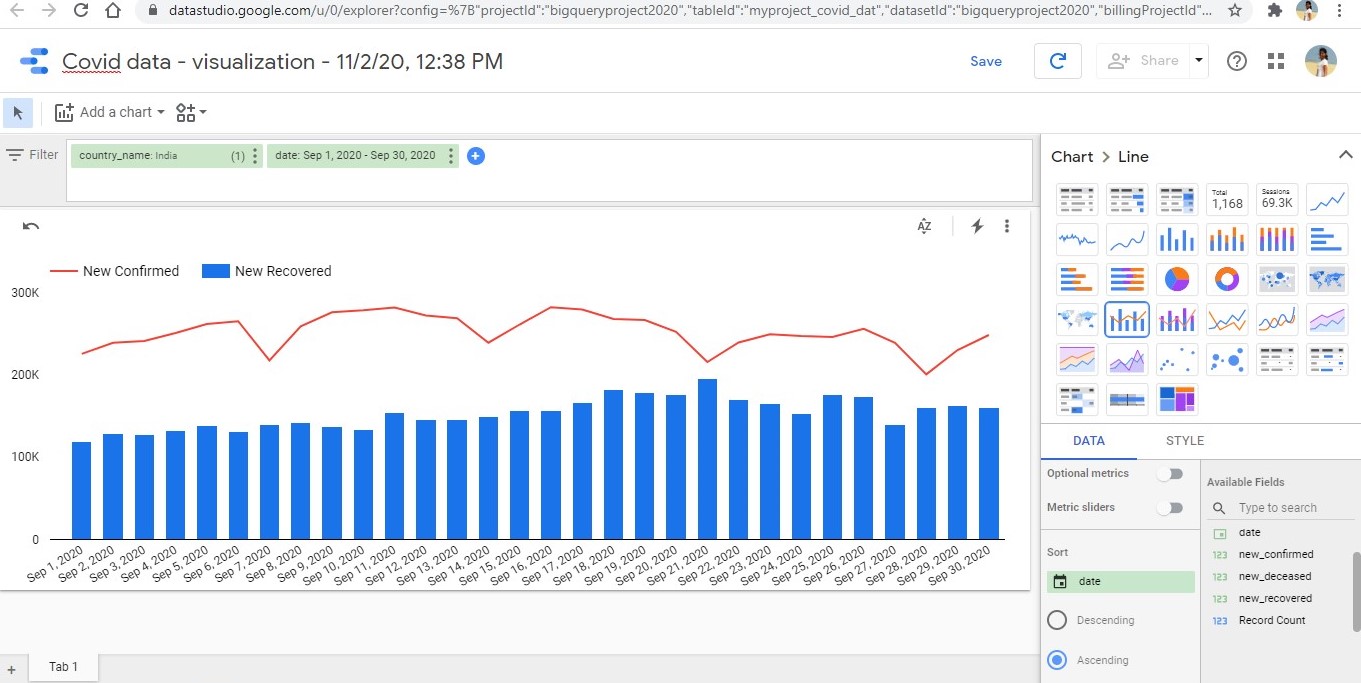
2. You would see a lot of chart/visual options on the right and the metrics to be represented in the visualization. Let us now create a visual which shows the number of confirmed versus recovered Covid cases by date and filter it by country to view results.
From the right, choose the combo chart (bar + line graph). On the bottom right, you would see 2 tabs for ‘Data’ and ‘Style’ – you can add the metrics required under the Data tab, and format the graphs visually under the Style tab.
3. Under the Data tab, add the ‘date’ column under Dimension, and ‘new_confirmed’ and ‘new_recovered’ under Metric. You would notice that an automatic sum aggregation is chosen for these columns, and that is what we want to look at.
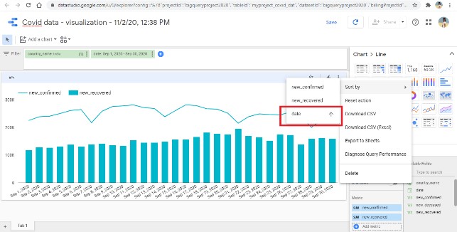
4. Next, drag the ‘country_name’ and ‘date’ columns to the Filter pane above the chart. Select one of the countries, eg – India, and a date range – eg – 1st to 30th Sep’20 from the filter dropdowns. Your visual should appear as follows. Also, make sure to sort the X-axis dates using the sort option in the chart (in 2nd image):
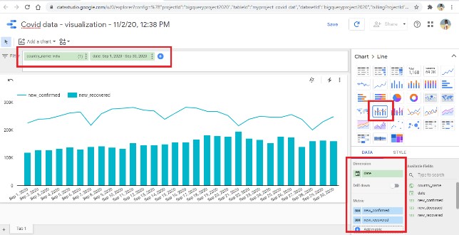
5. As you can see, the chart plots the number of confirmed cases on the line graph and the number of recovered cases on the bar graph for India for the time period 1st to 30th Sep’20. Hovering over the data bars or lines would display the exact values for that data point.
6. We can further format this chart to look more visually appealing by using the Style tab on the bottom right. Our final visual then looks as follows, and voila! You have built insights by creating a dataset in BigQuery and visualizing it in Data Studio!
