Introduction
The k-nearest neighbors algorithm, or KNN, is a non-parametric, supervised learning method. It classifies or predicts the grouping of a data point based on its proximity to neighboring points. KNN is a versatile tool widely used in machine learning for various classification and regression tasks
The abbreviation KNN stands for “K-Nearest Neighbour”. It is a supervised machine learning algorithm. The algorithm can be used to solve both classification and regression problem statements.
The number of nearest neighbours to a new unknown variable that has to be predicted or classified is denoted by the symbol ‘K’.
This article was published as a part of the Data Science Blogathon.
Table of contents
KNN Algorithm real-world scenario
Let’s take a good look at a related real-world scenario before we get started with this awesome algorithm.
We are often notified that you share many characteristics with your peers, whether it be your thinking process, working etiquette, philosophies, or other factors. As a result, we build friendships with people we deem similar to us.
The KNN algorithm employs the same principle. Its aim is to locate all of the closest neighbors around a new unknown data point in order to figure out what class it belongs to. It’s a distance-based approach.
Consider the diagram below; it is straightforward and easy for humans to identify it as a “Cat” based on its closest allies. This operation, however, cannot be performed directly by the algorithm.
KNN calculates the distance from all points in the proximity of the unknown data and filters out the ones with the shortest distances to it. As a result, it’s often referred to as a distance-based algorithm.
In order to correctly classify the results, we must first determine the value of K (Number of Nearest Neighbours).
In the following diagram, the value of K is 5. Since there are four cats and just one dog in the proximity of the five closest neighbours, the algorithm would predict that it is a cat based on the proximity of the five closest neighbors in the red circle’s boundaries.
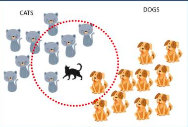
Here, ‘K’ is the hyperparameter for KNN. For proper classification/prediction, the value of K must be fine-tuned.
But, How do we select the right value of K?
We don’t have a particular method for determining the correct value of K. Here, we’ll try to test the model’s accuracy for different K values. The value of K that delivers the best accuracy for both training and testing data is selected.
Note!!
It is recommended to always select an odd value of K ~
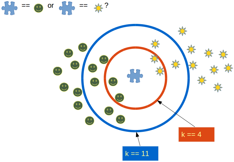
When the value of K is set to even, a situation may arise in which the elements from both groups are equal. In the diagram below, elements from both groups are equal in the internal “Red” circle (k == 4).
In this condition, the model would be unable to do the correct classification for you. Here the model will randomly assign any of the two classes to this new unknown data.
Choosing an odd value for K is preferred because such a state of equality between the two classes would never occur here. Due to the fact that one of the two groups would still be in the majority, the value of K is selected as odd.
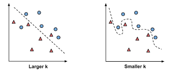
The impact of selecting a smaller or larger K value on the model
- Larger K value: The case of underfitting occurs when the value of k is increased. In this case, the model would be unable to correctly learn on the training data.
- Smaller k value: The condition of overfitting occurs when the value of k is smaller. The model will capture all of the training data, including noise. The model will perform poorly for the test data in this scenario.
How does KNN work for ‘Classification’ and ‘Regression’ problem statements?
Classification
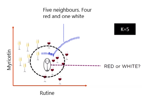
When the problem statement is of ‘classification’ type, KNN tends to use the concept of “Majority Voting”. Within the given range of K values, the class with the most votes is chosen.
Consider the following diagram, in which a circle is drawn within the radius of the five closest neighbours. Four of the five neighbours in this neighbourhood voted for ‘RED,’ while one voted for ‘WHITE.’ It will be classified as a ‘RED’ wine based on the majority votes.
Src: https://images.app.goo.gl/Ud42nZn8Q8FpDVcs5
Several parties compete in an election in a democratic country like India. Parties compete for voter support during election campaigns. The public votes for the candidate with whom they feel more connected.
When the votes for all of the candidates have been recorded, the candidate with the most votes is declared as the election’s winner.
Regression
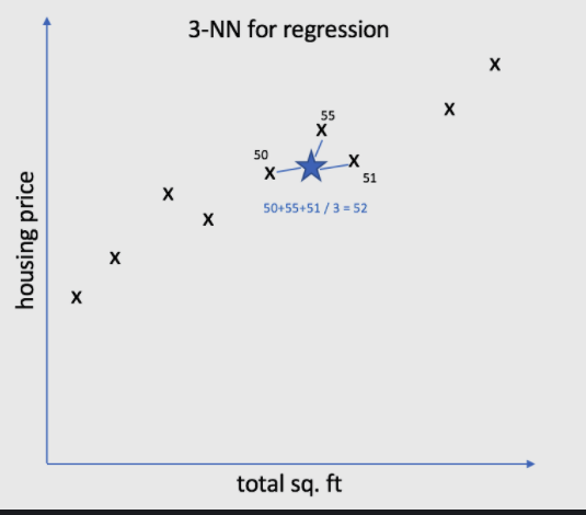
KNN employs a mean/average method for predicting the value of new data. Based on the value of K, it would consider all of the nearest neighbours.
The algorithm attempts to calculate the mean for all the nearest neighbours’ values until it has identified all the nearest neighbours within a certain range of the K value.
Consider the diagram below, where the value of k is set to 3. It will now calculate the mean (52) based on the values of these neighbours (50, 55, and 51) and allocate this value to the unknown data.
Impact of Imbalanced dataset and Outliers on KNN
Imbalanced dataset
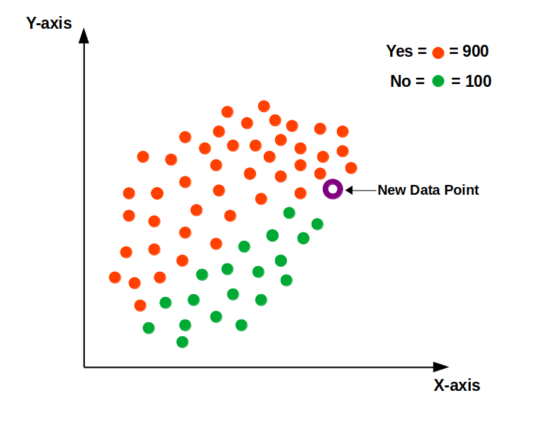
When dealing with an imbalanced data set, the model will become biased. Consider the example shown in the diagram below, where the “Yes” class is more prominent.
As a consequence, the bulk of the closest neighbours to this new point will be from the dominant class. Because of this, we must balance our data set using either an “Upscaling” or “Downscaling” strategy.
Src: https://images.app.goo.gl/1XkGHtn16nXDkrTL7
Outliers
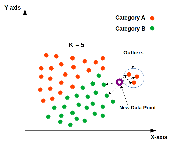
Outliers are the points that differ significantly from the rest of the data points.
The outliers will impact the classification/prediction of the model. The appropriate class for the new data point, according to the following diagram, should be “Category B” in green.
The model, however, would be unable to have the appropriate classification due to the existence of outliers. As a result, removing outliers before using KNN is recommended.
Src: https://images.app.goo.gl/K35WtKYCTnGBDLW36
Importance of scaling down the numeric variables to the same level
Data has 2 parts: –
1) Magnitude
2) Unit
For instance; if we say 20 years then “20” is the magnitude here and “years” is its unit.
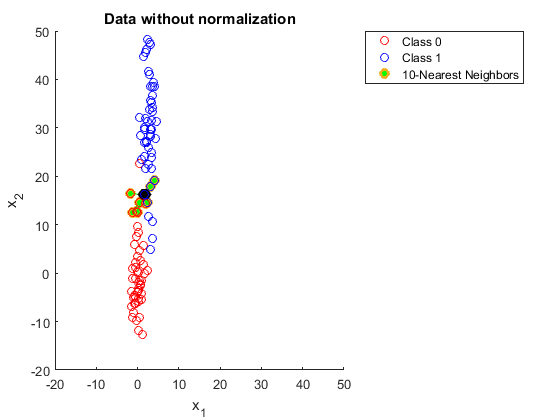
Since it is a distance-dependent algorithm, KNN selects the neighbours in the closest vicinity based solely on the magnitude of the data. Have a look at the diagram below; the data is not scaled, so it can not find the closest neighbours correctly. As a consequence, the outcome will be influenced.
Src:https://images.app.goo.gl/M1oenLdEo427VBGc7
The data values in the previous figure have now been scaled down to the same level in the following example. Based on the scaled distance, all of the closest neighbours would be accurately identified.
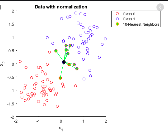
Src:https://images.app.goo.gl/CtdoNXq5hPVvynre9
Understand with code in R
Step1
load the libraries “caTools” & “class” in the R environment.
library(caTools)
library(class)
Step 2
Load the ‘iris’ data in the data variable. See the structure of the data using str() function.
data <- read.csv('iris.csv',header = T)
str(data)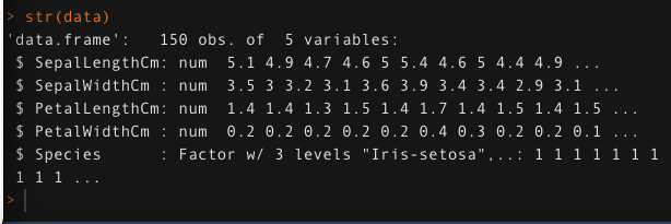
Step 3
Split the data into two parts: ‘train’ and ‘test.’ 80% of the data is used to train the model, while the remaining 20% is used for testing.
set.seed(123)
split <- sample.split(data,SplitRatio = 0.8)
train <- subset(data,split==T)
test <- subset(data,split==F)
Step 4
Store the independent variables for both train and test data into ‘trainx’ and ‘testx’ respectively. Similarly, store the dependent variable ‘Species’ into ‘trainy’ and ‘testy’.
trainx <- train[,-5]
testx <- test[,-5]
trainy <- train$Species
testy <- test$Species
Step 5
Scale all the numeric features down to the same level.
## scaling is required
trainx <- scale(trainx)
testx <- scale(testx)
Step 6
train_accuracy=1
i=1
set.seed(0)
for (i in 1:15){
   knn.pred <- knn(trainx, trainx, trainy, k=i)
   train_accuracy[i] <- 100 * sum(trainy == knn.pred)/NROW(trainy)
   a=i
   cat(a,'=',train_accuracy[i],'
')
}
Step 7
Evaluating the accuracy of the model on test data for K values between 1 and 15
test_accuracy=1
i=1
for (i in 1:15){
  knn.mod <- knn(train=trainx, test=testx, cl=trainy, k=i)
  test_accuracy[i] <- 100 * sum(testy == knn.mod)/NROW(testy)
  k=i
  cat(k,'=',test_accuracy[i],'
')
}
Step 8
Comparing the change in the values of train_accuracy and test_accuracy for K value between 1 and 15.
Compare <- cbind(train_accuracy,test_accuracy)
Compare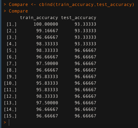
The model gives the highest accuracy for K = 5 in the above comparison of train and test accuracy; 98.333 percent for train data and 96.66 percent for test data. As a consequence, we’ll use this value of K to build our model.
Conculsion
K-Nearest Neighbour (KNN) is a useful computer tool that predicts things by looking at nearby examples. We talked about how it helps in real-life situations and how it guesses both categories and numbers. We also learned how to deal with tricky situations like having too many or too few examples. Making sure all the info is fair and equal is important. We tried it out with simple computer code in R. KNN is like a handy friend who can help with many problems!
Thank you,
Shivam Sharma.
Phone: +91 7974280920
E-Mail: [email protected]
LinkedIn: www.linkedin.com/in/shivam-sharma-49ba71183
The media shown in this article on Data Visualizations in Julia are not owned by Analytics Vidhya and is used at the Author’s discretion.


