This article was published as a part of the Data Science Blogathon
Split Panels
This article will guide the step-by-step process to publish a web app featuring split panels. The web app is created using the Earth Engine Cloud-computing platform. Earth Engine makes tons of satellite images available to analyze and display. It also provides web app publication.
The web app we are going to discuss today is split panels. The split panel is one of the User Interfaces available in Earth Engine. The web app consists of two panels on the left and right sides. Each panel shows the same area with different images. In other words, two images are overlaid and showed only the left and right sides respectively. By default, each image in each panel is displayed half.
The two panels are not fully displayed but are split in the middle by a divider. The divider can be dragged to the left or right. When the divider is dragged to the left, both the panels are resized. The left panel will have its size smaller showing less area of the image. On the other hand, the image on the right panel will display more of its image replacing the area passed by the divider.
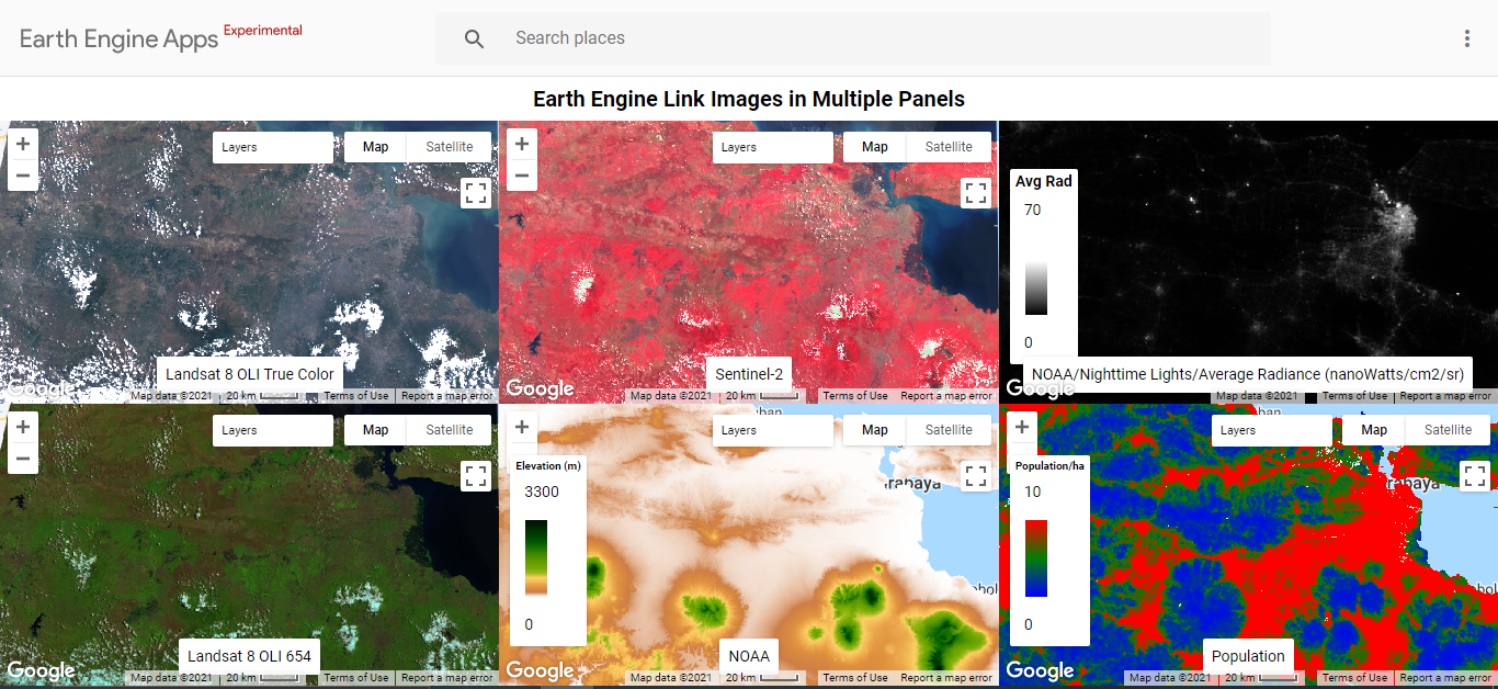
Split panels are useful for comparing two images, especially at certain points in the images. Previously, I have written about another Earth Engine web app featuring linked multiple panels. The linked multiple panels are similar to the split panels. Linked multiple panels also can be used to compare 2 or more images. Linked multiple panels display two or more images side-by-side, but not overlapping. See Figure 2 below for example, or read the article for an explanation.

For illustration, we can imagine linked multiple panels as showing two maps of the same area by putting them beside each other. The two maps are not overlapping. If pointing out a finger to a location on the first multiple panels, we need to carefully search for the same location on another map because they are not overlapping.
In contrast, split panels are like putting one of the maps on top of another map displaying the exact same area. The advantage of split panels overlapping two images is that we can compare certain points in the two images more easily than we do in linked multiple panels. We will see the example later.
Comparing Images of Different Date
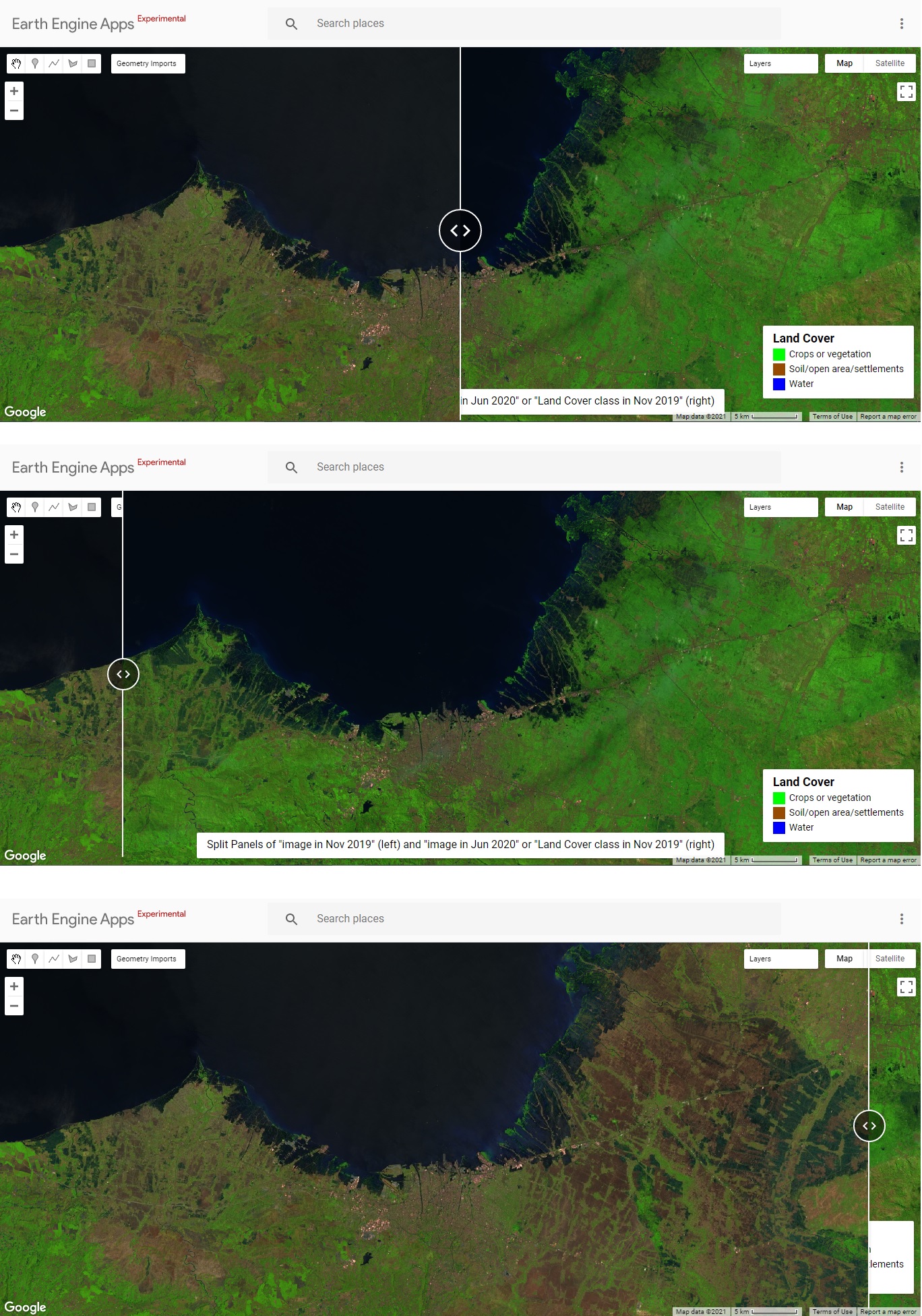
So, what is the use of comparing two images of the same location using split panels? This article will describe two examples of the use. The first use is to compare the same location on different dates. Satellite images are indeed frequently used for monitoring. The following Figure 2 compares the crop condition in Central Java in November 2019 and June 2020.
The result of the code is published in this web app. Below is the figure of the web app result. The left image shows the image in November 2019. Many areas are visualized in brown color which means that those areas were already harvested. The harvested land is visualized in brown color for the soil or open land. The right image shows the land cover in June 2020 when the crops had been replanted. Drag the divider to the left and to the right and examine that many areas have their colors change from brown to green. This indicates the crop conditions. Some areas are even flooded (dark blue).

Comparing Machine Learning or Image Analysis with the Input Data
Split panels are also practical for comparing the image analysis result output to the input image. For demonstration, I will process an image with supervised Machine Learning. The code below trains a Machine Learning model to predict the land cover type into 3 classes: crop/vegetation, open land settlement, and water body in November 2019. The process starts with training the Machine Learning with some areas labeled with the land cover type. The Machine Learning algorithm used for this task is Gradient Boosting Tree. Then, the model can predict the land cover type for the rest areas.
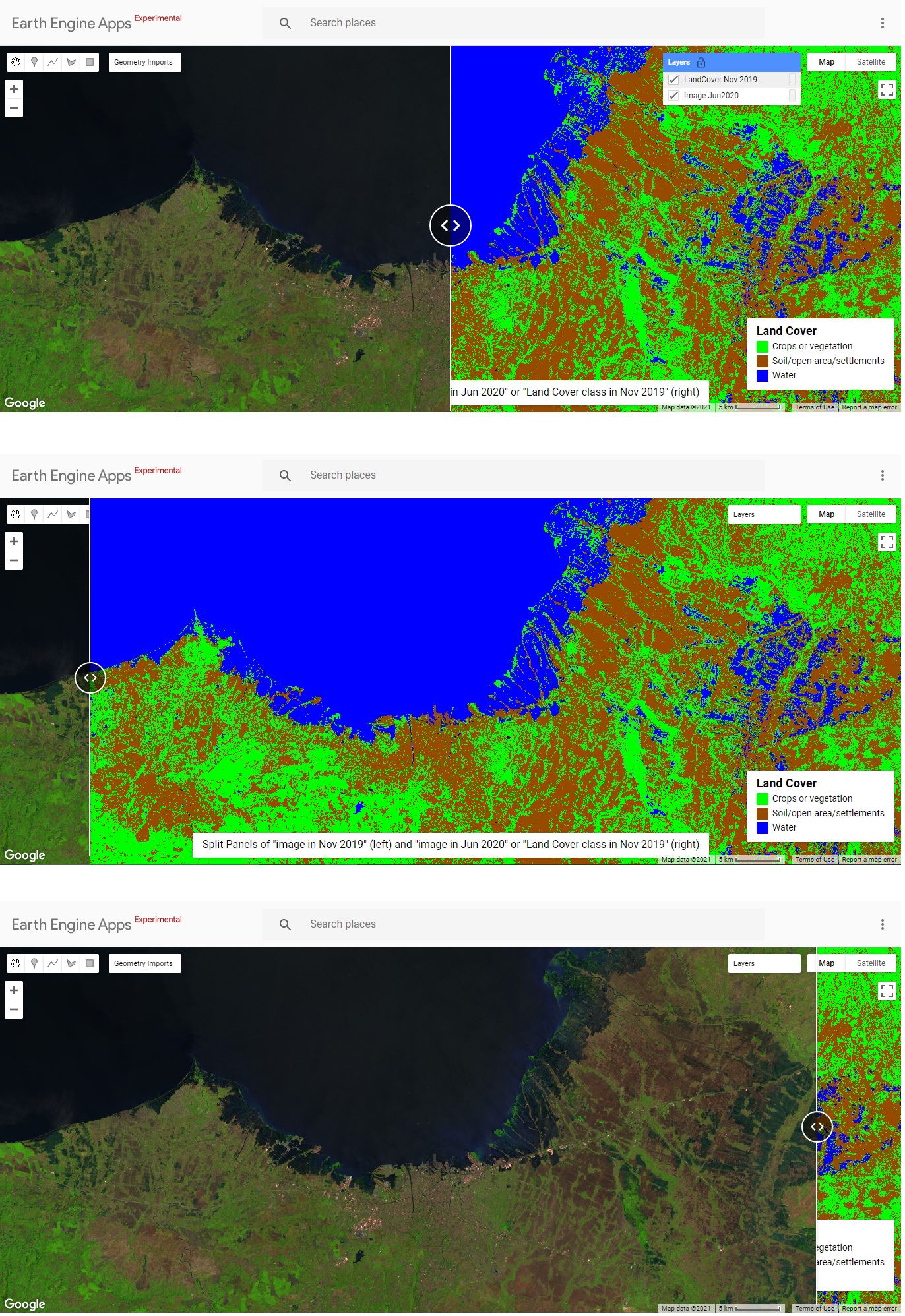
After having the Machine Learning prediction, we might want to overlay the Machine Learning output with the input image and compare them area by area. To accomplish this, split panels are used. Please find this published web app again. It is still in the same web app as the previous one. But this time, go to the right panel and see the layers. Check the “LandCover Nov 2019”.

Now, we can easily compare the Machine Learning analysis result with the input data. In general, we should find most crops or vegetation are classified in green, open land/soil or settlements in brown, and water bodies in blue. Of course, you can zoom in, zoom out, and pan the panel just like any webGIS.
Here is the code to run the web app. The code starts with importing the satellite images and labeling some of the areas with land cover types as the training dataset.
// Split Panels Comparing Different Date Images and Machine Learning Results
// Loading Landsat 8 collection
var landsat = ee.ImageCollection('LANDSAT/LC08/C01/T1');
var image = ee.Algorithms.Landsat.simpleComposite({
  collection: landsat.filterDate('2019-11-01', '2019-11-30'),
  asFloat: true
});
// Features/bands used for prediction.
var bands = ['B2', 'B3', 'B4', 'B5', 'B6', 'B7'];
// Labeling training data
var polygons = ee.FeatureCollection([
  ee.Feature(geometry0, {'class': 0}), // bare land or settlements
  ee.Feature(geometry1, {'class': 1}), // crop or vegetation
  ee.Feature(geometry2, {'class': 2}), // water
]);
// Extract Digital Numbers of pixels in training polygons
var training = image.sampleRegions({
  // Get the training polygons
  collection: polygons,
  // Set the properties name
  properties: ['class'],
  // Set the spatial resolution of the images
  scale: 30
});
This code performs Gradient Boosting Machine Learning to the training dataset and predicts the whole area land cover types.
// Build GradientTreeBoost classifier
var trained = ee.Classifier.smileGradientTreeBoost(8).train(training, 'class', bands);
Then, the Machine Learning model is applied to predict the land cover classes.
// Load November 2019 image
var Nov = ee.ImageCollection('LANDSAT/LC08/C01/T1_TOA')
  .filterDate('2019-11-01', '2019-11-30')
  .median();
// Clip image
var Nov = Nov.clip(geometry);
// Classify the satellite image
var classified = Nov.select(bands).classify(trained);
// clip the classification
var classified = classified.clip(geometry);
// Load June 2020 image
var Jun = ee.ImageCollection('LANDSAT/LC08/C01/T1_TOA')
  .filterDate('2020-06-01', '2020-06-30')
  .median();
// Clip image
var Jun = Jun.clip(geometry);
The Code below displays the image in November 2019 on the left side. It also displays the image of June 2020 and the Machine Learning prediction result on the right side. Finally, split panels are created with a divider in the middle.
// Show the composite image for November 2019
Map.addLayer(Nov , {bands: ['B6', 'B5', 'B4'], max: 0.7}, "Image Nov2019", true);
// Split Panels
// Map 2
var map2 = ui.Map();
// Show the composite image for June 2020
map2.addLayer(Jun , {bands: ['B6', 'B5', 'B4'], max: 0.7}, "Image Jun2020", true);
// Show the classification result for November 2019
map2.addLayer(classified,
         {min: 0, max: 2, palette: ['#964b00','#00FF00','#0000FF']},
         'LandCover Nov 2019', false);
// Link the two panels
var linker = ui.Map.Linker([ui.root.widgets().get(0), map2]);
// Create the split panels
var splitPanel = ui.SplitPanel({
  firstPanel: linker.get(0),
  secondPanel: linker.get(1),
  orientation: 'horizontal',
  wipe: true,
  style: {stretch: 'both'}
});
// Set the split panels to ui roots
ui.root.widgets().reset([splitPanel]);
// Set the view center
linker.get(0).setCenter(110.4411, -6.9112, 11);
The following code creates the map legend for explaining the land cover class symbols.
// Add map legend
var legend = ui.Panel({
  style: {
    position: 'bottom-right',
    padding: '8px 15px'
  }
});
var legend2 = ui.Label({
  value: 'Land Cover',
  style: {
    fontWeight: 'bold',
    fontSize: '18px',
    margin: '0 0 4px 0',
    padding: '0'
    }
});
legend.add(legend2);
// Creates the content of the legend
var content = function(colour, label) {
      // Create the coloured boxes
      var box = ui.Label({
        style: {
          backgroundColor:  colour,
          // Set box height and width
          padding: '9px',
          margin: '0 0 4px 0'
        }
      });
      // Create the labels
      var labels = ui.Label({
        value: label,
        style: {margin: '0 0 4px 6px'}
      });
      return ui.Panel({
        widgets: [box, labels],
        layout: ui.Panel.Layout.Flow('horizontal')
      });
};
//  Set legend colours
var classColour = ['#00FF00','#964b00','#0000FF'];
//var classColour = ['green','brown','blue'];
// Set legend labels
var labelName = ['Crops or vegetation','Soil/open area/settlements','Water'];
// Combine legend colour and labels
for (var i = 0; i < 3; i++) {
  legend.add(content(classColour[i], labelName[i]));
  }
// Add legend
map2.add(legend);
It also put brief information regarding the displayed image at the bottom center.
// Add info
var info = ui.Panel({
  style: {
    position: 'bottom-center',
    padding: '8px 15px'
  }
});
var info2 = ui.Label({
  value: 'Split Panels of "image in Nov 2019" (left) and "image in Jun 2020" or "Land Cover class in Nov 2019" (right)',
  style: {
    fontSize: '16px',
    margin: '0 0 3px 0',
    padding: '0'
    }
});
info.add(info2);
map2.add(info);
Conclusion
Split panels web app can be created using Earth Engine. Split panels display two overlapping images of the same area with a divider in the middle. The divider can be dragged and decide the size of each image for display. Split panels can be used to compare two images of the same area. The two different images can show the area on different dates. The two images can also be the input image and the output from the image analysis result.
About Author
Connect with me here.
The media shown in this article are not owned by Analytics Vidhya and is used at the Author’s discretion.


How to compare forest loss/gain correlation with cloud cover/LST using search window strategy? Is it possible in GEE? thank you!