This article was published as a part of the Data Science Blogathon
After understanding and working with this hands-on tutorial, you will be able to:
- Understand what is cohort and cohort analysis
- Handling missing values
- Month extraction from date
- Assign cohort to each transaction
- Assigning cohort Index to each transaction
- Calculate the number of unique customers in each group
- Create cohort table for retention rate
- Visualize the cohort table using the heatmap
- Interpret the retention rate
What is Cohort and Cohort Analysis?
A cohort is a collection of users who have something in common. A traditional cohort, for example, divides people by the week or month of which they were first acquired. When referring to non-time-dependent groupings, the term segment is often used instead of the cohort.
Cohort analysis is a descriptive analytics technique in cohort analysis. Customers are divided into mutually exclusive cohorts, which are then tracked over time. Vanity indicators don’t offer the same level of perspective as cohort research. It aids in the deeper interpretation of high-level patterns by supplying metrics around the product and consumer lifecycle.
Generally, there are three major types of Cohort:
- Time cohorts: customers who signed up for a product or service during a particular time frame.
- Behavior cohorts: customers who purchased a product or subscribed to service in the past.
- Size cohorts: refer to the various sizes of customers who purchase the company’s products or services.
However, we will be performing Cohort Analysis based on Time. Customers will be divided into acquisition cohorts depending on the month of their first purchase. The cohort index would then be assigned to each of the customer’s purchases, which will represent the number of months since the first transaction.
Objectives:
- Finding the percentage of active customers compared to the total number of customers after each month: Customer Segmentations
- Interpret the retention rate
Here’s the full code for this tutorial if you would like to follow along as you progress through the tutorial.
Step involved in Cohort Retention Rate Analysis
1. Data Loading and Cleaning
2. Assigned the cohort and calculate the
Step 2.1
- Truncate data object in into needed one(here we need month so transaction_date)
- Create groupby object with target column ( here, customer_id)
- Transform with a min() function to assign the smallest transaction date in month value to each customer.
The result of this process is the acquisition month cohort for each customer i.e. we have assigned the acquisition month cohort to each customer.
Step 2.2
- Calculate Time offset by extracting integer values of the year, month, and day from a datetime() object.
- Calculate the number of months between any transaction and the first transaction for each customer. We will use the TransactionMonth and CohortMonth values to do this.
The result of this will be cohortIndex i.e, the difference between “TransactionMonth ” and “CohortMonth” in terms of the number of months and call the column “cohortIndex”.
Step 2.3
- Create a groupby object with CohortMonth and CohortIndex.
- Count the number of customers in each group by applying the pandas nunique() function.
- Reset the index and create a pandas pivot with CohortMonth in the rows, CohortIndex in the columns, and customer_id counts as values.
The result of this will be the table that will serve as the basis for calculating retention rate and other matrices as well.
3. Calculate business matrices: Retention rate.
Retention measures how many customers from each of the cohort have returned in the subsequent months.
- Using the dataframe called cohort_counts we will select the First columns(equals to the total number of customer in cohorts)
- Calculate the ratio of how many of these customers came back in the subsequent months.
The result gives a retention rate.
4. Visualizing the retention rate
5. Interpreting the retention rate
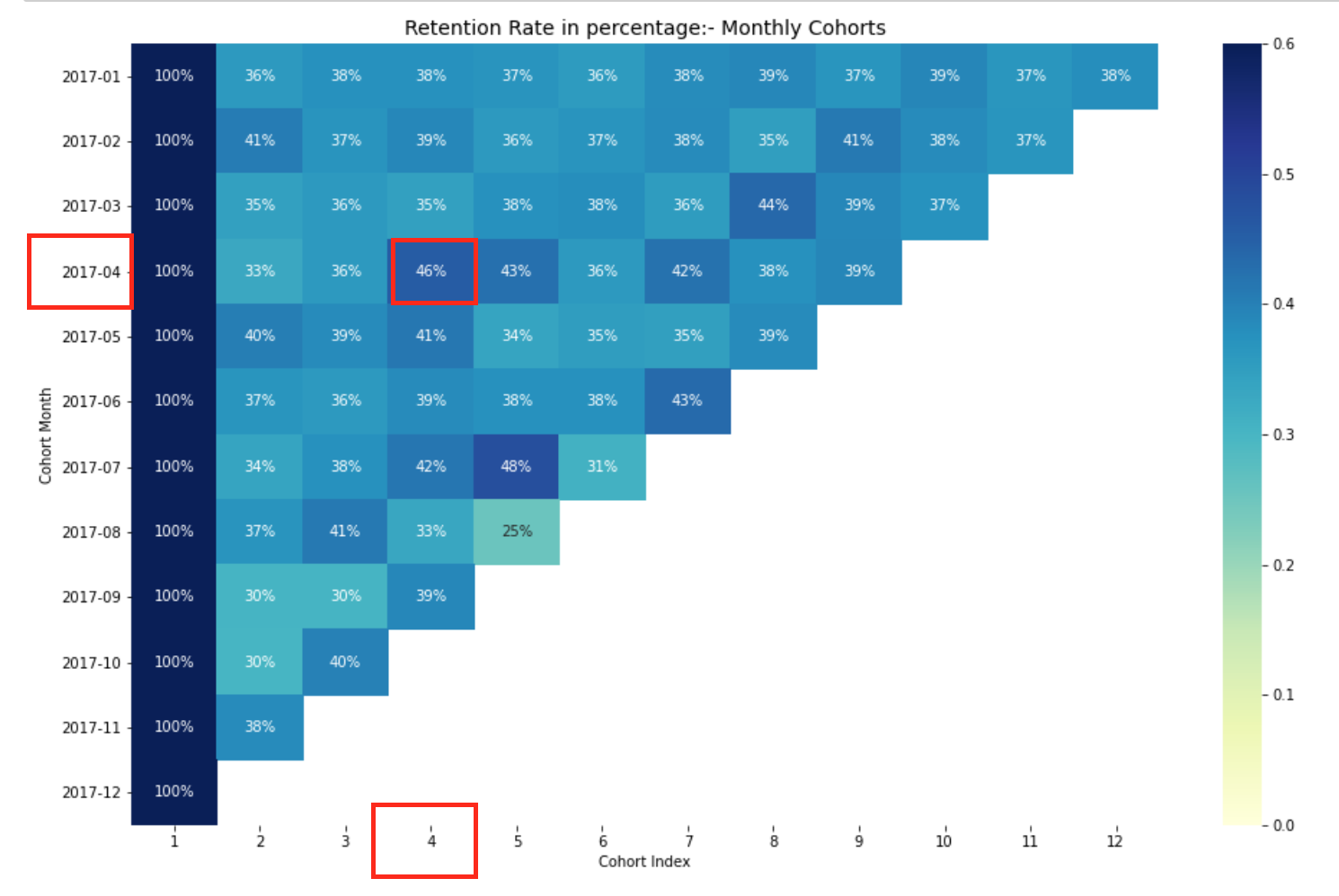
Retention rate monthly cohorts.
Let’s Begin:
Import Libraries
import pandas as pd
import seaborn as sns
import matplotlib.pyplot as plt
import numpy as np
import datetime as dt
import missingno as msno
from textwrap import wrap
Data loading and cleaning
# Loading dataset
transaction_df = pd.read_excel('transcations.xlsx')
# View data
transaction_df.head()
Checking and working with missing value
# Inspect missing values in the dataset
print(transaction_df.isnull().values.sum())
# Replace the ' 's with NaN
transaction_df = transaction_df.replace(" ",np.NaN)
# Impute the missing values with mean imputation
transaction_df = transaction_df.fillna(transaction_df.mean())
# Count the number of NaNs in the dataset to verify
print(transaction_df.isnull().values.sum())
print(transaction_df.info())
for col in transaction_df.columns:
    # Check if the column is of object type
    if transaction_df[col].dtypes == 'object':
        # Impute with the most frequent value
        transaction_df[col] = transaction_df[col].fillna(transaction_df[col].value_counts().index[0])
# Count the number of NaNs in the dataset and print the counts to verify
print(transaction_df.isnull().values.sum())
Here, we can see that we have 1542 null values. Which we treated with mean as well as most frequent values as per datatype. Now, as we have completed our data cleaning and understanding, now we will commence the Cohort Analysis.
Assigned the cohorts and calculated the monthly offset
# A function that will parse the date Time based cohort:  1 day of month
def get_month(x): return dt.datetime(x.year, x.month, 1)
# Create transaction_date column based on month and store in TransactionMonth
transaction_df['TransactionMonth'] = transaction_df['transaction_date'].apply(get_month)
# Grouping by customer_id and select the InvoiceMonth value
grouping = transaction_df.groupby('customer_id')['TransactionMonth']
# Assigning a minimum InvoiceMonth value to the dataset
transaction_df['CohortMonth'] = grouping.transform('min')
# printing top 5 rows
print(transaction_df.head())
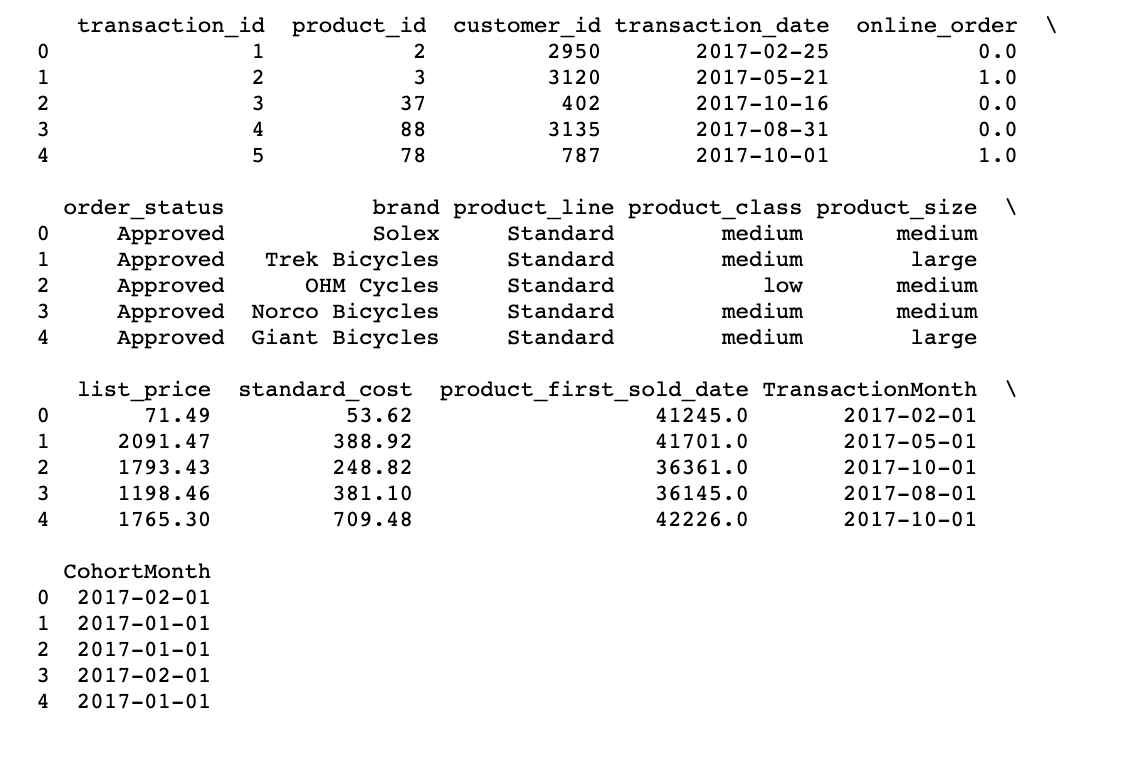
Calculating time offset in Month as Cohort Index
Calculating the time offset for each transaction allows you to evaluate the metrics for each cohort in a comparable fashion.
First, we will create 6 variables that capture the integer value of years, months, and days for Transaction and Cohort Date using the get_date_int() function.
def get_date_int(df, column):
    year = df[column].dt.year
    month = df[column].dt.month
    day = df[column].dt.day
    return year, month, day
# Getting the integers for date parts from the `InvoiceDay` column
transcation_year, transaction_month, _ = get_date_int(transaction_df, 'TransactionMonth')
# Getting the integers for date parts from the `CohortDay` column
cohort_year, cohort_month, _ = get_date_int(transaction_df, 'CohortMonth')
Now we will calculate the difference between the Invoice Dates and Cohort dates in years, months separately. then calculate the total Months difference between the two. This will be our month’s offset or cohort Index, which we will use in the next section to calculate the retention rate.
#  Get the  difference in years
years_diff = transcation_year - cohort_year
# Calculate difference in months
months_diff = transaction_month - cohort_month
""" Extract the difference in months from all previous values
 "+1" in addeded at the end so that first month is marked as 1 instead of 0 for easier interpretation.
 """
transaction_df['CohortIndex'] = years_diff * 12 + months_diff  + 1
print(transaction_df.head(5))
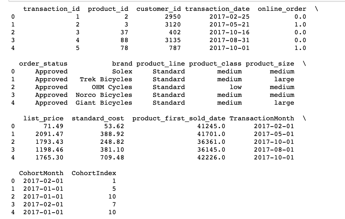
Here, at first, we create a group() object with CohortMonth and CohortIndex and store it as a grouping.
Then, we call this object, select the customer_id column and calculate the average.
Then we store the results as cohort_data. Then, we reset the index before calling the pivot function to be able to access the columns now stored as indices.
Finally, we create a pivot table bypassing
- CohortMonth to the index parameter,
- CohortIndex to the columns parameter,
- customer_id to the values parameter.
and rounding it up to 1 digit, and see what we get.
# Counting daily active user from each chort
grouping = transaction_df.groupby(['CohortMonth', 'CohortIndex'])
# Counting number of unique customer Id's falling in each group of CohortMonth and CohortIndex
cohort_data = grouping['customer_id'].apply(pd.Series.nunique)
cohort_data = cohort_data.reset_index()
 # Assigning column names to the dataframe created above
cohort_counts = cohort_data.pivot(index='CohortMonth',
                                 columns ='CohortIndex',
                                 values = 'customer_id')
# Printing top 5 rows of Dataframe
cohort_data.head()

Calculate business metrics: Retention rate
The percentage of active customers compared to the total number of customers after a specific time interval is called retention rate.
In this section, we will calculate the retention count for each cohort Month paired with cohort Index
Now that we have a count of the retained customers for each cohortMonth and cohortIndex. We will calculate the retention rate for each Cohort.
We will create a pivot table for this purpose.
cohort_sizes = cohort_counts.iloc[:,0]
retention = cohort_counts.divide(cohort_sizes, axis=0)
# Coverting the retention rate into percentage and Rounding off.
retention.round(3)*100
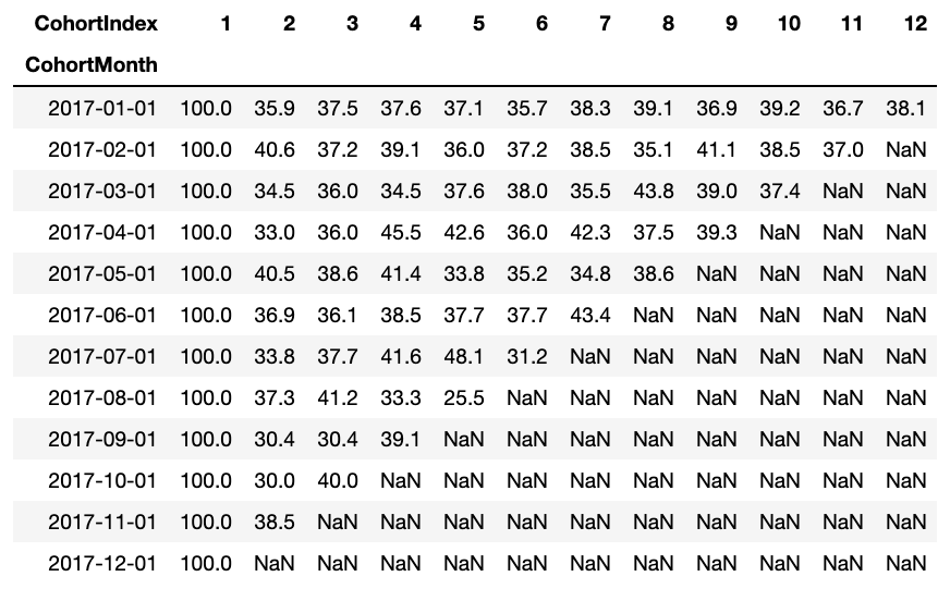
The retention rate dataframe represents Customer retained across Cohorts. We can read it as follows:
- Index value represents the Cohort
- Columns represent the number of months since the current Cohort
Also, you can see from the retention Rate DataFrame:
- Retention Rate 1st index i.e 1st month is 100% as all the customers for that particular customer signed up in 1st Month
- The retention rate may increase or decrease in subsequent Indexes.
- Values towards the bottom right have a lot of NaN values.
Visualizing the retention rate
Before we starting plotting our heatmap, let’s set the index of our Retention rate dataframe to a more readable string format.
average_standard_cost.index = average_standard_cost.index.strftime('%Y-%m')
# Initialize the figure
plt.figure(figsize=(16, 10))
# Adding a title
plt.title('Average Standard Cost: Monthly Cohorts', fontsize = 14)
# Creating the heatmap
sns.heatmap(average_standard_cost, annot = True,vmin = 0.0, vmax =20,cmap="YlGnBu", fmt='g')
plt.ylabel('Cohort Month')
plt.xlabel('Cohort Index')
plt.yticks( rotation='360')
plt.show()
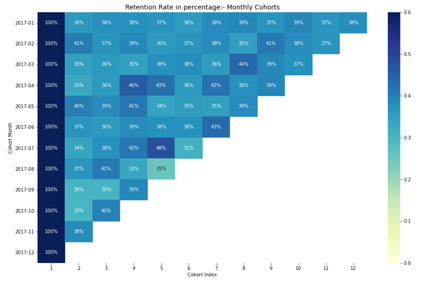
Interpreting the retention rate
The most effective way to visualize and analyze cohort analysis data is through a heatmap, as we did above. It provides both the actual metric values and the color-coding to see the differences in the numbers visually.
If you do not have basic understanding of heatmap, you can check out my blog Exploratory Data Analysis for Beginner Using Python, where I have talked about heatmaps for beginners.
Here, We have 12 cohorts for each month and 12 cohort indexes. The darker the blue shades higher the values. Thus, if we see in 2017-07 cohort Month in 5th Cohort Index, we see the dark blue shade with 48% which means that 48% of cohorts that signed in July 2017 were active 5 months later.
This concludes our Cohort analysis for the retention rate. Similarly, we can perform cohort analysis for other business matrices.
Click here to learn more on Cohort analysis for business free of cost from DataCamp.(Affiliated Link)
Thus, We complete our Cohort Analysis, where you learned about basic and types of cohort analysis, performing time cohorts, working with pandas pivot, and create a retention table along with visualizing it. We also learned the way to explore other matrices.
Now, you can start creating and exploring the metrics that matters to your business on your own.
Extra readings & tutorials
- Exploratory Data Analysis for Beginner Using Python with Complete Guide and Code
- Build Your First Data Visualization Web App in Python Using Streamlit
- The Ultimate Guide To SMS: Spam or Ham Detector Using Python(AN APPROACH WITH ARTIFICIAL INTELLIGENCE)
- 8 Tips for the Better Digital Version of Yourself: No Social media or digital addiction any more
- Surprisingly Effective Way To Name Matching In Python: Data Matching, Fuzzy Matching, Data Deduplication
The media shown in this article are not owned by Analytics Vidhya and are used at the Author’s discretion.


In the last box of codes, you write: average_standard_cost.index = average_standard_cost.index.strftime('%Y-%m') that is not defined before. Here is the error: NameError: name 'average_standard_cost' is not defined
change 'average_standard_cost' to 'retention'