This article was published as a part of the Data Science Blogathon
Introduction:
Biomedical Signals always plays important role in research and also in the data science field. When comes to Convolution Neural Network (CNN), this particular algorithm plays important role in defining the architecture for the most sophisticated and highly advanced algorithms w.r.t Deep Learning (DL). Most of the open-source coding w.r.t DL is related to images types, which comes under 2-dimensional data (about dimensional details and it’s types related please refer – https://www.analyticsvidhya.com/blog/2021/07/artificial-neural-network-simplified-with-1-d-ecg-biomedical-data/). So this particular article gives a clear picture in 1-dimensional data and what are the basic layers we need to use from 2-dimensional data or about 1-dimensional data.
Convolution Neural Network:
We discussed already Convolution Neural Network (CNN) in detail in the following article with the Image processing domain (related to computer vision) with python code. Please find the link for better understanding, (https://www.analyticsvidhya.com/blog/2021/07/convolution-neural-network-better-understanding/)
In simple CNN can be explained by,
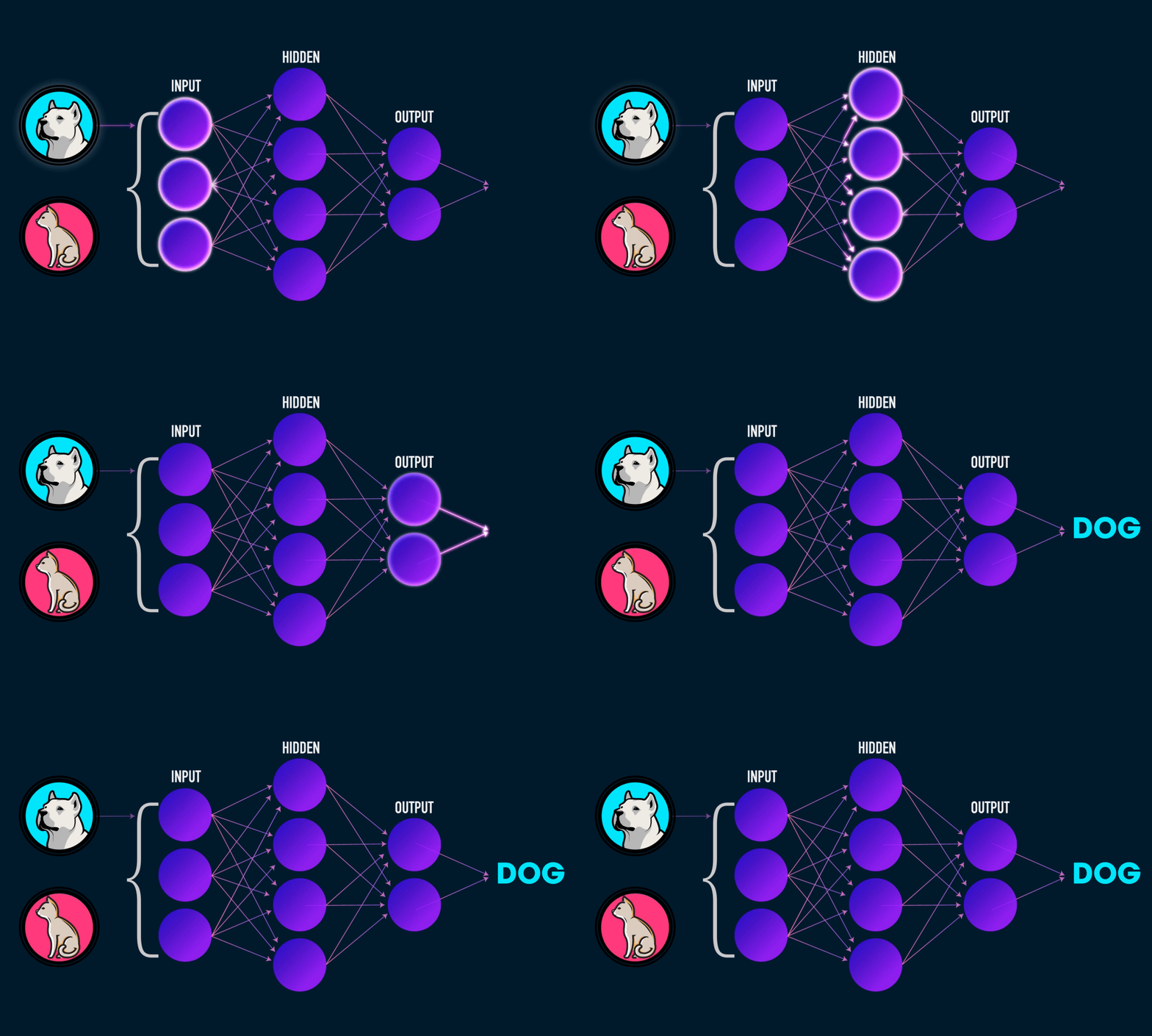
Some of the important layers or steps for CNN algorithm,
1. Convolution layer (Most important layer in CNN)
2. Activation function (Boosting power, especially ReLu layer)
3. Pooling (Dimensionality reduction like PCA)
4. Flattening (converting matrix form to single big column)
5. Activation layer – SOFTMAX layer (Output layer mostly, Probability distribution)
6. Full connection (depends on the target/dependent variable)
2-Dimensional to 1-Dimensional data (w.r.t functional difference):
For CNN, we will be using some basic layers, that lays the foundation for most of the algorithms like LeNet 5, Alexnet, Inception, and many more, for instance for image analysis we will be using, some basic blocks or parts and in parallel, I gave for 1-dimension too (how to use in 1-D data),
1. Convolution layer – Conv2D (for 2-dimension) – Conv1D (for 1-dimension)
2. Max Pooling layer – MaxPool2D (for 2-dimension) – MaxPool1D (for 1-dimension)
3. Flattening layer – Flatten (1 & 2-dimension)
4. Drop-Out layer – Dropout (1 & 2-dimension)
5. fully-connected layer & Output layer – Dense
from the above discussion, we can conclude that there won’t be any difference wrt to the functional aspect, but it is a bit different in the application-specific.
Here is another most important concept we need to keep while in writing code before we are giving our dataset to the model/feature extraction process, our data should be in the shape of
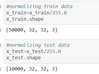
The source for the above concept for normalization process screenshot is:
https://github.com/anandprems/cnn/blob/main/cnn_cifar10.ipynb,
w.r.t image, in the case of 1-dimensional data like ECG or any time series data, we need to reshape our data for the DL algorithm format,

The above concept for reshaping process screenshot is taken from 1-dimensional data,
https://github.com/anandprems/mitbih_cnn/blob/main/mitbih_cnn.ipynb.
1st dimension refers to the input sample
2nd dimension refers to the length of the sample
3rd dimension refers to the number of channels
the same condition, but for LSTM (Recurrent Neural Network),
1st dimension – Samples
2nd dimension – Time steps
3rd dimension – Features
We infer from the above condition that the input layers expect a 3-dimension array of data to process further for data modelling or model extraction.
ECG Data:
Physionet is a world-famous open source for Bio-Signal data (ECG, EEG, PPG, or others), and also working with a real-time dataset is always adventurous, so that we can monitor how our model starts working with real-time and also adjustment needed with our ideal/open-sourced data. Here we took the database from www.physionet.org, we have a different disease-specific database, among them, I preferred to work with the MIT-BIH Arrhythmia database, one main reason is the multi-class approach rather than binary class.
Important specification – all the recordings are sampled at 360 & 11-bit resolution.
Dataset: https://www.physionet.org/content/mitdb/1.0.0/
The signals that we used in this article will resemble the below picture and without coding, with the help of MS EXCEL we can visualize how our dataset looks like
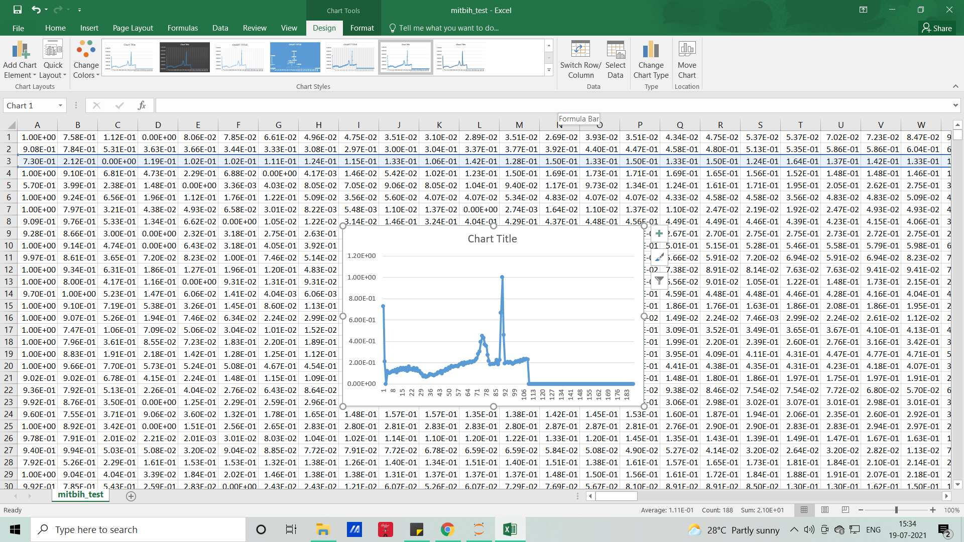
Each row represents samples and each column which represents samples per second (here it’s 188), so if you want to visualize it for the feel (PQRST-U waveform – raw signal), you can either do it with excel or with the help of Python code.
Python code – CNN:
#importing libraries
import numpy as np
import pandas as pd
import matplotlib.pyplot as plt
#importing datasets
test = pd.read_csv('mitbih_test.csv')
train = pd.read_csv('mitbih_train.csv')
#viewing normal dataset
test.head()
#viewing abnormal dataset
train.head()
#dimenion for normal
test.shape
#dimension for abnormal
train.shape
#changing the random column names to sequential - normal
#as we have some numbers name as columns we need to change that to numbers as
for trains in train:
    train.columns = list(range(len(train.columns)))
#viewing edited columns for normal data
train.head()
#changing the random column names to sequential - abnormal
#as we have some numbers name as columns we need to change that to numbers as
for tests in test:
    test.columns = list(range(len(test.columns)))
#viewing edited columns for abnormal data
test.head()
#combining two data into one
#suffling the dataset and dropping the index
#As when concatenating we all have arranged 0 and 1 class in order manner
dataset = pd.concat([train, test], axis=0).sample(frac=1.0, random_state =0).reset_index(drop=True)
#viewing combined dataset
dataset.head()
dataset.shape
#basic info of statistics
dataset.describe()
#basic information of dataset
dataset.info()
#viewing the uniqueness in dataset
dataset.nunique()
#skewness of the dataset
#the deviation of the distribution of the data from a normal distribution
#+ve mean > median > mode
#-ve mean < median < mode
dataset.skew()
#kurtosis of dataset
#identifies whether the tails of a given distribution contain extreme values
#Leptokurtic indicates a positive excess kurtosis
#mesokurtic distribution shows an excess kurtosis of zero or close to zero
#platykurtic distribution shows a negative excess kurtosis
dataset.kurtosis()
#missing values any from the dataset
print(str('Any missing data or NaN in the dataset:'), dataset.isnull().values.any())
#data ranges in the dataset - sample
print("The minimum and maximum values are {}, {}".format(np.min(dataset.iloc[-2,:].values), np.max(dataset.iloc[-2,:].values)))
#correlation for all features in the dataset
correlation_data =dataset.corr()
print(correlation_data)
import seaborn as sns
#visulaization for correlation
plt.figure(figsize=(10,7.5))
sns.heatmap(correlation_data, annot=True, cmap='BrBG')
#for target value count
label_dataset = dataset[187].value_counts()
label_dataset
#visualization for target label
label_dataset.plot.bar()
#splitting dataset to dependent and independent variable
X = dataset.iloc[:,:-1].values #independent values / features
y = dataset.iloc[:,-1].values #dependent values / target
#checking imbalance of the labels
from collections import Counter
counter_before = Counter(y)
print(counter_before)
#applying SMOTE for imbalance
from imblearn.over_sampling import SMOTE
oversample = SMOTE()
X, y = oversample.fit_resample(X, y)
#after applying SMOTE for imbalance condition
counter_after = Counter(y)
print(counter_after)
#splitting the datasets for training and testing process
from sklearn.model_selection import train_test_split
X_train, X_test, y_train, y_test = train_test_split(X, y, test_size =0.3, random_state=42)
#size for the sets
print('size of X_train:', X_train.shape)
print('size of X_test:', X_test.shape)
print('size of y_train:', y_train.shape)
print('size of y_test:', y_test.shape)
DEEP LEARNING ALGORITHMS
CONVOLUTION NEURAL NETWORK
#CNN
from tensorflow.keras.layers import Flatten, Dense, Conv1D, MaxPool1D, Dropout
#Reshape train and test data to (n_samples, 187, 1), where each sample is of size (187, 1)
X_train = np.array(X_train).reshape(X_train.shape[0], X_train.shape[1], 1)
X_test = np.array(X_test).reshape(X_test.shape[0], X_test.shape[1], 1)
print("X Train shape: ", X_train.shape)
print("X Test shape: ", X_test.shape)
# Create sequential model
cnn_model = tf.keras.models.Sequential()
#First CNN layer  with 32 filters, conv window 3, relu activation and same padding
cnn_model.add(Conv1D(filters=32, kernel_size=(3,), padding='same', activation=tf.keras.layers.LeakyReLU(alpha=0.001), input_shape = (X_train.shape[1],1)))
#Second CNN layer  with 64 filters, conv window 3, relu activation and same padding
cnn_model.add(Conv1D(filters=64, kernel_size=(3,), padding='same', activation=tf.keras.layers.LeakyReLU(alpha=0.001)))
#Third CNN layer with 128 filters, conv window 3, relu activation and same padding
cnn_model.add(Conv1D(filters=128, kernel_size=(3,), padding='same', activation=tf.keras.layers.LeakyReLU(alpha=0.001)))
#Fourth CNN layer with Max pooling
cnn_model.add(MaxPool1D(pool_size=(3,), strides=2, padding='same'))
cnn_model.add(Dropout(0.5))
#Flatten the output
cnn_model.add(Flatten())
#Add a dense layer with 256 neurons
cnn_model.add(Dense(units = 256, activation=tf.keras.layers.LeakyReLU(alpha=0.001)))
#Add a dense layer with 512 neurons
cnn_model.add(Dense(units = 512, activation=tf.keras.layers.LeakyReLU(alpha=0.001)))
#Softmax as last layer with five outputs
cnn_model.add(Dense(units = 5, activation='softmax'))
cnn_model.compile(optimizer='adam', loss = 'sparse_categorical_crossentropy', metrics=['accuracy'])
cnn_model.summary()
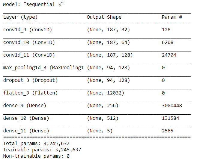
Image Source: Author
cnn_model_history = cnn_model.fit(X_train, y_train, epochs=10, batch_size = 10, validation_data = (X_test, y_test))
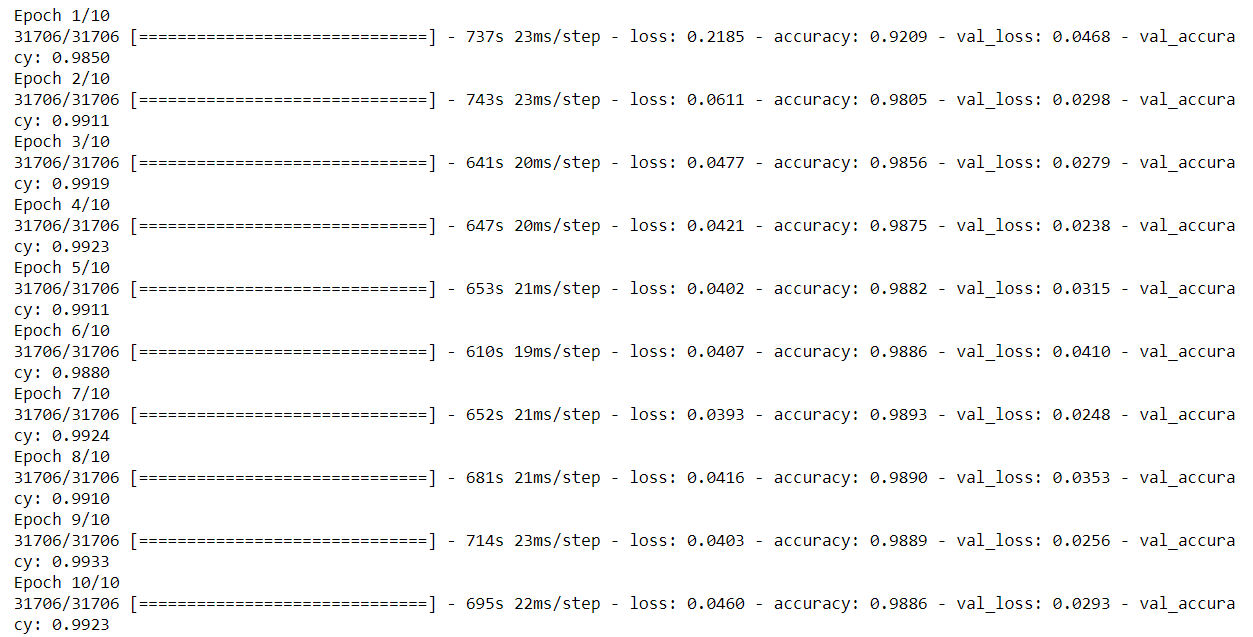
Image Source: Author
plt.plot(cnn_model_history.history['accuracy'])
plt.plot(cnn_model_history.history['val_accuracy'])
plt.legend(["accuracy","val_accuracy"])
plt.title('Accuracy Vs Val_Accuracy')
plt.xlabel('Epoch')
plt.ylabel('Accuracy')
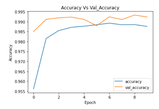
Image Source: Author
plt.plot(cnn_model_history.history['loss'])
plt.plot(cnn_model_history.history['val_loss'])
plt.legend(["loss","val_loss"])
plt.title('Loss Vs Val_loss')
plt.xlabel('Epoch')
plt.ylabel('Loss')
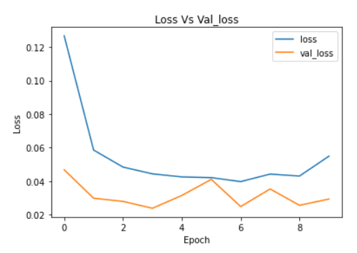
Image Source: Author
For full code: https://github.com/anandprems/mitbih_cnn
EndNote:
Did you find this article helpful? Please share your opinions/thoughts in the comments section below. Learn from mistakes is my favourite quote, if you found anything wrong too, just highlight it, I am ready to learn from the learners like you people.
About me in short, I am Premanand.S, Assistant Professor Jr and a researcher in Machine Learning. Love to teach and love to learn new things in Data Science. Mail me for any doubt or mistake, [email protected], and my Linkedin https://www.linkedin.com/in/premsanand/
Happy learning!!
The media shown in this article are not owned by Analytics Vidhya and are used at the Author’s discretion.


Thank you, good work and helpful article, I have a question, please, I am trying to predict student performance using CNN, but when I trained and fitted the model, the output takes only part of the training dataset, not all of them, i don't know whats the problem
Dear Sir, I am working on ECG signal, I need your Code and Dataset for Classification. when we go through your provided links it will show an image. Please send me the code and dataset.