This article was published as a part of the Data Science Blogathon
Introduction
I have been associated with Analytics Vidya from the 3rd edition of Blogathon. Unlike hackathons, where we are supposed to come up with a theme-oriented project within the stipulated time, blogathons are different. Blogathons are competitions that are conducted for over a month or so where, instead of coding, we need to create technical content on any relevant topic.
After conducting almost 11 editions of blogathons, I think the data analytics team at Analytics Vidya has carefully analyzed the data from the previous blogathons. It has taken some bold steps to increase the overall engagement of the competition. Therefore, we will extract the relevant data from blogathons, take a closer look at the changes made after every edition, some of the articles and blogathon trends, most popular and unexplored topics, and much more insights.

Data Extraction from Leaderboard
Note: The Author has scraped data from Analytics Vidhya’s DataHack platform with our consent.
For any type of analysis, we need data. The main data source for these blogathons would be the leaderboard. It lists all the author’s names, dates of publishing, and views. After the blogathon 9 edition, the article links were also populated in the leaderboard and starting with the blogathon 11 edition, an Analytics Vidhya Creator Club was introduced, and to distinguish authors of this club, a star is displayed along with the author name.
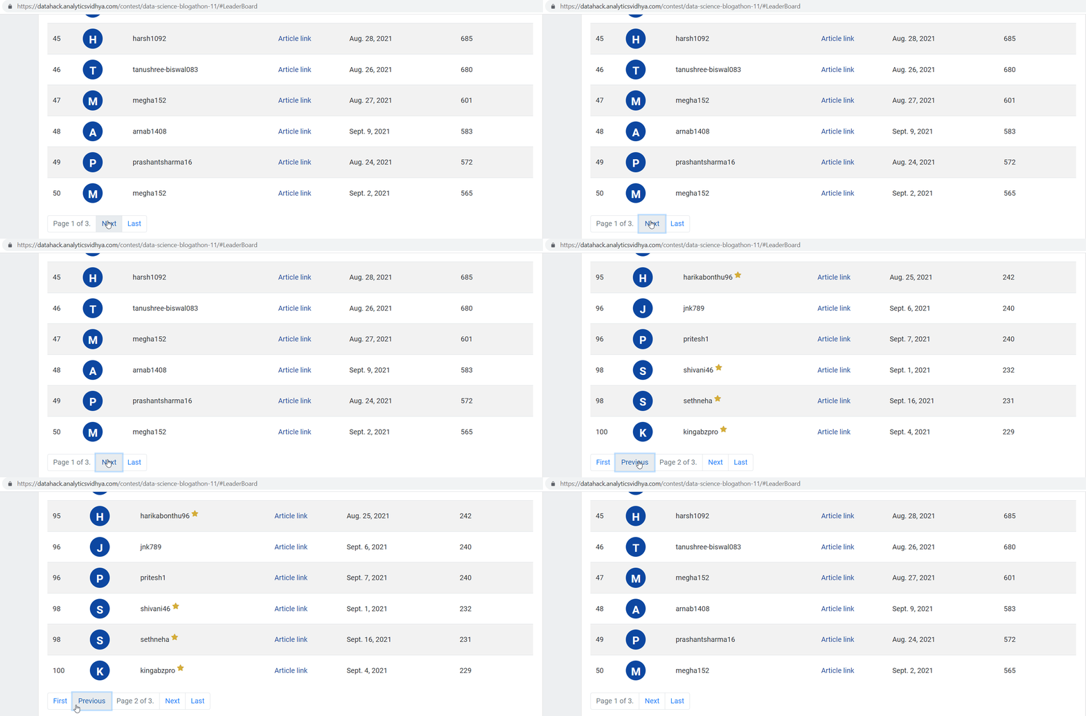
Blogathon 11 leaderboard
Obtaining the leaderboard endpoint
The leaderboard in these blogathons is paginated and the content of the table is rendered under the leaderboard tab only. The problem is that we can’t figure out how the content is changing based on the URL in the browser. Consider this URL:
“https://datahack.analyticsvidhya.com/contest/data-science-blogathon-11/#LeaderBoard”

As soon as we click on the “Next” button under the table, the content of the table changes, but no change in the URL. Therefore, we need to dig deeper into how the content is updated.
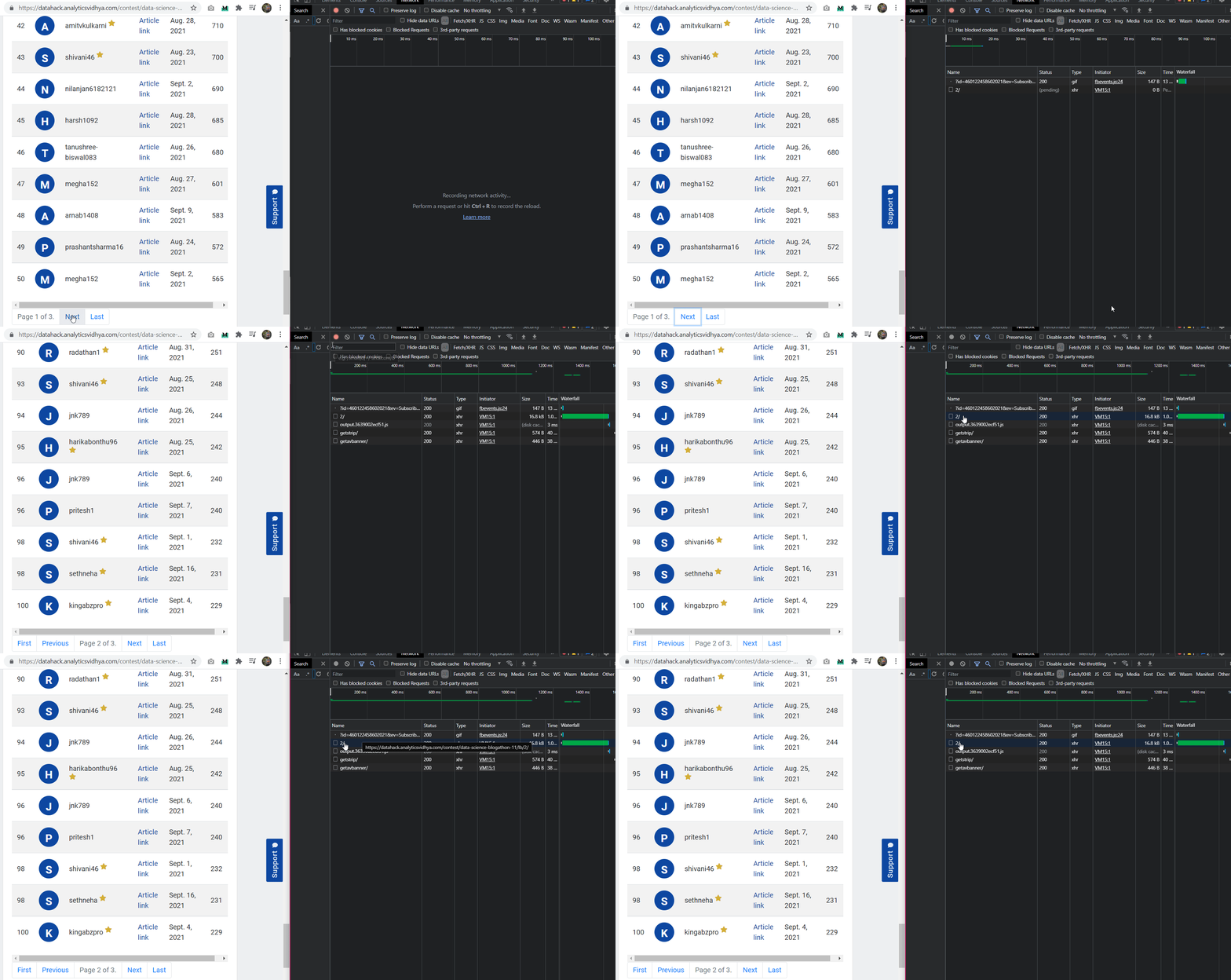
For this, we can check the actual request I/O in the chrome console window (ctrl + shift + i). Here, we will find all the requests and data fetches that have been done in the background. The procedure I will describe here is almost the same for all sites which are built similarly to the Analytics Vidhya:
- First, open the chrome console
- Navigate to the Network tab
- Then click on “Stop recording network log”, the red dot button, and then again click on that button
- Now, click on the “Next” button under the leaderboard and quickly click on the red dot again so that the activity area is not crowded
- Notice the requests made in the activity area
- We will see some hyperlinked elements. Try to copy-paste the associated link in the browser and see if we get any data outputs.
I found the endpoint from where the leaderboard data was being updated.

Looking at the URL, I found the pattern:
“https://datahack.analyticsvidhya.com/contest/data-science-blogathon-11/lb/1/”
After the contest link, if we add the “lb” endpoint and a number, we will get the leaderboard page of that number. That means, we can get any leaderboard page using this URL. This is an important endpoint as it will help us in scrapping data. If we visit this endpoint, only the leaderboard is present which makes our process easy.
Scrapping data using Excel (No code approach)
Excel is indeed a powerful application and I cannot stress how it is helping me in my Data Analytics journey. We can simply navigate to the “Data” tab and select the “From Web” option. Here we need to give the URL, and after some searching, it will provide us with the data table.
We can easily get the data in this way, but here are the limitations of this approach:
- We need to input the link for different pages multiple times and it will tedious when multiple editions of the blogathon data are needed.
- We will lose the article links as it will extract the text components from the table rows
- We will lose the Analytics Vidya Creator Club status star for each username
One can argue that a custom VBA can be created to fetch this data and modify the contents to be scrapped. I won’t suggest you this as a path as the same thing can be done using Python. Python codes are easy to understand and require less effort.
Scrapping data using Python
We have many libraries in the market that can easily extract the tabular data from the websites. I tried a few of them but I didn’t get the expected results. Therefore, we will be manually applying certain rules to obtain the desired output. Before I discuss the code approach, here is what we want to achieve on an abstract level:
- Visit the leaderboard endpoint
- Look for the table body element
- Iterate over all the rows and scrap username, creator club status, article link, date of publishing, and views
- Repeating this for all the leaderboard pages and adding them to a single dataframe.
For the code implementation, we will require the following libraries:
- urllib: For making requests to the URL
- Pandas: For creating dataframes, storing as CSV and other manipulations
- re: For making regular expressions rules to scrap data
- tqdm: For creating progress bar for extraction process so that we are aware of the progress.
Let’s start with code implementation:
Import the required libraries
import urllib.request
import pandas as pd
import re
import time
import numpy as np
from tqdm import tqdm
For obtaining the HTML content of the website, in the string format, we will make a request to the URL, and read the code. As this action will be done quite a few times, create a function for this.
def url_get_contents(url):
    req = urllib.request.Request(url=url, headers={'User-Agent': 'Mozilla/5.0'})
    f = urllib.request.urlopen(req)
    return f.read()
Create a data dictionary where we can hold the data extracted from the website
data = {
    'rank': [],
    'username': [],
    'article_link': [],
    'date': [],
    'views': [],
    'creator_club_status': [],
    'article_cat': []
}
Ignore the “article_cat” feature for now. To start, let’s scrap the data for blogathon 11, and then we can use the same code for other editions. First, get the contents of the website.
import urllib.request

def url_get_contents(url):
    req = urllib.request.Request(url=url, headers={'User-Agent': 'Mozilla/5.0'})
    f = urllib.request.urlopen(req)
    return f.read()

xhtml = url_get_contents(f"https://datahack.analyticsvidhya.com/contest/data-science-blogathon-11/lb/1/").decode('utf-8')

print(xhtml)
Note: Here I have explicitly mentioned the page number for the leaderboard, but later, it will be replaced with the loop iterating variable.
Next, we will define the regular expression rule for getting the content between the table body tag and then use the findall function to obtain the data.
r = re.compile(r'.*</tbody>', re.DOTALL)tableData = r.findall(xhtml)[0]
We need to remove the table body tags and line breaks from the data obtained.
def replace_all(dict, str):
    for key in dict:
        str = str.replace(key, dict[key])
    return str
cleanedTableData = replace_all({"":"", "
“:””, “n”: “”}, tableData).strip()[:-1]
Now, this table data is a long string with table rows and table data tags. We can see the structure of the table as below:
Under the table body tag, there are many table rows, and under these row tags, we have the cell data containing the username, article URL, views, etc. Till now, we have the table body data in the form of a string.
Therefore, we will split this string at row endings so that we have all the rows as separate list items which can be iterated.
tableRowsList = cleanedTableData.split('
‘)
Every item in this list is of the form:
Again, we need to split this list item at the closing table data tag (TD), after which we will obtain the final list of table elements.
for i in range(len(tableRowsList)):
        row = tableRowsList[i]
        row = row.split('
‘)[:-1]
Rules for all the elements in the row are:
for i in range(len(tableRowsList)):
    row = tableRowsList[i]
    row = row.split('
')[:-1]
data['rank'].append(row[0][8:])
data['views'].append(row[-1][4:])
data['creator_club_status'].append(1 if "" in row[2] else 0)
data['date'].append(row[4][4:])
username = row[2].split('')[0].strip()[4:]
data['username'].append(username if '[email protected]' not in username else decodeEmail(username.split('>')[0].replace('"', '').split('=')[-1]))
data['article_link'].append(row[3].split('=')[1].replace('"', '')[:-7])
Here is the breakdown of the code:
- Rank is simply the first element and starts from the 9th character (8th index)
- Views are the last element and start from the 5th character
- Creator club status is determined if the star superscript tag is present in the 3rd element of the list. We are appending 1 for presence and 0 for absence
- The date is the fifth element and starts from 5th character
- The article link is present in the 4th element. It needs split at the equal sign, then replacing the double quotes of the 2nd element and then removing the last 7 characters from the last
The username requires special treatment as it may or may not be accompanied with star superscript. Therefore, we will split the username element at the superscript tag and then take the 5th character onwards. But here is another issue that some usernames with “@” are treated as email ids and Cloudflare DNS, by default encodes these emails. The hashed form is also available and the text is replaced with placeholder text “email protected”.
To decode such hashes, I found the function code:
def decodeEmail(e):
    de = ""
    k = int(e[:2], 16)
    for i in range(2, len(e)-1, 2):
        de += chr(int(e[i:i+2], 16)^k)
    return de
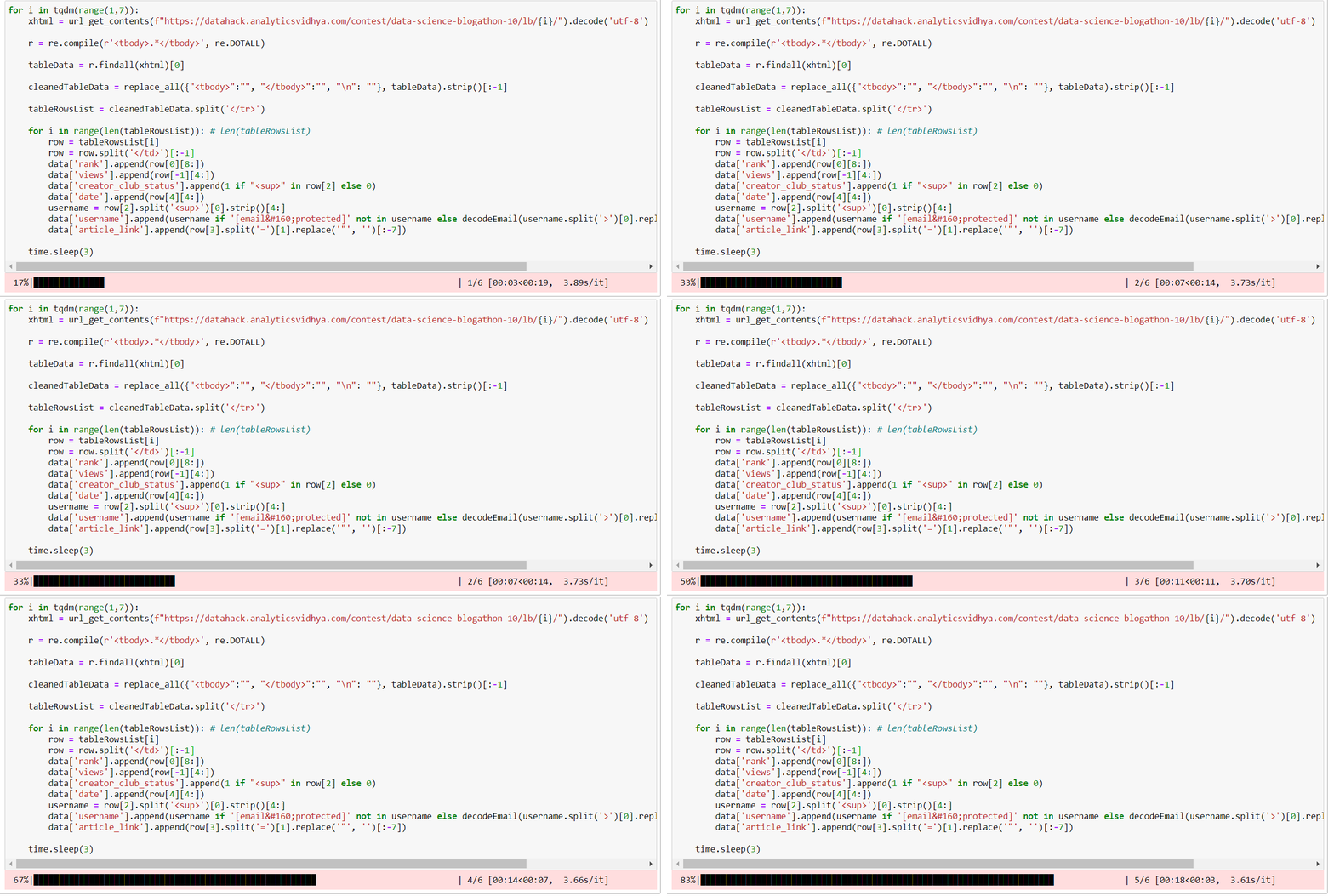
Now, we need to check if the obtained username has the text “email protected”. If yes, then we need to pass the hash to the function and append that username. This was the whole process of the data extraction. We can put all this row loop in another loop for all the pages of the leaderboard and here is the whole consolidated logic:
for i in tqdm(range(1,4)):
    xhtml = url_get_contents(f"https://datahack.analyticsvidhya.com/contest/data-science-blogathon-11/lb/{i}/").decode('utf-8')
    r = re.compile(r'.*
', re.DOTALL)
tableData = r.findall(xhtml)[0]
cleanedTableData = replace_all({"

":"", "

":"", "n": ""}, tableData).strip()[:-1]
tableRowsList = cleanedTableData.split('

')
for i in range(len(tableRowsList)): # len(tableRowsList)
row = tableRowsList[i]
row = row.split('

')[:-1]
data['rank'].append(row[0][8:])
data['views'].append(row[-1][4:])
data['creator_club_status'].append(1 if "" in row[2] else 0)
data['date'].append(row[4][4:])
username = row[2].split('')[0].strip()[4:]
data['username'].append(username if '[email protected]' not in username else decodeEmail(username.split('>')[0].replace('"', '').split('=')[-1]))
data['article_link'].append(row[3].split('=')[1].replace('"', '')[:-7])
time.sleep(3)

Note:
- Make sure to give some sleep time while making page requests so that we don’t “DDoS:” the server.
- We should put the iterating range in the “tqdm” function. It displays the progress of the for loop in the form of a progress bar which helps in keeping track of the process.
- To get data for all blogathons, just update the number of pages in the range function and change the blogathon number in the URL.
Scrapping Articles Categories
From blogathon 9, we have the article links for all authors. We can use these links to obtain the categories of the articles. These categories will be null for older editions. If we visit any article and inspect the article HTML, we can simply spot the div tag class corresponding to the articles categories. I will not repeat this process as I did in the previous section.
We can use the same function to fetch the contents of the article and split the page into the categories class HTML. Here is the logic for the categories extraction:
for i in tqdm(range(len(data['article_link']))):
    try:
        webD = url_get_contents(data['article_link'][i]).decode('utf-8')
        cat = ','.join([i.split('>')[-1] for i in webD.split('
‘)[0].replace(‘n’, ”).split(”)[:-1]])
data[‘article_cat’].append(cat)
except:
data[‘article_cat’].append(‘NA’)
time.sleep(1)
We are iterating over all the article links obtained from the initial scraping. Then, for each link, we are fetching the contents, doing some processing and splitting of the string and finally, we are adding these categories as a comma-separated string into the data dictionary.

Final Dataset Preparation
After all the extraction process and the HTML inspection, it’s time to transform this dataset from dictionary to pandas dataframes and CSVs. Use the pandas data frame function for this transformation
df = pd.DataFrame(data)
Before we move to the analysis part, let’s do some more preprocessing steps and assign the right data types to the dataset features.
Some numeric columns still have greater than signs. We need to remove those symbols:
for i in df.columns:
    if df[i].dtype != np.int64:
        df[i] = df[i].str.replace('>', '')
Next, convert the numeric columns into correct datatype:
for i in ['rank', 'views']:
    df[i] = df[i].astype(int)
And the final step is to convert the date stamp strings into datetime values:
df['date'] = pd.to_datetime(df['date'])
We can save the final dataframe into CSV files so that we can retrieve it later.
Find the whole source code discussed in this article at my GitHub repository: blogathon-analysis
Analysis of the Data
Until the last section, we saw how to obtain the endpoint for the leaderboard updates, how to deal with HTML code, and how to lay down the logic for data segregation. We also did some preprocessing steps before saving the files into CSV formats. For this article, I ran the same code for all the blogathon editions from the first to the 11th edition.
Now onwards, we will focus on how all this data extraction makes sense. We will create visualizations to follow up on the trends and in the end, consolidate all the charts and figures into a dashboard. We will be using PowerBI for all the visual analyses.
PowerBI is an amazing data visualization and dashboard creation tool. The best part about this tool is one can apply any type of operation to data, merge data sources: local or cloud-based pipelines, and publish the reports to the web. These reports are accessible to all the stakeholders and the organization can manage the access from the admin accounts.
Adding Data in PowerBI and Preparing it for reports
To add a folder containing all the CSVs into the PowerBI. select the “Get Data” option from the top ribbon, “More” from the bottom, then, select add folder and input the path of the folder.
Now, we will select the combine and transform option. This will open up the PowerBI Query editor which is the heart of PowerBI. In the query editor, we will clean the combine and clean the data, remove unnecessary data and save the final merged data set. Here are the steps we need to perform:
Combine Files: Click on combine files. This option is accessible by clicking on the content column right side icon. A popup will show which presents the preview of the merged data. For now, click “ok”.
Removing Columns: Some columns are not needed for the final analysis. This includes “rank”, “article_link”, and an extra “123” column generated. Simply select these columns and right-click to get display the option to remove the columns.
Modify Source Column values: When we combined all the data into one file. PowerBI added a source column to indicate which value came from which source. This column will be useful for us to filter the data by certain blogathon editions. The values of this column have the exact file name and therefore, it contains the file extension too.
To get rid of these, simply right-click on the column name, select “Replace values” and input “.csv” in value to find and leave replacement value. Now, all the source values are for the corresponding blogathon edition.
Click close and apply to get the transformed data into the report.
Creating visualizations for Data Analysis
Now comes the part for which we have done so much prep work. We will create different visuals for our dashboard in PowerBI
Numeric Cards: These card elements are present at the top of any dashboard, We can add any type of calculated value into these cards. For our case, we will add Total views, Authors, and Article count cards. To add a card, simply drag it from the visualization pane on the right. Now, we need to add a measure to these cards. To create a measure, right-click on the data source, select the new measure option, and input the format/formula for the same.
For Views, PowerBI has automatically created a measure as the sum of views. So, we can directly add it to the card. For Authors, we need to apply a distinct count function so that we get the unique number of authors.
For article count, we only want the count of the entire data. Therefore, we can pick any non-null column from the data.
Drag these measures into individual cards and you should have the output like this:
Date vs Views Area chart: We will plot the views of the article by the date of publishing. For the aggregation metric, I have chosen the default as a sum.
Word Cloud: A word cloud represents the words that are present in the particular column with the feature that their font size is in relation to their frequency. It means that the greater is the frequency of the word, the bigger it appears.
It may happen that by default, it is not installed in your PowerBI application. Therefore, in the visualization pane, click on three dots, select “Get more visuals” and in the marketplace, search for the word cloud. You will see an official Microsoft visual. Click get it now to install.
Drag the articles categories column into the word cloud category option and the word cloud will be generated. PowerBI is smart enough to treat out comma-separated categories as single categories.
Creator Club pie chart: We want to see how much is the contribution of creator club members in comparison to the non-club members. Therefore, a pie chart would show the contribution clearly. Drag the pie chart visual on the report, and select the username (distinct) as values and creator club status as a legend.
Adding slicers to sort the data: The final element of our dashboard is a sorting system where one can change the charts dynamically by selecting the criteria or the sorting filer set. For our dataset, we will add two slicers: One for the blogathon editions or the data source and the second one for the usernames column or the authors.
Final Dashboard
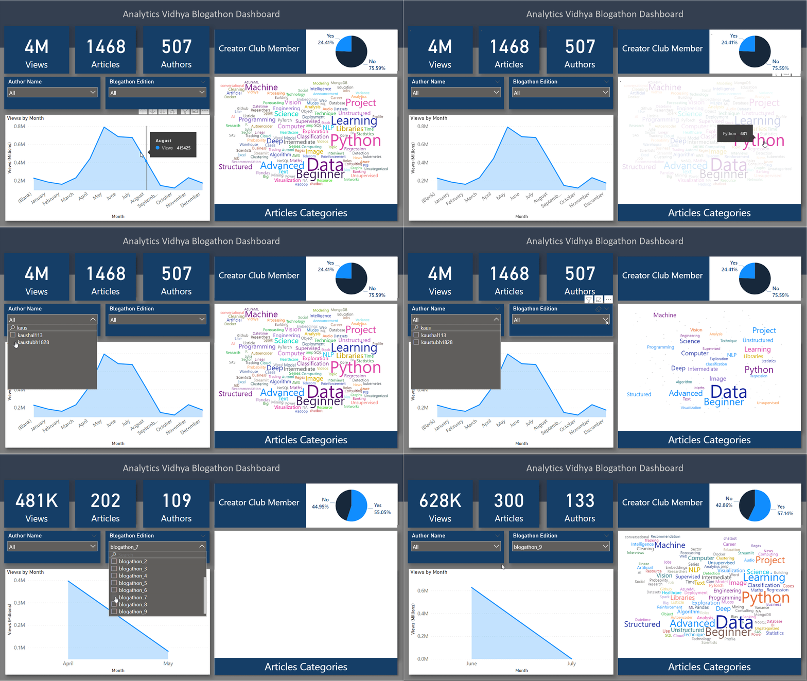
After all the visualizations are configured, it’s time to clean up the space, add some appealing text and fonts, style the graphs and the background to create the final dashboard. This task is purely based on imagination and creativity and therefore, we are free to do anything here. The final dashboard I prepared with background images, styled graphs, and other visuals are this:

Find this dashboard at my GitHub repository: blogathon-analysis
Conclusions From Dashboard and Data Analysis
Finally, we have created an interactive dashboard out of the leaderboard and article categories data. If we had the exact timestamp of the publishing articles, the time of publishing, we might end up getting a good trend over time. There are some points I would conclude based on my analyses:
- The views went from 280k in the 6th edition to 481k in the 7th edition. This happened because the team introduced a base price for all the articles published.
- Though I don’t have the data for blogathon 8 articles categories, but, I believe that in comparison to blogathon 8, blogathon 9 had a huge surge of articles aligned towards advanced categories such as NLP. data engineering, computer vision as these categories were prized higher as compared to normal articles. As many as 108 advanced articles were published in blogathon 9.
- In blogathon 9, a maximum of 300 blogs was– published which is the highest of all times with a total of 628k views. At the same time, the lowest views went to 13! That’s why in blogathon 10, a threshold of 500 views was set because they had to give prizes even for this many views too. It didn’t reduce the number of articles and in fact second-highest articles, 284 were posted. The shocking thing was that this edition, blogathon 10, recorded a total of 1 million views even after the threshold condition.
- The 11th edition had a hard time with only 222k views and 123 articles. I think that’s the reason that a new category, guide, is introduced in blogathon 12.
- May 2021 had the highest number of views of all time. peaking at 0.79M.
- Python, Data, beginner. learning, and project are some of the most popular categories of all time.
- Docker, R, Julia, Excel, and Deployment are some of the least explored categories.
EndNotes
In this detailed article cum guide, I explained the whole idea of the project, background check, obtaining the essential endpoints, then how to scrap the data using Python, how to clean up the data, how to load the data into PowerBI, create visualizations, and at the end, how to consolidate all the visuals created onto a dashboard.
If you want to read/explore every article of mine, then head over to my master article list which gets updated every time I publish a new article on any platform!
For any doubts, queries, or potential opportunities, you can reach out to me via:
1. Linkedin — in/kaustubh-gupta/
2. Twitter — @Kaustubh1828
3. GitHub — kaustubhgupta
4. Medium — @kaustubhgupta1828


That was really insightful! A data extraction tool like Digital Resume Parser is what your enterprise needs to process resumes faster and boost efficiency.