This article covers all the basic to intermediate concepts and features of Tableau from scratch. This is the perfect article for you if you are an absolute beginner in Tableau.
Introduction to Data Visualization using Tableau
Our goal as Data Analysts is to get the insights from our data in such a way that everybody who sees them can easily understand their implications and how to act on them.
Tableau is a data analytics and visualization tool. It’s the leading (33% market share followed by Power-BI) data analytics and visualization tool in the market. Tableau comes with a very easy drag-drop interface which makes it easy to learn and you can work on almost every type of data in Tableau.
This makes it an excellent choice for data analysts.
Table of Contents
This article will give you a walkthrough of all essential features of the Tableau, which you must know in order to work on it:
- Installing Tableau on your System
- Getting Started with Tableau!
- Tableau Visualizations – Charts, Tooltips, Maps
- Tableau Visualizations – Formatting, Colors
- Parameters, and Calculated Fields in Tableau
- Analytics in Tableau (Forecasting, Clustering)
- Creating Dashboards in Tableau
- Crafting your own Story in Tableau
Installing Tableau on your System
Tableau provides us various services according to our business need Tableau Desktop, Tableau Public, and Tableau Online, all these offer Data Visual Creation. Choice of Tableau depends upon the type of work.

Tableau Desktop is a program that allows you to execute complicated data analysis tasks and generate dynamic, interactive representations to explain the results. Tableau also lets you share your analysis and visualizations with the rest of your company, allowing everyone from coworkers to top management to look into the data that matters to them.
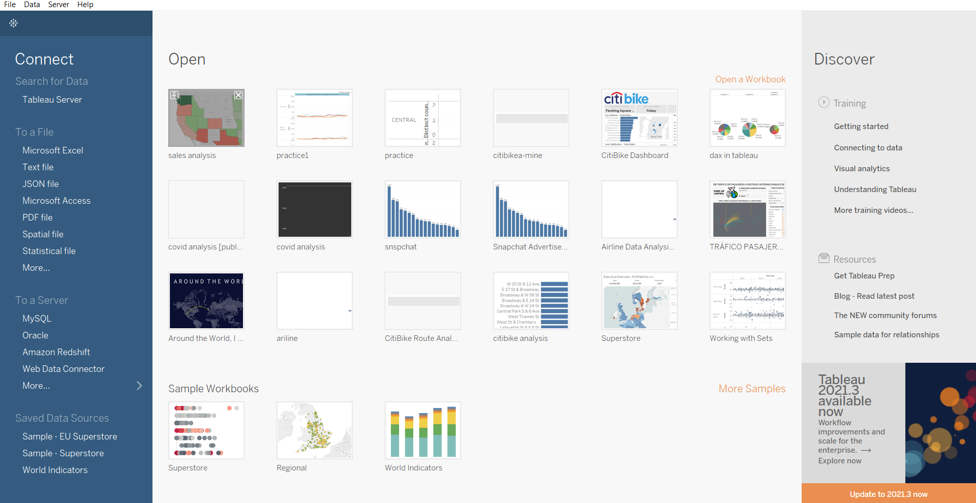
Before you can begin using Tableau, you need to download the Tableau setup from the link and then accept all the licenses and agreements. After installation, you will get a home screen same as the given picture below.
After installation, if you find this Homescreen you are good to go:
Getting Started with Data Visualization using Tableau
Once you have installed Tableau in the system, let’s start with some real-world Data Visualization using Tableau.
Load Data in Tableau
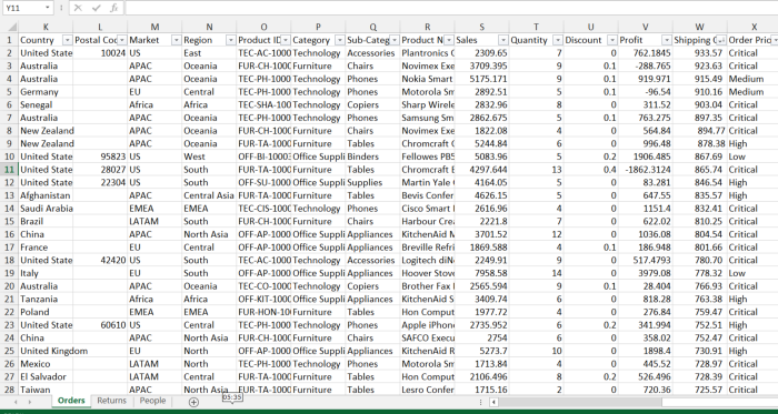
We will be using global superstore data throughout the article, which is perfect for learning purposes. This link will take you to a page where you may download the dataset. The downloaded file is a zip file that contains an excel that looks like the given picture below:
Now we have an excel file and Tableau installed let’s load the data set into Tableau. Tableau also gives us some flexibility to create new columns, rename, split, edit alias, join tables, some preprocessing before loading the data into Tableau. The below image will demonstrate to you how to load data and perform some preprocessing.
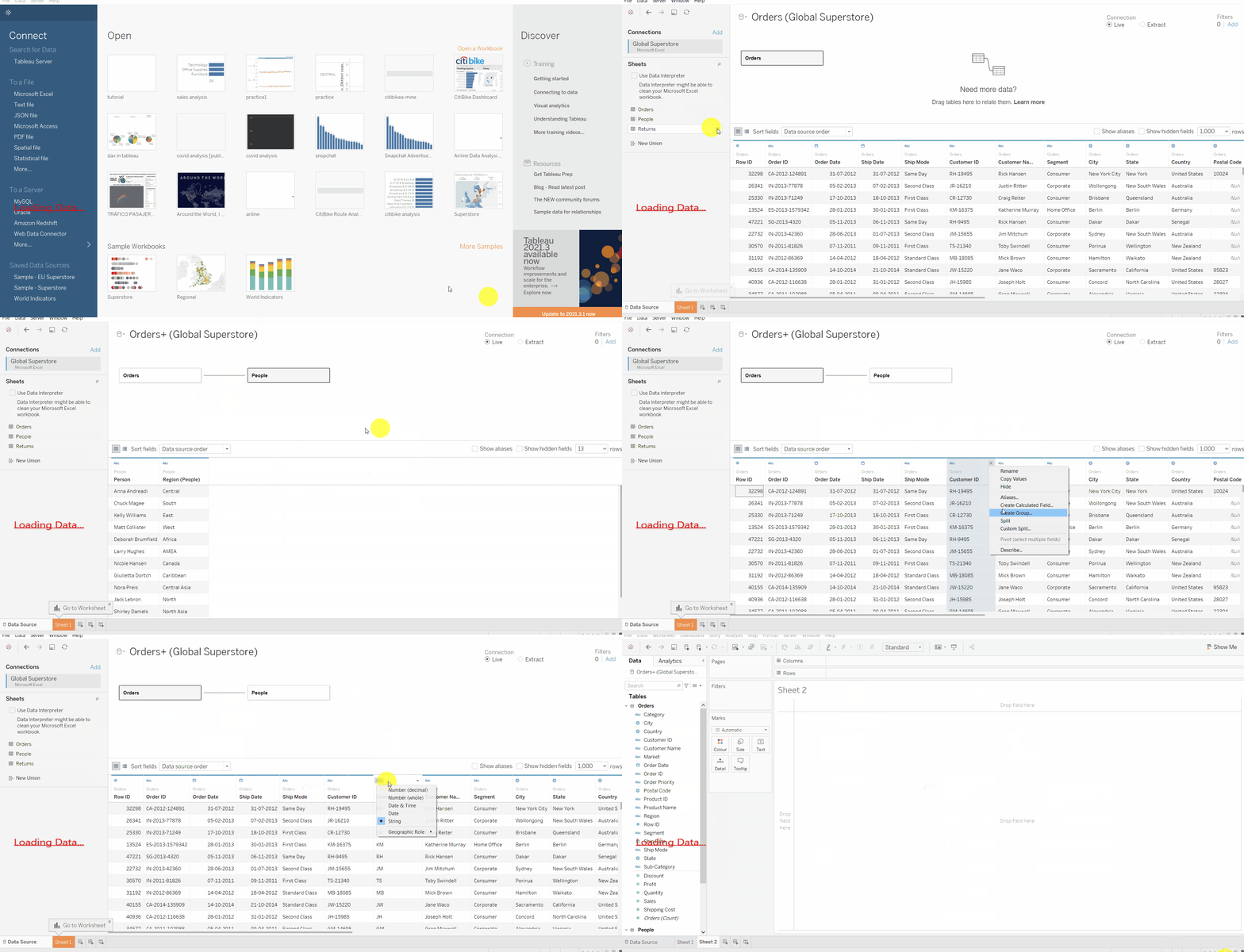
Tableau supports various data formats which can be loaded by choosing those options. Under a file we see various options to load data from the local directory and under to a server, we see options to load data from cloud servers. for loading CSV files we select Text file options, for excel and SQL files we choose their respective options.
Connect Tableau to the data file:
- To open the application, click the Tableau icon on your desktop (or in your Start menu).
- In the Connect panel at the left side of the Start page, click the Excel link under the “To a File”
heading to the open file selection option. - Using the file selection box, select the Excel worksheet that you want to open, and then click the Open button to continue
- Select
the Orders sheet from the navigation menu on the left and drag it onto
the Drag Sheets Here area, as shown in the above gif. - After loading we can perform data cleaning, data preprocessing, feature extraction to some extent.
Understanding different Sections in Tableau
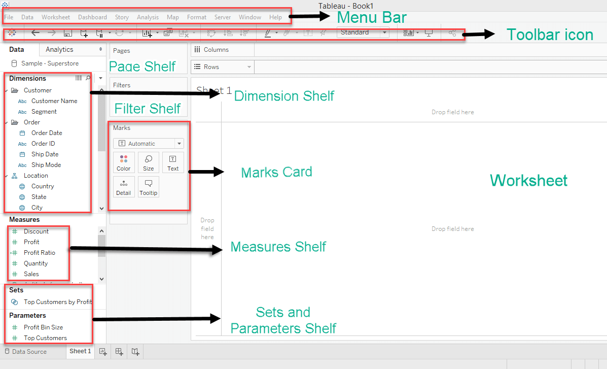
Up until now, we have Tableau loaded with global-superstore data and now we can see Tableau work-page. Tableau work-page consist of different section. Let’s understand them first before plotting our graphs.
Source: Local
- Menu Bar: Here you’ll find various commands such as File, Data, and Format.
- Toolbar Icon: The toolbar contains a number of buttons that enable you to perform various tasks with a click, such as Save, Undo, and New Worksheet.
- Dimension Shelf: This shelf contains all the categorical columns under it. example: categories, segments, gender, name, etc
- Measure Shelf: This shelf contains all numerical columns under it like profit, total sales, discount, etc
- Page Shelf: This shelf is used for joining pages and create animations. we will come on it later
- Filter Shelf: You can choose which data to include and exclude using the Filters shelf, for example, you might want to analyze the profit for each customer segment, but only for certain shipping containers and delivery times. You may make a view like this by putting fields on the Filters tier.
- Marks Card: The visualization can be designed using the Marks card. The markings card can be used to change the data components of the visualization, such as color, size, shape, path, label, and tooltip.
- Worksheet: In the workbook, the worksheet is where the real visualization may be seen. The worksheet contains information about the visual’s design and functionality.
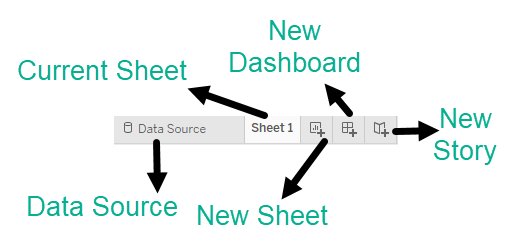
- Data Source: Using Data Source we can add new data, modify, remove data.
- Current Sheet: The current sheets are those sheets which we have created and to those, we can give some names.
- New Sheet: If we want to create a new worksheet ( blank canvas ) we can do using this tab.
- New Dashboard: This button is used to create a dashboard canvas.
- New Storyboard: It is used to create a new story
Creating Visuals in Tableau
Let’s begin with the real data visualization using Tableau-
Tableau supports the following data types:
- Boolean: True and false can be stored in this data type.
- Date/Datetime:
This data type can help in leveraging Tableau’s default date hierarchy
behavior when applied to valid date or DateTime fields. - Number: These are values that are numeric. Values can be integers or floating-point numbers (numbers with decimals).
- String: This is a sequence of characters encased in single or double quotation marks.
- Geolocation: These are values that we need to plot maps.
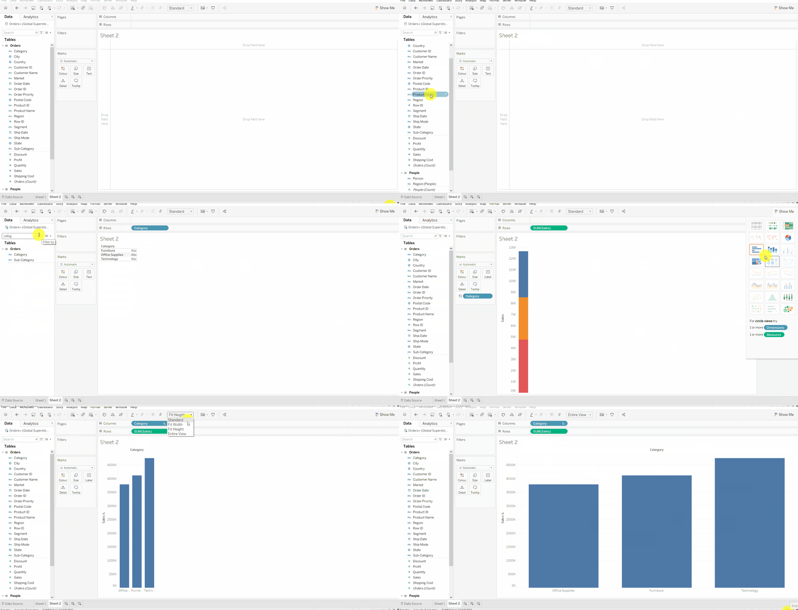
Follow these steps:
- drag the dimension and measure in row and column input field and it will automatically suggest a graph best fitted on data.
- you can change the graph by clicking on the show me
- you can also remove the axis just by dragging and dropping them under the marks card (remove field).
- Show Me: When you click this label, a palette appears, giving you rapid access to many options for showing the selected types of fields. The palette changes depending on the fields in the worksheet you’ve selected or are active.
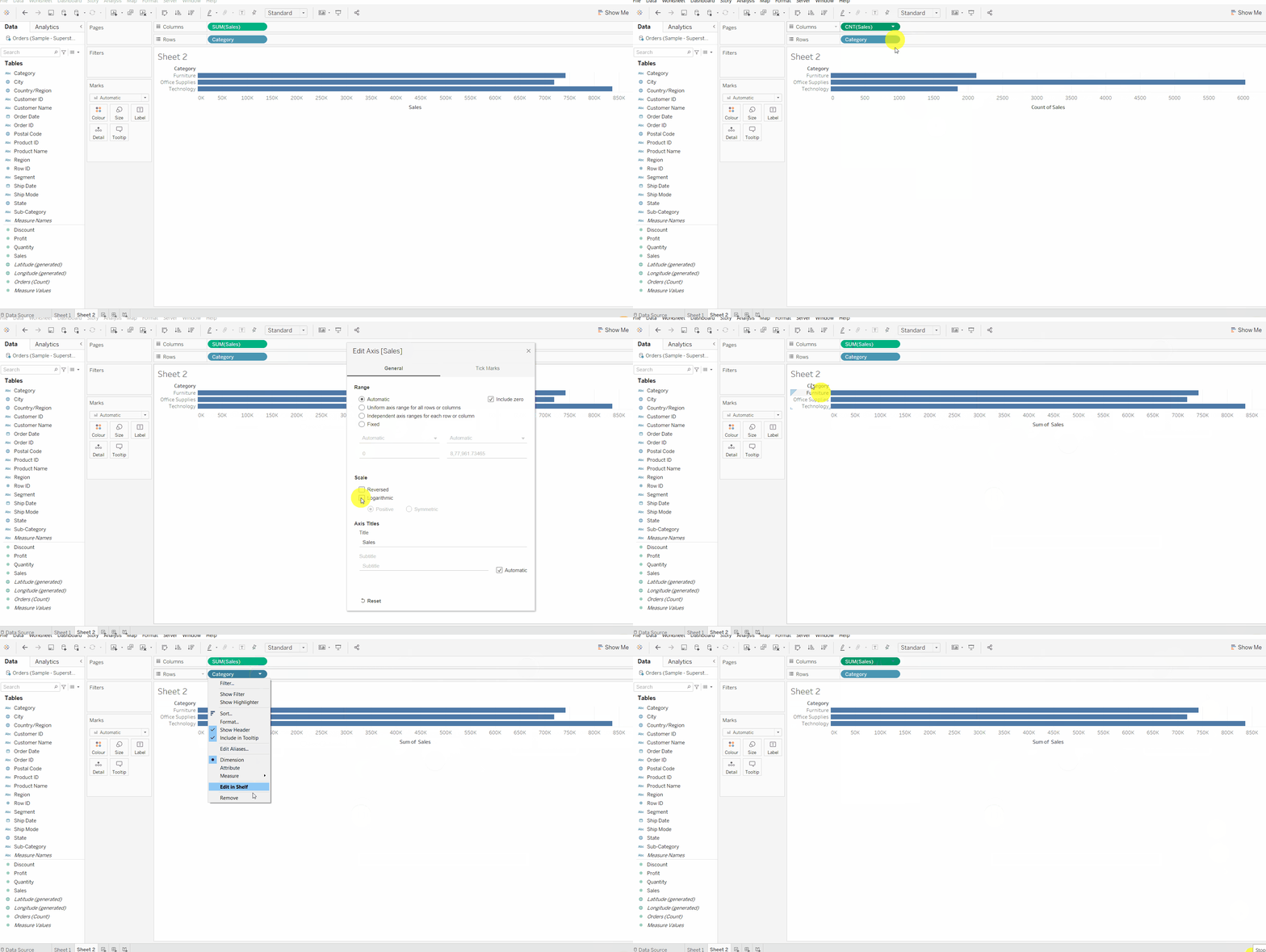
From the above image, you might have observed that the default aggregation on the measure is sum but you can change the aggregation to sum, avg, min, max, etc, you can also customize the axis name, orientation, size, show-hide axis as shown in the above image.
Enhancing The Analysis:
In order to create a beautiful interactive visual, you must understand the following features:
a. Marks card
Marks card is very important for plotting graphs. In marks card we have:
Colour button which is used to give different colors to different categories and measures,
Size button is used to give size which depends on how big a value is. The bigger the value means bigger the size of a particular mark
Label button which is used to show labels to graphs, clicking on the label button throws us some settings where you can set the formatting of labels.
Tooltips, here you can add information like ( profit, quantity, sales, discount, category, state, etc.) which will be visible on hovering over the graph
The Details button allows you to display more information without affecting the table’s structure. which is used to show details about particular points. dragging a field on details buttons will show the details of that point, and this feature is majorly used for maps to show more details of a particular point.
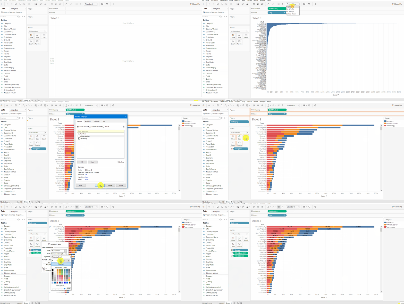
b. Filter
After creating some plots you might want to use different filters, to do so follow these steps:
- On the filter shelf, you can drag any measure or dimension whichever you want to apply a filter on.
- As you drop the field a box will appear, now you can select any particular category, or top-n rows according to measure values or you can write some rules to select top rows or by using some parameters.
- Now click on show filter
- You may want to apply multiple filters, to do so you will need to add previous filters into context by clicking on add to context here Context Filter is a Tableau filter that is applied before all other filters. You can choose different options standard, fit width, fit height, entire view
c. Hierarchy
You can quickly establish hierarchies with Tableau to keep your data organized.
Hierarchy is basically nesting the same type of related data together. Tableau calendar data is an example of a hierarchy.
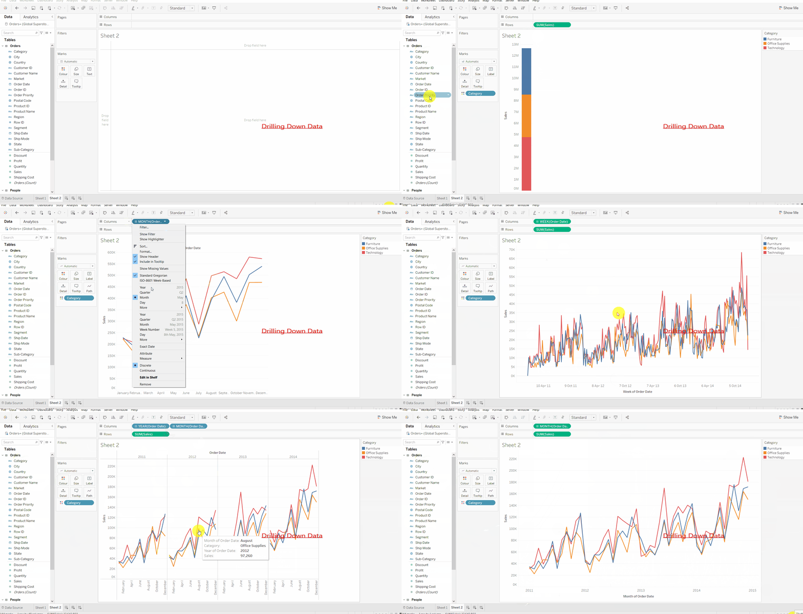
Date-time, calendar is in the form of hierarchy in Tableau, which can be drilled down to year -> quarter ->month -> day by clicking on the “+” button on the features tab,
You also can create your own hierarchy like country -> state -> city -> postal code, just by dragging features to another and when needed clicking on ‘+’ button you can drill down further to city, state, postal code.
d. Parameter
A parameter is a workbook variable like a number, date, or string that can be readily managed by the user to replace a constant value in a calculation.
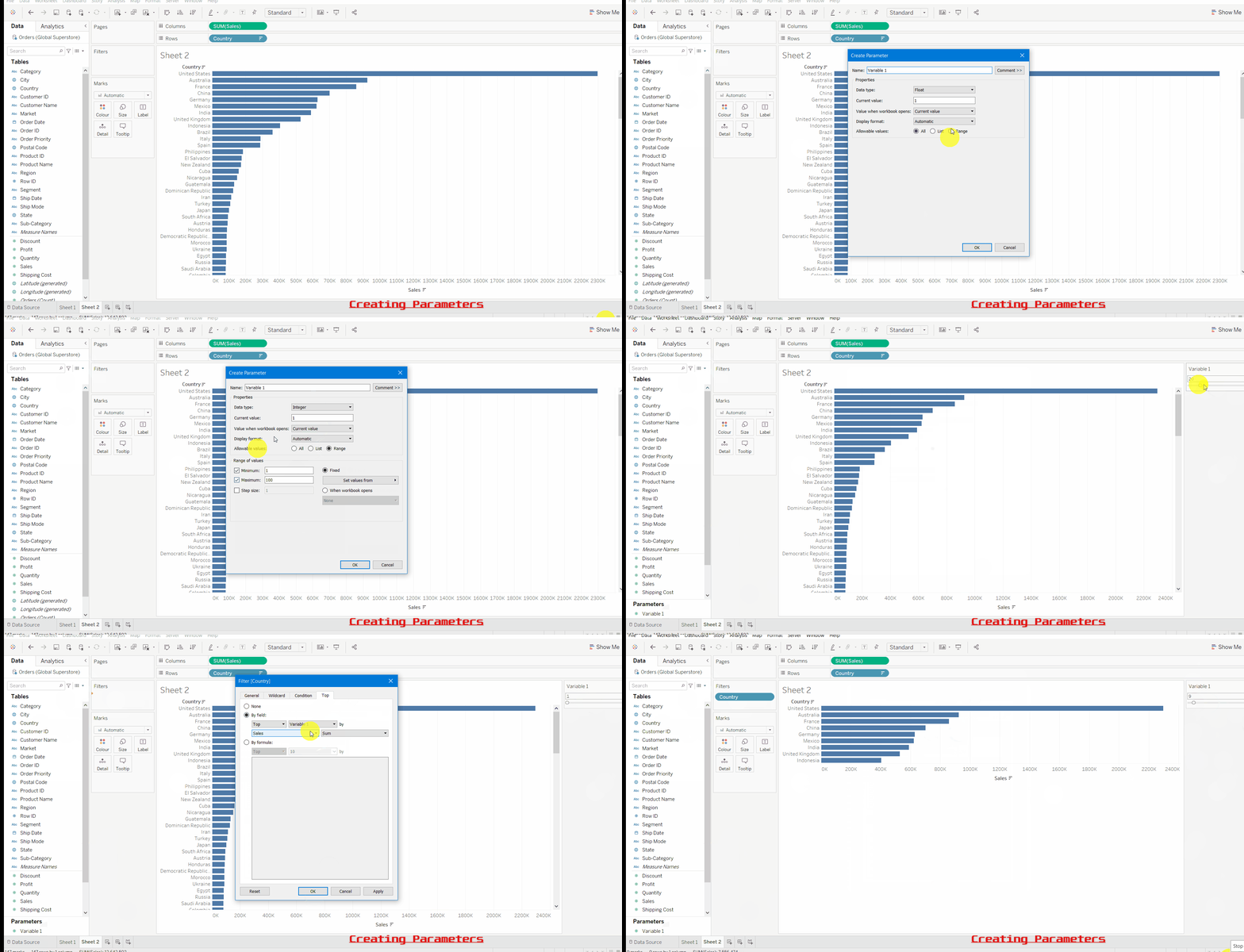
In the above image, our goal was to choose the top N countries having maximum sales but here we wanted to let the user select how many top countries they want to list. To accomplish so, we’ll need to create the following parameters:
- Click the down arrow to the right of Dimensions in the Data pane and select Create Parameter from the pop-up menu that appears, as shown in the above image. and give a name variable1.
- Select a data type from the Data Type drop-down menu, in my case, I have chosen to int
- Click on
- Here we wanted to choose top-N countries based on the sales. drag country field to filter shelf and choose top tab and then choose variable1
- Now slide the parameter value and observe the difference.
e . Calculated field
Tableau gives us the option to create a calculated field where we can create our own new field( column). Tableau comes with many functions like if-else, switch, case, date diff, level of dimension which is extensively used for our visualization
- To segment data
- level of details(LOD)
- To change a field’s data type, for example, from a string to a date.
- To aggregate data
- handling date time
- To filter results
- To calculate ratios
In Tableau, select Analysis > Create Calculated Field then we give some rules to create a calculated field and it will create a new field in the data shelf. which we can use by dragging to the axis. more on the calculated field can be read on the link.
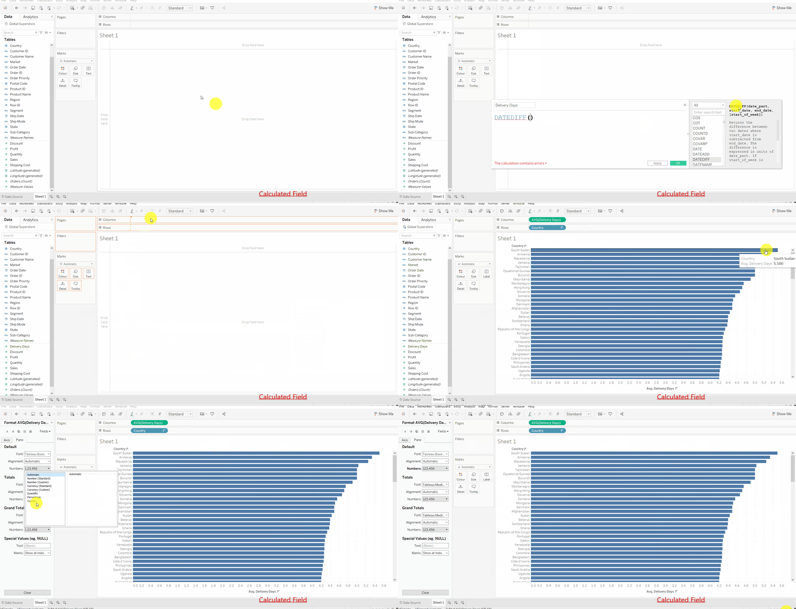
Creating Calculated Field:
Here our goal is to calculate delivery days using order date and ship date:
- Select Analysis > Create Calculated Field and give the name delivery days
- Give the Rule to calculate delivery days in the rule box. here we will use the DATEDIFF function to subtract two dates.
- Type Rule: delivery days = DATEDIFF(‘day’, [shipdate],[order date])
- now drag the delivery days field in rows or cols.
I would try to write a separate blog on calculated field on Tableau ,
since calculated field is the most powerful features of Tableau.
f. Format
Formatting in Tableau is very easy. Just click on the format button wherever you want to format. we can format text, numbers, percentage, decimals, date-time format, label color, label size, axis line color, worksheet, columns, header, etc . as shown in the above image.
Data Analytics in Tableau
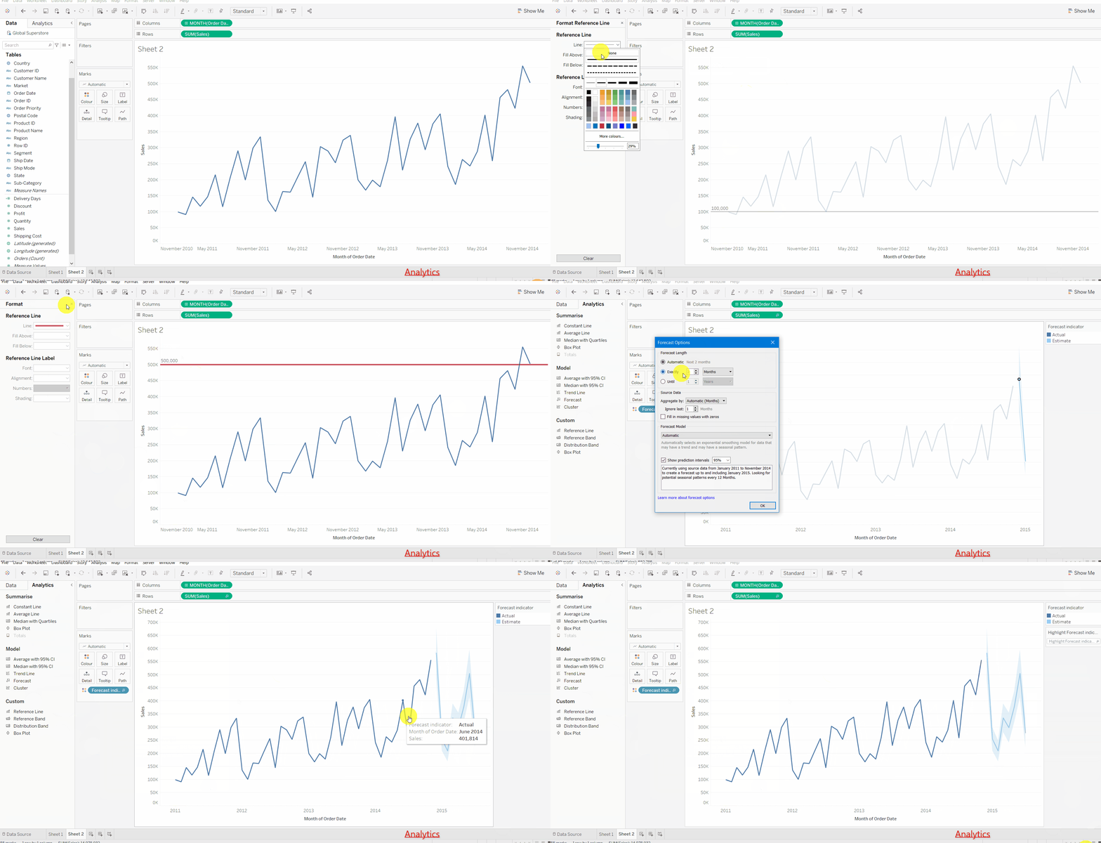
In the Analytics tab, we have several analytical tools like forecasting, clustering, trend line, Average line, constant line, etc. let’s see in action.
Source: Local
Steps to perform Analytics:
- From the Analytics tab on the left side, you can choose various options.
- Dragging and dropping a constant line on a particular X, or Y-axis draws a line at a given constant value.
- Dragging forecast on your sheet will give you a time forecasting of a given measure, which you can edit by clicking right click on the forecasted part, there you can choose the confidence interval, time steps to be forecasted and forecast model, etc.
- The trend line is not the same as forecasting. The trend line only tells us if the overall trend is increasing or decreasing.
Maps in Tableau
We can easily draw maps in Tableau if we have geographical data aka a location field (country, city, state, etc). Tableau has 2 types of maps, symbol map, filled map.
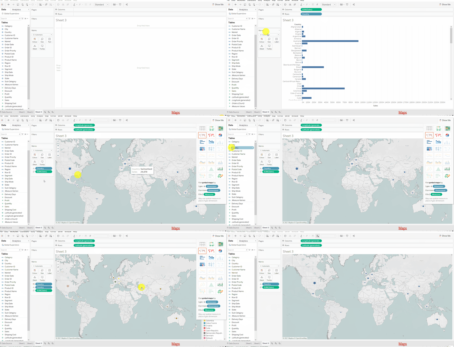
Steps to create Maps:
- Drag Country field in the worksheet, it will draw a symbol map.
- you can choose a symbol map or a filled map by clicking on the show me
- Adjust the size of the points on the map by clicking on the
- Dropping city on Details will show the names of cities on the map.
you can also decide the colors of different states based on the sales amount on the filled map.
If you see unknown
label on map its just because those location were not recognised by Tableau map engine .we can either filter those null locations or we can
sort them by giving their specific country, city , state, pin-code etc.
Colors: You can adjust colors of visualization based on categories and on the magnitude of measure values.
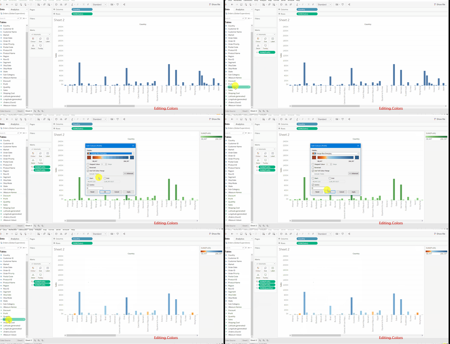
From the above image you see that the color of bars has decided by the profit amount, more profit means more bluish in color, more loss means more reddish in color
adjusting colors is so simple in Tableau:
- Drag a dimension or measure in the color shelf under the marks card.
- Now you see colors are now visible as a legend.
- Now click on the legend and then choose edit colors.
- you can choose a wide variety of colors, modes of coloring like stepped or continuous bar and
- you can edit the range of colors as well.
Tooltip: When we hover over a particular point on the graph we see a box showing up details about that particular point, this is basically a tooltip. we can add information to show as a tooltip, let’s see an example.
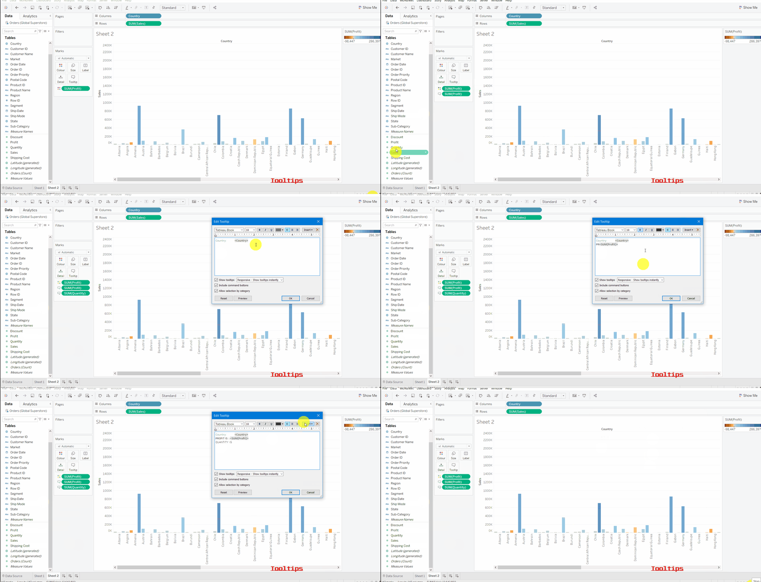
As you can see dragging a field on the Tooltip button adds details in the tooltip which can be seen on hover, we can also customize the text, color, font of the tooltip.
Designing a Dashboard in Tableau
Combining multiple views with filters, interactivity, legends on the same page is simply our dashboard. it helps us to see all views on the same page with fully interactive features. Let’s see an example.
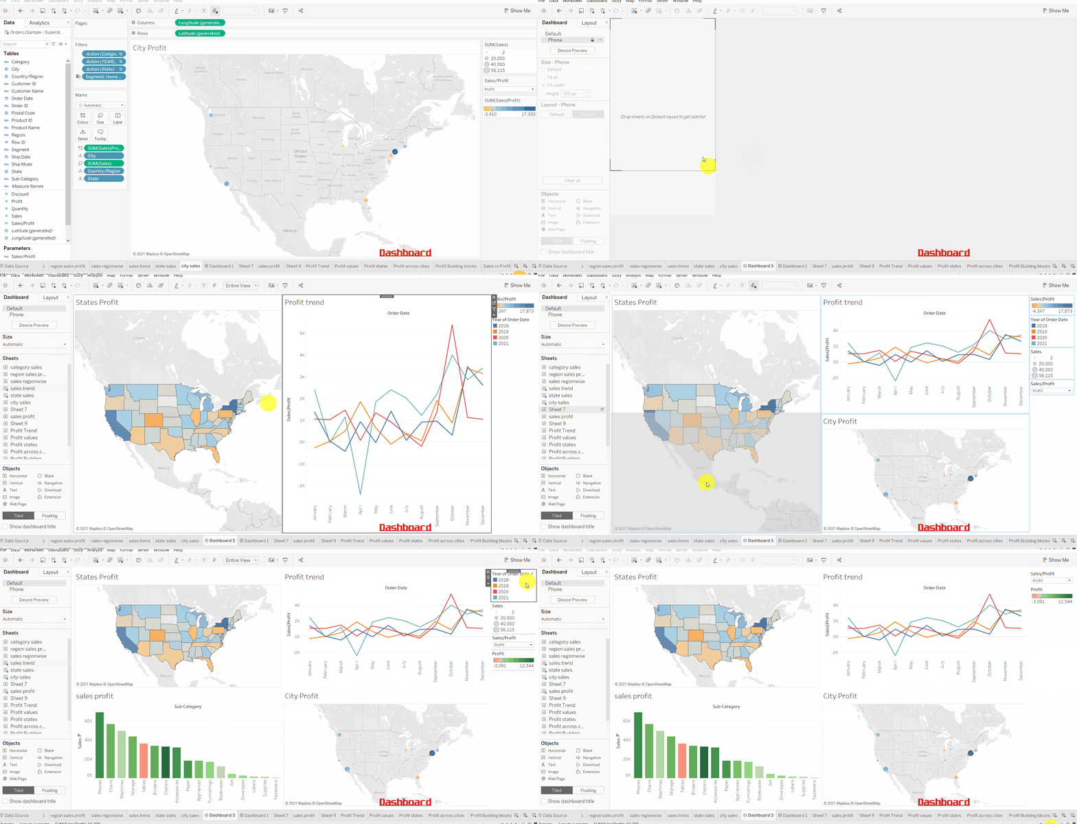
Steps to create a dashboard in Tableau:
- Click on the new dashboard button and it will create a new blank dashboard.
- Adjust the layout of the dashboard. you get fixed or automatic sizes based on the screen size to choose from.
- On the left-hand side, you can see that our all graphs (viz) are visible so you simply need to drag and drop them into the dashboard.
- You can drag as many as sheets you want to include in our dashboard.
- Clicking on the sheet and then change into floating converts into a floating object which can be placed anywhere in the dashboard.
- On the lower left side, you get options to format our dashboard. you can
include images, weblinks, change color, title & text of our
dashboard. If you find managing spaces and layout difficult in the dashboard try floating sheets.
You can also apply filters on different visuals present in our dashboard. More information on the dashboard may be found here.
Storytelling in Tableau
The story in the Tableau is narrated walkthrough of one or more sheets or dashboards. each view in the story is called a Story Point.
In storytelling, we take a visual and write a narration about the insight that has found from visual
Creating a story is the same as creating a dashboard, just drag our visual on the story page and give narration. You can add as many visuals as you want along with narration.
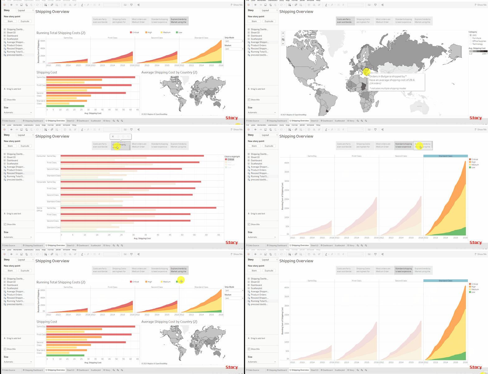
Actually creating story points in Tableau is easy. You can see an example of creating a Story Point and experience Tableau’s free on-demand training at the same time! Go to Tableau’s training page.
Saving your Tableau Work:
Tableau comes with autosave features so you don’t need to worry if you couldn’t save your work manually.
You can save your work in various ways:
Tableau Desktop
To save a Tableau workbook locally, Select File > Save. Specify the workbook file name in the Save Asdialogue box. Tableau saves the file with the .twb extension by default.
Tableau Server
In case the data is confidential and the story needs to be shared with the entire team, Tableau Server comes in handy. Select Server > Publish Workbook or click Share in the toolbar to publish a story to Tableau Server.
Tableau Public
With Tableau Public all the views and data are made public and anybody on the internet has access to it. Select Server > Tableau Public > Save to Tableau Public and give your credentials. before accessing Tableau public you should have a Tableau public account.
Tips:
- When in Doubt, Right-Click
- The Undo Button Is Your Friend
- Pay Attention to Visual Cues
- Save Early and Often
Final Thoughts on Tableau
This is all you need to know about Tableau in order to create good-looking charts and dashboards. I tried to cover as much as I could although it’s not the ending. You can learn more about formatting, calculated field, pages, animation, extensions, etc. in order to go in-depth with Tableau you must practice different kinds of data and it will help you analyze and present data efficiently and in a nice manner. I highly encourage you to go through the free learning material given by Tableau.
Thanks for reading, do share the article if you have learned something new, feel free to comment. See you next time !!! ❤️


