This article was published as a part of the Data Science Blogathon
Introduction
Time series data is the collection of data at specific time intervals like on an hourly basis, weekly basis. Stock market data, e-commerce sales data is perfect example of time-series data. Time-series data analysis is different from usual data analysis because you can split and create samples according to randomness in data analysis and preprocessing. Still, the next value depends on the previous input in time series data, so its analysis and preprocessing should be done with care. We use different visualization techniques to identify a hidden pattern in data but anomaly detection in time-series data has a different model technique. This article will learn and perform hands-on practise on detecting anomalies in time-series data using Facebook Prophet.
What is Anomaly Detection?
Anomalous data can indicate a critical incident in your business or a potential opportunity to take advantage of to drive new decisions. Fraud detection, complex application scenario. when we talk about anomaly detection, it is of two varieties. The first is global outliers, and the second is contextual outliers.
- Global outliers are the data points far apart from the normal distribution of data—far outside means which exist far outside the entirety of the dataset. We can identify global outlies with naked eyes, which can occur due to business processing issues or data ingesting problems. It can also be a natural data element where business processes are generated, so it is essential to understand the business context while working with anomalies.
- Contextual outliers are very common in time-series data. These values exist within the global expectation but may appear anomalous within specific seasonal patterns, so the way has a trend.
I know these terms might seem a bit complex to understand, but when we work with data, we will learn how to find global and contextual outliers and visualize them in time-series data.
- Seasonality is an essential component of time series which indicates a regular and predictable increase and decrease in amount according to calendar year.
- The trend is another component of time series which means any pattern in data that shows movement in time series data that may be increasing or decreasing.
Now we have a glance at anomalies in data, what kind of anomalies can occur, and why it is essential to find and deal with them. So the remaining things we will learn with practice so let’s make our hands dirty with loading and performing anomaly detection on a real dataset.
Brief on Dataset
The dataset we will use is named New York Taxi dataset. The dataset is straightforward and contains only two columns as timestamp and count of taxi trips, and there is a timestamp for every half-hour interval. The data spans over seven months, from July 2014 to Jan 2015. The target is to predict how many taxis were active daily or on half an hour basis in new york city. A dataset is readily available on Kaggle, and you can download it from here. We aim to detect and visualize anomalies in the dataset.

Hands-on Anomaly Detection
Importing Libraries
We are importing the basic processing libraries and visualizing Numpy and pandas for data wrangling tasks. We will use plotly express to imagine the time-series data because it makes easy visualization of a lot of data points, and it allows you to zoom and visualize perfectly a single data point.
import pandas as pd
import numpy as np
import matplotlib.pyplot as plt
from datetime import datetime
import plotly.express as px
import matplotlib as mpl
mpl.rcParams['figure.figsize'] = (10, 8)
mpl.rcParams['axes.grid'] = False
df = pd.read_csv("nyc_taxi.csv")
df.shape
The data has 10320 rows and only 2 columns.
Preprocessing
If we see the timestamp column, it is in the form of an object because when we load the data with pandas, it loads the timestamp as a string, so we will convert it to datetime.
df['timestamp'] = pd.to_datetime(df['timestamp'])
Now we have 10320 data points, so to visualize it quickly, I am resampling the data hourly. By keeping timestamp as an index, we are resampling it on an hourly basis from half an hour and taking its mean. It will not disturb the data distribution because it takes 2 values and finds its mean.
df = df.set_index('timestamp').resample('H').mean().reset_index()
df.shape
After performing the above processing, the shape of data will behalf.
Data Visualization
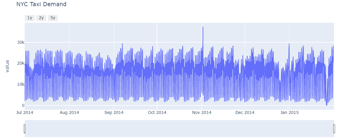
Now we are going to plot the data, and I am drawing the line chart. On the x-axis, we have a timestamp, and on Y-axis, we have values.
#express to plot entire data
fig = px.line(df.reset_index(), x='timestamp', y='value', title='NYC Taxi Demand')
#slider
fig.update_xaxes(
    rangeslider_visible = True,
    rangeselector = dict(
        buttons = list([
              dict(count=1, label='1y', step="year", stepmode="backward"),
              dict(count=2, label='2y', step="year", stepmode="backward"),
              dict(count=2, label='5y', step="year", stepmode="backward")
        ])
    )
)
fig.show()
Modelling
we are using Facebook Prophet to detect anomalies in time-series data. So first, we will install the library.
!pip install fbprophet
from fbprophet import Prophet
taxi_df = df.reset_index()[['timestamp', 'value']].rename({'timestamp':'ds', 'value':'y'}, axis='columns')
Separate the train and test set
#train test split
train = taxi_df[(taxi_df['ds'] >= '2014-07-01') & (taxi_df['ds'] <= '2015-01-27')]
test = taxi_df[(taxi_df['ds'] > '2015-01-27')]
From 2014 July to 27th January 2015, we have taken in the train set and remain in the test set.
Create Prophet model
When we use Facebook prophet, it gives the output according to the confidence interval. By default, it is set to 80 per cent, and we change it to a 95 per cent confidence interval so it will give us prediction and lower and upper confidence intervals. After that, we feed the train data to it. After running the below snippet, it shows you that yearly seasonality is not valid because data is of only six months.
m = Prophet(changepoint_range=0.95)
m.fit(train)
Forecast on test data
We are creating a dataframe that only consists of dates of test data in timestamp format to forecast test data. We need to create a dataframe with hourly frequency because by default it creates on daily basis.
future = m.make_future_dataframe(periods=119, freq='H')
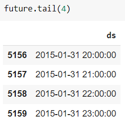
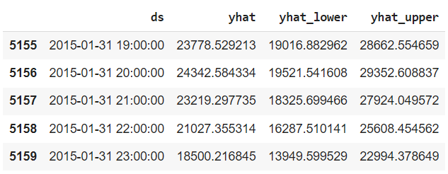
Now we will predict the target value on these dates. you can see that that is the predicted value, that lower is the lower confidence interval and the upper column represent the upper confidence interval.
forecast = m.predict(future)
forecast[['ds','yhat','yhat_lower','yhat_upper']].tail()
Now we want to see the difference between actual and predicted values so I am creating a new dataframe where we merge the actual and forecasted dataframe. At the same time, we also visualize the forecast values to understand the predictions.
result = pd.concat([taxi_df.set_index('ds')['y'], forecast.set_index('ds')[['yhat','yhat_lower','yhat_upper']]], axis=1)
fig1 = m.plot(forecast)
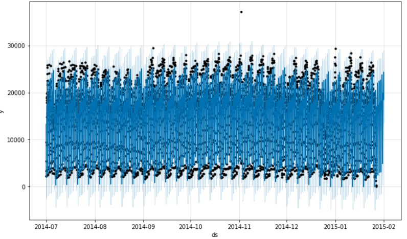
The black points are the actual outcomes(target), dark blue points are the predicted points. upper light blue shades represent the upper confidence interval and lower shades represent the lower confidence interval. Still, we have not done anything with outliers but some points we can see as outliers which we will deal with in the next section.
We will also plot the component of time series data. what these components will give? It will take the time-series data and give the trend and seasonality component out of it.
comp = m.plot_components(forecast)
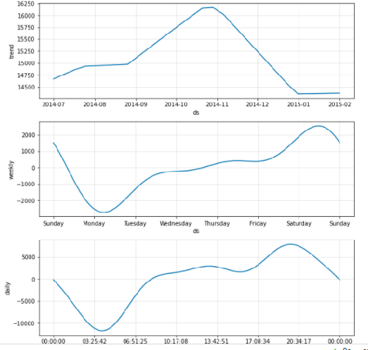
- The top one is a trend. Data from 2014 July has an increasing trend and then it has a decreasing trend.
- The second plot shows the weekly trend then the number of rides running in a new york city decrease at Sunday time and starts increasing from Monday. Basically, on Sunday everyone usually takes holiday and from Monday offices are about to start.
- The third plot is about the daily pattern which shows the 24 hours window. the number of rides is slower from midnight to morning 4’O clock and then increases till 8 pm and then reduces to some extent.
why this component’s visualization is important? The reason is when I spoke about contextual outliers then it will take a weekly and daily seasonality into consideration while modelling so that it can detect outliers that look like inliers.
Anomaly and outlier detection
First, we are adding two columns to the result dataframe. error is a difference between actual and predicted values. The second is uncertainty level which is the difference between upper and lower confidence intervals.
result['error'] = result['y'] - result['yhat']
result['uncertainty'] = result['yhat_upper'] - result['yhat_lower']
The error can be negative or positive so we are taking absolute of it and checking that is it greater than the uncertainty level then most probably it is an outlier or an incident that is most likely to outperform in a dataset from a normal distribution. And these points or records we will get it will be assigned as an anomaly in the data.
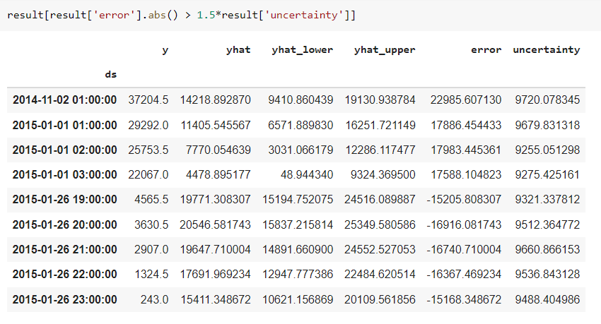
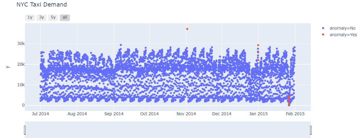
Among 5160 rows only a few are detected as an anomaly. let us see it in brief. The first record on 2nd November 2014 in new york is a marathon so most likely people around different cities come to become a part of it and enjoy it. After that we can see on 1st January it is new year eve so all the normal plots we have seen upper are reverse on this dates because as we saw that from midnight to 4 AM in morning number of taxi are less active but on new year eve, it is completely reverse.
result['anomaly'] = result.apply(lambda x: 'Yes' if(np.abs(x['error']) > 1.5*x['uncertainty']) else 'No', axis = 1)
#result['anomaly'] = np.where(np.abs(x['error']) > 1.5*x['uncertainty']), 'Yes', 'No') #Alternate way
Visualizing the Anomalies in Data
Now we are creating a scatter plot in which the x-axis is a timestamp, the y-axis values, and color of points vary as per anomaly. the color is the anomaly part of it so let us see that how anomalies look in a graph.
#visualize the anomaly data
fig = px.scatter(result.reset_index(), x='ds', y='y', color='anomaly', title='NYC Taxi Demand')
#slider
fig.update_xaxes(
    rangeslider_visible = True,
    rangeselector = dict(
        buttons = list([
              dict(count=1, label='1y', step="year", stepmode="backward"),
              dict(count=2, label='3y', step="year", stepmode="backward"),
              dict(count=2, label='5y', step="year", stepmode="backward"),
              dict(step="all")
        ])
    )
)
fig.show()
Conclusion
Anomalies in the data can be present in different forms which deviate and has an inverse or completely reverse behavior than actual data. Detecting anomalies depend on your business use case and domain that how and what type of cases you assume to happen as per seasonality and which case you consider the uncritical situation in business. In most businesses, these points are very helpful to drive some strategies and to think in another way. Hence when you are working with time-series data then it is important to take care of all these components.
I hope that it was easy to catch up on all the concepts we have discusses and performed. If you have any doubts then feel free to comment below or you can directly connect with me.
Connect with me on Linkedin
Check out my other articles here and on Blogspot
Thanks for giving your time!


very informative blog Thanks, Anomaly detection on log files using Python effectively identifies unusual patterns in time series data. It allows you to quickly identify potential issues and improve the overall security and performance of your system