This article was published as a part of the Data Science Blogathon.
Introduction
Data visualization is crucial in Data Analytics. With exploratory data analysis (EDA), we gain insights into the hidden trends and patterns in a dataset that are useful for decision-making. Several popular open-source Python libraries like Matplotlib, seaborn, Altair, Bokeh, Plotly, etc. are being used to generate attractive and meaningful plots to understand datasets better. In this context, D3.js is a well-known data visualization tool for building interactive data visualizations. However, many people struggle with this because it requires the use of JavaScript. Python, on the other hand, is opted by data scientists who work in machine learning or data analysis. The first version of bqplot was released in October 2015 by Bloomberg’s Quantitative Research team to solve this flaw.
Bqplot library
The bqplot library is a 2-D visualization solution for the Jupyter notebook, based on the Grammar of Graphics components. It has been created by fully utilizing d3.js and ipywidgets. The bqplot package aims to bring d3.js functionality to Python while keeping the ipywidgets widget facility. It achieves this by utilizing widgets, which are all of the available plot components. The library was designed with interactive widgets in mind, so we may update widget variables to follow plot changes.
For constructing plots, bqplot supports two types of APIs:
- Matplotlib pyplot-like API: It has the same set of methods which matplotlib.pyplot offers.
- bqplot internal object model API: It provides an API that allows us to build objects for specific graph elements like figures, markers, axes, scales, and so on.
You can find more information about bqplot here.
So let us first install this package using the following command:
pip install bqplot
If you are running this tutorial on anaconda, then use the following command:
conda install -c conda-forge bqplot
We’ll import the following libraries for bqplot.
import bqplot
from bqplot import pyplot as plt
from bqplot import Tooltip
import pandas as pd
import numpy as np
import seaborn as sns
import sklearn

import warnings
warnings.filterwarnings("ignore")
Now we will import the mpg dataset from Kaggle. This dataset contains 398 rows of data with 9 different features, which tells us about the car’s fuel consumption in miles per gallon.
We will print the first few rows of the dataset using the following command.
df1 = pd.read_csv("../input/autompg-dataset/auto-mpg.csv")
df1.head()

Scatter Plot
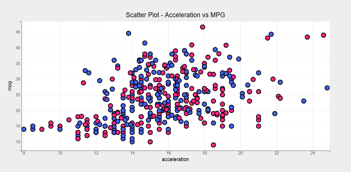
The first plot type we’ll look at is a scatter plot. We’ll use a scatter plot to visualize the acceleration vs. mpg relationship using the following code.
fig = plt.figure(title="Scatter Plot - Acceleration vs MPG", )
options = {'x':{'label':"acceleration"}, 'y':{'label':'mpg'}}
scat = plt.scatter(df1['acceleration'], df1["mpg"],
                   colors=["#f72585", "#4361ee"],
                   axes_options = options,
                   stroke="black", stroke_width=2.0,
                   default_size=120,
                   default_opacities=[0.5],
                   marker="circle",
                   )
plt.show()
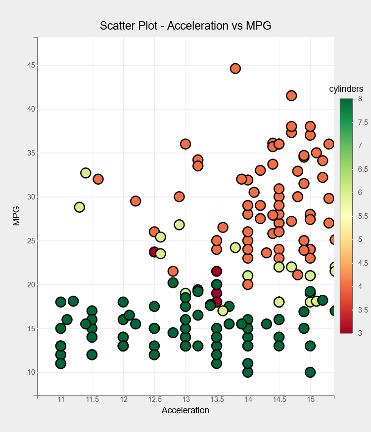
Using the following code, we can explore the connection between acceleration and mpg variables for different cylinders.
fig = plt.figure(title="Scatter Plot - Acceleration vs MPG")
fig.layout.height = "700px"
fig.layout.width = "600px"
options = {'color': dict(label='cylinders', orientation='vertical', side='right')}
scat = plt.scatter(x = df1["acceleration"], y = df1["mpg"],
                   color=df1["cylinders"],
                   axes_options = options,
                   stroke="black", stroke_width=2.0,
                   default_size=200,
                   default_opacities=[0.9],
                   marker="circle",
                   )
plt.xlabel("Acceleration")
plt.ylabel("MPG")
plt.xlim(10.7, 15.3)
plt.show()
Pie Chart
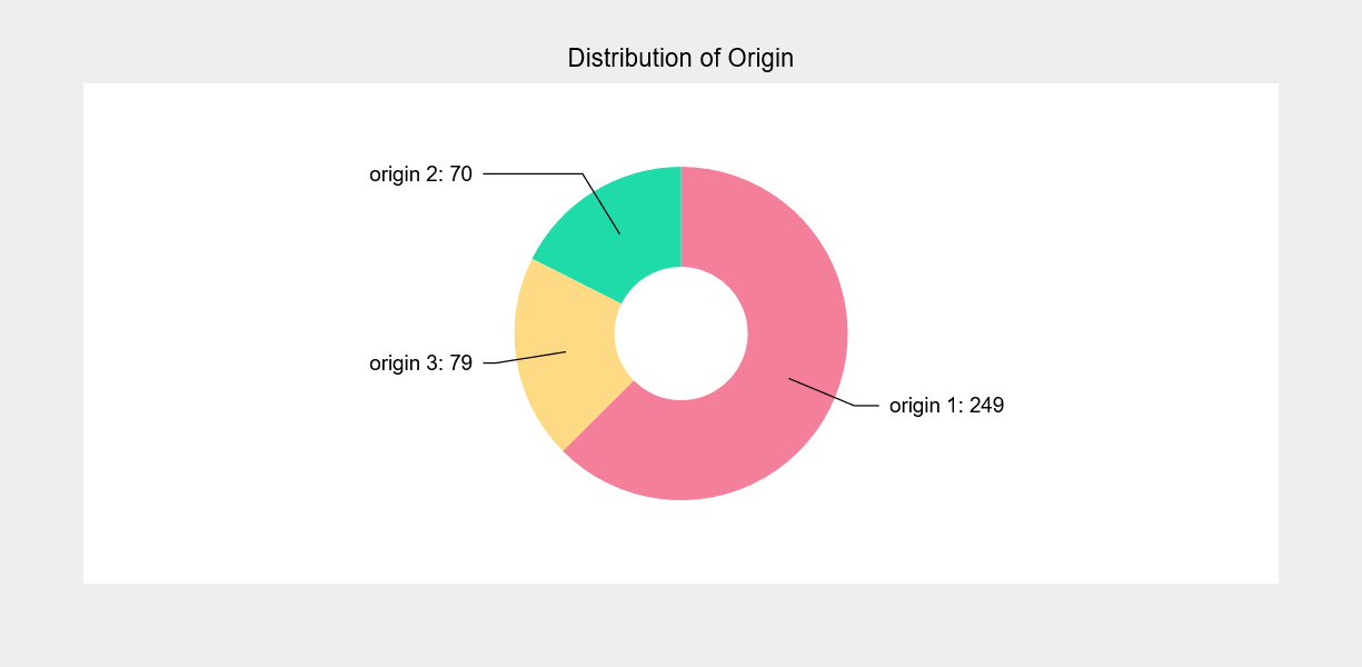
Next, we will be creating the pie chart. Pie charts are widely used to understand the distribution of values in a categorical variable. We’ll analyze the origin distribution in the mpg dataset with the following code.
from collections import Counter
mpg_ctg = Counter(df1["origin"])
fig = plt.figure(title="Distribution of Origin", animation_duration=1500)
pie = plt.pie(sizes = list(mpg_ctg.values()),
              labels =["origin %d"%val for val in list(mpg_ctg.keys())],
              display_values = True,
              values_format=".0f",
              display_labels='outside')
pie.colors = ["#ef476f","#ffd166", "#06d6a0"]
pie.opacities = [0.7,0.8,0.9]
pie.radius = 150
pie.inner_radius = 60
pie.font_size = '15px'
plt.show()
Box Plot
The pie chart will be created next. Pie charts are widely used to understand the distribution of each value in a categorical variable. We’ll analyze the origin distribution in the mpg dataset. The next chart type we’ll look at is the Box plot.
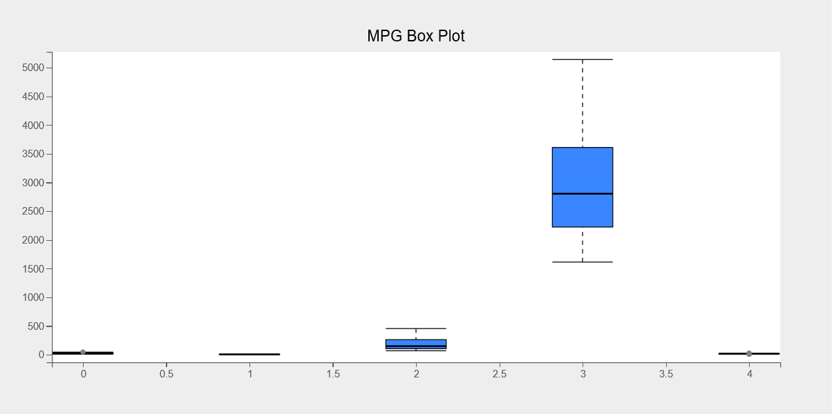
Box plots are commonly used to determine most of the values of a variable’s concentration.
Using the following code, we’ll make a box plot for each column in the mpg dataset.
fig = plt.figure(title="MPG Box Plot")
mpg_df = df1[["mpg","cylinders","displacement","weight","acceleration"]]
boxes = plt.boxplot(x=range(mpg_df.shape[1]), y=mpg_df.values.T)
boxes.box_fill_color = '#3a86ff'
boxes.opacity = 0.5
boxes.box_width = 70
plt.grids(value="none")
plt.show()
Bar Chart
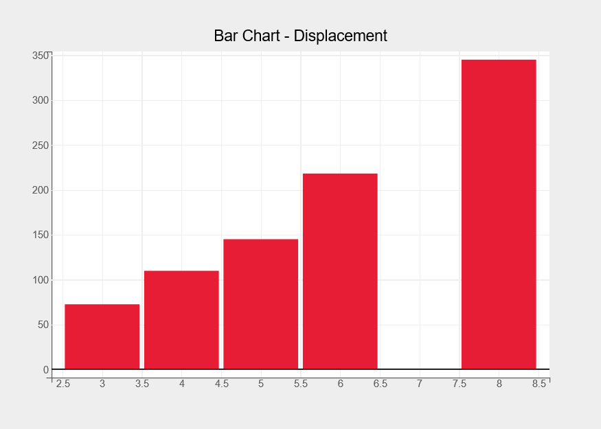
The bar chart representing the average displacement per cylinder category is plotted using the following code.
fig = plt.figure(title="Bar Chart - Displacement")
fig.layout.height = "500px"
fig.layout.width = "700px"
df = df1.groupby(by="cylinders").mean()
bar_chart  = plt.bar(x =df.index, y= df["displacement"])
bar_chart.colors = ["#e71d36"]
plt.show()
Stacked Bar Chart
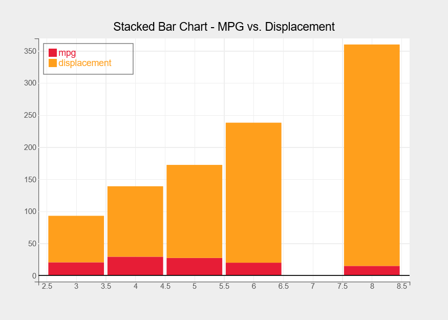
With the following code, we will now plot a stacked bar chart with average displacement and mpg per cylinder category.
fig = plt.figure(title="Stacked Bar Chart - MPG vs. Displacement",legend_location="top-left")
fig.layout.height = "500px"
fig.layout.width = "700px"
avg_df = df1.groupby(by="cylinders").mean()
bar_chart  = plt.bar(x = avg_df.index, y= [avg_df["mpg"],avg_df["displacement"]],
                     labels = ["mpg","displacement"],
                     display_legend=True)
bar_chart.type = "stacked"
bar_chart.colors = ["#e71d36","#ff9f1c"]
bar_chart.tooltip = Tooltip(fields=["x", "y"])
plt.show()
For our next plots, we are importing NIFTY-50 stock market data from Kaggle. The data represents the price history and trading volume of the 50 stocks in the NIFTY 50 index from India’s NSE (National Stock Exchange). The data ranges from January 1, 2000, to April 30, 2021. We are using the Axis Bank stocks dataset, which contains 5306 rows of data with 14 different values related to Axis Bank stocks.
df2 = pd.read_csv("../input/nifty50-stock-market-data/AXISBANK.csv",index_col=0, parse_dates=True)
df2.head()

Histogram
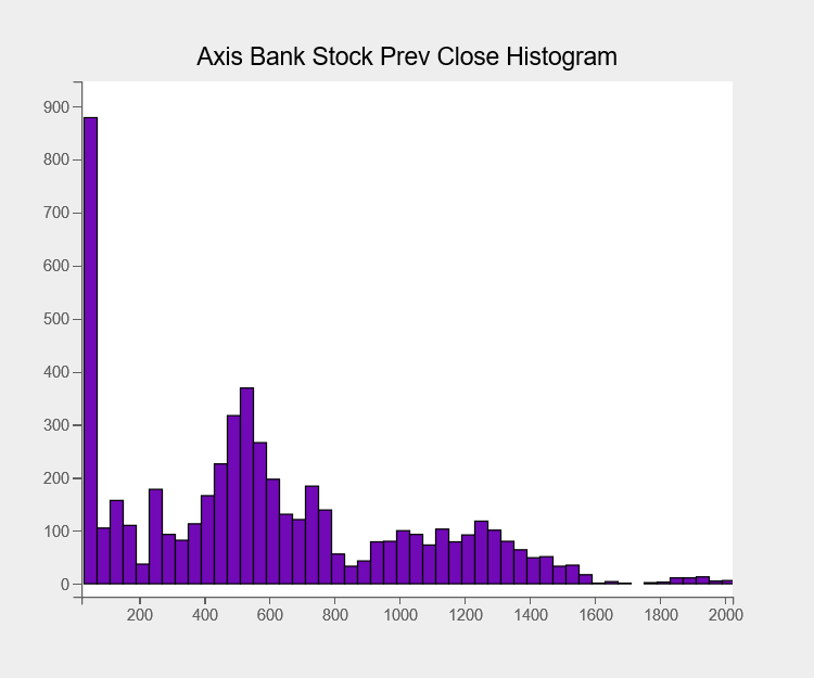
We are now plotting histograms. Histograms allow us to visualise the distribution of values in a certain column of data. The closing price distribution of the last day is shown here, with 50 bins per histogram.
fig = plt.figure(title="Axis Bank Stock Prev Close Histogram")
fig.layout.width = "600px"
fig.layout.height = "500px"
histogram = plt.hist(sample = df2["Prev Close"], bins=50)
histogram.colors = ["#7209b7"]
histogram.stroke="black"
histogram.stroke_width = 2.0
plt.grids(value="none")
plt.show()
Line Chart
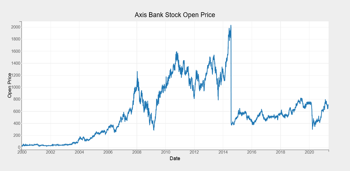
Now we will create a simple line chart for the Axis Bank Open Price from 2000 to 2021. To build a line chart, we’ll use the plot() function. Next we will pass inputs as a range of dates alongwith the opening prices.
fig = plt.figure(title="Axis Bank Stock Open Price")
line_chart = plt.plot(x=df2.index, y=df2.Open)
plt.xlabel("Date")
plt.ylabel("Open Price")
plt.show()
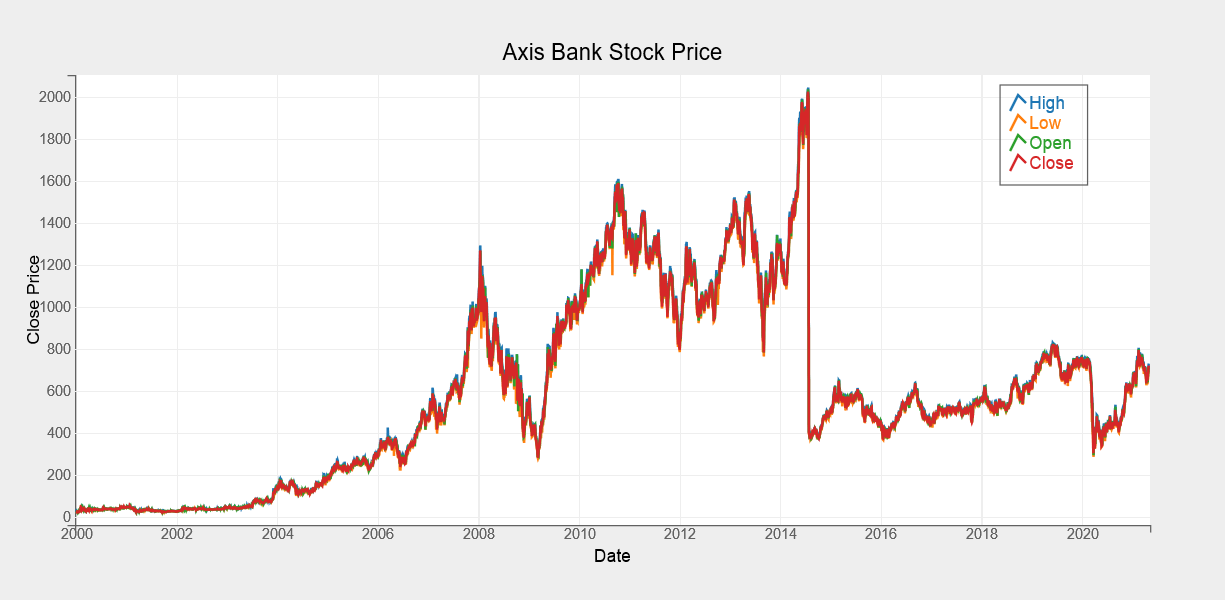
We’ve created another line chart below, this one displaying the open, high, low, and close prices of Axis Bank shares from 2000 to 2021. We’ve integrated all line charts into a single image with legends and different colors to differentiate each line from the others.
fig = plt.figure(title="Axis Bank Stock Price", legend_location="top-right")
line_chart = plt.plot(x=df2.index, y=[df2["High"], df2["Low"],df2["Open"],df2["Close"]],
                     labels=["High","Low","Open","Close"],
                     display_legend=True)
plt.xlabel("Date")
plt.ylabel("Close Price")
line_chart.tooltip = Tooltip(fields=["x", "y"], labels=["High","Low","Open","Close"])
plt.show()
CandleStick Chart
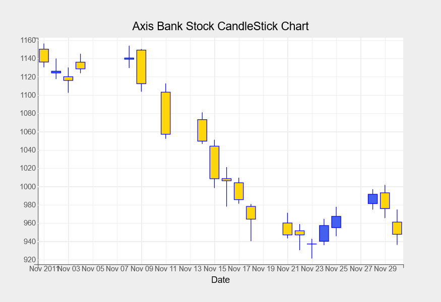
Candlestick charts are quite popular in the finance business. We will explore these chart next. These are used to display changes in the value of a stock over time on a particular day.
For November 2011, we’re creating a candlestick chart for Axis Bank stock shares. For candlestick charts, we are using the Axis Bank stock’s open, high, low, and closing prices with the following code.
fig = plt.figure(title="Axis Bank Stock CandleStick Chart")
fig.layout.width="700px"
axis_df = df2["2011-11"]
ohlc = plt.ohlc(x=axis_df.index, y=axis_df[["Open","High","Low","Close"]],marker="candle", stroke="blue")
ohlc.colors=["#4361ee", "#ffd60a"]
plt.xlabel("Date")
plt.show()
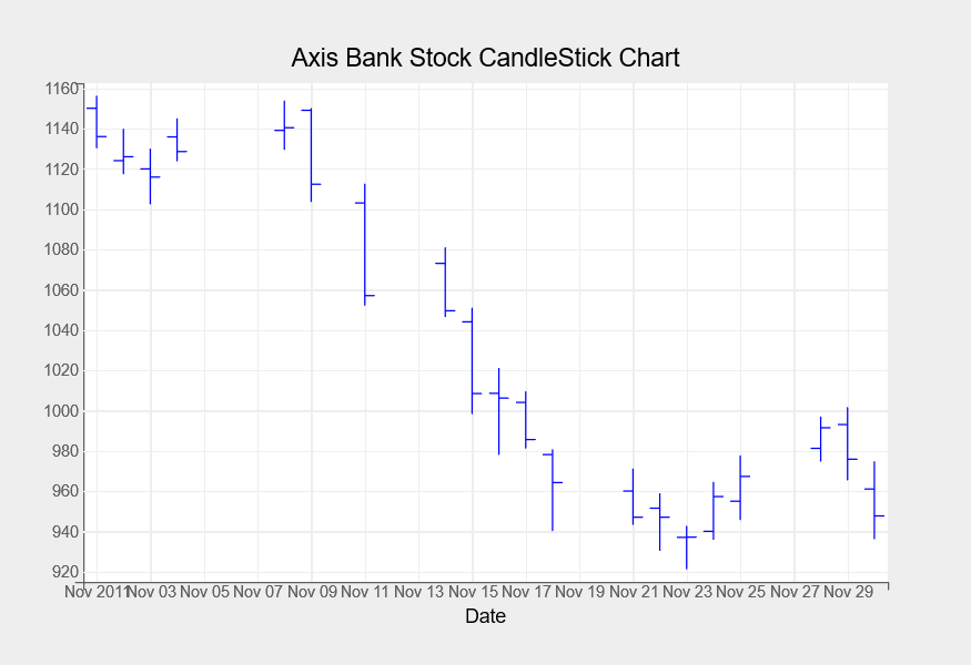
Below is another form of a candlestick chart. This chart depicts each change in stock value as lines rather than a bars for each change in stock value.
fig = plt.figure(title="Axis Bank Stock CandleStick Chart")
fig.layout.width="700px"
axis_df = df2["2011-11"]
ohlc = plt.ohlc(x=axis_df.index, y=axis_df[["Open","High","Low","Close"]],marker="bar", stroke="blue")
plt.xlabel("Date")
plt.show()
The next dataset we’ll be using is the world happiness dataset from Kaggle. This dataset contains 149 rows of data with 20 columns related to the world happiness report.
df3 = pd.read_csv("../input/world-happiness-report-2021/world-happiness-report-2021.csv")
df3.head()

Correlation Heatmap
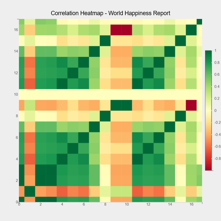
A heatmap is the next chart type that we’ll go through. The heatmap below displays the relationship between the different columns of the World Happiness Report dataset.
fig  = plt.figure(title="Correlation Heatmap - World Happiness Report",padding_y=0)
fig.layout.width = "700px"
fig.layout.height = "700px"
axes_options = {'color': {'orientation': "vertical","side":"right"}}
plt.heatmap(color=df3.corr().values, axes_options=axes_options)
plt.show()
Choropleth Maps
Now we will explore the choropleth maps. We’ll be producing multiple choropleth maps using the world happiness dataset imported earlier.
A basic mapping approach is required to input map data and then use it to map each country’s id to a certain value like happiness, life expectancy, corruption, etc. The bqplot library includes a function geo() which requires a mapping from country id to its value. This value will be a color input to plot choropleth maps.
To create choropleth maps with bqplot, we will be doing the series of steps:
• First, we’ll create a global map graph with bqplot’s geo function (). It will populate the graph with information on each country in the world.
• We will next get map data from the bqplot map object and pass it forward that will build a mapping from the country id to the column.
• We’ll then make this mapping from country id to value (like happiness score, life expectancy, corruption perception, and so on) the map object’s color attribute. We’ve set the default color value to grey when the mapping value is not available.
 def map_data_to_color_mapping(map_data, column="Ladder score"):
    name_to_id_mapping = []
    for entry in map_data:
        if entry["properties"]["name"] == "Netherlands":
            name_to_id_mapping.append(("Netherlands", entry["id"]))
        else:
            name_to_id_mapping.append((entry["properties"]["name"], entry["id"]))
    name_to_id_mapping = dict(name_to_id_mapping)
    color = []
    for name, idx in name_to_id_mapping.items():
        score = df3[df3["Country name"].str.contains(name)]["Ladder score"].values
        if len(score) > 0:
            color.append((idx,score[0]))
    return dict(color)
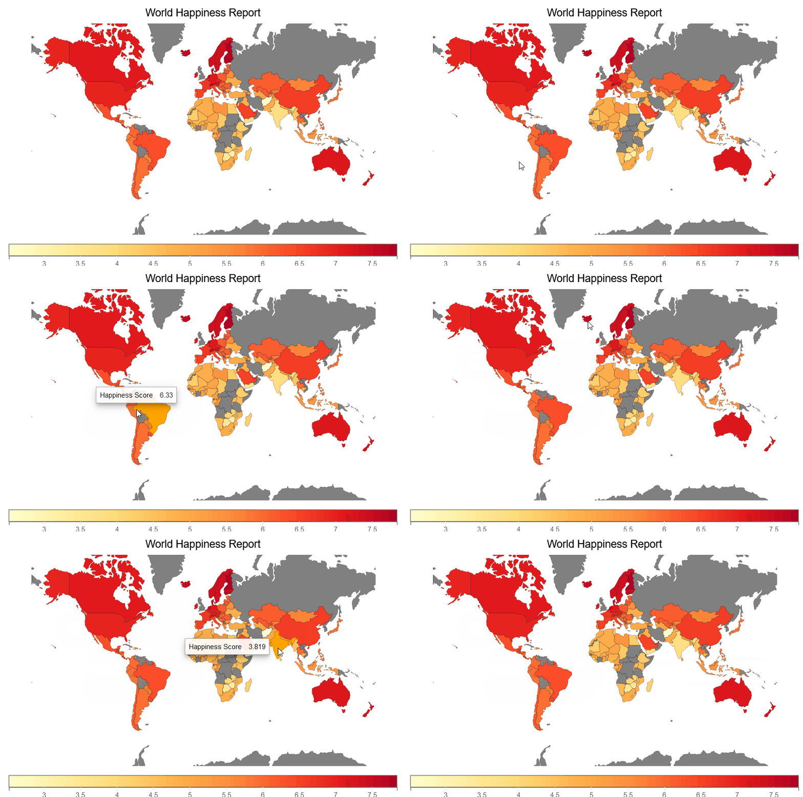
We are creating a happiness choropleth map below that shows the choropleth of happiness score for each country in the world.
fig = plt.figure(title='World Happiness Report')
plt.scales(scales={'color': bqplot.ColorScale(scheme='YlOrRd')})
choropleth_map = plt.geo(map_data='WorldMap',
                     colors={'default_color': 'Grey'})
map_data = choropleth_map.map_data["objects"]["subunits"]["geometries"]
choropleth_map.color = map_data_to_color_mapping(map_data)
choropleth_map.tooltip = Tooltip(fields=["color"], labels=["Happiness Score"])
fig
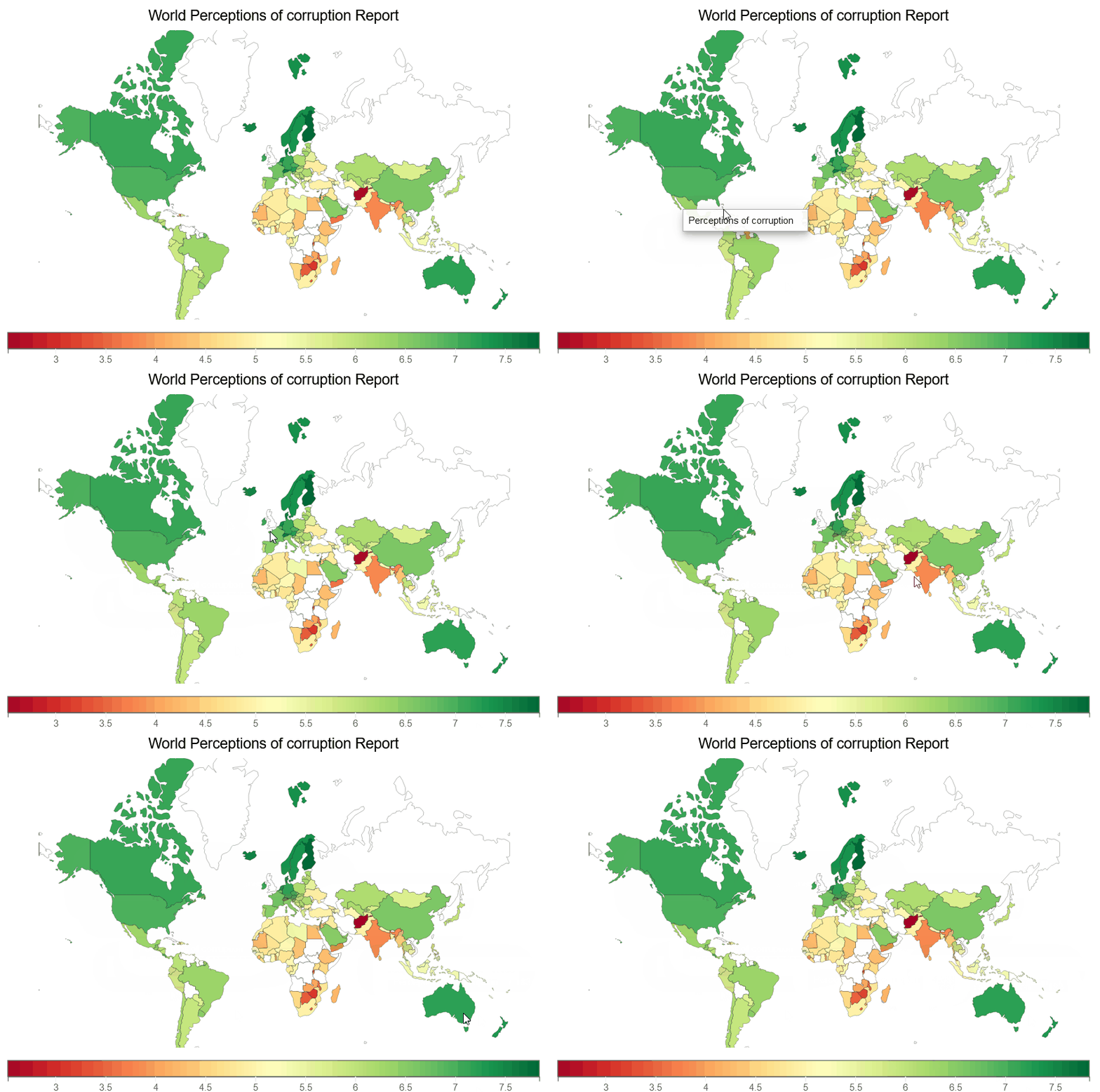
We are creating a Perceptions of corruption choropleth map below, which illustrates a choropleth of Perceptions of corruption for each country on earth.
fig = plt.figure(title='World Perceptions of corruption Report')
plt.scales(scales={'color': bqplot.ColorScale(scheme='virdis')})
choropleth_map = plt.geo(map_data='WorldMap',
                     colors={'default_color': 'white'})
map_data = choropleth_map.map_data["objects"]["subunits"]["geometries"]
choropleth_map.color = map_data_to_color_mapping(map_data, "Perceptions of corruption")
choropleth_map.tooltip = Tooltip(fields=["color"], labels=["Perceptions of corruption"])
fig
Conclusion
In this article, we explored different interactive data visualizations using the python library ‘bqplot.’ These interactive charts are good alternatives to the static matplotlib or seaborn charts.
Key takeaways from this article:
- The python library bqplot helps build fully interactive visualizations in the Jupyter notebook. Since the library is based on the Grammar of Graphics, users can create complex visualizations with a few lines of code.
- It offers two APIs – a pythonic API for 2-D visualizations, and a sensible API (similar to Matplotlib’s pyplot) for adding interactivity like zooming, selection, etc.
- Several commonly used visualizations are available in bqplot along with some advanced plots like candlestick chart, choropleth map, correlation map, etc. It is relatively easy to use for beginners.
I hope you found this article interesting. Do try this library for your next exploratory data analysis project. The code for this article is available on my GitHub repository.
The media shown in this article is not owned by Analytics Vidhya and is used at the Author’s discretion.


