This article was published as a part of the Data Science Blogathon.
Introduction
Customer churn or attrition is one of the most crucial problems for any business that directly sells or serves customers Be it Telecom service providers, eCommerce or SaaS businesses it is important to track and analyse how many customers are leaving the platform and how many are sticking and the reasons behind them. Knowing customer behaviour can greatly enhance decision-making processes and can further help reduce churn to improve profitability.
In this article, we are going to analyse an eCommerce dataset and find the best model to predict customer churn. But before delving into analysis let’s have a brief look at what is churn
What is Churn Analysis?
Customer churn can be defined as the rate at which customers leave a platform or service. And customer churn analysis is the method of analysing the rate. There are usually two kinds of churn.
- Voluntary Churn: when the customer voluntarily chooses to not subscribe anymore, for example, they got a better deal somewhere else or they had a dissatisfactory experience.
- Involuntary Churn: when the customer involuntarily leaves the platform, for example, payment failures because credit card maxed out.
Some of the churns are expected but when the churn is high it could highly impact the bottom line of the company. It also reveals the net consumer perception of the company, which is essentially an important factor in the long term growth and sustainability of the company. It is pretty much intuitive to know if there is a significant churn or not but unless and until we have key data points to draw actionable insight it is just a guessing game. Several factors influence churn and understanding each can give us a pretty solid idea of what to do next.
Now, we are all set to delve into the practical analysis part. For this article, we will be using e-commerce data set.
Importing Libraries
For analysing the data we will be using Pandas and Numpy and for visualization Matplotlib and Seaborn.
import pandas as pd
import numpy as np
import matplotlib.pyplot as plt
import seaborn as sns
Now that we have imported the necessary libraries, now we will read the data.
df = pd.read_excel('D:/Data Sets/E Commerce Dataset.xlsx', sheet_name = 'E Comm')
df.head()

We will keep an untouched copy of our dataset in case we need it ahead.
dt = df.copy()
Data Exploration
Now that we brought the dataset to our Jupyter kernel, let’s explore the dataset statistics.
df.describe()

df.info()
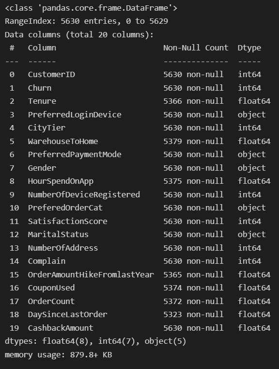
We can observe there are 5630 observations in total and some of the features have missing values. Let’s see which of these variables have missing values. More on these values later. Before that, we will remove the customerID column as it is irrelevant to our needs.
df.drop('customerID', axis=1, inplace=True) #set inplace true to reflect the change on original dataframe.
Handling Outliers
Let’s now explore if there are any outliers in our feature columns.
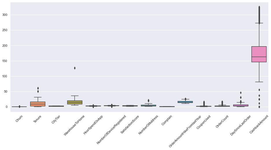
There’s a quite a lot of features with outliers. We will use a quantile based flooring method to treat outliers. As per the method, any value beyond 1.5*Q1 and 1.5*Q3 will be regarded as outliers, and all the outlier values will be replaced by Q1-1.5*Q1 and Q3+1.5*Q3.
cat = df.select_dtypes(include='object').columns #object type columns
num = list(df.select_dtypes(exclude='object').columns) #numerical type columns
num.remove('Churn')
for cols in num:
    Q1 = df[cols].quantile(0.25)
    Q3 = df[cols].quantile(0.75)
    IQR=Q3-Q1
    lr= Q1-(1.5 * IQR)
    ur= Q3+(1.5 * IQR)
    df[cols] = df[cols].mask(df[cols]<lr, lr, )
    df[cols] = df[cols].mask(df[cols]>ur, ur, )
Let’s see if we got rid of outliers or not.
sns.set(style="darkgrid", palette="muted")
fig, ax = plt.subplots(figsize=(16,7))
sns.boxplot(data=df)
plt.xticks(rotation=45)
plt.show()
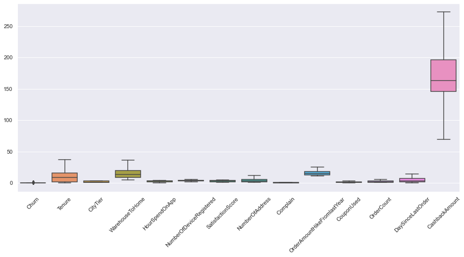
Nice. Now our data is free from outliers.
Handling Missing Values
From the dataset info, we observed some features have missing values. This section will be imputing the missing values with appropriate values.
df.isnull().sum()
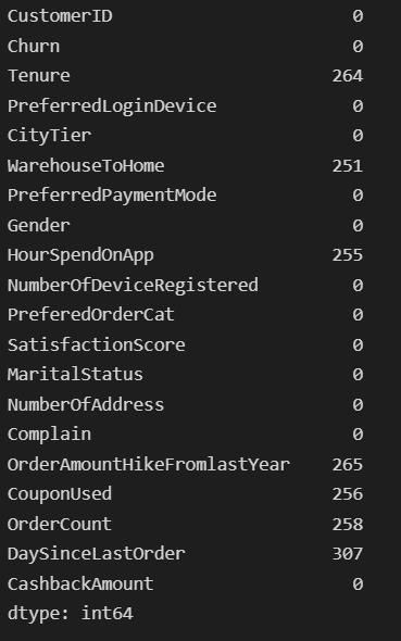
Quite a lot of missing values indeed. We will impute these features with means and medians wherever appropriate. There are also other imputing methods you could try out. But here it makes more sense to impute with simple means and medians.
df['Tenure'].fillna(df.Tenure.median(), inplace=True)
df['WarehouseToHome'].fillna(df.WarehouseToHome.median(), inplace=True)
df['HourSpendOnApp'].fillna(df.HourSpendOnApp.median(), inplace=True)
df['OrderAmountHikeFromlastYear'].fillna(round(df.OrderAmountHikeFromlastYear.mean()), inplace=True)
df['CouponUsed'].fillna(df.CouponUsed.median(), inplace=True)
df['OrderCount'].fillna(df.OrderCount.median(), inplace=True)
df['DaySinceLastOrder'].fillna(df.DaySinceLastOrder.median(), inplace=True)
df.isnull().sum()
Churn                          0
Tenure                         0
PreferredLoginDevice           0
CityTier                       0
WarehouseToHome                0
PreferredPaymentMode           0
Gender                         0
HourSpendOnApp                 0
NumberOfDeviceRegistered       0
PreferedOrderCat               0
SatisfactionScore              0
MaritalStatus                  0
NumberOfAddress                0
Complain                       0
OrderAmountHikeFromlastYear    0
CouponUsed                     0
OrderCount                     0
DaySinceLastOrder              0
CashbackAmount                 0
CashbackPerOrder               0
dtype: int64
Univariate Analysis
The term Univariate Analysis refers to the analysis of only one variable. The aim is to analyse and find out patterns specific to a single variable.
Categorical variables
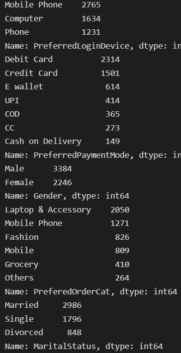
First, we will look into the categorical variables and the frequency of each value.
for col in cat:
    print(df[col].value_counts())
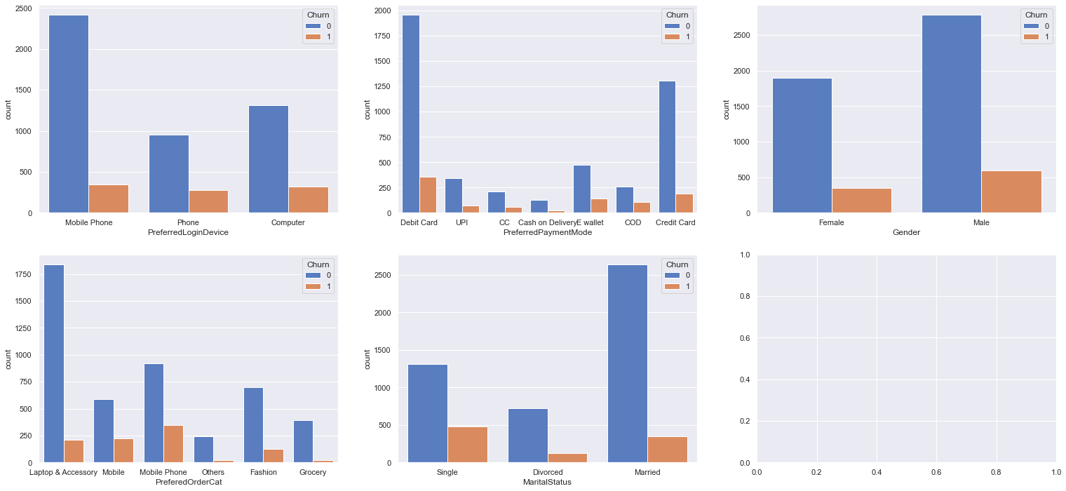
Now, we will visualise each variable with their corresponding churn value
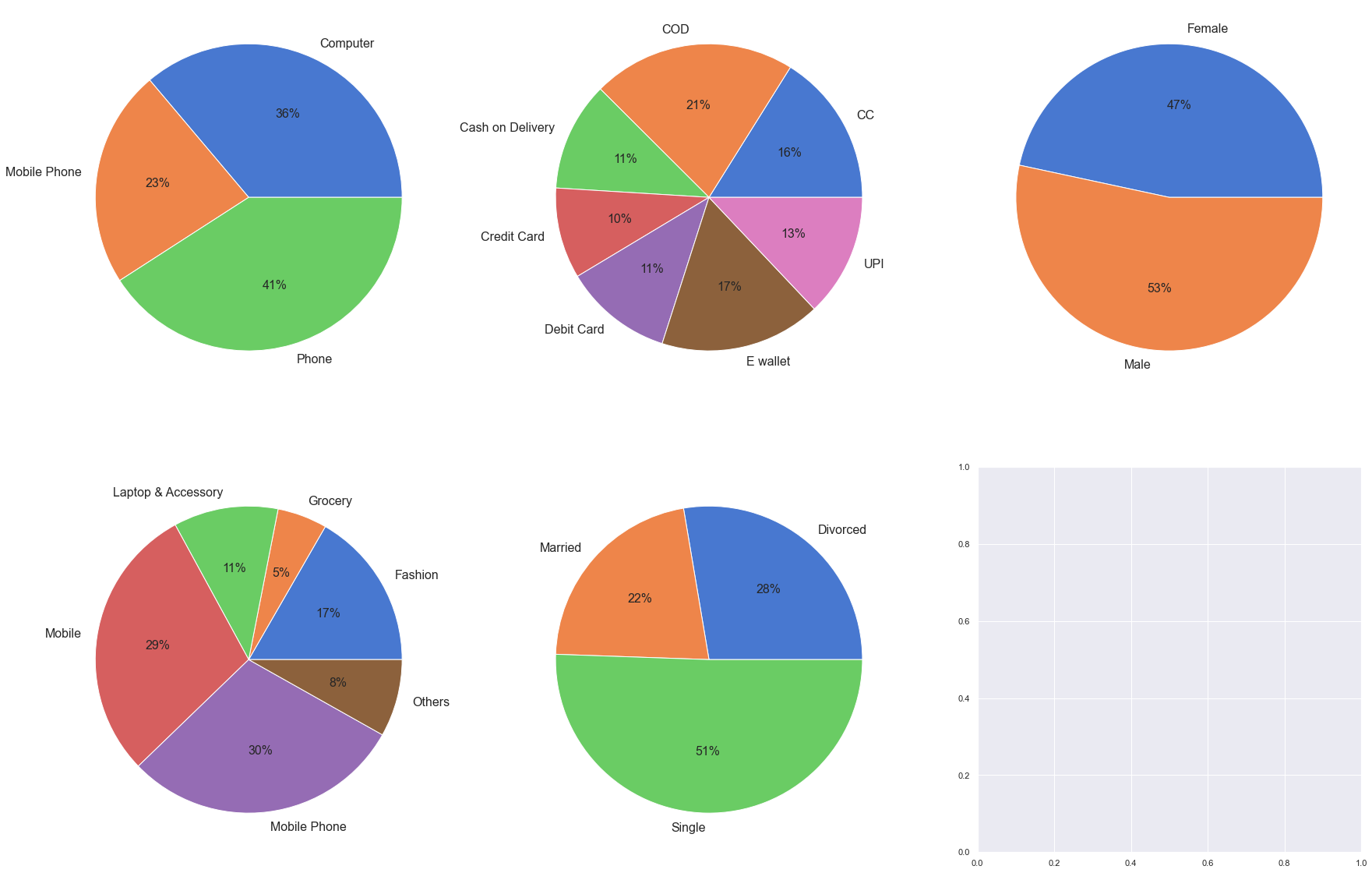
To make the inferences more insightful we can find out the per cent churn contributed by each category for each variable.
fig, ax = plt.subplots(2, 3, figsize=(30, 20))
plt.rcParams['font.size'] = '16'
for col,subplot in zip(cat, ax.flatten()):
    #calculate percent churn
    temp = df.groupby(by=df[col]).Churn.sum()
    total = df.value_counts(col).sort_index()
    res1 = temp/total*100
    #visualising the result
    subplot.pie(labels = res1.index, x = res1.values, autopct='%.0f%%',textprops={'fontsize': 16})
Numerical variable
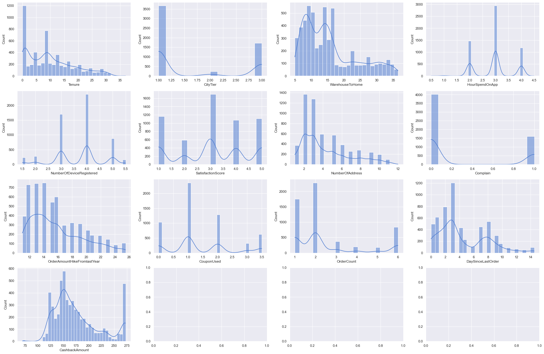
Visualise distributions
for i, subplot in zip(num, ax.flatten()):
    sns.histplot(df[i], kde = True, ax=subplot)
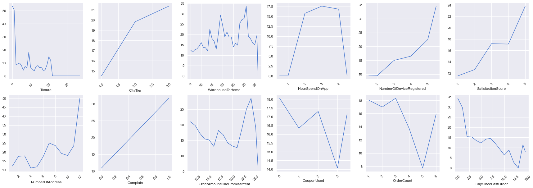
We can find the per cent churn for numerical variables as well but here we will use line charts instead.
fig, ax = plt.subplots(2, 6, figsize=(30, 10))
for col,subplot in zip(num, ax.flatten()):
    temp = df.groupby(by=df[col]).Churn.sum()
    total = df.value_counts(col).sort_index()
    res1 = temp/total*100
    sns.lineplot(x = res1.index, y = res1.values, ax=subplot, )
    subplot.tick_params(axis='x',labelrotation=45)
Bivariate Analysis
In the bivariate analysis, we will use two variables and find the relationship between them. We will use the correlation coefficient to find out the relationship between variables. A correlation value close to 1 indicates a positive correlation while a correlation nearing -1 has negative relation and around zero means neutral.
mask=np.zeros_like(df.corr())
mask[np.triu_indices_from(mask)] = True
fig, ax = plt.subplots( figsize=(16, 7))
sns.heatmap(df.corr(method='pearson'), mask=mask, cmap='rainbow')
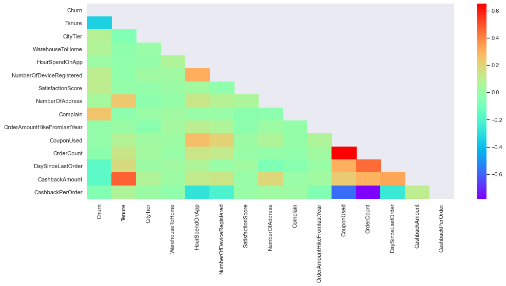
We can observe there is a positive correlation between tenure and the cashback amount, also the coupon used and the order count too have a strong positive correlation. Tenure and Complain have some effect on the churn but the rest of the variables are pretty neutral.
Classification
Now, that we are done with data cleaning and analysis we will be moving on to the classification part. For this, we will be using multiple classification algorithms and find out the best fitting algorithm using the sci-kit learns pipeline and GridsearchCV. So, let’s import all the necessary libraries.
from sklearn.linear_model import LogisticRegression
from sklearn.tree import DecisionTreeClassifier
from sklearn.ensemble import RandomForestClassifier
from xgboost import XGBClassifier
from sklearn.pipeline import Pipeline
from sklearn.model_selection import cross_val_score, KFold, train_test_split
from sklearn.preprocessing import StandardScaler, MinMaxScaler, Normalizer
from sklearn.metrics import confusion_matrix, f1_score, accuracy_score, roc_auc_score
from sklearn.feature_selection import SelectKBest
from sklearn.base import BaseEstimator, ClassifierMixin
from sklearn.model_selection import GridSearchCV
from sklearn.preprocessing import LabelEncoder
We have several variables with categorical values so we will encode them before feeding them to the algorithms.
enc = LabelEncoder()
for col in df.select_dtypes(include='object'):
    df[col]=enc.fit_transform(df[col])
Splitting the data into train and test sets
X_train, X_test,y_train, y_test = train_test_split(df.drop('Churn', axis=1), df.Churn)
We will now construct a custom switcher class which will be able to work for any estimator passed through GridsearchCV.
class my_classifier(BaseEstimator,):
    def __init__(self, estimator=None):
        self.estimator = estimator
    def fit(self, X, y=None):
        self.estimator.fit(X,y)
        return self
    def predict(self, X, y=None):
        return self.estimator.predict(X,y)
    def predict_proba(self, X):
        return self.estimator.predict_proba(X)
    def score(self, X, y):
        return self.estimator.score(X, y)
Now, we will define our pipeline
pipe = Pipeline([('scaler', StandardScaler()), ('clf', my_classifier())])
Define parameter space
parameters = [
              {'clf':[LogisticRegression(max_iter=1000)],
               'clf__C':[0.001,0.01,.1,1],
               'clf__solver':['lbfgs','liblinear']
               },
             {'clf':[RandomForestClassifier()],
             'clf__criterion':['gini','entropy'],
             },
             {
               'clf':[DecisionTreeClassifier()],
             'clf__criterion':['gini','entropy'],
             },
             {
              'clf':[XGBClassifier()],
             'clf__learning_rate':[0.01,0.1,0.2,0.3],
             'clf__reg_lambda':[0.01,0.1,1],
             'clf__reg_alpha': [0.01,0.1,0,1],
             }]
In the above code snippet, we defined hyper-parameters for each estimator to find a better fit.
Now, we will pass the pipeline and parameter to GridsearchCV.
grid = GridSearchCV(pipe, parameters, cv=5)
grid.fit(X_train,y_train)
output: GridSearchCV(cv=5,
             estimator=Pipeline(steps=[('scaler', StandardScaler()),
                                       ('clf', my_classifier())]),
             param_grid=[{'clf': [LogisticRegression(max_iter=1000)],
                          'clf__C': [0.001, 0.01, 0.1, 1],
                          'clf__solver': ['lbfgs', 'liblinear']},
                         {'clf': [RandomForestClassifier()],
                          'clf__criterion': ['gini', 'entropy']},
                         {'clf': [DecisionTreeClassifier()],
                          'clf__criterion': ['gini', 'e...
                                                max_cat_to_onehot=None,
                                                max_delta_step=None,
                                                max_depth=None, max_leaves=None,
                                                min_child_weight=None,
                                                missing=nan,
                                                monotone_constraints=None,
                                                n_estimators=100, n_jobs=None,
                                                num_parallel_tree=None,
                                                predictor=None,
                                                random_state=None, reg_alpha=0,
                                                reg_lambda=0.01, ...)],
                          'clf__learning_rate': [0.01, 0.1, 0.2, 0.3],
                          'clf__reg_alpha': [0.01, 0.1, 0, 1],
                          'clf__reg_lambda': [0.01, 0.1, 1]}])
Let’s see which estimator best classified the data
grid.best_estimator_
output: Pipeline(steps=[('scaler', StandardScaler()),
                ('clf',
                 XGBClassifier(base_score=0.5, booster='gbtree', callbacks=None,
                               colsample_bylevel=1, colsample_bynode=1,
                               colsample_bytree=1, early_stopping_rounds=None,
                               enable_categorical=False, eval_metric=None,
                               gamma=0, gpu_id=-1, grow_policy='depthwise',
                               importance_type=None, interaction_constraints='',
                               learning_rate=0.3, max_bin=256,
                               max_cat_to_onehot=4, max_delta_step=0,
                               max_depth=6, max_leaves=0, min_child_weight=1,
                               missing=nan, monotone_constraints='()',
                               n_estimators=100, n_jobs=0, num_parallel_tree=1,
                               predictor='auto', random_state=0, reg_alpha=0,
                               reg_lambda=0.01, ...))])
Training Score
grid.best_score_
output: 0.9611534255026781
Predicting values for test set
y_pred = grid.predict(X_test,)
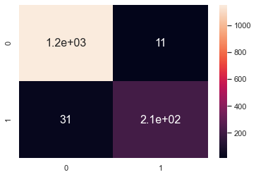
Confusion matrix
sns.heatmap(confusion_matrix(y_test, y_pred), annot=True)
F1 score on the test set
print(f1_score(y_test,y_pred))
output: 0.9154639175257732
Feature Importance
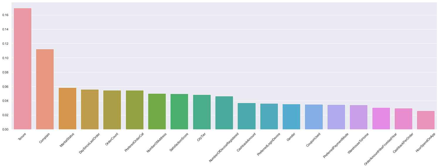
A trained XGboost model automatically calculates the feature importance of our predictive modelling problem. This lets us know which feature had more contribution to the overall prediction.
feature_array = grid.best_estimator_[-1].feature_importances_
importance = dict(zip(df.drop('Churn',axis=1).columns,feature_array))
importance = dict(sorted(importance.items(), key= lambda item:item[1],reverse = True) )
fig, ax = plt.subplots(figsize=(26,8))
sns.barplot(x=list(importance.keys()), y=list(importance.values()))
plt.tick_params(axis='x', labelrotation=45)
plt.show()
Conclusion
Churn prediction is easily one of the most practical and widespread use cases of machine learning in everyday businesses. Being able to analyse why and what causes your customers to leave and predict which customers are likely to leave can make decision making much easier.
In this article:
- We explored and performed an analysis of an e-commerce dataset.
- We ran different classification algorithms with sci-kit learn’s Pipeline method.
- We used GreedsearchCV for hyperparameter tuning to find the best algorithm with the best set of parameters.
- Finally found out the features that had more influence on prediction.
So, this was all about customer churn analysis and prediction.
Hope you liked the article.
The media shown in this article is not owned by Analytics Vidhya and is used at the Author’s discretion.


