Appropriate space allocation and compelling visuals which convey business insights in meaningful manner are key to creating a good dashboard.
The dashboard / chart which I plan to cover in today’s post is one example of how you can do this effectively. I am creating this dashboard for a Sales led business, but that does not stop you from applying in any other field. The core idea can be applied to any area where you want to analyze outcome in multi-dimension.
Let us start with an example, where a Sales team is divided into Regions (4), which are further divided in four Zones (16). Each of these zones will contain numerous cities.
In excel era, Sales MIS would typically look something like:
Next, you can either create multiple sheets or tables in same sheet to show comparison at a zonal or city level. Alternatively, we can also add Pivot tables to the mix or group rows. However, none of these features give you a natural drill down (barring Pivot tables to some extent). If you use pivots to create a drill down, you need your customer to be comfortable with pivot tables, which may or may not be the case for business users.
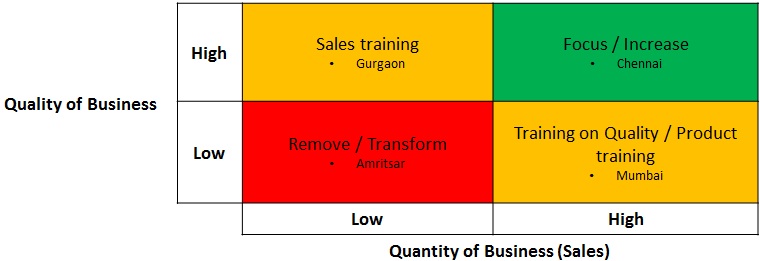
If you are slightly more evolved in Business Segmentation and Analytics thought process, we can summarize the performance on a grid like this (remember, Low rejection rate => Better quality):
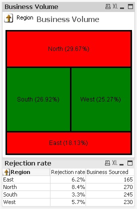
However, even this visualization also suffers from same problems of having limited drill-downs. This is where Qlikview comes in handy. One of the ways which I have found simple and powerful is to use box charts in Qlikview. Following are a few screenshots of how the dashboard might look like with natural capabilities of drill ups and drill downs.
Please note that the screenshots are for just this chart object only and not the entire dashboard.
This screenshot tells the summary at Regional level, with size of box showing the volume of business and Colour of box showing the quality of business. The chart below shows what happens as soon as you click on North.
A glance at this chart can tell you:
- North sources 29.67% of business, but quality is below average.
- Within North, 55.56% of business comes from Delhi, but is of very poor quality.
- On the other hand, there are some relatively smaller markets in North (Chandigarh, Faridabad & Gurgaon), which source good quality of business.
This is a simple example where we have brought out some key information with help of simple dashboard. In the next post, I plan to post a step by step guide of creating this dashboard and enhancing the same.
Do you know of any other application of this simple concept? If yes, please feel free to add them below or to reach out to me.


I have worked on Qlikview and completely agree with you. Its really helpful for those who are dealing with complex MIS tools and other business dashboards. The best thing is that its easy to learn and although, if are new to Qlikview and stuck with some problem, Qlikview community (http://community.qlikview.com) is gonna help you. So no worries of expensive trainings, one can learn and use it him/herself.
Tableau is another software by which we can create dashboards easily. But that software is too expensive. I dont have any idea on qlikview.is it an open source software?
Nagaraju, Qlikview is not a open source software. It is owned by Qliktech. However, personal edition of Qlikview is free to download. Personal edition comes with a few limitations, but is good enough to try out features. It is typically less expensive than Tableau. Thanks, Kunal