BI industry has its roots in MIS and spreadsheets have been the most commonly used MIS tool in the last decade. Due to this, a lot of typical reports in Organizations end up in tabular format. To make situation worse, the number of columns in these reports keep on increasing over time (e.g. addition of comparison against benchmarks). The end product of this evolution is an amorphous table with army of numbers. People will look at this report and deliberate over numbers and insights!
In today’s post, I’ll take one such report, tell you how to add a series of visualizations to make it better and leave you with a thought which will entirely transform the user experience about this report. While I am using Qlikview as a tool, the thought process can be applied to any BI tool.
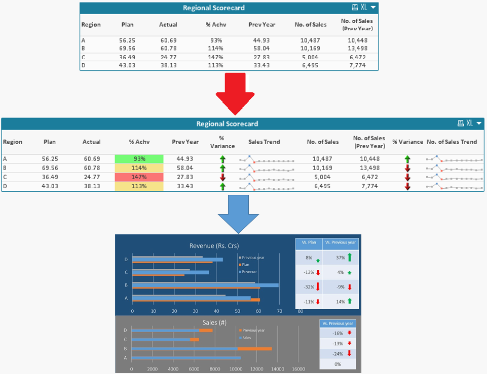
Lets start with a typical report (in form of table). This is the first representation in picture below. It shows multiple data points in non-meaningful manner. We will transform this report into the second representation with help of a few tools. Not only this, I’ll leave you with a thought on how you can apply these tools to make powerful dashboards (third representation).
If you come from an Excel background, these additions in reports are referred as conditional formatting and spark line chart (available in MS Excel 2010) option. While I tried searching internet for tutorials to create this in Qlikview, I could not find any. Hence I thought to contribute this article for the benefit of other analysts like me who are struggling with similar question.
We will discuss 3 visualization techniques for tabular information:
- Conditional formatting
- Image representation
- Mini Chart:
[stextbox id = “section”]Conditional formatting: [/stextbox]
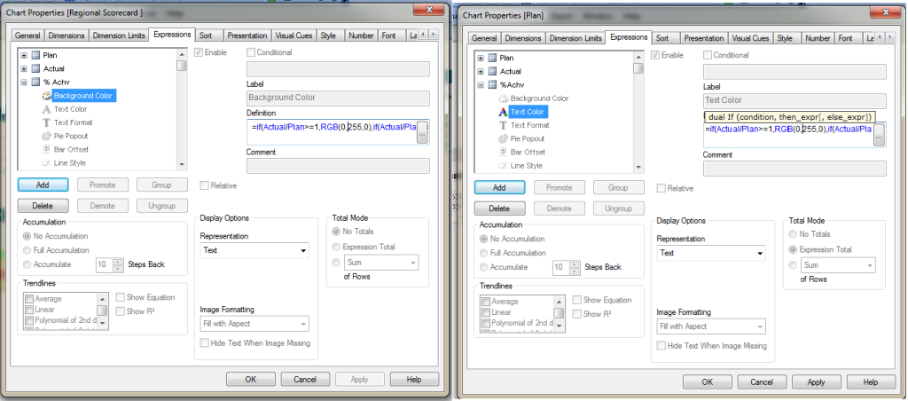
Conditional formatting refers to changes in formats of cells based upon specific criteria. Examples of conditional formatting would include displaying negative quantities in red, display background/ text color as green if Actual Vs Plan is more than 100%, number format etc.
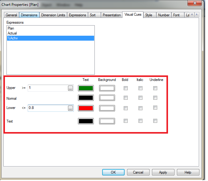
Conditional formatting can be performed in QlikView in two ways:A) Using Expression Attributes B) Visual Cues
Steps for Expression Attributes:
In expression tab of Pivot/ Straight table, click on (+) sign of expression attribute and select background color/ Text Color. Then move to definition section of background/ text color and write conditional statement based on your requirement.
Steps for Visual Cues :
Open Visual Cues tab of Pivot/ Straight table and click on expression. Apply conditional statement to set background color/ Text color.
[stextbox id = “section”]Image representation: [/stextbox]
This option is similar to icon representation (in conditional formatting) of excel. Examples of this include representing growth by up arrow and shrinkage by down aroox.
Steps for Image Representation:
Objective: Compare with last year sale, if it is above then up-arrow else down arrow.
Step 1: Create expression for Current Year and Previous year (Using Set Analysis)
Step 2: Generate expression for variance over previous year.
Step 3: Select Variance and and then in display options tab, select “Image”. Post that in expression window, write a conditional statement and select image name from image tab available in expression window (Refer below snapshot) based on your conditional statement like:
=if([Current Year]- [Prev Year]<0,'qmem://<bundled>/BuiltIn/arrow_s_r.png','qmem://<bundled>/BuiltIn/arrow_s_g.png')

[stextbox id = “section”]Mini Chart: [/stextbox]
Mini charts are the trend chart or bar chart in cell of a table over a period. It becomes more helpful when in one column we are showing the present value and in the next cell historical trend of that value. It will help the end user to quickly understand the trend. In excel 2010, this feature has been introduced as Sparklines chart. In Qlikview, this can be used in straight table only.
Steps for Mini chart:
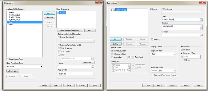
Objective: Represent regional monthly sales trend.
Step 1: Create a straight table with region as dimension and sum(sale) as expression.
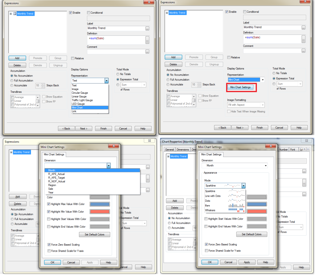
Step 2: Select expression and in display options tab select “Mini Chart”. Post that select mini chart setting, under mini chart setting, under dimension option select dimension for trend (Here select Month for Monthly trend) and we can select different mode of mini chart like sparkline, bars etc. then apply and OK.
Finally we have mini chart with regional Monthly trend but here monthly trend is not in ascending order of calender month. To execute same we need to sort the expression value in sort tab.
While we have improved the initial report a lot, it is still job half done! A good BI professional will spend more time thinking on following aspects of this report:
- How can I make this more visually appealing?
- How would this look on a mobile device?
- Can we simplify this or do we need all this information?
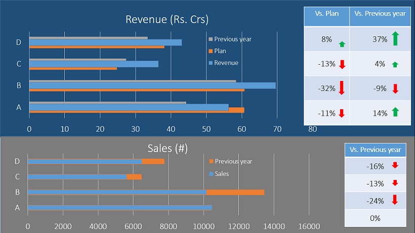
The end result of all this thinking should reflect in your application. Following is one such example of representing the same information in visually impressive manner:
You already have all the required knowledge to create something this powerful. All you need now is to apply this knowledge. Can you think of other powerful ways in which this information can be presented? Do you have some more examples like this to share?
Do let me know your thoughts through comments below.
