QlikTech recently announced a free version of its next-generation data visualization application – Qlik Sense. According to QlikTech, the product delivers a simple drag-and-drop interface for business users to rapidly create interactive visualizations, reports, and dashboards.
If you have been following QlikTech, Qlik Sense Desktop is the first commercially available release from the much talked about project QlikView.Next.
Initial excitement
I have been using Qlikview for about 2 years now. I have also used Tableau to a fair degree (though not as much as Qlikview). One of the benefits, Tableau had over Qlikview was a simple drag and drop interface, so that business users can create applications easily. So, when I heard that QlikTech has come out with a drag and drop visualization product, I got pretty excited! It could have been the best product available in the market. Did the excitement stay after I had tried the product? Let’s see.
Downloading and installing
I am on Windows 8.1, 64 bit architecture – downloading and Installing Qlik Sense was a breeze! ~120 MB download and installation happened smoothly. You can download the Desktop version here.
First impressions
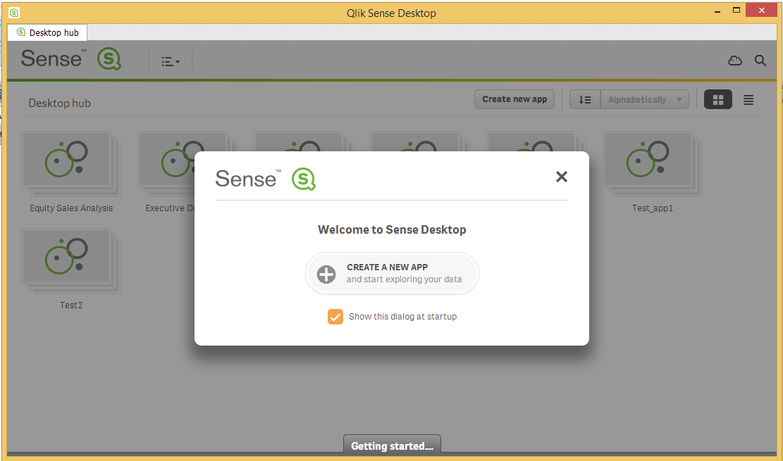
Qlik Sense impresses in its first impressions. You come across neat, crisp layouts with simple user interface. A new app can be created and opened easily. You can load data using either option – Quick Load for Excel files and Data Load editor to load data from Databases and web. Everything till now looks easy and fairly intuitive. The data load happens instantaneously for the small data sets I tried.
Once the data is imported, you can open and edit sheets exactly as described – drag and drop! There is a range of charts you can include. Surprisingly, the product doesn’t provide an option to create all the charts already present in Qlikview. For example, you cannot create a cross-table or Pivot table.
Getting the hands dirty – creating my first application
I thought, I will use Qlik Sense to visualize baby names dataset, available freely on the internet. This is a fairly simple dataset – with names of top 200 male and female children in the last decade. Getting total number of babies named in a bar chart by Gender was easy – all well till now!
Next, I thought, let me look at top 5 names from the list. This is when I started facing problems, I didn’t expect – I couldn’t find a simple way to limit the data to top 5 names by Gender. I am sure Qlik Sense would have some way to deal with this – but I couldn’t find a way to do it through simple drag and drop way.
Update: This can be done through Properties -> Dimensions -> Limitation -> Fixed Number (Thanks Rob for telling the trick).
Next, I thought to create a cross-table with Names on Vertical axis and Gender on Horizontal axis. While the simple table was showing the sum by Gender, I could not drag it on the horizontal axis.
After searching on Qlik Community, I saw that you can create some of these visualizations in Qlikview and then import them in Qlik Sense – but doing so kills the philosophy of the product – giving new users the power to create powerful visualizations.
Another thing, which I did not like in the interface was that you cannot edit and play around with the sheet in a single window. If you are editing a sheet – you cannot play around with the sheet in same window. You have to open the preview in a separate window. This kills the natural data discovery for me. May be I have got used to Qlikview and Tableau, but editing and previewing a sheet in different windows looks in contradiction with natural data discovery. Hopefully, QlikTech is thinking of merging them before the final edition is out later this year.
A few awesome features:
While I am disappointed by the data discovery process, there are a few awesome features Qlik Sense has come with.
Data Storytelling
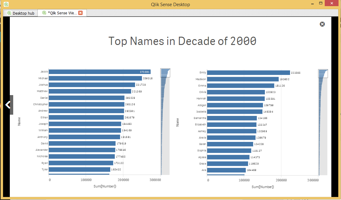
One of the best features was Data storytelling – you can create data based stories, while you are actually doing data discovery and play them as a slide show later on. Here are the 2 slides, I created with the small dataset I had:
Why is this feature a winner? Because it addresses my need. There have been instances, when I have created dashboards and then added stories in a sheet upfront through text boxes and use of bookmarks – but I have to admit, it was a mess. This storytelling feature makes life so much easier – you can now lead your discussions through the visualizations, without having to switch between PowerPoint and Qlikview.
Sharing visualizations:
This is a smart move from QlikTech. Sharing your work is a challenge in Qlikview, if you are working on a personal edition. Tableau, on the other hand, can help you share your work with other people – but you have to make it public. Qlik Sense just sits in the middle, I can share my work without any restriction to anyone who has Qlik Sense installed. How does it help?
I have faced this situation multiple times, I normally do data discovery in these visualization tools before starting on a new project. Also, now that I can do data based storytelling, I would like to share them at the end of projects as well. If the product takes off, Qlik Sense can become a standard way to tell data based stories – who would need Excel or PowerPoint any more!
Overall Verdict:
Sadly, it looks like, I ended up expecting more from the product that it actually delivers. However, this is a product, still in development (version 0.96), it would be interesting to see what comes out in September 2014. Also, the product is not too far from a very good product.
Here are the things I would want to see improvements upon:
- The product should ideally support all the visualizations present in Qlikview
- A more intuitive and connected data discovery – editing and exploring on the same tab.
Will I still use the tool in its current form?
Definitely, I am highly impressed by data story telling capabilities and ability to share visualizations freely. Overall, I think QlikTech is on the right track to raise the bar against Tableau. However, it needs to make a few changes before it is out with a killer product in the market.
Disclaimers / A few notes:
- All the views presented in the article are my independent views.
- QlikTech emphasizes on a new holistic search, which I have not tested yet. So, I can’t comment on how good or bad it is.
- There is a functionality for Maps based visualizations, which is in beta phase. It is not as good as Tableau Geo-intelligence. It requires you to input Latitude and Longitude in order to draw these visualizations.
What do you think about Qlik Sense? Have you downloaded and used it? If not, do you think, you will give it a try. Please share your review / feedback / experience with Qlik Sense through comments below.


I was easily able to limit the top 5 in a bar chart in the properties palette -> Dimensions -> Limitation -> Fixed Number -> Top -> 5
Thanks Rob for the suggestion. Not sure, how I missed it. Will update the review. Regards, Kunal
Nice overview. I totally agree about the crosstab/pivot table. That's a feature that MUST be implemented into Qlik Sense for it to truly take over my data discovery needs.
Nice review, i'm looking forward to trying it myself. Having used Tableau for four years now, but only limited Qlik I thought I'd jump in to mention a few points. In Tableau you definitely can share with other users who don't have licenses. Tableau Reader is free for consumers (think Adobe Reader), or you can license Tableau Server. Your referring to Tableau Public which as it's namesake implies is for sharing content on the web publicly and for free (bloggers, news outlets, etc). A few months ago Tableau released their v8.2 release which included a storytelling feature as well. Seems like this is a popular idea these days. Check it out! Chris
Thanks Chris for the suggestion. I had used 8.1, but missed 8.2. Will check it out. Regards, Kunal