The use of this article is best illustrated by a case study. So let’s dive straight in.
Business Situation:
Recently, we entered 2015 and before starting new projects and initiatives, every company would want to review their performance in last year. Let’s think about a sales oriented company ABC. They have branches across India and these branches fall under four regions. Now, the company wants to analyse profitability at branch level and compare region level performance. They are looking for answers like which regions are following good practices and can they be replicated in other regions.
So, you want to compare performance of a group of branches to come out with insights on relative performance like Region N branches are more profitable as compared to region S or 75% of Region W branches are more profitable than Region E.
Different ways of Visualization:
Now at individual level, we can easily evaluate profitability and visualize it with the help of Pivot Tables or Bar Chart to show top and bottom branches. But the question is, how would we visualize comparison of branch profitability at regional level? In other words, we can say how to compare distribution of branch profitability at regional level?
Let’s look at the available options to visualize this information. We can represent it through a pie chart, stacked column chart and also through table but all of these visualizations have some limitation.
- Pie and Stacked Column charts are capable of showing distribution within each region, but it is difficult (or next to impossible) to compare the distribution across regions
- If we use table, it will have lots of information to read. It would also not represent the information in easy to read / interpret format.
So, whenever we come across with such situations, we should look at Box Plot chart. It is the best way to visualize distribution of a group and compare across different levels. This chart is also known as Five Number Summary in statistics.
What is a Box Plot?
A box plot is a graphical method of displaying variation in a set of data. In most cases, a histogram provides a sufficient display; however, a box plot can provide additional detail while allowing multiple sets of data to be displayed in the same graph. As I have mentioned before, it is also known as Five Number Summary, reason being it uses five statistic metrics to represent it.

- Minimum – The minimum value in the data set
- First quartile – The value below which the lower 25% of the data exist
- Median – the value below which the lower 50% of the data exist
- Third quartile – the value below which the lower 75% of the data exist
- Maximum – the maximum value in the data set
There are some other types of Box plot also known as Modified Box Plot, those used to highlight outliers. In this article we will look at Box Plot only.
How to read a Box Plot?:
Let’s visualize the above discussed scenario using Box Plot and understand the insights gained from it.
Insights for the case study using Box Plot:
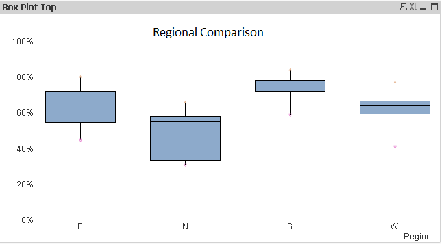
While looking at the above visualization, the following inferences can be generated:-
- We can identify distribution within each region like pie or stacked column chart.
- Almost 75% of South branches have better profitability as compared to Region N because Region S first quartile value is above maximum value of Region N.
- 50% of East branches have better profitability as compared to lower 75% of Region N branches as you can see that median of East is above third quartile of North.
- If you look at the distribution of South and North, you would observe that North branches are more spread as compared to South and West.
In similar way, we can generate various inferences compare to different levels of dimensions.
Method to Create A Box Plot in Qlikview:
Now that the use of Box plot is clear, it is dis-appointing that creating box plot is not a simple click away on QlikView. You need to use a combo chart with a few hacks to create a Box Plot. Let us look at them step by step:
Step 1:
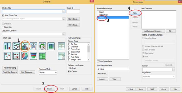
- Right Click on New Sheet and select Combo chart from New Sheet Object.
- Click Next and select dimension against which you want to compare distribution (Here, we have Region).
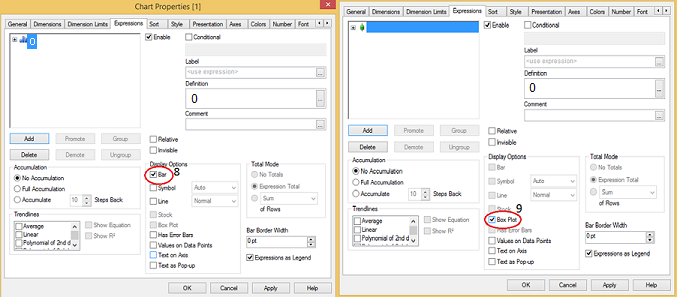
- Click Next and write expression as “=0” and click on OK, here we just need to enter something and will change it in coming steps.

- Deselect Bar in display options section and select Box Plot.
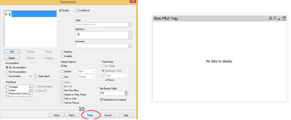
- Click on Finish, now we have a chart with No Data to Display, not to worry this is not a problem.
Step 2:
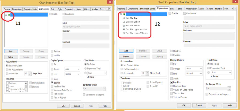
- Now right click on chart and go to expression tab and click on + sign to look at sub-expression. Here we have five sub-expressions. Box Plot Top, Box Plot Bottom, Box Plot Middle, Box Plot Upper Whisker and Box Plot Lower Whisker.
Step 3:
- Add two more expressions for maximum and minimum value to highlight and display them as symbol as shown in below snapshot.

- Go to presentation tab and deselect show legend option and format the axis as percentage after that finally click on apply and OK. Here we have Box Plot for distribution of profitability across branches at regional level.

End Notes:
In this article, precisely, we have looked at the methods to create Box Plot in Qlikview and how to generate insight while looking at box plot. Additionally, We have also looked at five statistical measures Minimum, Maximum, Median, First and third quartile and how these are useful to visualize the information effectively. Do you use Box Plots in your roles and visualizations? If yes, how do you create them? Do you think this tip is useful?
Do let me know your thoughts on using this chart in Qlikview.



Hello, I have read couple of Your articles which were very helpfull. Last one "A Comprehensive guide to Data Exploration" was really excellent!! I am quite new to data science and I am working with QlikView and have a little problem. I suppose that it is not so difficult as it seems to me but it stops me and I can't find any idea for solution. Could You maybe help me? Here is my question on Qlik website: https://community.qlik.com/thread/199364?sr=inbox I will be gratefull for any reply.