Foreword
Few months back, I got an opportunity to work on a QlikView project with an insurance company. The objective was to create a sales dashboard to bring out business insights, which could help improve sales of the company. Needless to say, the dashboard required use of multiple metrics and dimensions.
One of the common ways to include multiple dimensions in QlikView is to arrange them using list boxes. While this simple approach works, it ends up taking a lot of space in the dashboard. This leads to lesser area being available to represent your information. In this situation, how do you accomplish the task? Some challenges were associated with this project as discussed below:
- How can we keep all the dimensions as list boxes on the sheet without overpopulating the sheet?
- How do we represent the important business information prudently on the same sheet?
There are multiple ways to overcome these challenges. I’ll discuss two such methods in this article:
- By conditionally enabling objects like list boxes and chart objects using text object or command button.
- By creating container that would utilize utmost sheet space to represent various chart objects.
Let’s look at both the options in detail.
Method 1: Using Conditional Enable Option
Let’s look at the pre and post effect of this method on sheet space in QlikView (refer to the snapshot below):
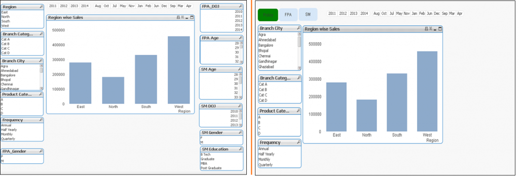 Did you notice the difference in the two snapshots? Snapshot at the right has more space available for effective data representation. How did we manage to get this extra space? How did we reduce the number of list boxes?
Well…this isn’t rocket science! If you observe closely, you will notice three new sub tabs appearing on top left corner: “Policy“, “FPA” and “SM“. We have simply categorized the dimensions in three categories and enabled them conditionally.
Let’s look at the steps to perform this:
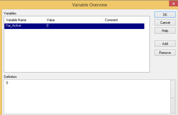
Step-1: Create a variable “Var_Active” and assign it the value 0 (zero). Go to Settings Menu –> Variable Overview. Then, click on ADD button to create new variable.
Step-2: Categorize the dimensions, identify the number of unique categories and create text boxes for each one. Here we have three different categories as Policy, FPA and SM represented by three text boxes.
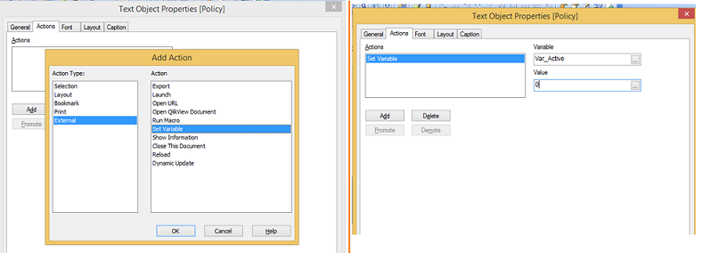
Step-3: Set ‘action’ for all three text boxes to assign the unique value to variable “Var_Active“. This is how you can do:
Select Text box –> Go to properties –> Actions Tab –> Click on ADD –> Select “External” action type and “Set Variable” as an action parameter. After that put the “Var_Active” in variable box and assign unique value for Value text box as 0.
Similar steps can be performed for FPA and SM text box also. Simply, assign unique value 1 for FPA and 2 for SM.
Step-4: Select list boxes individually and apply condition enable option using unique value of their respective category. Below are the steps:
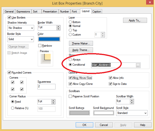
Select List box (Branch City) –> Go to Properties –> Layout Tab –> Option button on for “Conditional Show” –> Put expression “Var_Active=0“. Here, we have assigned value ‘0’ to ‘Var_Active’ as it belongs to category ‘Policy'(value for Var_Active is set at ‘0’).
Similarly, we can do it for other list boxes and assign respective variable value based on their category.
Step-5: This is an optional step. It enhances the visual effect. When we select a text box, it’s color changes, which indicates it as an active category. Below are the steps to do it:
Select text box (Policy) –> Go to properties window –> General tab –> Click on color button –>Select calculated option under base color bucket. Then, write the expression as: “=If(Var_Active=0,rgb(0,128,0),rgb(214,231,248))”.
This expression can be read as: If variable value is ‘0’ then color should go as green else default color. Similar expression can be written for other text boxes also. Only conditional argument will change as “Var_Active=1″ for FPA and “Var_Active=2″ for SM.
Now, we have sub tabs for list boxes seen as Policy, FPA and SM. It will show list boxes related to the active category. Similarly, we can use command button to perform this conditional enable or disable list boxes. This feature can also be used with chart objects.
QlikView has another object that can be used to show multiple chart objects at the same place where charts objects can be accessed using tabs known as CONTAINER.
Method 2: Creating Container in QlikView
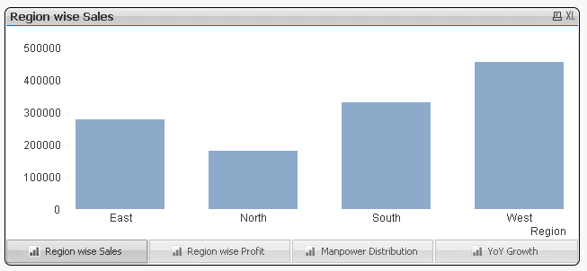
Container is a QlikView object which holds multiple charts in the same box as seen below. All charts will appear in the same window but only one chart will appear active at a given time and navigation to different charts can be done using the bottom tabs. Position of the tabs can be changed to top, left and right as well. Look at the snapshot below, here we have four different charts namely Region wise sales, Region wise Profit, Manpower Distribution, YoY Growth available in one container. Users can navigate through the charts by clicking on their respective tabs.
Method to create container is as easy as drag and drop objects. It is just a two steps process. Let’s take a look:
Select Container from ‘New Sheet Object List’ –> Select objects from list of available objects on ‘General’ tab. Now, we have Container with selected list of objects. We can change the position of tab or container type by selecting different option under ‘Presentation’ tab.
End Note
In this article, we have looked at two methods for effective use of sheet space:
- Conditionally enable or disable of objects using variables in QlikView.
- Use of container to hold multiple objects at the same place.
These two techniques are quite effective in utilizing your sheet space. Have you used these techniques ever while working on QlikView? Do yo know of any other hacks to utilize sheet space effectively? Share your valuable experience with our readers through comments below.
If you like what you just read & want to continue your analytics learning, subscribe to our emails, follow us on twitter or like our facebook page.


Good tricks! w.r.t first trick we need to overlap the list boxes else it would look weird, when it comes to container i would keep same container next to each other(duplicating)..so that two charts comparison is possible. In the above example if we duplicate the container, comparison of region wise sales with that of profit would be easy.
you have a good article on QlikView but where practical examples 20-30 lines?
Good tips indeed. Apart from conditional listboxes I also use multibox at times to save some real estate. However, I would go easy on containers if the charts have lot of calculations. Unlike other objects, containers force all the child objects do calculations when the container is activated (even though only one object is active at a time) - which is a pity. Also, if u put a container within another, your objects in IE Plugin access point may behave weird.