Introduction
Excel is a powerful and easy to use tool for data analysis. Often it is seen that the journey of a data analyst begins with MS Excel. When I started learning excel, I realized that it’s quite easy to learn. But, the difficult part is to understand “when to use which command”. Do you think the same ?
We organized an exclusive competition named Mini Excel Hack on 5th March 2016. It was a 3 hour competition. More than 1300 participants registered for this competition. It was organized to help people learn using excel while by working on business problems. Of course, winners were rewarded with amazon vouchers worth INR 18000 ($265).
The competition was challenging. After the competition ended, the participants were keen to know what did they miss. Hence, here’s a complete solution to the business problem shared in Mini Hack Excel. This tutorial will make you proficient at using excel to find business solutions.
Note: This solution requires using advanced excel methods, number crunching abilities and a logical approach. Prior knowledge of basic excel commands will be helpful. This solution has been provided by the client. There can be many solutions to this problem, this article reveals one of them.

What is the problem ?
In short, the problem was to help Mr. Assurenaut, CEO of AssureNext with a decision on “Robossurance”. Robossurance is a newly created channel which consists of smart machines. These machines are installed in different location to study the consumer purchase behaviour and recommends the best insurance plan.
Mr. Assurenaut expected their sales to shoot up with this innovative product. At first, good things did happen. But, didn’t sustain for long. Soon, their customer acquisition rate declined. Soon, the board members started raising questions on his decision.
Based on this situation, the challenge was to answer 3 questions:
- Forecast the month wise new business (premium in millions) in 2016 and 2017 ?
- How many new machines are required to achieve 170 crores of new business in 2017 ?
- Assuming, annual machines installed are capped at 6500 (due to budget constraints) and average annual premium at 55,000 (due to product portfolio). Now, what should be the expected business in 2016 & 2017?
Read the complete problem statement here. Download the data set here.
Let’s quickly understand the information provided in the data set:
- Sheet First
- Business Sourcing Month – Month in which company got new business (new policies)
- Machine Installed Month – Month in which new machines were installed.
- Total New Policies – New policies sold by machines
- Sheet Second
- Year – Year of business sourcing
- Value (Rs.) – Average Premium Per Year
- Sheet Third
- Month – Month of machine installation
- Machines Installed – Number of machines installed in a particular month
It’s important to understand every bit of information available in the given data. Refer to image of data from Sheet First below. The image shows business sourcing for 2 months. It explains that the machines installed in the month of January contributes to new policies of Jan, Feb and March. Similarly, machines installed in February contribute to new policies for Feb, March, April and so on.
I hope now you have understood how these variables are related.
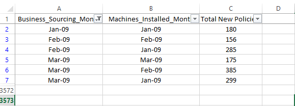
Table of Contents
- Exploring Hidden Trends
- Calculating Machine Productivity
- Extrapolation and Assumptions
- Summarizing Answers
Let’s start solving now!
1. Exploring Hidden Trends
Visualizing trend is important. Especially, when we have time series data. I’ll start with plotting simple line charts. Through this step, I’ll look to find answers for two questions:
- Is there any pattern in this data ?
- Can there be any seasonality effect in machines installed and sourcing new policies ?
For your convenience, the solution is available for download.
Let’s start with Sheet Third. The idea is to discover monthly and yearly pattern in machines installed at AssureNext.
Simply select the data in Sheet Third and press Alt + N + N (shortcut to activate line chart). Now, select a suitable line chart. It would look like this:
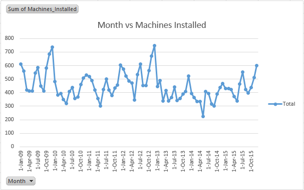
We can say that the company hasn’t remain consistent at installing new machines. The consistent up-down trend justifies that. However, the average trend of this plot does have a story to say. On an average, the plot shows increase in machines installed until Oct-09 and there after declines drastically. Then, it again rises and falls.
For better understanding, let’s create a monthly plot on this data. For this, we need to group data on monthly basis. This can be done easily.
Grouping of data can be done using sumif() function. But, why to opt for difficult method when we have a simpler way? Yes! we’ll use pivot tables. Pivot tables are immensely helpful in grouping and summarizing data. They offer absolute control on the output with its easy to use interface.
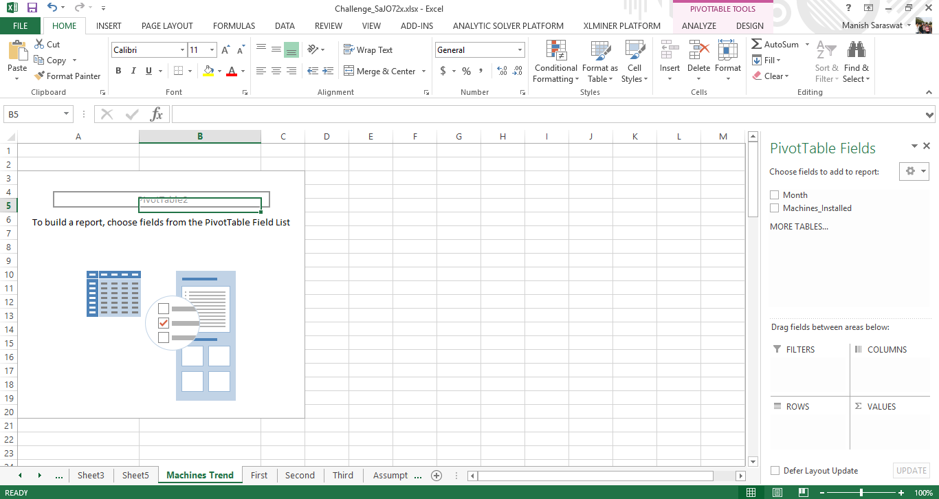
To activate pivot table, select the entire data in Sheet Third ( A shortcut for selecting entire data is, Press Ctrl + Home followed by Ctrl + A ). Then, press Alt + N + V. Press Enter. This will open a new sheet which looks like this:
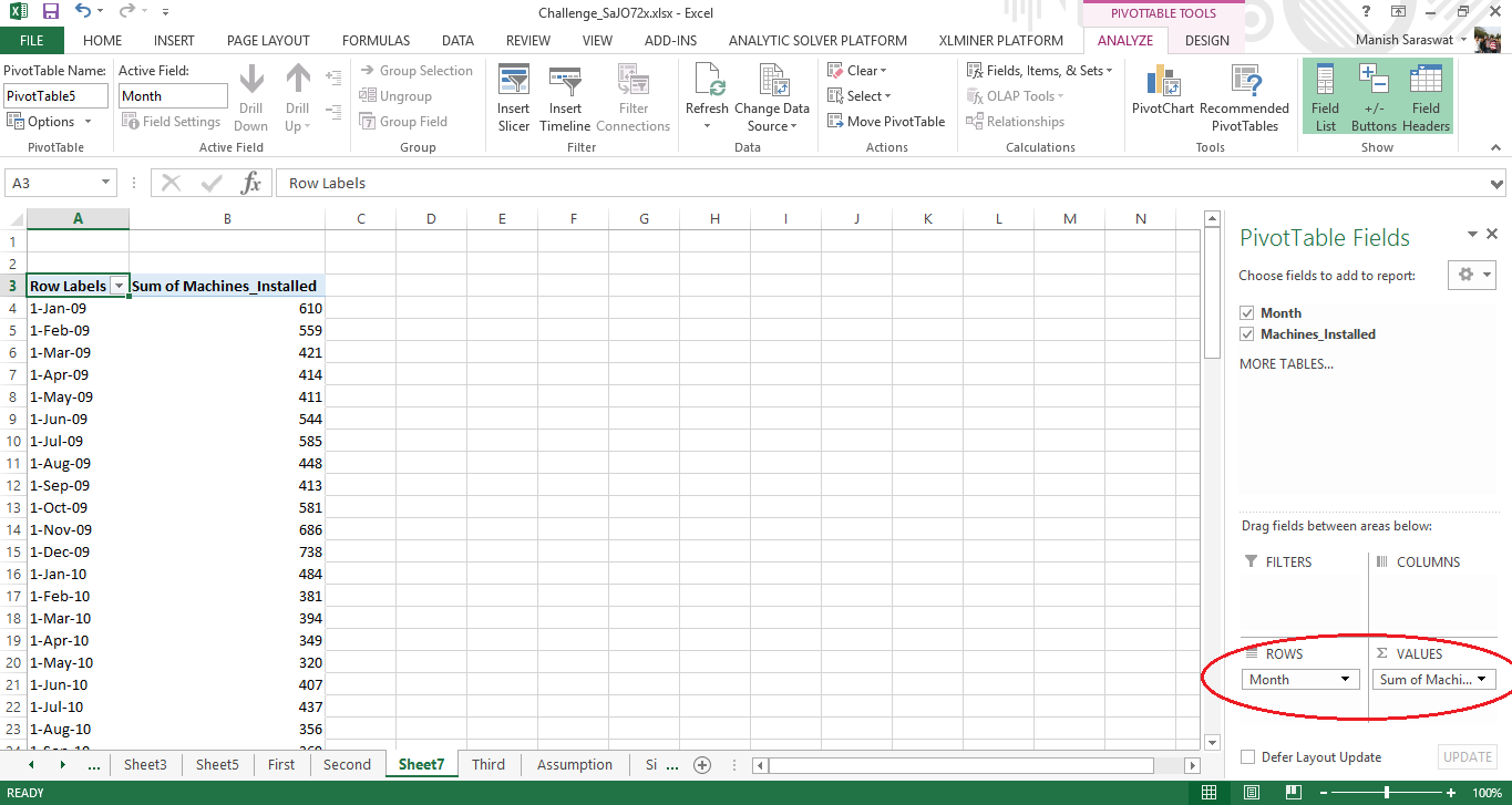
Now, we’ll plot a line chart which shows month wise trend of machines installed. For this, drag and drop the field “Month” in Rows and “Machines Installed” in Values (shown below).
Move to any cell in the pivot table. Right click on the cell and click Group. Then, select Months and Press OK (Shown below).
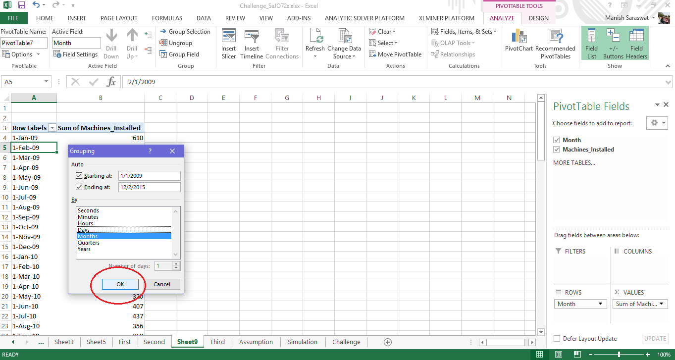
To plot the data, select any cell in the pivot table and press Alt+N+N. The plot appears like this.
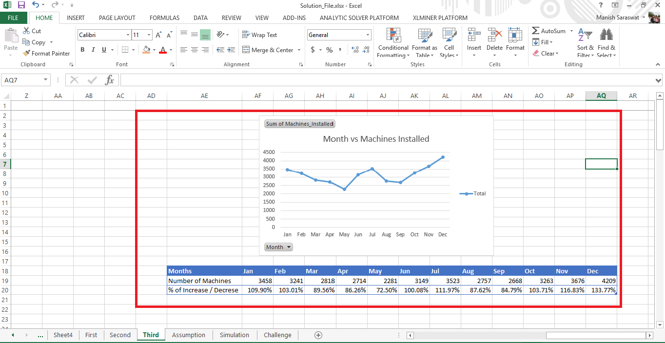
This is an important insight. This plot shows a seasonality pattern in number of machines installed per month. It also shows that towards the end of year, company used to install more machines as compared to first half of the year. This can be corroborated with the table shown. The trend is highest in December where, on an average, the %increase is 133% followed by November at 116%. In fact, there are many ways to analyze a graph.
Let’s dig deeper. Now, I’ll check yearly trend on this data.
To check yearly trend, move to any cell in pivot table. Right click on the cell and click Group. Then, select Years and Press OK (Shown below).
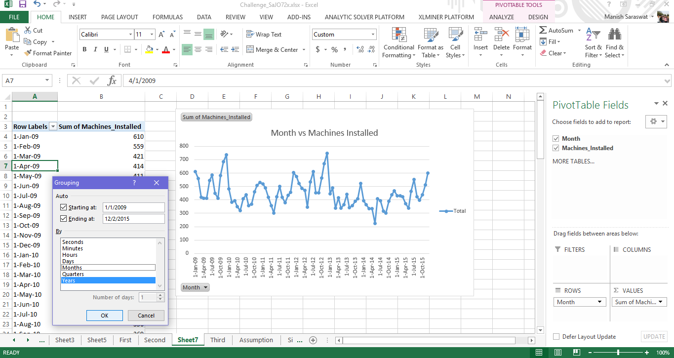
Press OK. And, the line chart will automatically convert into yearly chart.
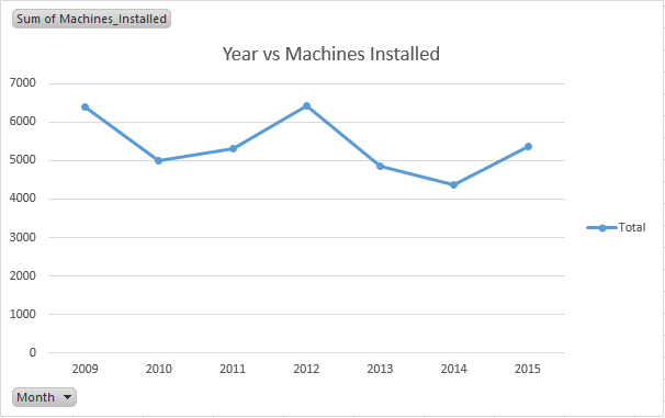
This chart also follows a pattern, but a different one than the previous. After every 2 years, there is a spike seen in number of machines installed. 2009 has a spike. Then, 2012 has a spike and so on. If we assume the same pace of growth, year 2016 and year 2017 should see a dip in the number of machines installed.
Now, let’s move to Sheet Second and explore the trend of average premium per year. This is simple. Just select the data and press Alt + N + N.
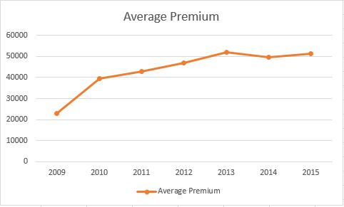
This plot shows a consistent rise in average premium from 2009 and gets nearly flatten as it reaches 2015. This can be due to various reasons. For example, there might have been a change in product distribution. Company might have started selling products which gives high premium.
This is becoming interesting now!
Move to Sheet First. This sheet has a lot to reveal. Let’s do it one by one. Select the entire data and create a pivot table (keyboard shortcut: Alt + N + V).
Let’s analyze month wise new policies. For this, simply drag Business_Sourcing_Month in Rows and Total New Policies in Values. It would appear like this:
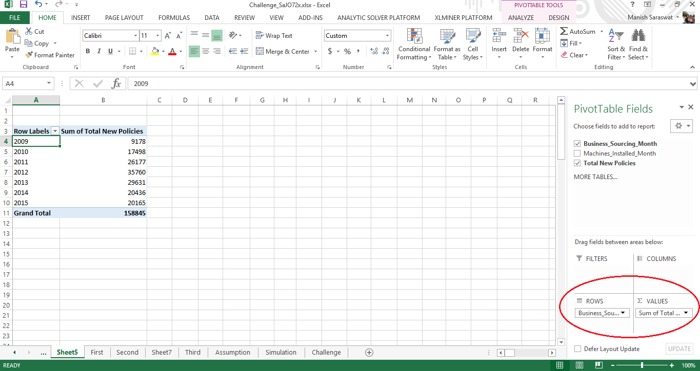
Now plot this data. Click anywhere in pivot table and press Alt+N+N. The plot looks like this:

This plot tells us that until 2012 there was a steep growth in number of new policies, but couldn’t sustain after that. Also, a sharp decline after 2012 in seen with nearly flattened in 2014-15. The sharp dip could be due to some prevailing regulatory changes or some internal strategy change.
Let’s analyze the same data on monthly basis. Simply follow the Group step as explained above. The plot comes out to be like this:
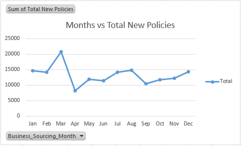
This plot is important. This trend will surely influence our predicted new policies for 2016-17. This plot shows that maximum new policies have come in month of March and declined drastically in April. Beyond April, new policies continue to sway until September from where an increase is visible. This trend actually complies with Indian insurance industry. March marks the end of financial year. Most of the people, seek to gain tax benefits by signing up for last minute insurance plans.
Till here, we’ve gained significant insights on underlying trends of this data. These gave us enough information for making assumptions in upcoming sections. Let’s move the next part.
2. Calculating Machine Productivity
Why am I calculating machine productivity ? I’m sure many of you would have this questions. In simple terms, the value of productivity will help me to understand how efficient a machine remains after operating for so many years. Productivity, is nothing but average number of policies sold by a machine. Productivity can be calculated using this formula:
Productivity = No. of Policies / No. of Machines
From here on, we’ll be entering the ultra-calculation mode. Make sure you keep up with me. We’ll be working intensely with pivot tables, look up functions and other useful formulas.
Let’s start by creating a pivot table. Move to Sheet First. With this table, we’ll get to know the number of new policies given business sourcing month and machines installed. Generally, policies are sold by humans and not machines. Humans have a tendency to become inefficient as they grow old. But, machines are more powerful and can work longer (with regular maintenance).
So, does the machines installed at AssureNext lose productivity over the years? We’ll soon come to know.
If you’ve been following this tutorial, I assume now you know how to make a pivot. Select the data. Then Press Alt + N + V. Once you get used to these shortcuts, you’ll realize excel is insanely fast working with shortcuts.
A new sheet will open. Activate the pivot by clicking on pivot box. Now drag the following columns as shown. You output should look like this:
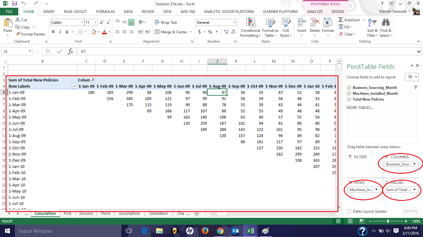
Table 1
This table tells us that total business generated in month of January (Business Sourcing Month) is only by machine installed in January. Total business generated in February is by machines installed in month of both January and February. Similarly, total business generated in the month of March is by machines installed in the month of January, February and March.
Then, why is there a diagonal pattern ? It’s simply because the machine (yet to be installed) in Feb 09 can’t bring business in Jan 09. Right ? In simple terms, one’s future efforts can’t bring results in present.
Since, all this effort is invested to calculate productivity, we’ll create a machine life cycle. Confused? Let’s understand this. The data is available for 84 months (7 years). I wish to analyze the performance of a machine over these 84 months. Finally, this will lead me to productivity. Also, this will help me understand if a machine loses productivity over a period of 84 months or not.
Let’s do it.
Create a table showing year & month (shown below). You can simply copy paste the pivot table from above and delete the data (shown below empty table). Row represents timeline of machines installed and columns represent timelines of new policies (new business ) arrived.
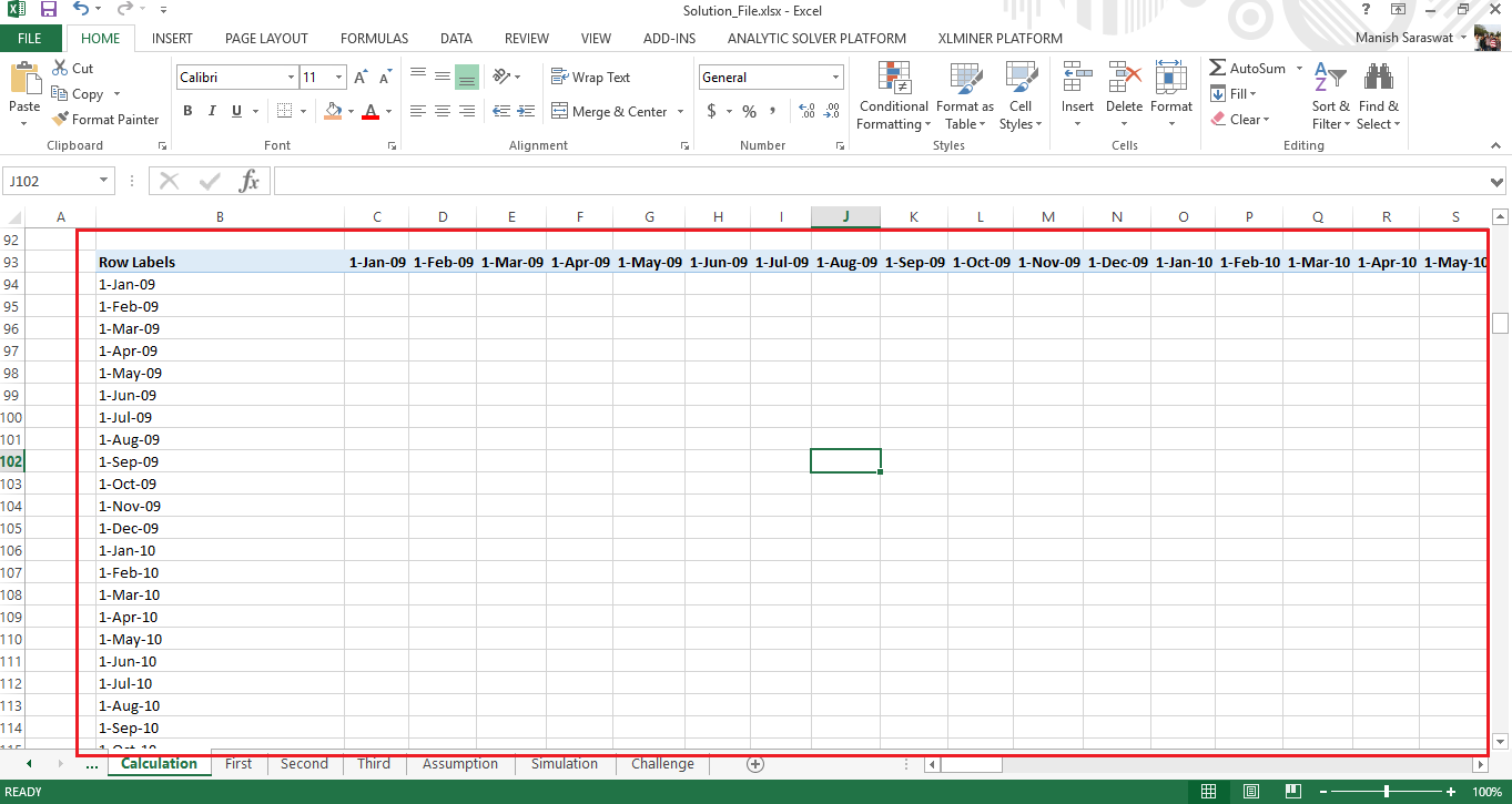 Table 2
Life cycle is nothing but, ” for how many months has a machine contributed to business, from the day it got installed.”
It means, if we can find the difference between the month of machine installation and month of new policies, we can get the number of months a particular machine has remain at work.
To find the difference between the month of machine installation and business sourcing, we’ll simply write a function at cell C94: =IFERROR(DATEDIF($B94,C$93,"M"),"")
Press Enter and copy the formula to all cells. This gives us the difference between months.
 Table 2
Now, I’m interested in finding out total number of new policies, the company got in month 0, 1, 2 and so on. This will help me in calculating new policies on yearly basis.
To accomplish this, I’ll use index & match function. Index match function is considered to be an alternative of vlookup function. But, works best we need to extract data from two different tables. Match function extracts the cell position, Index function extracts the data from that cell. You’ll understand it better when you do it. Let’s see.
Create a table with years in a column and month index in a row (shown below).
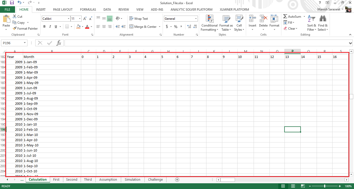 Table 3
Now, we’ll use this formula at cell C183: =IFERROR(INDEX($C$5:$CH$88,MATCH($B183,$B$5:$B$88,0),MATCH(C$182,$C94:$CH94,0)),"")
Copy this formula across the table and the final populated table looks like this:
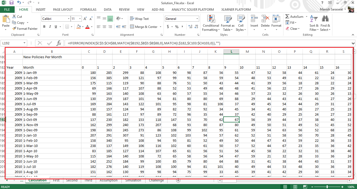 Table 3
I think this formula deserves a quick explanation. The index function selects the table 2. It’s row and column is specified by 2 match functions.
First match function, looks up the date adjacent to table selected for index column. The column match look for months (0, 1, 2..) in the Table 2. The combination of these functions provide the number of new policies sold in 0 month, 1st month, 2nd month and so on.
Now, let’s find out the 84 months timeline of machine installed. This will help us understand the number of months (out of 84) been completed by a machine. The older the machine, lesser will it contribute to total business.
We’ll start using Year column (shown in image above). You can extract year by using year() function.
Using vlookup() function, we can extract the machines installed from sheet third. You can use the function at cell C274: =VLOOKUP($B274,Third!$A$2:$B$85,2,0)
After the value is extracted, we can start building our time line. Such that, out of 84 months, machine installed will become zero only when a particular month has no business is done. A simple if statement does the trick.
If statement says. “if there are no policies (no business done) in a particular month, return zero else return the number of machines installed.”.
I’ve used the following formula:
=IF(C183="",0,C274)
The output table looks like this (screenshot of bottom half):
 Table 4
Till here, we have got enough monthly data. Let’s consolidate it on yearly basis.
Firstly, we’ll find the number of machines on yearly basis. This can be achieved using Table 4 and sumif() command. Using: =SUMIF($A$274:$A$357,$B362,C$274:C$357)
The output comes as:
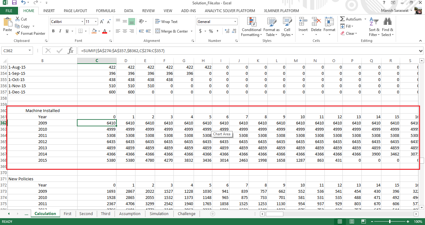 Table 5
Up til here, we’ve found out number of machines on yearly basis.
Let’s now find number of new policies on yearly basis. We are just one step away from productivity. To calculate number of new policies on yearly basis, follow the steps similar to previous calculation. For this calculation, you require Table 3 and sumif() command.
Using: =SUMIF($A$183:$A$266,$B373,C$183:C$266)
The output should look like:
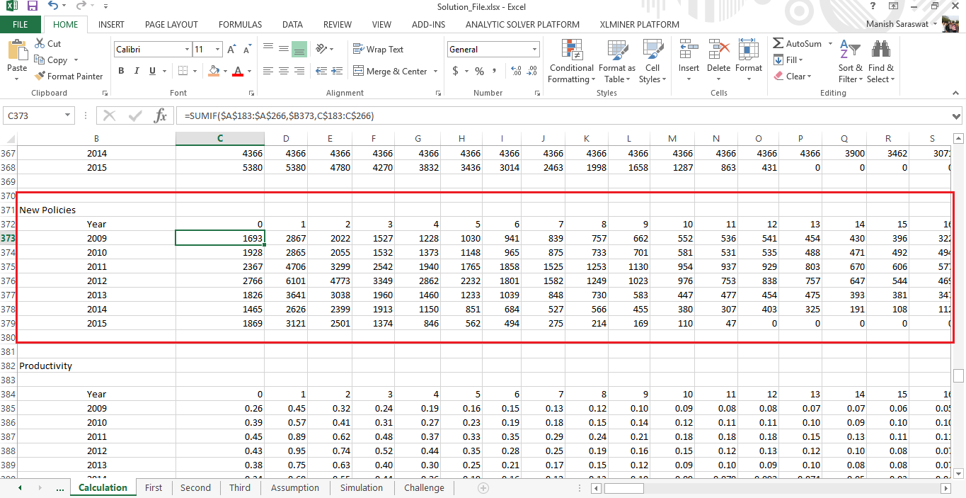 Table 6
Now, it’s time to calculate the productivity. I’ve already disclosed its formula in the beginning of this section. The productivity (Number of Policies / Number of Machines) turns out to be:
 Table 7
The highlighted rows in productivity table have been extrapolated, which we shall discuss in next section. Let’s plot the productivity and check the trend:
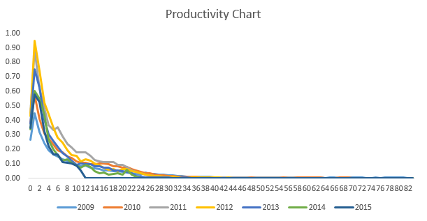
This suggests that machines work wonderfully good only in initial 2-4 months. After that, their productivity starts deteriorating. Thus, these machines do lose efficiency over time. And, this is a dominating trend as it continues to prevail all 7 years. Out of 7 years, year 2012 achieved the highest productivity and year 2009 achieved the lowest. In fact, we can also see that a machine remains productive at a maximum of 34 months from its inception.
Until here, we have seen enough trends and numbers to make robust assumptions. Let’s proceed to the next section.
3. Extrapolation and Assumptions
Extrapolation is an art of making estimations beyond the range of available data. This is similar to regression, hence regression can also be used for solving this problem.
Let understand the underlying assumptions taken for extrapolating the productivity. Precisely, I’ve taken the following assumptions:
- For year 2009, I’ve followed the growth pattern of previous 3 months.
- For year 2010 – 2015, I’ve followed the growth pattern of months from previous year where growth wasn’t zero.
- For 2016 – 2017, I’ve taken the same growth pattern as followed in 2015. However, you can also try adding a growth factor in productivity.

Till here, we have the calculated the productivity for 2016 & 2017. If we can estimate the machines installed for 2016 and 2017, then we can easily find total number of policies . We are getting closer to our answers now!
Create a new table of machines installed year wise. I’ve considered the seasonality effect as seen in the plots above. Seasonality effect is captured by %monthly machines available in the table (shown below). Rest is basic arithmetic calculation.
I’ve assumed no. of machine installed as 5000 per year based on average derived from Sheet Third.
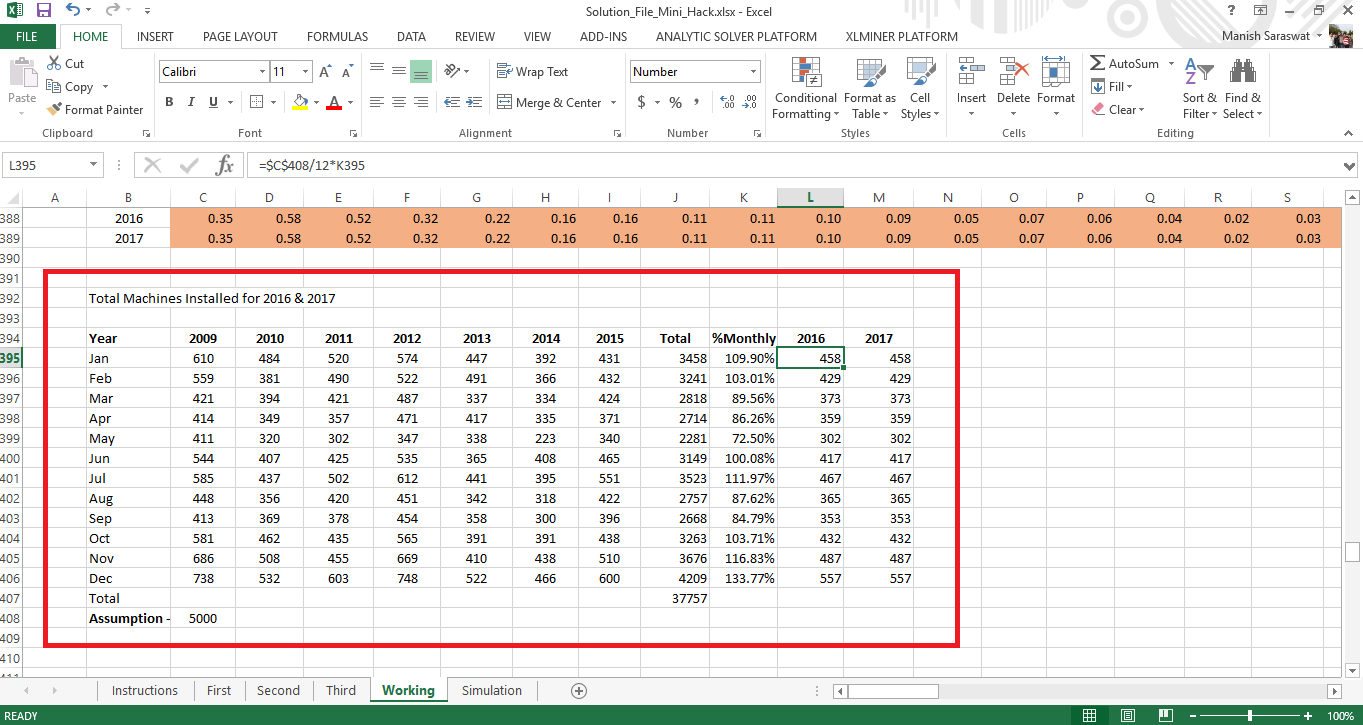
Following are the calculations:
- Calculated month wise machines installed.
- Calculated percentage of machines installed in a month. This captures the effect of seasonality.
- Using our assumption, estimated the expected number of machines in 2016 and 2017.
Hold tight, we are moving towards the last stage of this solution.
Amidst all calculation, the most important thing is productivity (on yearly basis). Yet, this productivity wouldn’t help much unless we map it with every machine installed. After this step, we’ll come to know the productivity of every machine from 2016 to 2017. Once we’ve calculated this figure, we are free to make all sorts of estimations.
The formula (image shown below) is quite long but easy. Let me explain it to you (Refer to the solution):
- Index function selects yearly productivity
- First match function matches the year of machine with year of productivity
- Second match functions returns the total time period (difference) from the year when it was installed.
- Finally, we multiply the resultant productivity with total number of machines
The output table looks like this:
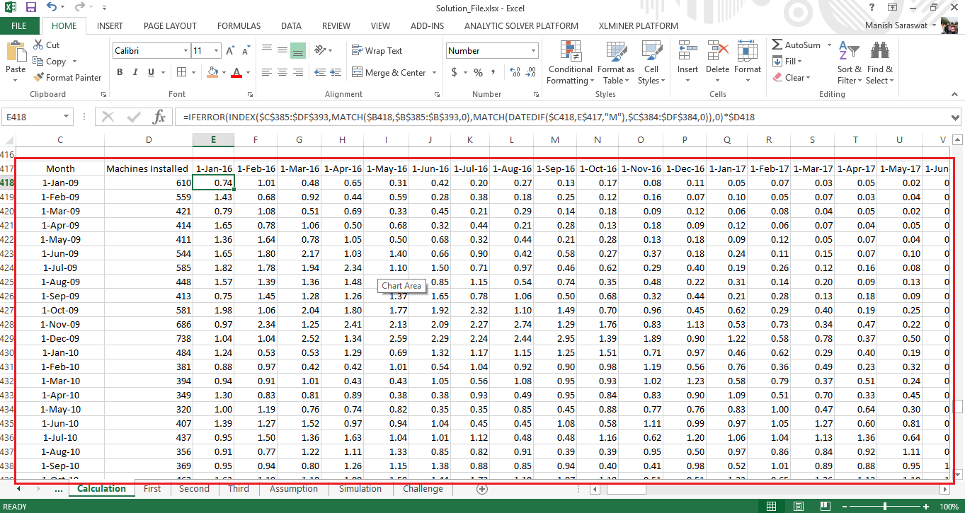
Finally, by doing columnwise addition, we will get number of policies the company will get from Jan 2016 to Dec 2017. Remember, the effect of seasonality on new policies ? The data of last 7 years showed that number of policies surged in the month of March followed by an almost sudden decline in April.
It will be good practice to add the effect of seasonality to our predictions. This will make our solution more relatistic. since the company will operate in the same market and industry in 2016 & 17.
Monthly Seasonality can be calculated from Sheet First (shown below). The formula is:
Monthly Seasonality = Sum of Total New Policies in a particular month / Average of all months

Now, we’ll add the effect of seasonality to number of policies obtained for 2016 and 2017. Let’s plot its trend and check if we did right.
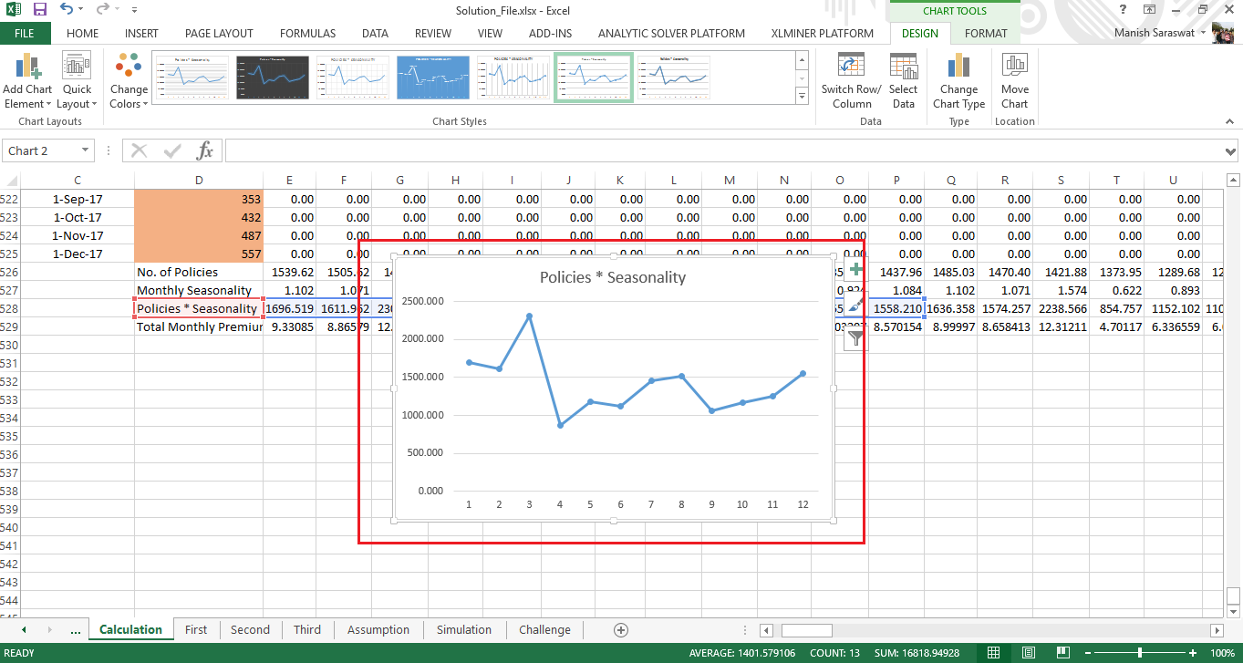
This shows we have very well captured the entrenched seasonality in number of policies. We are almost done solving for answers.
4. Summarizing Answers
Let’s see what do we have till now:
- We have number of policies from Jan 2016 to Dec 2017.
- We have applied the seasonality effect too.
- We have assumed that 5000 machines (per year) will be installed.
- We have forecasted average monthly premium for 2016 and 2017 using forecast function. (refer to Sheet Second). Taking the average of forecasted values, I’ve assumed the average yearly premium at INR 50000
Move to Simulation Sheet where you can find answers for all 3 questions.
Answer 1: Total Premium forecasts the month wise new business in 2016 and 2017
Answer 2: Using hit and trial method, make changes in number of machines installed. Try increasing it to 6000 or 7000. Simultaneously, note the change in Yearly Premium. Stop when you attain 170 crores yearly premium in 2017. This will be your answer. When I tried, I got 170 crores of business at 10800 machines.
Answer 3: Update the value for machines installed and Average premium policy as mentioned in the question. Simultaneously, you can achieve quarterly premium too.
End Notes
With this, I come to the end of this tutorial and solution on advanced excel. If you have thoroughly followed till here, you would realize winning this competition was more about structured thinking than excel skills. I believe, it’s easily to perform tasks rather than thinking at what to do? I’ve shared the link to download this complete solution above.
Several participants tried at this competition, some succeeded and the rest learnt and got insanely curious. I enjoyed writing this tutorial. This isn’t the only solution of this competition. As you can see, the assumptions are subjective. You too can make any practical assumption and get the answer. After all, business problems aren’t about right or wrong answer, but the thought process use behind it.
Did you find this solution helpful ? Did you understand the things you missed or couldn’t think of during competition? Share your suggestions / opinions in the comments section below.


I wouldn't use excel for this (or anything else) if you knocked me down and held a gun to my balls .... well ... maybe then. So, that said, I wasn't really interested in viewing the solution.
Hi Ron This sounds interesting! How would you have solved this problem ? It'll be great if you can share your thought.
Hello , I am unable to get the dataset for the mentioned Hackathon , Please help in providing me the dataset.
Hi Swati You can download the data set now.
Dataset not available for download. Please provide
Hi Ved Data set is available for download now.