Introduction
Sometimes numbers do have a beautiful story to share!
Visualizing data is crucial in today’s world. Without powerful visualizations, it is almost impossible to create and narrate data based stories on humongous data. These stories help us build strategies and make intelligent business decisions.
R is well supported to make data visualization easier and fun. It’s already equipped with base functions and the external support rendered by packages makes it just awesome tool to work. Thanks to our community members.
Among all packages, ggplot package has become a synonym for data visualization in R. A package which allows you to get more control on charts, graphs and maps, is also known to create breathtaking graphics. I would like to sincerely thank Hadley Wickam, the father of ggplot2 package for this accomplishment.
In this article, I’ve answered some of the most commonly asked questions by R users while working with ggplot package. So, next time when you need to visualize data, you can pick any of the shown below.
Note: This article is best suited for beginners and intermediate R users having basic knowledge of data visualization. You can refer to this complete data visualization guide.
Table of Contents
- How to create a Scatter Plot ?
- How to create a Histogram ?
- How to create a Bar Chart?
- How to create a Stacked Bar Chart ?
- How to create a Box Plot?
- How to create an Area Chart ?
- How to create a Heat Map ?
- How to create a Correlogram ?
- How to plot a geographical map ?
- How to plot the entire data in a single command ?
Note: ICC T20 Cricket WorldCup is starting from 8th March 2016. Which countries are participating this year ? We’ll see to it through map visualization.
Getting started
Let’s quickly get over with pre-visualization rituals.
Data Set: In this article, I have used the data set from Big Mart Sales Prediction. Data is available for download here.
> path <- ".../desktop/Data/Big Mart"
> setwd(path)
#Load Data
> train <- read.csv("Train_UWu5bXk.csv")
#Look at data
> str(train)
#check variable classes
> sapply(train, class)
Item_Identifier Item_Weight
"factor" "numeric"
Item_Fat_Content Item_Visibility
"factor" "numeric"
Item_Type Item_MRP
"factor" "numeric"
Outlet_Identifier Outlet_Establishment_Year
"factor" "integer"
Outlet_Size Outlet_Location_Type
"factor" "factor"
Outlet_Type Item_Outlet_Sales
"factor" "numeric"
#Install and Load Library
> install.packages("ggplot2")
> library(ggplot2)
We are good to start now. Do keep a check on variable classes. This will help you to decide the type of plot best suited for them.
Q1. How to create a Scatter Plot ?
When to use: Scatter Plot is used when want to see the relationship between two continuous variables.
> ggplot(train, aes(Item_Visibility, Item_MRP)) + geom_point() +
scale_x_continuous("Item Visibility", breaks = seq(0,0.35,0.05))+
scale_y_continuous("Item MRP", breaks = seq(0,270,by = 30))+
theme_bw()
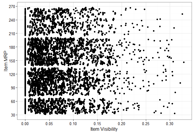
Let’s quickly understand the structure of ggplot code:
- aes – refers to aesthetics. It includes variable names used to create plots.
- geom_point – ggplot offers many ‘geoms’ which are used to represent data. Since, we are interested here in scatter plot, we used geom_points.
- scale_x_continuous – x variable is continuous. This parameter is used to alter information represented at x axis.
- scale_y_continuous – It performs the same task as scale_x_continuous but for y axis.
- theme_bw – It refers to setting the background of plots. I used the grid version.
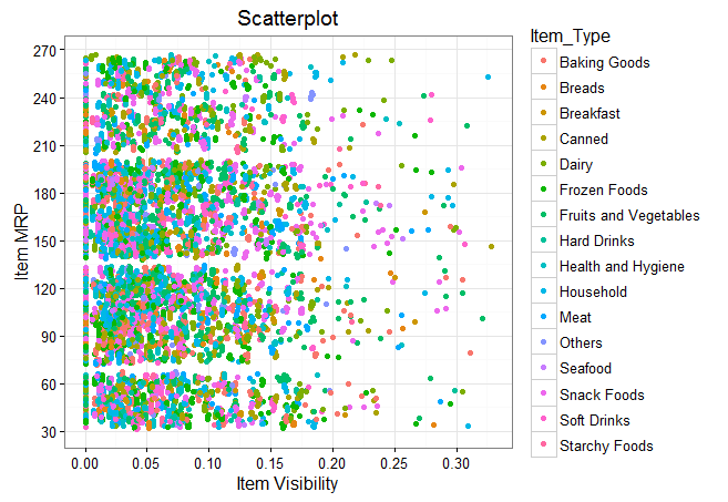
We can also add a categorical variable (Item_Type) in the current plot. Do check the data to get familiar with the available in the data set.
> ggplot(train, aes(Item_Visibility, Item_MRP)) + geom_point(aes(color = Item_Type)) +
scale_x_continuous("Item Visibility", breaks = seq(0,0.35,0.05))+
scale_y_continuous("Item MRP", breaks = seq(0,270,by = 30))+
theme_bw() + labs(title="Scatterplot")
We can even make it better by creating separate scatter plot for separate Item_Type.
> ggplot(train, aes(Item_Visibility, Item_MRP)) + geom_point(aes(color = Item_Type)) +
scale_x_continuous("Item Visibility", breaks = seq(0,0.35,0.05))+
scale_y_continuous("Item MRP", breaks = seq(0,270,by = 30))+
theme_bw() + labs(title="Scatterplot") + facet_wrap( ~ Item_Type)
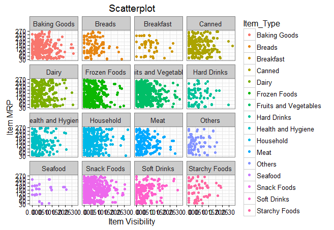
At your end, you need to ‘zoom’ this graph for a clear view. The zoomed version looks like this. In this case, the parameter facet_wrap does the trick. It wraps facet in rectangular layout.
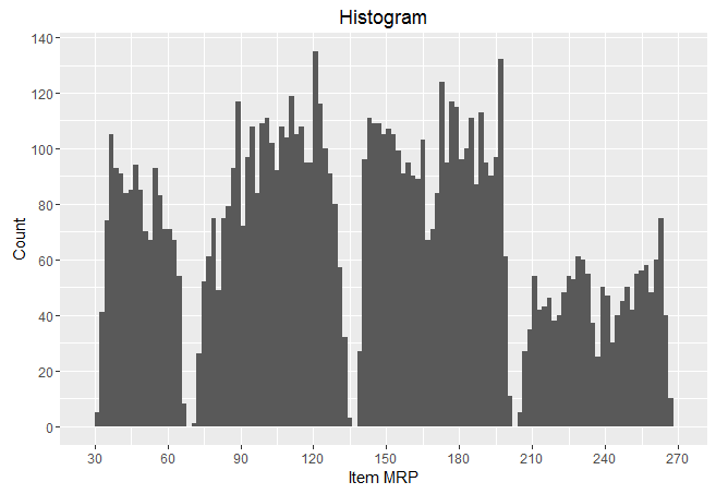
Q2 . How to create a Histogram ?
When to use: Histogram is used when we want to plot one continuous variable.
> ggplot(train, aes(Item_MRP)) + geom_histogram(binwidth = 2)+
scale_x_continuous("Item MRP", breaks = seq(0,270,by = 30))+
                scale_y_continuous("Count", breaks = seq(0,200,by = 20))+

labs(title = "Histogram")
Q3. How to create a Bar Chart ?
#Bar chart with one variable

> ggplot(train, aes(Outlet_Establishment_Year)) + geom_bar(fill = "red")+theme_bw()+
scale_x_continuous("Establishment Year", breaks = seq(1985,2010)) +
scale_y_continuous("Count", breaks = seq(0,1500,150)) +
coord_flip()+ labs(title = "Bar Chart") + theme_gray()
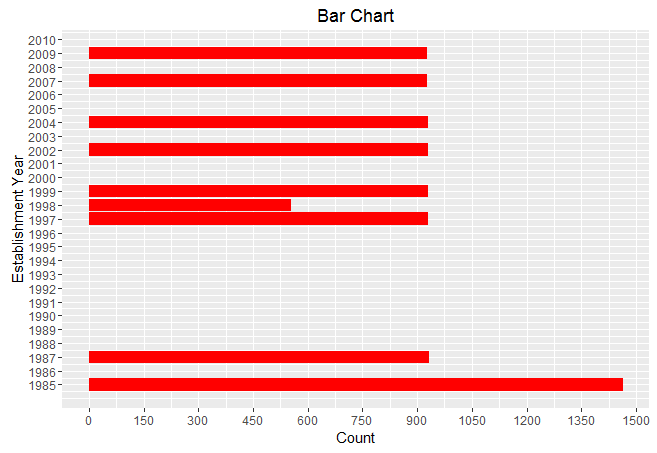
You can remove coord_flip() parameter to get this bar chart vertically. As you can see, I tried a different theme for this plot. You are always welcome to become experimental while using ggplot package.
#Bar Chart with 2 variables
> ggplot(train, aes(Item_Type, Item_Weight)) + geom_bar(stat = "identity", fill = "darkblue") + scale_x_discrete("Outlet Type")
+ scale_y_continuous("Item Weight", breaks = seq(0,15000, by = 500))
+ theme(axis.text.x = element_text(angle = 90, vjust = 0.5))
+ labs(title = "Bar Chart")
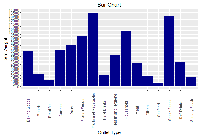
You can zoom this graph at your end for a better visual. In this graph, I used categorical vs continuous variable on x and y axis respectively.
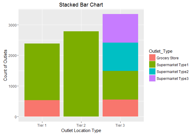
Q4. How to create a Stack Bar Chart ?
When to use: It’s an advanced version of a Bar Chart. It used when we wish to visualize a combination of categorical variables.
> ggplot(train, aes(Outlet_Location_Type, fill = Outlet_Type)) + geom_bar()+
labs(title = "Stacked Bar Chart", x = "Outlet Location Type", y = "Count of Outlets")
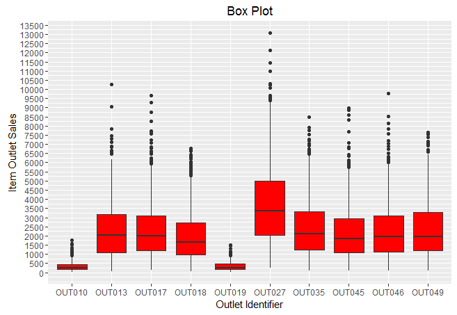
Q5. How to create a Box Plot ?
> ggplot(train, aes(Outlet_Identifier, Item_Outlet_Sales)) + geom_boxplot(fill = "red")+
scale_y_continuous("Item Outlet Sales", breaks= seq(0,15000, by=500))+
labs(title = "Box Plot", x = "Outlet Identifier")
The black points are outliers. Outlier detection and removal is an essential step of successful data exploration. Learn more about Outlier Detection from this guide.
Q6. How to create an Area Chart ?
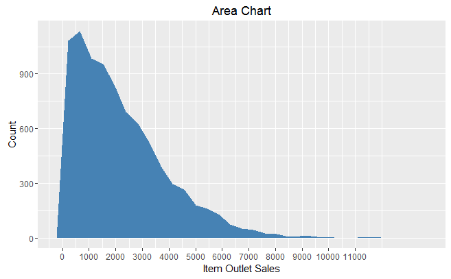
When to use: Area chart is used to show continuity across a variable or data set. It’s quite similar to a line chart. It is commonly used for time series plots. Alternatively, it is used to plot continuous variables and analyze the underlying trends.
> ggplot(train, aes(Item_Outlet_Sales)) + geom_area(stat = "bin", bins = 30, fill = "steelblue") +
scale_x_continuous(breaks = seq(0,11000,1000))+
labs(title = "Area Chart", x = "Item Outlet Sales", y = "Count")
Q7. How to create a heat map ?
When to use: Heat Map uses intensity (density) of colors to display relationship between two or three or many variables in a two dimensional image.
> ggplot(train, aes(Outlet_Identifier, Item_Type))+
geom_raster(aes(fill = Item_MRP))+
labs(title ="Heat Map", x = "Outlet Identifier", y = "Item Type")+
scale_fill_continuous(name = "Item MRP")
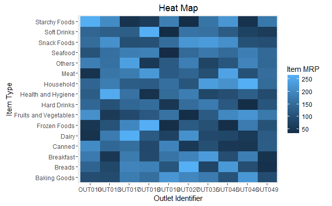
You can zoom this plot at your end for a better visual. The dark portion indicates Item MRP is close 50. The brighter portion indicates Item MRP is close to 250.
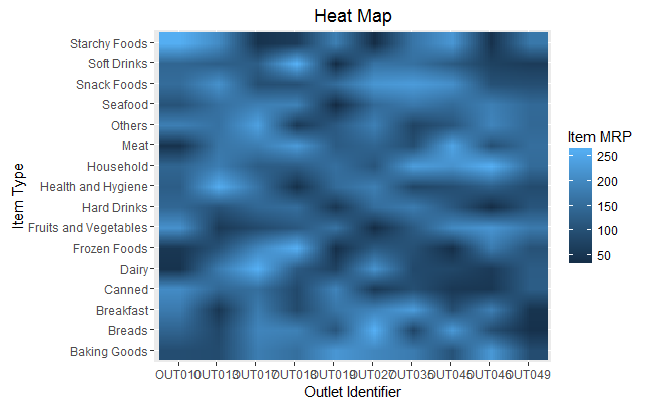
Heat Maps can also produce visuals used for image recognition. This can be done by adding a parameter as interpolate = TRUE .
> ggplot(train, aes(Outlet_Identifier, Item_Type))+
geom_raster(aes(fill = Item_MRP), interpolate = T)+
labs(title ="Heat Map", x = "Outlet Identifier", y = "Item Type")+
scale_fill_continuous(name = "Item MRP")
Q8. How to create a Correlogram ?
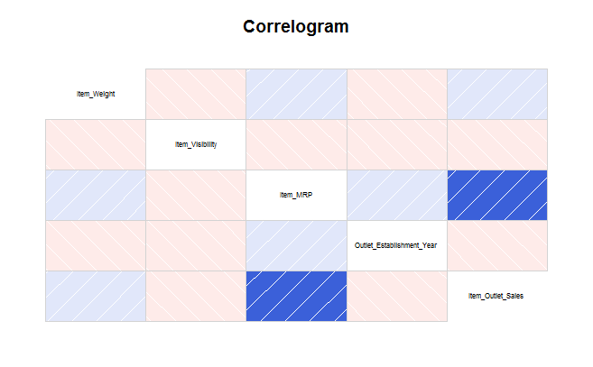
When to use: Correlogram is used to test the level of correlation among the variable available in the data set.
To create a correlogram, I’ve used corrgram package instead of ggplot. I realized creating correlogram using its dedicated package is much easier than using ggplot.
> install.packages("corrgram")
> library(corrgram)
> corrgram(train, order=NULL,
panel=panel.shade, text.panel=panel.txt,
main="Correlogram")
It’s quite easy to interpret too. Darker the color, higher the correlation between variables. Blue indicates positive correlation. Red indicates negative correlation. Color intensity indicates the magnitude of correlation.
Q9. How to plot a geographical map ?
When to use: Maps are commonly used to visualize certain factor been influenced geographically. It’s easy to plot maps in R.
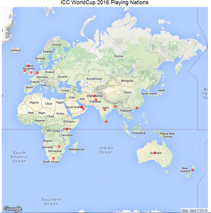
Let’s plot the countries participating in ICC World T20 World Cup 2016. After I did my research, I found there are 16 countries participating this year. Let’s see where these countries are located on the world map.
We’ll use ggmaps package along with ggplot for creating these maps.
#List of Countries
> ICC_WC_T20 <- c("Australia",
"WestIndies",
"India",
"SriLanka",
"Pakistan",
"Bangladesh",
"NewZealand",
"SouthAfrica",
"England",
"HongKong",
"Zimbabwe",
"Afghanistan",
"Scotland",
"Netherlands",
"Ireland",
"Oman")
#extract geo location of these countries
> countries <- geocode(ICC_WC_T20)
#map longitude and latitude in separate variables
> nation.x <- countries$lon
> nation.y <- countries$lat
#using ggplot
#plot the world map
> mapWorld <- borders("world", colour="grey", fill="lightblue")
#add data points to the world map
> ggplot() + mapWorld + geom_point(aes(x=visit.x, y=visit.y) ,color="red", size=3)
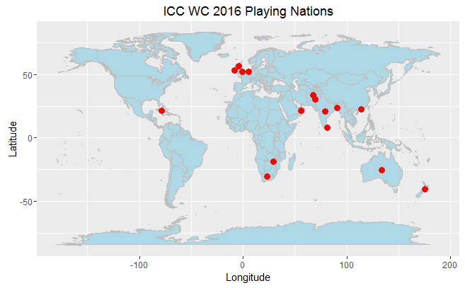
It was easy. Isn’t it? We can still embellish this map. If you are not familiar with world map, it would be difficult for you to identify countries name. Let’s use functions from ggmap() package and redesign this map.
#using ggmaps extract world map
> world_map <- qmap("World", zoom = 2)
#see how map looks
> world_map
#plot the data on map
> world_map + geom_point(aes(x=nation.x, y=nation.y),
               data = countries, alpha = 0.5,

size = 3, color = "red")
This looks better. ggmap() package is linked with google map and hence extracts location detail directly. But I have one regret. If you carefully watch this map, you’ll realize this map is incomplete. West Indies isn’t shown on this map. I tried extracting data from multiple source, but couldn’t succeed in this matter. If any of you happens to solve this riddle, do share your solution.
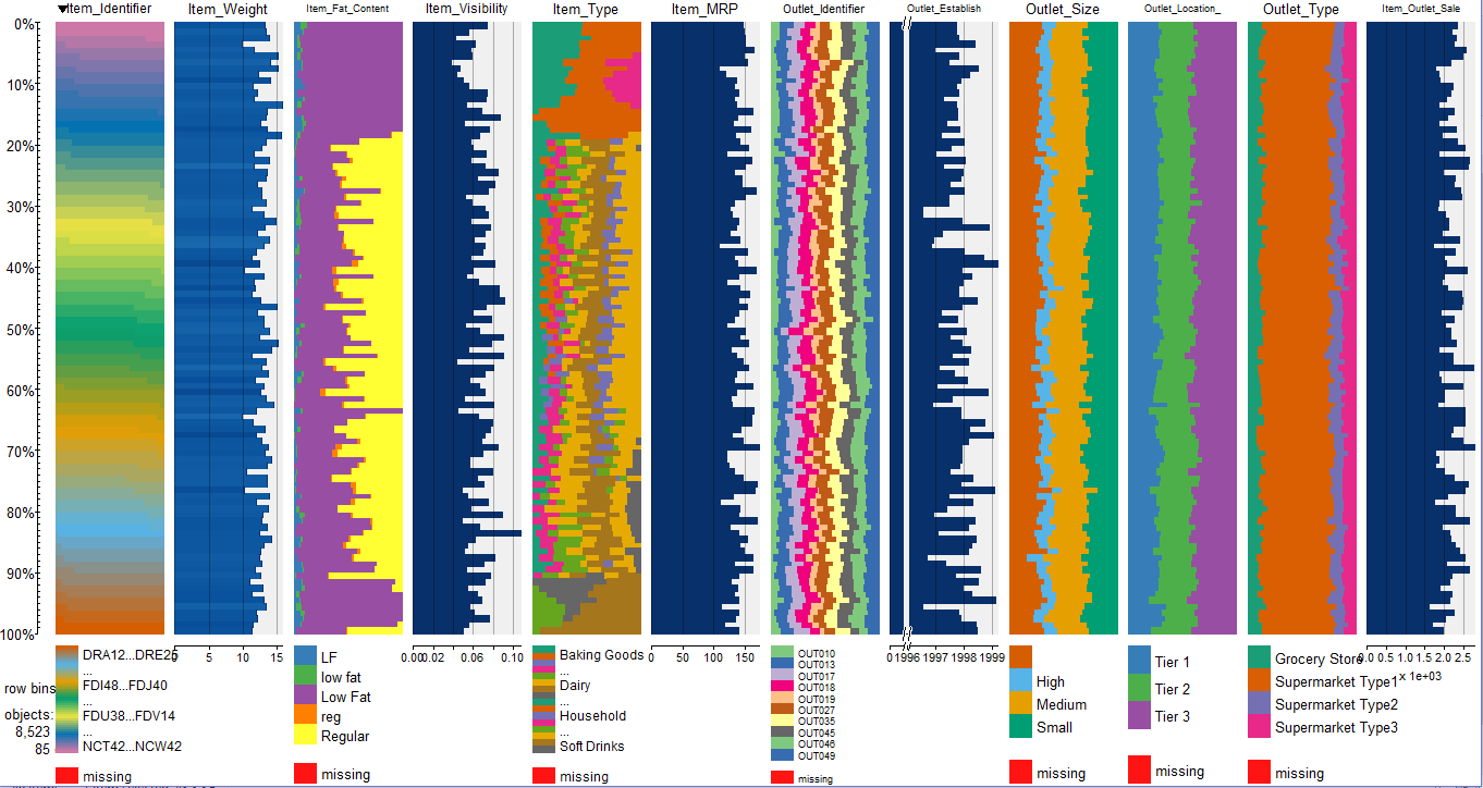
Q10. How to plot a data set in single command ?
You can use tabplot() package to accomplish this feat.
#plot data
> install.packages("tabplot")
> library(tabplot)
> tableplot(train)
End Notes
This end of a colorful journey! I hope it enables people to starts several new colorful journeys. You might have noticed that using ggplot2 is a lot easier. Most of the codes are repetitive, hence you will quickly get used to it. You need to be careful about picking up “geoms” for the charts, because that’s the main design element. When I started learning this package, I asked all these questions at different point in time. Hence, the idea to line up all questions in one article came to me.
In this article, I discussed 9 types of different visualizations which can be plotted using ggplot package. These visualizations are best used depending on the type of variable supplied to them. Hence, you must be careful about the type of variable you wish to plot.
Did you find this article helpful ? Do you use any other package for visualization ? Do share your suggestions / opinions in the comments below.


ggplot2 is a nice package, but it sometimes is daunting to beginners, Thank you for this post, it also would be nice if you blog a tutorial on using ggplot2, thanks
Hi Samuel ggplot2 isn't daunting at all. I felt the same when I started. Once you start creating plots, you'll discover a pattern in ggplot codes. You'll get used to them, once you start spending more time with them. Run these codes at your end. Change the parameters value I used to see which part of code affects which part of plot. This way you will learn faster. All the Best !
Thanks for the post. It is very helpful for beginners like me. Once you said that you will post some insight for linear regression e.g., use log for Item_Outlet_Sales. I am eagerly waiting for that post.
Hi Ambuj Thanks for appreciating. I've written down that topic in my to-do list. You'll surely see it soon.
Good article to start ggplot2. It eases out all the difficulties one has when starting plotting in R.