Most of us would have heard about the new buzz in the market i.e. Cryptocurrency. Many of us would have invested in their coins too. But is investing money in such a volatile currency safe? How can we make sure that investing in these coins now would surely generate a healthy profit in the future? We can’t be sure but we can surely generate an approximate value based on the previous prices. Time series modeling, including various python forecasting models, is one way to predict them.
Besides cryptocurrencies, time series forecasting plays a crucial role in various areas, including forecasting sales, call volume in call centers, solar activity, ocean tides, stock market behavior, and more.
Assume the Manager of a hotel wants to predict how many visitors should he expect next year to accordingly adjust the hotel’s inventories and make a reasonable guess of the hotel’s revenue. Based on the data from previous years, months, or days, they can use time series forecasting to estimate the number of visitors. Forecasted value of visitors will help the hotel to manage the resources and plan things accordingly.

Let’s get started!
Table of contents
- Understanding the Problem Statement and Dataset
- Installing library(statsmodels)
- Method 1: Naive Forecast Python
- Method 2: Simple Average
- Method 3: Moving Average Time Series Forecasting Python
- Method 4: Simple Exponential Smoothing
- Method 5: Holt’s Linear Trend method
- Method 6: Holt-Winters Method
- Method 7: ARIMA
- Conclusion
Understanding the Problem Statement and Dataset
We are provided with a Time Series problem involving prediction of number of commuters of JetRail, a new high speed rail service by Unicorn Investors. We are provided with 2 years of data(Aug 2012-Sept 2014) and using this data we have to forecast the number of commuters for next 7 months.
Let’s start working on the dataset downloaded from the above link. In this article, I’m working with train dataset only.
import pandas as pd
import numpy as np
import matplotlib.pyplot as plt
#Importing data
df = pd.read_csv('train.csv')
#Printing head
df.head()

#Printing tail
df.tail()
Python Code:
import pandas as pd
import numpy as np
import matplotlib.pyplot as plt
#Importing data
df = pd.read_csv('train_series.csv')
#Printing head
print(df.head())
print(df.tail())
The print statements above show that we have 2 years of hourly data (2012-2014) on the number of commuters traveling, and we need to estimate the number of commuters for the future.
In this article, I’m subsetting and aggregating dataset at daily basis to explain the different methods.
- Subsetting the dataset from (August 2012 – Dec 2013)
- Creating train and test file for modeling. The first 14 months (August 2012 – October 2013) serve as training data, while the next 2 months (November 2013 – December 2013) serve as testing data.
- Aggregating the dataset at daily basis
#Subsetting the dataset
#Index 11856 marks the end of year 2013
df = pd.read_csv('train.csv', nrows = 11856)

#Creating train and test set
#Index 10392 marks the end of October 2013
train=df[0:10392]
test=df[10392:]

#Aggregating the dataset at daily level
df.Timestamp = pd.to_datetime(df.Datetime,format='%d-%m-%Y %H:%M')
df.index = df.Timestamp
df = df.resample('D').mean()
train.Timestamp = pd.to_datetime(train.Datetime,format='%d-%m-%Y %H:%M')
train.index = train.Timestamp
train = train.resample('D').mean()
test.Timestamp = pd.to_datetime(test.Datetime,format='%d-%m-%Y %H:%M')
test.index = test.Timestamp
test = test.resample('D').mean()
Let’s visualize the data (train and test together) to know how it varies over a time period.
#Plotting data
train.Count.plot(figsize=(15,8), title= 'Daily Ridership', fontsize=14)
test.Count.plot(figsize=(15,8), title= 'Daily Ridership', fontsize=14)
plt.show()
Installing library(statsmodels)
The library which I have used to perform Time series forecasting is statsmodels. You need to install statsmodels before applying some of the given approaches. Although statsmodels might already be installed in your Python environment, it does not support forecasting methods. We will clone it from their repository and install using the source code. Follow these steps :-
- Use pip freeze to check if it’s already installed in your environment.
- If already present, remove it using “conda remove statsmodels”
- Clone the statsmodels repository using “git clone git://github.com/statsmodels/statsmodels.git”. Initialise the Git using “git init” before cloning.
- Change the directory to statsmodels using “cd statsmodels”
- Build the setup file using “python setup.py build”
- Install it using “python setup.py install”
- Exit the bash/terminal
- Restart the bash/terminal in your environment, open python and execute “from statsmodels.tsa.api import ExponentialSmoothing” to verify.
Method 1: Naive Forecast Python
Consider the graph given below. Let’s assume that the y-axis depicts the price of a coin and x-axis depicts the time (days).

We can infer from the graph that the price of the coin is stable from the start. Many a times we are provided with a dataset, which is stable throughout it’s time period. If we want to forecast the price for the next day, we can simply take the last day value and estimate the same value for the next day. The forecasting technique that assumes the next expected point equals the last observed point is called the Naive Method.

Now we will implement the Naive method to forecast the prices for test data.
dd= np.asarray(train.Count)
y_hat = test.copy()
y_hat['naive'] = dd[len(dd)-1]
plt.figure(figsize=(12,8))
plt.plot(train.index, train['Count'], label='Train')
plt.plot(test.index,test['Count'], label='Test')
plt.plot(y_hat.index,y_hat['naive'], label='Naive Forecast')
plt.legend(loc='best')
plt.title("Naive Forecast")
plt.show()
We will now calculate RMSE to check to accuracy of our model on test data set.
from sklearn.metrics import mean_squared_error
from math import sqrt
rms = sqrt(mean_squared_error(test.Count, y_hat.naive))
print(rms)

RMSE = 43.9164061439
The RMSE value and the graph above indicate that the Naive method isn’t suited for datasets with high variability; it works best with stable datasets. We can still improve our score by adopting different techniques. Now we will look at another technique and try to improve our score.
'''Time Series'''

import pandas as pd
import numpy as np
import matplotlib.pyplot as plt

#Importing data
df = pd.read_csv('Train_SU63ISt.csv')
#Printing head
print(df.head())

print(df.shape)

#Creating train and test set
#Index 10392 marks the end of October 2013
train=df[0:10392]
test=df[10392:]

#Aggregating the dataset at daily level
df['Timestamp'] = pd.to_datetime(df.Datetime,format='%d-%m-%Y %H:%M')
df.index = df.Timestamp
df = df.resample('D').mean()
train['Timestamp'] = pd.to_datetime(train.Datetime,format='%d-%m-%Y %H:%M')
train.index = train.Timestamp
train = train.resample('D').mean()
test['Timestamp'] = pd.to_datetime(test.Datetime,format='%d-%m-%Y %H:%M')
test.index = test.Timestamp
test = test.resample('D').mean()

train.Count.plot(figsize=(15,8), title= 'Daily Ridership', fontsize=14)
test.Count.plot(figsize=(15,8), title= 'Daily Ridership', fontsize=14)
plt.savefig('time-series.png')


dd= np.asarray(train.Count)
y_hat = test.copy()
y_hat['naive'] = dd[len(dd)-1]
plt.figure(figsize=(12,8))
plt.plot(train.index, train['Count'], label='Train')
plt.plot(test.index,test['Count'], label='Test')
plt.plot(y_hat.index,y_hat['naive'], label='Naive Forecast')
plt.legend(loc='best')
plt.title("Naive Forecast")
plt.savefig('time-series-naive-approach.png')

from sklearn.metrics import mean_squared_error
from math import sqrt
rms = sqrt(mean_squared_error(test.Count, y_hat.naive))
print('RMSE with naive approach : ', rms)
Method 2: Simple Average
Consider the graph given below. Let’s assume that the y-axis depicts the price of a coin and x-axis depicts the time(days).

We can infer from the graph that the price of the coin is increasing and decreasing randomly by a small margin, such that the average remains constant. Many a times we are provided with a dataset, which though varies by a small margin throughout it’s time period, but the average at each time period remains constant. In such a case we can forecast the price of the next day somewhere similar to the average of all the past days.
The Simple Average technique predicts the expected value by averaging all previously observed points.

We take all the values previously known, calculate the average and take it as the next value. Of course it won’t be it exact, but somewhat close. As a forecasting method, there are actually situations where this technique works the best.
y_hat_avg = test.copy()
y_hat_avg['avg_forecast'] = train['Count'].mean()
plt.figure(figsize=(12,8))
plt.plot(train['Count'], label='Train')
plt.plot(test['Count'], label='Test')
plt.plot(y_hat_avg['avg_forecast'], label='Average Forecast')
plt.legend(loc='best')
plt.show()
Now calculate RMSE to check to accuracy of our model.
rms = sqrt(mean_squared_error(test.Count, y_hat_avg.avg_forecast))
print(rms)

RMSE = 109.545990803
We can see that this model didn’t improve our score. Hence we can infer from the score that this method works best when the average at each time period remains constant. Though the score of Naive method is better than Average method, but this does not mean that the Naive method is better than Average method on all datasets. We should move step by step to each model and confirm whether it improves our model or not.
Method 3: Moving Average Time Series Forecasting Python
Consider the graph given below. Let’s assume that the y-axis depicts the price of a coin and x-axis depicts the time(days).

We can infer from the graph that the prices of the coin increased some time periods ago by a big margin but now they are stable. Many a times we are provided with a dataset, in which the prices/sales of the object increased/decreased sharply some time periods ago. In order to use the previous Average method, we have to use the mean of all the previous data, but using all the previous data doesn’t sound right.
Using the prices of the initial period would highly affect the forecast for the next period. Therefore as an improvement over simple average, we will take the average of the prices for last few time periods only. Obviously the thinking here is that only the recent values matter. The forecasting technique that uses a time window to calculate the average is called the Moving Average technique. Calculating the moving average involves a “sliding window” of size nn.
Using a simple moving average model, we forecast the next value(s) in a time series based on the average of a fixed finite number ‘p’ of the previous values. Thus, for all i > p

A moving average can actually be quite effective, especially if you pick the right p for the series.
y_hat_avg = test.copy()
y_hat_avg['moving_avg_forecast'] = train['Count'].rolling(60).mean().iloc[-1]
plt.figure(figsize=(16,8))
plt.plot(train['Count'], label='Train')
plt.plot(test['Count'], label='Test')
plt.plot(y_hat_avg['moving_avg_forecast'], label='Moving Average Forecast')
plt.legend(loc='best')
plt.show()
You chose the data of last 2 months only. We will now calculate RMSE to check to accuracy of our model.
rms = sqrt(mean_squared_error(test.Count, y_hat_avg.moving_avg_forecast))
print(rms)
RMSE = 46.7284072511
We can see that Naive method outperforms both Average method and Moving Average method for this dataset. Now we will look at Simple Exponential Smoothing method and see how it performs.
An advancement over Moving average method is Weighted moving average method. In the Moving average method as seen above, we equally weigh the past ‘n’ observations. But we might encounter situations where each of the observation from the past ‘n’ impacts the forecast in a different way. The technique that assigns different weights to past observations is called the Weighted Moving Average technique.
A weighted moving average assigns different weights to values within the sliding window, typically giving more importance to more recent points. Ins

tead of selecting a window size, it requires a list of weights (which should add up to 1). For example if we pick [0.40, 0.25, 0.20, 0.15] as weights, we would be giving 40%, 25%, 20% and 15% to the last 4 points respectively.
Method 4: Simple Exponential Smoothing
After we have understood the above methods, we can note that both Simple average and Weighted moving average lie on completely opposite ends. We would need something between these two extremes approaches which takes into account all the data while weighing the data points differently. For example it may be sensible to attach larger weights to more recent observations than to observations from the distant past. The technique that works on this principle is called Simple Exponential Smoothing. It calculates forecasts using weighted averages, where the weights decrease exponentially as observations move further into the past, with the smallest weights assigned to the oldest observations.

where 0≤ α ≤1 is the smoothing parameter.
The one-step-ahead forecast for time T+1 is a weighted average of all the observations in the series y1,…,yT. The rate at which the weights decrease is controlled by the parameter α.
If you stare at it just long enough, you will see that the expected value ŷx is the sum of two products: α⋅yt and (1−α)⋅ŷ t-1.
Hence, it can also be written as :

So essentially we’ve got a weighted moving average with two weights: α and 1−α.
As we can see, 1−α is multiplied by the previous expected value ŷ x−1 which makes the expression recursive. And this is why this method is called Exponential. The forecast at time t+1 is equal to a weighted average between the most recent observation yt and the most recent forecast ŷ t|t−1.
from statsmodels.tsa.api import ExponentialSmoothing, SimpleExpSmoothing, Holt
y_hat_avg = test.copy()
fit2 = SimpleExpSmoothing(np.asarray(train['Count'])).fit(smoothing_level=0.6,optimized=False)
y_hat_avg['SES'] = fit2.forecast(len(test))
plt.figure(figsize=(16,8))
plt.plot(train['Count'], label='Train')
plt.plot(test['Count'], label='Test')
plt.plot(y_hat_avg['SES'], label='SES')
plt.legend(loc='best')
plt.show()
Now calculate RMSE to check to accuracy of our model.
rms = sqrt(mean_squared_error(test.Count, y_hat_avg.SES))
print(rms)

RMSE = 43.3576252252
We can see that implementing Simple exponential model with alpha as 0.6 generates a better model till now. We can tune the parameter using the validation set to generate even a better Simple exponential model.
Method 5: Holt’s Linear Trend method
We have now learnt several methods to forecast but we can see that these models don’t work well on data with high variations. Consider that the price of the bitcoin is increasing.

If we use any of the above methods, it won’t take into account this trend. Trend is the general pattern of prices that we observe over a period of time. In this case we can see that there is an increasing trend.
Although each one of these methods can be applied to the trend as well. E.g. the Naive method would assume that trend between last two points is going to stay the same, or we could average all slopes between all points to get an average trend, use a moving trend average or apply exponential smoothing.
But we need a method that can map the trend accurately without any assumptions.The method that takes into account the trend of the dataset is called Holt’s Linear Trend method.
You can decompose each time series dataset into its components: Trend, Seasonality, and Residual. Any dataset that follows a trend can use Holt’s linear trend method for forecasting.
import statsmodels.api as sm
sm.tsa.seasonal_decompose(train.Count).plot()
result = sm.tsa.stattools.adfuller(train.Count)
plt.show()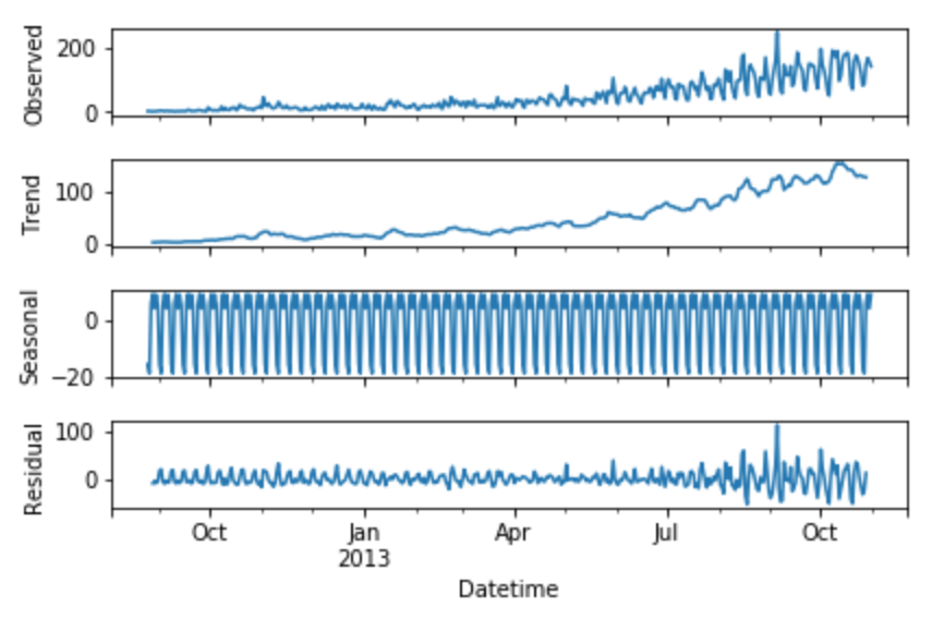
We can see from the graphs obtained that this dataset follows an increasing trend. Hence we can use Holt’s linear trend to forecast the future prices.
Holt extended simple exponential smoothing to allow forecasting of data with a trend. It is nothing more than exponential smoothing applied to both level(the average value in the series) and trend.To express this in mathematical notation, we need three equations: one for the level, one for the trend, and one to combine the level and trend to obtain the expected forecast y^.

The values we predicted in the above algorithms are called Level. In the above three equations, you can notice that we have added level and trend to generate the forecast equation.
As with simple exponential smoothing, the level equation here shows that it is a weighted average of observation and the within-sample one-step-ahead forecast The trend equation shows that it is a weighted average of the estimated trend at time t based on ℓ(t)−ℓ(t−1) and b(t−1), the previous estimate of the trend.
We will add these equations to generate Forecast equation. We can also generate a multiplicative forecast equation by multiplying trend and level instead of adding it. Use the additive equation when the trend increases or decreases linearly, and use the multiplicative equation when the trend increases or decreases exponentially. Practice shows that the multiplicative method serves as a more stable predictor, while the additive method is simpler to understand.

y_hat_avg = test.copy()

fit1 = Holt(np.asarray(train['Count'])).fit(smoothing_level = 0.3,smoothing_slope = 0.1)
y_hat_avg['Holt_linear'] = fit1.forecast(len(test))

plt.figure(figsize=(16,8))
plt.plot(train['Count'], label='Train')
plt.plot(test['Count'], label='Test')
plt.plot(y_hat_avg['Holt_linear'], label='Holt_linear')
plt.legend(loc='best')
plt.show()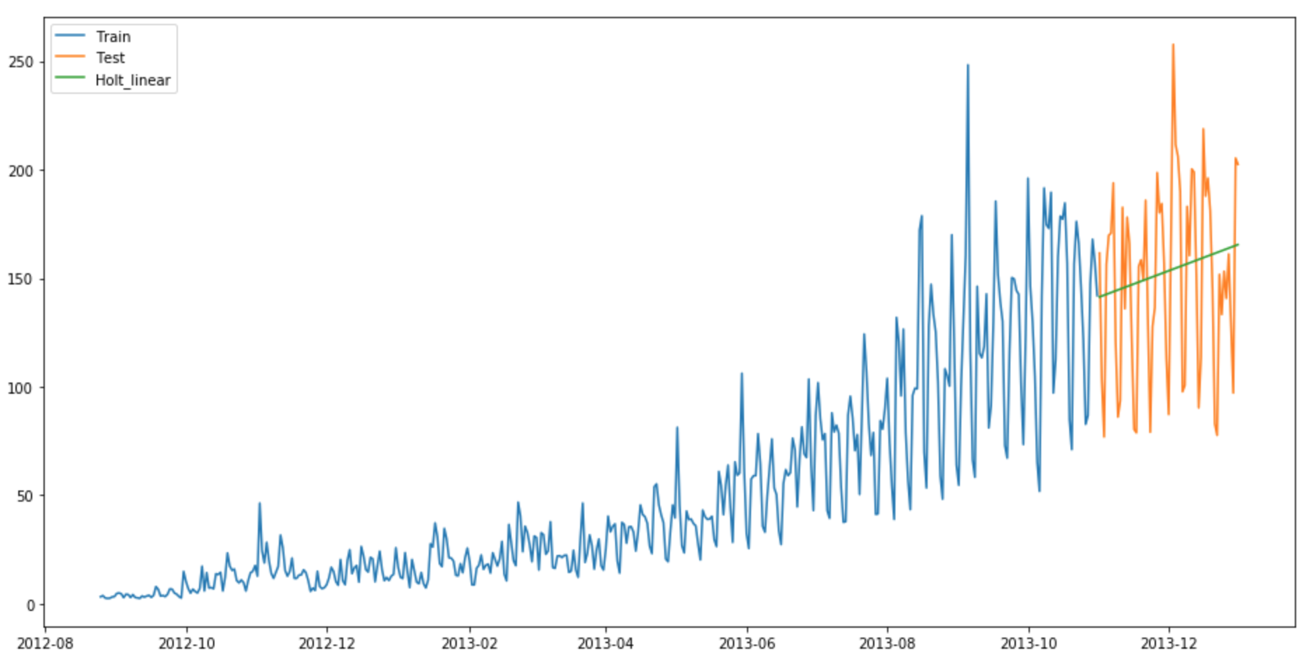
Now calculate RMSE to check to accuracy of our model.
rms = sqrt(mean_squared_error(test.Count, y_hat_avg.Holt_linear))
print(rms)
RMSE = 43.0562596115
We can see that this method maps the trend accurately and hence provides a better solution when compared with above models. We can still tune the parameters to get even a better model.
Method 6: Holt-Winters Method
So let’s introduce a new term which will be used in this algorithm. Consider a hotel located on a hill station. It experiences high visits during the summer season whereas the visitors during the rest of the year are comparatively very less. Hence the profit earned by the owner will be far better in summer season than in any other season. This pattern will repeat itself every year. Such a repetition is called Seasonality. Datasets which show a similar set of pattern after fixed intervals of a time period suffer from seasonality.

The above mentioned models don’t take into account the seasonality of the dataset while forecasting. Hence we need a method that takes into account both trend and seasonality to forecast future prices. One such algorithm that we can use in such a scenario is Holt’s Winter method. The idea behind triple exponential smoothing(Holt’s Winter) is to apply exponential smoothing to the seasonal components in addition to level and trend.
Using Holt’s winter method will be the best option among the rest of the models beacuse of the seasonality factor. The Holt-Winters seasonal method comprises the forecast equation and three smoothing equations — one for the level ℓt, one for trend bt and one for the seasonal component denoted by st, with smoothing parameters α, β and γ.

where s is the length of the seasonal cycle, for 0 ≤ α ≤ 1, 0 ≤ β ≤ 1 and 0 ≤ γ ≤ 1.
The level equation shows a weighted average between the seasonally adjusted observation and the non-seasonal forecast for time t. The trend equation is identical to Holt’s linear method. The seasonal equation shows a weighted average between the current seasonal index, and the seasonal index of the same season last year (i.e., s time periods ago).
In this method also, we can implement both additive and multiplicative technique. Use the additive method when seasonal variations remain roughly constant throughout the series, and use the multiplicative method when seasonal variations change proportionally to the level of the series.
y_hat_avg = test.copy()
fit1 = ExponentialSmoothing(np.asarray(train['Count']) ,seasonal_periods=7 ,trend='add', seasonal='add',).fit()
y_hat_avg['Holt_Winter'] = fit1.forecast(len(test))
plt.figure(figsize=(16,8))
plt.plot( train['Count'], label='Train')
plt.plot(test['Count'], label='Test')
plt.plot(y_hat_avg['Holt_Winter'], label='Holt_Winter')
plt.legend(loc='best')
plt.show()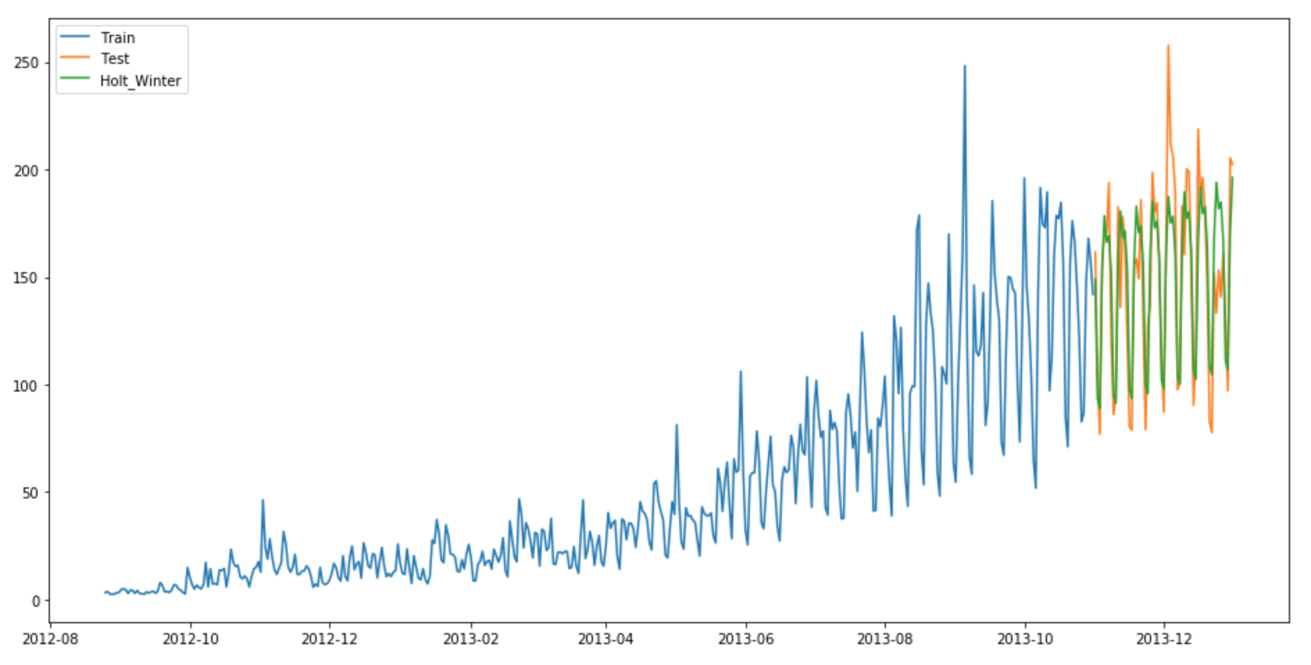
Now calculate RMSE to check to accuracy of our model.
rms = sqrt(mean_squared_error(test.Count, y_hat_avg.Holt_Winter))
print(rms)

RMSE = 23.9614925662
We can see from the graph that mapping correct trend and seasonality provides a far better solution. We chose seasonal_period = 7 as data repeats itself weekly. Other parameters can be tuned as per the dataset. I have used default parameters while building this model. You can tune the parameters to achieve a better model.
Method 7: ARIMA
Another common Time series model that is very popular among the Data scientists is ARIMA. It stand for Autoregressive Integrated Moving average. While exponential smoothing models were based on a description of trend and seasonality in the data, ARIMA models aim to describe the correlations in the data with each other. An improvement over ARIMA is Seasonal ARIMA. It takes into account the seasonality of dataset just like Holt’ Winter method. You can study more about ARIMA and Seasonal ARIMA models and it’s pre-processing from these articles (1) and (2).
y_hat_avg = test.copy()
fit1 = sm.tsa.statespace.SARIMAX(train.Count, order=(2, 1, 4),seasonal_order=(0,1,1,7)).fit()
y_hat_avg['SARIMA'] = fit1.predict(start="2013-11-1", end="2013-12-31", dynamic=True)
plt.figure(figsize=(16,8))
plt.plot( train['Count'], label='Train')
plt.plot(test['Count'], label='Test')
plt.plot(y_hat_avg['SARIMA'], label='SARIMA')
plt.legend(loc='best')
plt.show()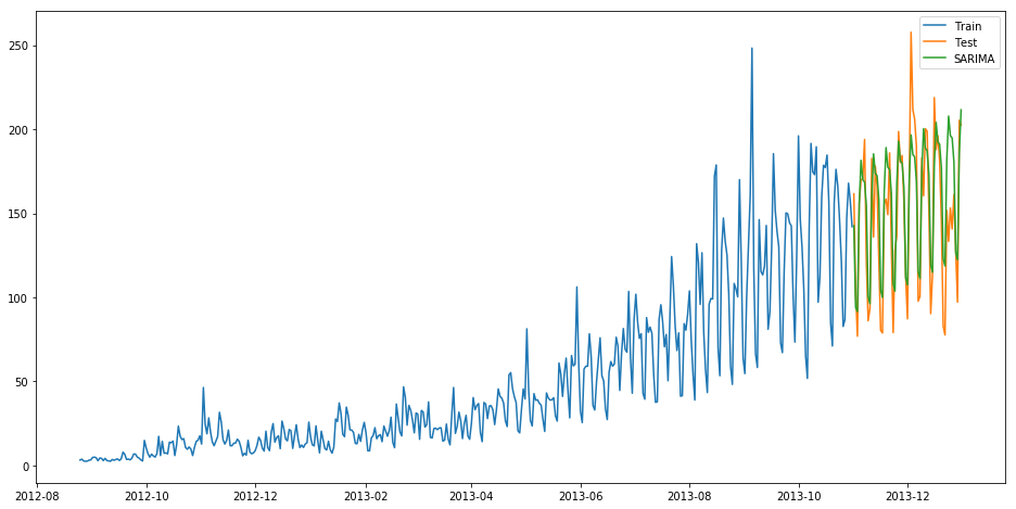
Now calculate RMSE to check to accuracy of our model.
rms = sqrt(mean_squared_error(test.Count, y_hat_avg.SARIMA))
print(rms)

RMSE = 26.035582877
You can see that using Seasonal ARIMA generates a similar solution as of Holt’s Winter. We chose the parameters as per the ACF and PACF graphs. You can learn more about them from the links provided above. If you face any difficulty finding the parameters of ARIMA model, you can use auto.arima implemented in R language. A substitute of auto.arima in Python can be viewed here.
We can compare these forecasting models in python on the basis of their RMSE scores.

Conclusion
I hope this article was helpful and now you’d be comfortable in solving similar Time series problems. I suggest you take different kinds of problem statements and take your time to solve them using the above-mentioned techniques. Try these models and find which model works best on which kind of Time series data.
One lesson to learn from these steps is that each of these models can outperform others on a particular dataset. Therefore it doesn’t mean that one model which performs best on one type of dataset will perform the same for all others too.
You can also explore forecast package built for Time series modelling in R language. You may also explore Double seasonality models from forecast package. Using double seasonality model on this dataset will generate even a better model and hence a better score.
Frequently Asked Questions
Q1. What is seasonal naive forecasting in python?
A. Seasonal naive forecasting in Python is a simple time series forecasting method that uses the last observed value from the same season in the previous year as the prediction for the current season. It assumes that historical patterns repeat annually. You can implement this approach using libraries like pandas and scikit-learn, which makes it straightforward to apply in Python.
Q2. What is moving average time series forecasting in python?
A. Moving average time series forecasting in Python involves calculating the average of a specified number of previous observations to predict future values. This method smooths out short-term fluctuations, making it useful for identifying trends. Python libraries like pandas and NumPy provide functions to calculate moving averages, making it easy to implement this forecasting technique in Python.


Hello Gurchetan, Thks for your interesting article. Even though I use R, I think the question is interesting for any user of Time series regarding of the tool used. I implemented for a client a Time Series using Holt -Winters. Everything was fine, but because my client is not an IT or stats proficient guy I needed to provide among the implementation some kind of algorythm that could calculate for him the 3 coeffcients used in the Holt Winters method. My first solution was very simple just generate a random set of numbers and the one that has the least SSE is the one the system would use to forecast the Timeseries. At this moment is working fine but I would like to optimize it using for example Nelder-Mead. Because the environment is not R pure, not all the libraries are recognized meaning that I would have to code the whole Nelder-Mead function. My question is acording to your experience is worth the effort? Would my algorythm would gain performance and/or accuracy? Thks a lot for your time.
Hey Rodrigo I have implemented these algorithms many times just on practice datasets and never for any company/client and using SSE minimisation always works for me. Though I havent tried Nelder-mead function, but you can always try and implement it. I assume it will only increase your accuracy and performance but if it doesn't, you will anyhow learn something new developing it. So do make a try and check if it is worthy or not. Do update me with the results. Cheers
Where is the link to the train dataset, I cant get assess to it
Great article..
Hey Fawad Glad that you liked the article.
Nice very useful article for time series beginners, Thanks
Hey Kotrappa Glad that you liked the article.