Overview
- Animated visualizations are a work of art and are really easy to create in Tableau
- We’ll work with open-source datasets here and create our own animated visualization in Tableau
Introduction
I’m a huge fan of animated visualizations. I love the way the data points dance across my screen, weaving and cutting across lines to tell their own stories. Designing an animated visualization is a work of art.
I often use animated visualizations to showcase the progress of a cricket match, or the number of points in basketball, or the evolution of the passing game in football (yes I’m a sports-crazy person). There is a beauty in watching the points talking to each other while making progress across my Tableau worksheet.
Trust me, once you start building these animated visualizations in Tableau, there’s no going back. You’ll be hooked like I am, trying to find any excuse to convert the visualization into its animated form.
I have received numerous requests from our community members and the students in my Tableau course on how to making animated visualizations. So I decided to write this article for all of you. It’s a simple premise – we will use open-source data and try to create Hans Rosling’s iconic visualization.
Here’s a taste of the animated visualization we’ll be building in Tableau:
Are you new to Tableau? I highly recommend these resources to get started:
- Tableau for Beginners (Free Course)
- Mastering Tableau from Scratch: Become a Data Visualization Rockstar
Table of Contents
- Why Should you use Animated Visualizations?
- Understanding the Problem Statement
- Setting up the Data for Animated Visualizations in Tableau
- Creating our Own Animated Visualization in Tableau
- How can we Improve this Animated Visualization?
Why Should you use Animated Visualizations?
This is a key question – when we have a plethora of options at our fingertips for creating visualizations, why should we go for animated ones? And are these useful in the industry?
Animated charts are a hit in the data visualization community because of their aesthetically pleasing nature. Who doesn’t love looking at a motion chart depicting how trends have changed over time?
Source: Tableau
But apart from their obvious eye-pleasing nature, animated visualization can be really effective in the industry, whether that’s finance or marketing or sports. I love Tableau’s explanation for creating animated charts:
“Without animation, changing something like a date filter causes scatterplot marks to suddenly jump to new locations. It’s hard to pinpoint what changed or why, but a smooth animation connects the dots. It’s easier to spot and understand changes, like when a specific mark becomes an outlier, when there’s a sudden value spike or dip, or when data clusters appear. You can sense how bars grow, shrink, or re-sort relative to each other, or track an individual mark’s path.
Animations clarify analysis by calling attention to what matters and directing your audience’s focus to where it counts. They help you and others understand the how and why behind evolving data.”
In short, thoughtfully designed animated visualizations can enhance our understanding of the data.
Understanding the Problem Statement
We are going to use open-source datasets for building our animated visualizations in Tableau. That’s the best way for a broader audience to learn. You can pick up the datasets (link below) and start working on them straight away. Or you can follow along with me as we go through this tutorial.
Here, we will aim to create an animated visualization that shows the relationship between life expectancy and income per capita of countries over time. This is quite an intriguing project and close to my heart. The idea is to analyze if these two features are related and how different countries compare against each other in terms of life expectancy and income per capita.
As I said, this is inspired by Hans Rosling’s magnificent visualization and we will be using the same data that his organization, Gapminder, has open-sourced for the community.
We’ll be working with four datasets primarily:
- life_expectancy_years: This contains data about the life expectancy per country
- income_per_person_gdppercapita_ppp_inflation_adjusted: Gross domestic product per person (adjusted for differences in purchasing power)
- population_total: Total population per country
- countries_total: Contains country names, region names (continents), country codes, and other information
All the datasets contain yearly information from 1800 to date. You might see a few null values. Can you guess why that’s the case? That’s because a few countries were created sometime after 1800. Hence, there’ll be blank values in certain columns for them.
You can download all the datasets from Gapminder’s excellent site here. Edit: Noticed a few people aren’t able to find the countries dataset. You can download it here – countries_total.
Setting up the Data for Animated Visualizations in Tableau
Alright, time to fire up Tableau! Here, we’ll import all our datasets into Tableau and perform a few preprocessing steps before we start building our animated visualization.
Let’s start with the Life Expectancy dataset (the importing steps will be similar, if not the same, for the other datasets).
First, import this Excel file into Tableau using the ‘Connect’ option on the Tableau home page. You should see this screen come up:
That’s a lot of values! And our header is showing in the first row. Let’s fix that by right-clicking on the life_expectancy_years button and selecting ‘Field names are in first row’:
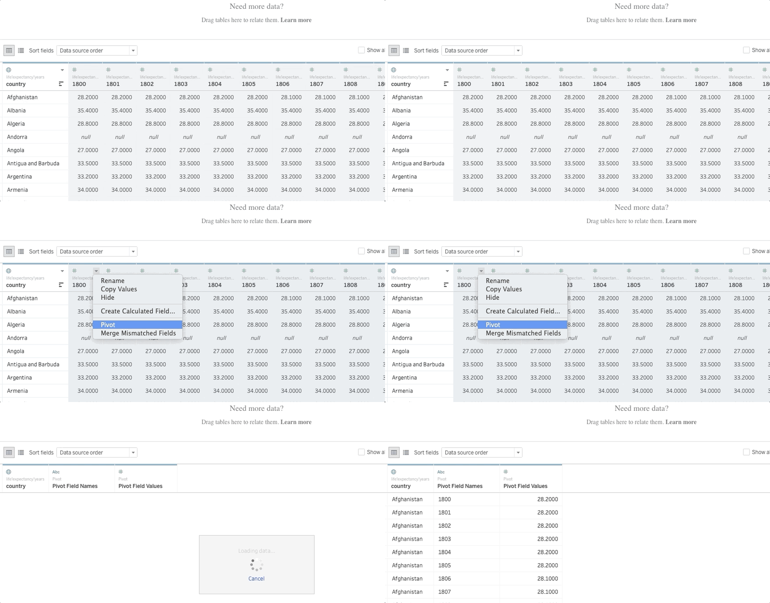
Excellent – that fixed it. Next, I want to roll up the values into a single column so it’s easier for me to analyze the data and create my animated visualization. We’ll use the help of Tableau’s ‘pivot’ option for this. Just select all the columns (except the first one), right-click on the column header, and select ‘Pivot’:
Note: The ‘Pivot’ option will only show up if you’re importing Excel (.xlsx) files. You won’t get this option for any other file format. You’ll need to use Tableau Prep to first convert this into Pivot and then import it into your Tableau Desktop or Public version.
Next, let’s change the column names to reflect what they’re representing. Simply right-click on the column header and select ‘Rename’:
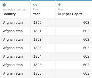
You can follow the same steps for the other three datasets. Don’t forget to rename the columns because we will use one of them as the primary key to connect all the four datasets (or as Tableau puts it, blend the data). This is what the other datasets should look like after you’ve performed the above steps:
income_per_person_gdppercapita_ppp_inflation_adjusted:
population_total:
Let the ‘countries_total’ dataset remain as it is. You’ll notice that the headers are already correct and we don’t need to pivot anything here. This is what the dataset will look like when we import it in Tableau:
Our data is now ready and primed for creating visualizations.
Creating our own Animated Visualization in Tableau
Head over to ‘Sheet 1’ now and rename it to “Life Expectancy vs. GDP per Capita”. It’s very important to name your sheets according to your work. When we’re working with multiple sheets (and that happens quite often in the industry), it’s important that the names are well defined so we can easily find the visualization we’re looking for.
We can see the four datasets we’ve imported on the top-left of our Tableau worksheet. Before we start using any variables, we need to establish the relationship between the four datasets so Tableau knows that these are inter-linked.
To do this, click on the ‘Data’ button at the top of your Tableau window and select ‘Edit Blend Relationships’:
Next, drag and drop the ‘Life Expectancy (Years)’ feature into your rows shelf and the ‘GDP per Capita’ into your columns:
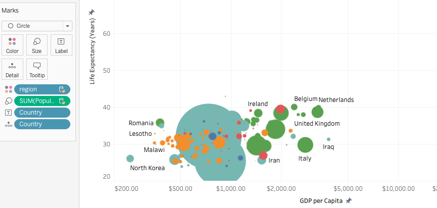
Next, we need to do three quick drag and drop actions. Take the ‘Population’ dimension and drop it into your ‘Size’ button under the ‘Marks’ section. Take the ‘region’ and drop that into the ‘Color’ cart and drop ‘Country’ into the ‘Details’ cart. This is what your visualization should look like:
Our visualization is starting to take shape! But we have a problem here – the axis values are all over the place. They’re absurdly high for both the X and the Y-axis. Let’s fix that before we do anything else.
I’m going to fix Life Expectancy between 20 and 90. Right-click on the Y-axis and select ‘Edit Axis’. Click on the ‘Fixed’ option and input the values:
Do the same thing for GDP per Capita which we will fix between $200 and $60,000 (and choose the logarithmic option). We will get a blank worksheet now. Where in the world did our data points disappear?
Don’t worry – we’ll get them back soon!
Unleash the Animations in Tableau!
It’s time to see the magic unfold. We will be using the ‘Pages’ shelf to animate our visualization in Tableau. This Pages shelf helps us break down our visualization into a series of pages – hence creating the animation. Each page is a unique view and is based on a member of the field that we place on the Pages shelf.
Pages are especially popular when we want to showcase the movement of points with time. And that’s exactly what we intend to do here. We want the life expectancy and GDP per capita to move as the years progress.
So drag and drop your ‘Years’ feature into the Pages shelf and select ‘Add all members’:
And we have our data points back! You’ll also notice a slider has popped up on the right-hand side – that’s your Pages shelf working its magic. Next, drag the Pages menu from the right-hand side and drop it under the Pages shelf on the left:
The size of these bubbles is far too small right now. We can increase this easily by clicking on the ‘Size’ button under the ‘Marks’ section and increasing the size. Also, change the visualization to ‘Circle’ in case you had ‘Shape’ selected:
Nice! Let’s get the country names into the visualization as well. Drag and drop the ‘Country’ measure into your ‘Labels’ cart:
Looking good. All that’s left for us to do is to see the animation in action. Very straightforward – just press the ‘Play’ button on your Pages section and watch the magic unfold:
And there’s your own animated visualization in Tableau!
How Can We Improve this Animated Visualization?
There’s a lot we can do to enhance this visualization. For starters, we can do a more granular analysis. We can take a few countries, like India, China, UK, USA, Brazil, etc. and see how life expectancy vs. GDP per Capita has progressed over the years.
Or we can go region by region – analyze how each continent has done in its own right. There are so many details we can extract from this animated visualization!
Outside this dataset, I encourage you to play around with different options in Tableau:
- Try different charts – see how a line chart changes in Tableau when we make it animated
- A really cool visualization would be using animations to see how a map viz. changes over time (you can use Tableau’s Superstore dataset for this)
- Pick up any previous project you’ve done and improve that using what you’ve learned here
- Try this out in dashboards. Imagine the power of an animated dashboard when you’re presenting to an audience!
Honestly, the sky is the limit as far as customizing and playing around with animations is concerned. Go ahead and experiment all you want.
End Notes
I had a lot of fun putting this together for our community. Animated visualizations can be such a powerful tool if used in the right manner and for the right audience. We have the power to sway our audience if we carefully craft and design our charts in Tableau.
Did you find this article useful? I would love to hear your thoughts, feedback, and experience using this tutorial.


It's really a great article. Looking forward to more content on data visualization.
Thanks, Suman!
unable to find countries_total data set
Hi Raj - I have added the link in the article.
Don't see Countries_Total dataset in the given link, if It's there please share the access path. Also, I am using the free Tableau Public version do I need to build the pivots first in Tableau Prep? Request you to post one video exploring the Tableau Prep software as well which covers the basics of builder and conductor.
I have added the dataset link in the article. Regarding your query - you need to use Prep if you're importing a non-.xlsx file. All XLSX files will have the Pivot option in Tableau Public. And sure, I'll look into the Tableau Prep suggestion, thanks!