Introduction
The best way to track the COVID-19 outbreak is by using data and visualization. The COVID-19 patterns are sometimes contradictory and this is where visualizations come in.
Data visualization is enabling understanding of the coronavirus pandemic with the John Hopkins University and World Health Organization Dashboards providing updates.
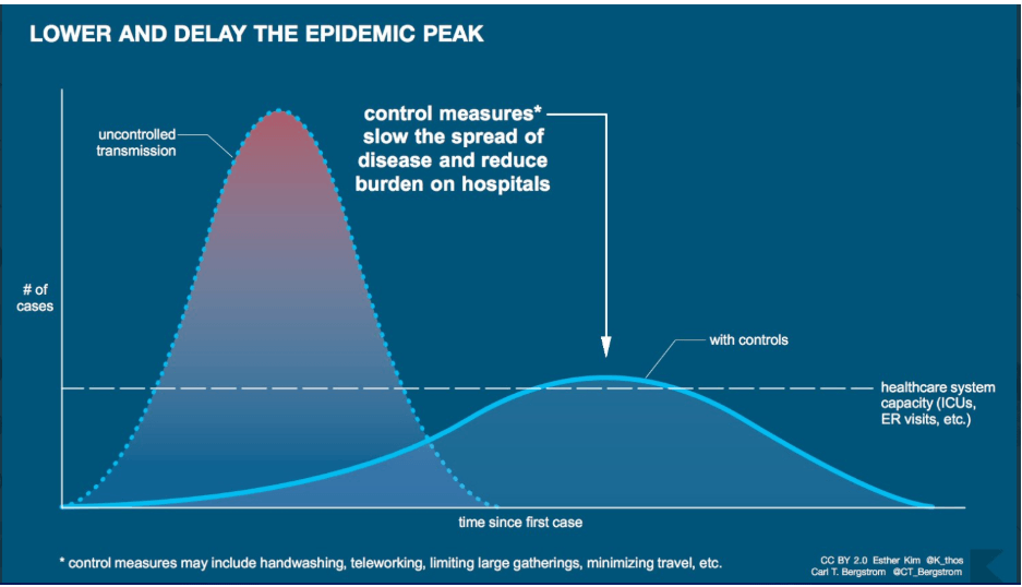
Data scientists and researchers are collaborating by using visualizations to map the coronavirus. Visualization techniques are assisting the public to understand COVID-19 outbreak and implement safety measures.
Further, visualizations break down COVID-19 trends into simplified information for public understanding. Data scientists are using visualizations to predict the next out breakpoint, forecasting peak levels and measuring curve flattening.
Here is a list of top 20 visualizations mapping COVID-19.
1. John Hopkins University Dashboard
Since the outbreak of COVID-19, the John Hopkins dashboard has provided reliable and real-time updates on the coronavirus.
Based on data from credible sources including global governments, the European Center for Disease Prevention and Control. This dashboard provides insights about the spread of COVID-19. The John Hopkins dashboard shows virus hotspots through red marks around different Continents of the world.
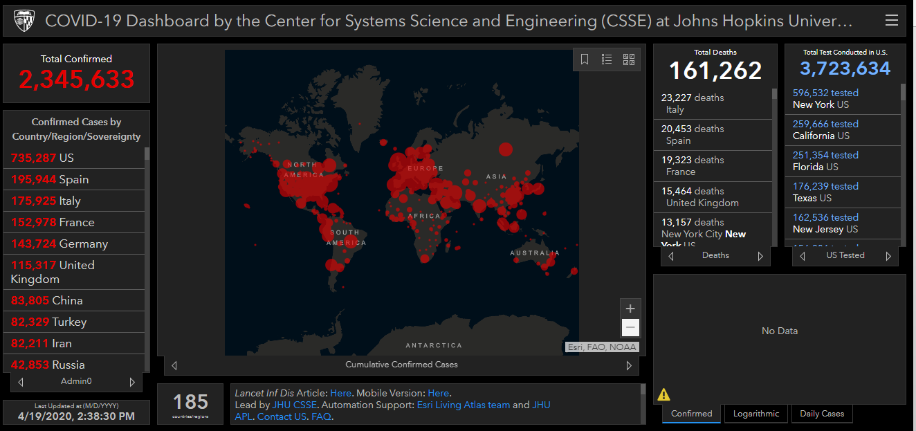
Data from countries collected by the John Hopkins University provides a realistic assessment of the virus spread from each location. COVID-19 outbreak differs from country to country as seen in the past month and the John Hopkins dashboard offers this information to the public.
On the side panel of the John Hopkins dashboard are confirmed cases, deaths, and recoveries. Automatic updates from the dashboard about the virus is supporting the public to understand the nature of this virus.
2. WHO COVID-19 Dashboard
The World Health Organization dashboard is among the most accessed and relied upon visualizations in the COVID-19 pandemic. The public can navigate the WHO dashboard easily by exploring numbers around the world such as infected, deaths, and recoveries.
Users can zoom the visualization to understand the details of the pandemic including variables considered. In addition, the WHO dashboard assists users to analyze data about COVID-19 in real-time as graphics change depending on the current situation.
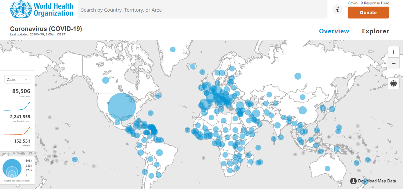
The overview section of COVID-19 on the WHO dashboard offers information about tracking guidelines to enable understanding of the pandemic. For instance, users can understand the method of determining COVID-19 figures and real-time updates on the dashboard.
The explorer section guides the public on navigating through the dashboard and helping them make sense of the numbers on COVID-19.
3. The University of Washington Dashboard
The University of Washington dashboard provides an overview of COVID-19 infections worldwide by using cases confirmed and remaining infections to determine inflection points.
Mapping an outbreak like COVID-19 requires determining the inflection point and the public benefits from this because of understanding the transformation of the pandemic.
A green and gray slash texture on the dashboard enables users to see the movement of the pandemic and estimating peak levels and curve flattening. This dashboard generates data from different sources including CDC and WHO in relaying information about the coronavirus.
The simple and interactive design of this dashboard allows users to make quick judgments about the pandemic by comparing figures.
Infection, deaths, and recovery numbers on the dashboard guide users in exploring the scope of the pandemic and getting a clear picture of the global situation. The University of Washington dashboard utilizes computational resources and technology to improve the accuracy of reported trends.
4. SharedGeo
Data analytics support for tracking COVID-19 is happening with Shared Geo among visualizations using technology to explain the numbers. In the past, confusion about confirmed cases, recoveries, and deaths has emerged and Shared Geo uses real-time analytics for accuracy.
The cumulative case approach used at Shared Geo matters in visualization because of accounting for new cases. By using required variables in determining COVID-19, Shared Geo continues to offer updates about this pandemic.
Curve flattening is essential in understanding the nature of this pandemic and Shared Geo offers analytics including declining rates and growth patterns. These assist in understanding the highs and lows of the coronavirus and the likely implications.
As confirmed cases change, visualizations rise and sometimes remain stagnant but the Shared Geo visualization offers the best analysis because of cumulative variables used. The rate of spread versus population numbers as seen in the comparative table makes Shared Geo a reliable information source.
5. South China Morning Post Dashboard
The South China Morning Post is one of the trusted publications in China and its dashboard on COVID-19 offers reliable updates on the outbreak.
Graphical analysis of data about COVID-19 on this dashboard simplifies trends and understanding movement of the virus. During the first days of the COVID-19 outbreak in China, this dashboard received millions of visitors each hour as people followed updates about the virus.
Cases updates and status indicators on the South China Morning Post dashboard provide information about the pandemic by determining the current direction of the virus. Users of this dashboard benefit from different colors for infections, deaths, recovered cases and improves visibility.
The dashboard indicates those in serious conditions and stable with their respective colors as well. This has made tracking the spread of coronavirus by the public easy.
6. CDC Dashboard
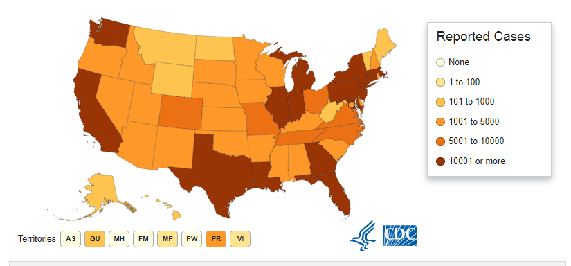
The CDC dashboard remains one of the most visited platforms as the COVID-19 pandemic continues with the public using updates on the dashboard to understand the virus. The CDC dashboard, unlike others, considers all factors required for pandemic evaluation such as infection dates and racial groups affected. This dashboard consists of a section at the top where users can see a preview of current figures on COVID-19 before proceeding to other areas.
7. The COVID tracking project (COVID Tracking)
The COVID Tracking dashboard offers updates about testing numbers both positive and negative alongside deaths. The number of recovered cases and those pending provided on this dashboard assist the public to understand numbers as the pandemic spreads.
Factors such as admissions reported and ICU cases on the COVID Tracking dashboard demonstrates the widespread nature of the virus in different locations.
The COVID Tracking dashboard makes accessing information and predicting patterns easy because of their statistical considerations. Cumulative variables used in assessing the coronavirus pandemic as provided in the dashboard support in the analysis of the virus.
The number of positive and negative cases as provided in this dashboard and those using ventilators makes this dashboard a good experience for those interested in tracking the coronavirus outbreak.
8. Epidemic Calculator
There are many questions and inconsistencies on the COVID-19 outbreak as seen from different regions of the world and the epidemic calculator makes everything simple by collecting data in a centralized system.
Number contextualization and parameters of the disease recorded in the Epidemic Calculator enable users to compute the current numbers by determining the scope of the outbreak. Exposed patients, infections, and those at risk of contracting the virus have their numbers displayed on the dashboard.
The computational methods of COVID-19 including reproduction, incubation, and period of infection from this dashboard make it a reliable visualization tool in this pandemic.
Users can assess the numbers and do their computations to verify the authenticity of the numbers displayed. The resolution segment of this dashboard maps the rate of infection by determining disease outlook in the coming days.
9. ECDC Dashboard
For those interested in learning about the distribution of COVID-19 around the world, the ECDC dashboard offers the best features.
This dashboard explores the worldwide number of cases and combines the data into a visualization map that gives an overview of the global situation. From Europe, Asia, North America, and Australia, the ECDC dashboard provides real-time updates about coronavirus.
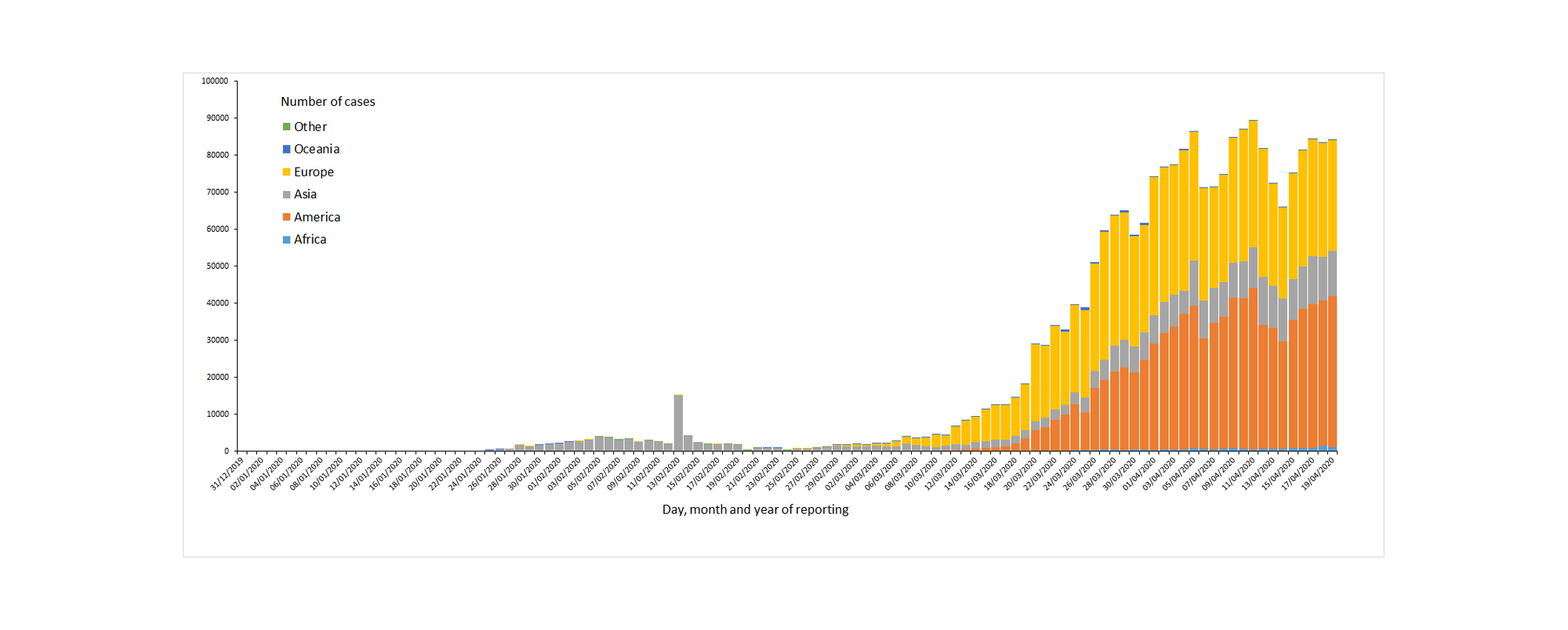
Application of variables including testing rates and deaths, on the ECDC dashboard, offers reliable information about COVID-19 pandemic. Countries differ in their handling of the pandemic and the ECDC dashboard accounts for these differences to the benefit of the public.
The distribution of cases based on a given population count (100,000). The cumulative infection cases facilitates accurate information on the ECDC dashboard.
10. University of Virginia COVID-19 Dashboard
The University of Virginia dashboard in collaboration with Biocomplexity Institute developed a visualization map with real-time updates on the COVID-19 outbreak.
Users can choose different sections of the visualization based on their interest areas about the coronavirus. Data from countries on the dashboard gives a cumulative view of infections, deaths, and recovered cases.
The slider feature at the top of the University of Virginia dashboard allows users to track the progression of the outbreak. For example, the slider begins on January 22, where users can assess the evolution of the virus based on the current figures. Moreover, prediction by the use of analytics and regular updates makes this dashboard ideal for tracking the COVID-19 pandemic.
11. Carnegie Mellon Dashboard
By combining searches online, symptoms, and visits to medical care centers, the Carnegie Mellon dashboard creates a simulation of the current coronavirus patterns. Users can see rates of spread in a city, state, and country making it easier to follow trends.
Hospitals are collaborating with Carnegie Mellon by providing data about patients with COVID-19 and this gives a real-time analysis of coronavirus. Artificial intelligence and machine-learning tools used in this dashboard provide analytics on the virus and support prediction.
12. Stanford COVID-19 Dashboard
The Stanford Dashboard offers data on location and cumulative deaths from the coronavirus based on population. Since the COVID-19 pandemic began, mapping the cumulative deaths based on a population has caused challenges but the Stanford Dashboard is doing a good job in this area. The region with the highest cumulative deaths tops the list followed by locations with the lowest cumulative deaths.
13. 91-DIVOC
Normalization of country and state data from the 91-DIVOC dashboard enables users to make sense of the numbers and tracking the virus around the world. Each country from the 91-DIVOC dashboard consists of epidemic levels and this arrangement offers a clear view of the pandemic.
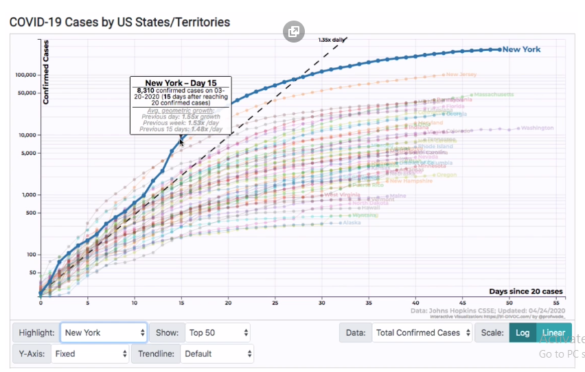
Developed by Fagen-Ulmschneider, the 91-DIVOC dashboard is attracting more users with the current numbers at over 80,000 visitors. The state of Kentucky is using 91-DIVOC graphs to update the public on coronavirus developments. By using data from the John Hopkins database, the 91-DIVOC dashboard offers real-time information on a country basis and does not make predictions.
14. COVID Trends
Another great dashboard gaining traction as the COVID-19 pandemic. It unfolds with users enjoying graphical analysis based on total and new cases. By developing X and Y-axis without the time factor, the developer of COVID Trends, Aatish Bhatia focuses on daily cases and total cases. A country doing well in combating the pandemic has a higher line deviation compared to those struggling.
The straight line according to Aatish remains similar for all countries but changes depending on the rate of virus spread. Further, the diagonal line represents the success of stopping the virus where users check to see real-time information about the virus in different geographical locations. The comparative feature of this dashboard utilizes a linear format to see trends in each country such as confirmed cases, recovered, and deaths.
15. COVID19-SEIR
Simulation works better with advanced techniques such as mathematical modeling which enables users to compare the effects of the virus through comparisons. Users of the COVID19-SEIR can assess the current situation of coronavirus in a given location by using transmission and death rates.
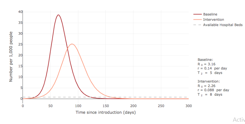
This dashboard creates a simulation of the COVID-19 outbreak on the healthcare system by showing the tipping point. The creator of this simulation dashboard, Alison Hill wanted a simple graph showing the interaction between infections and exposure levels. The death rate shows the distribution rate in various locations.
16. Rt Covid-19 Dashboard
Developed by the co-founders of Instagram, the Rt COVID-19 dashboard looks at the rate of spread in a given population by an infected person. The rate of virus spread is critical as the dashboard estimates the progression of the virus at the infection stage. For instance, an Rt level more than 1 means the virus is spreading fast. While an Rt level below 1 means the virus is slowing down and will eventually stop.
17. IHME COVID-19 Dashboard
This dashboard focuses on curve flattening by looking at variables including ventilators and hospital capacity of regions versus the current situation. The simulation explores the implication of COVID-19 on hospitals by considering patient numbers, preparedness, and strains expected. Growth is critical in establishing the next outbreak as seen from the coronavirus and this dashboard measures these metrics.
18. WORLDOMETER
The WORLDOMETER dashboard offers information about the aggregate number of virus cases in real-time. It is based on reliable data from media houses and governments. Users of this dashboard enjoy the trends map such as infection rates, death, and recoveries. Hospitals matter in a pandemic like COVID-19. And WORLDOMETER makes accessing the information easy including ventilators required, beds in hospitals, and the total number of ICU cases.
19. COVID ACT Now Dashboard
This is the last dashboard on our list of visualizations for mapping COVID-19 developed by Stanford and Google teams. The dashboard explains the growth curve of COVID-19. It uses different conditions for accurate results including wearing masks and social distancing. The dashboard offers analysis on geographical locations such as country, state, and city by mapping the direction of the pandemic.
20. COVID-19 Measures Oxford
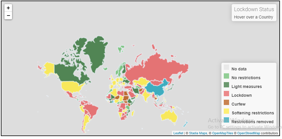
This visualization dashboard consists of organized tables showing government data on COVID-19 pandemic combined with information from credible sources including media outlets. Dashboards contradict the average user most times and this dashboard has made everything simple through their visible charts.
Users can compare the outbreak across the globe and find out their current situation with respect to other regions. In addition, the simple presentation of statistics in this dashboard makes it appealing for ordinary users who want to understand the implications of COVID-19 around the world.
Visualization is explaining COVID-19 Pandemic
From this top 20 dashboards list for tracking the coronavirus, evidence suggests that visualization provides the best insights for COVID-19.
Progression of the coronavirus since the first reported case in Wuhan, China demonstrates the unpredictable nature of this virus. Visualizations bridge this gap by providing detailed information based on data and variables on the ground.
As testing rates increase worldwide to combat COVID-19, consequently dashboards explain the numbers including infections, next infection waves, deaths, and recovered cases. Artificial intelligence and machine learning tools used by data scientists and researchers facilitate visualizations as they support the world in addressing the COVID-19 crisis.
What dashboard are you using to track the COVID-19 outbreak and which best suits you? Share your comments below to contribute to the discussion
About the Author
 David Yakobovitch – Educator/data geek
I hope to educate and inspire you to build great products on everything AI and Data Science. ️Here is a link to his podcast – HumAIn Podcast


https://covid19rt.in if you are looking for a dashboard for India
Very insightful article. Thanks. For tech enthusiast.. It would be great if the underlying tool was also identified.. :)