- COUNTIFS(criteria_range1, criteria1, [criteria_range2, criteria2]…)
Overview
- Microsoft Excel hacks, tips and tricks help make you a better analyst
- On Excel’s 35th birthday, we present 35 hacks, tips, and tricks in MS Excel that will increase your analytics efficiency
Happy Birthday Excel!
“The global economy is built on two things: the internal combustion engine and Microsoft Excel. Never forget this.” — Kevin Hector
Let’s consider a couple of scenarious almost all of us have seen:
Scenario 1
ME: “I am overspending, I want to build a monthly planner budget dude! Please help!”
FRIEND: “Use Excel”
Scenario 2
ME: “I want to build a sales forecast for the next quarter! Kindly help.”
MANAGER: “Use Excel”
Is there any tool used so widely across all the industries and all the departments than Microsoft Excel? It is also the most widely adopted personal tool helping millions of people organize their work and their personal lives.
Microsoft Excel has revolutionized the human community by its number-crunching and data wrangling abilities.

Microsoft Excel has been at the forefront of analytics and data science for years, consequently making it very important to be well-versed with this universal tool. In fact, Excel has gone from simple reporting to all sorts of analysis along with advanced visualization capabilities.
This week on October 1st, Excel celebrated its 35th birthday. It’s getting quite old and yet remains at the top of the analytics skillset list. 🙂
So, let’s celebrate this occasion with 35 Excel hacks, tips, and tricks. Put on your seat belts and let’s get started!
If you’re a newcomer to Excel, we have curated the perfect courses for you:
Table of Contents
- About Microsoft Excel
- 25 Excel Shortcuts
- General and handy shortcuts
- Navigating through cells smoothly
- Editing the cells
- Selection of cells
- text formatting
- cell formatting
- hide/unhide
- 10 Excel Tricks
- Countif function
- Flash Fill
- Highlight rows fulfilling multiple conditions
- Percentage of row total in the pivot table
- Dealing with empty rows
- Sparklines
- Waterfall chart
- Vlookup
- Linear Regression
- Forecasting
About Excel
Excel is a spreadsheet tool provided by Microsoft that was launched in 1985. Spreadsheets are a great way to organize your data in a tabular format (rows and columns). It was used widely in business applications for crunching and manipulating numbers (and incredibly it’s even more widely used now!).
Funnily enough, the first version of Excel was launched on Apple Macintosh which was a huge success. Only later in 1987 did Microsoft launch Excel for the Windows Operating System. It had a very easy-to-use Graphical User Interface:

Looks pretty familiar, doesn’t it?
Fast-forward 35 years and Excel is still the king when it comes to analytics and data wrangling. It is one of the most commonly used and accepted tools across companies in various verticals. Today’s version of Excel can perform advanced tasks like forecasting with a click of a button and design beautiful visualizations even on a world map!
25 Most Used Shortcuts in Microsoft Excel
There are a few keyboard shortcuts for Excel you absolutely should master. There is no getting away from them so why not quickly understand what these shortcuts do and incorporate them into your daily analysis workflow?
General and handy shortcuts
1. Ctrl+N: Create a new workbook
2. Ctrl+O: Open an existing workbook
3. Ctrl+S: Save a workbook
4. Ctrl+W: Close a workbook
Navigating through cells
5. Ctrl+Left/Right Arrow: Move to the farthest cell left or right in the row
6. Ctrl+Up/Down Arrow: Move to the top or bottom cell in the column
7. Alt+Page Up/Down: Move one screen to the right or left in a worksheet
8. Ctrl+Page Up/Down: Move to the previous or next worksheet
Editing the cells
9. F2: Edit a cell
10. Shift+F2: Add or edit a cell comment
11. Alt+Enter: Insert a hard return within a cell (while editing a cell)
Selection of cells
12. Shift+Left/Right Arrow: Extend the cell selection to the left or right
13. Shift+Space: Select the entire row
14. Ctrl+Space: Select the entire column
15. Ctrl+Shift+Space: Select the entire worksheet
Text Formatting
16. Ctrl+B: Add or remove bold to the contents of a cell, selected data, or selected cell range
17. Ctrl+I: Add or remove italics to the contents of a cell, selected data, or selected cell range
18. Ctrl+U: Add or remove underline to the contents of a cell, selected data, or selected cell range
Cell formatting
19. Alt+H+H: Select a fill color
20. Alt+H+B: Add a border
21. Ctrl+Shift+&: Apply outline border
22. Ctrl+Shift+$: Apply currency format
23. Ctrl+Shift+%: Apply percent format
Hide/Unhide
24. Ctrl+9: Hide the selected rows
25. Ctrl+0: Hide the selected columns
10 Important Excel Hacks, Tips and Tricks
Here is a list of important tips, tricks, and hacks that will help you boost your efficiency in Excel.
Countifs Function
Countifs are one of the most used statistical functions in Excel. The COUNTIFS function applies one or more conditions to the cells in the given range and returns only those cells that fulfill all of the conditions.

Flash Fill
Flash Fill is a lifesaver when you are working on a large dataset, especially when you need to fill in data that is already present in other columns!
Flash Fill automatically fills the data in your column when it senses a pattern.
It saves a lot of time and effort by automating the manual task. You may follow the video for a demo of Flash Fill in Excel:
This video is part of the article Classic Excel tricks. Go through it to understand the topic in-depth.
Highlight rows having multiple conditions
Let us know discuss a tip, trick related to conditional formatting. In this section, we will be applying multiple conditions and highlighting the records accordingly.
We are going to take up an interesting problem statement to understand better. Here, we have a list of students in the final year of their graduation. The college authorities need to return the security deposits to its students but there’s a catch – the deposit will be given only to those students who have received the approval from all the departments, i.e., Library, Sports department, and Laboratory.

We will apply the following conditional formatting rule –
= AND($E5 = "Yes", $F5 = "Yes",$G5 = "Yes")
You can learn more about conditional formatting and the steps for the above problem statement here – Excel tricks for conditional formatting.
Percentage of Row Total
Pivot tables are a really powerful tool for analysis in Excel. They can provide a complete analysis in seconds. This simple Pivot table trick can provide really interesting insights and it is definitely my all-time favorite! Usually, we look at the count, average, max, or min value for a column. We can get enhanced knowledge by analyzing values as a percentage of the row total.
You can refer to the video or follow the steps after the video:
To understand Pivot tables and some of their hacks, do checkout – Pivot tables tips and tricks.
Dealing with Empty Rows
Data analysts and data scientists spend a major chunk of their time in data cleaning, and empty cells are dealt with during this time. An empty cell is a common scenario in datasets but they may create havoc during the time of statistical modeling. So, it is always better to deal with them in the beginning during the data cleaning stage of your analytics project.
Get more data cleaning hacks and examples here.
Sparklines
Let me introduce you to my personal favorite chart – Sparkline charts. These charts really help me out in making amazing dashboards! So what are the sparkline charts?
Sparkline charts are typically small in size and fit into a single cell. These charts are wonderful to visualize trends in your data such as seasonal increase or decrease in value.
In Microsoft Excel, we have 3 different types of sparkline charts – Line, column, and Win/Loss.
You can learn more about the advanced charts in my previous article – here.
Excel Chart #1 – Waterfall Charts
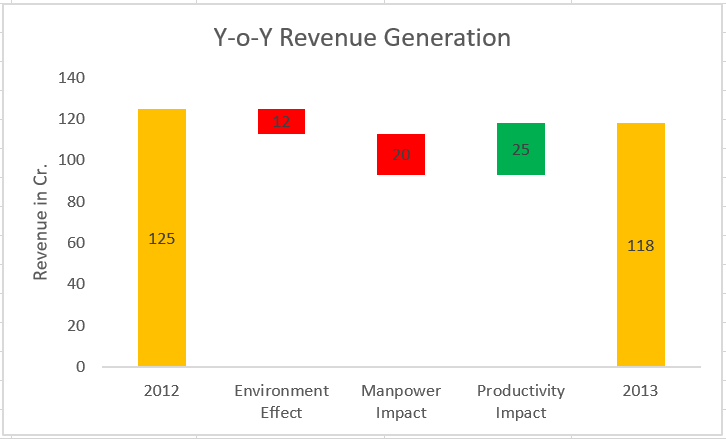
Another really useful advanced charts in Excel, the Waterfall Chart gets its name thanks to the resemblance of its structure to waterfalls. This powerful chart provides a visual snapshot of the positive and negative changes to value over a period of time.
In a waterfall chart, the initial and final values are represented by columns. The columns depicting the positive and negative impacts are depicted by floating columns in respective colors. Here’s an example of a waterfall chart which we will be making:

These are widely used across industries, specifically the finance industry.
Let us take an example and build a waterfall chart from scratch in Excel. We have the year-on-year (YoY) revenue generation data of a company along with some of the influencing factors – Environment effect, Manpower Impact, Productivity Impact. You can follow along with the video too for better understanding:
If you are interested in excel charts, remember to check out this article – here.
Vlookup()
Vlookup is probably the most used function by analysts around the globe. It helps to search a value in a table and returns a corresponding value. For example, you run a grocery store, you store data in two tables – transactions(containing only transactions), and customer data(all customer information). You can use vlookup to map the data of customers using a common key. We will understand better by looking at an example.
Let’s look at the table below (Policy and Customer). In the Policy table, we want to map the city names from the customer tables based on the common key “Customer id”. Here, function vlookup() would help to perform this task.
Syntax: =VLOOKUP(Key to lookup, Source_table, column of source table, are you ok with relative match?)
For the above problem, we can write the formula in cell “F4” as =VLOOKUP(B4, $H$4:$L$15, 5, 0) and this will return the city name for all the Customer id 1 and post that copy this formula for all Customer ids.
Tip: Do not forget to lock the range of the second table using a “$” sign – a common error when copying this formula down. This is known as relative referencing.
Liked this hack? Do check out some of the great Excel tips and tricks here.
Linear Regression
Linear Regression is the first machine learning technique most of us learn. It’s also the most commonly used supervised learning technique in the industry.
But what is linear regression?
It is a linear approach to statistically model the relationship between the dependent variable (the variable you want to predict) and the independent variables (the factors used for predicting). Linear regression gives the following equation:

Here, we have Y as our dependent variable, X’s are the independent variables and all C’s are the coefficients. Coefficients are basically the weights assigned to the features, based on their importance.
Linear regression is used often as an analyst. If you wish to understand it better, I have explained linear regression with a great example in this article – here.
Forecasting
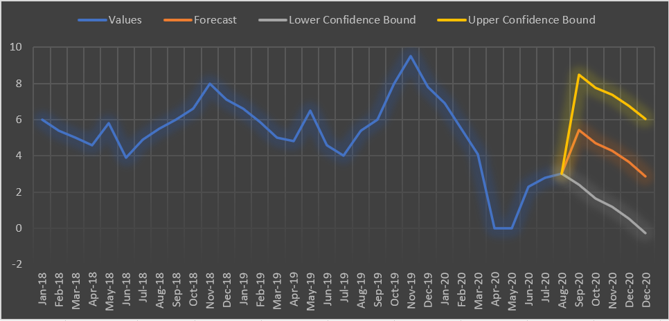
In the simplest terms, it is the process of predicting the future while analyzing the past and present data. We do Quantitative Forecasting majorly on time-series data. If you want to become a pro-excel user then forecasting is a must!

Forecasting can perform wonders for business analysts. I have explained forecasting in excel in a step-by-step process. You can check it out here.
End Notes
To summarize, Excel is a versatile tool that has been used for decades and there’s no doubt about its usefulness even now. As an analytics and data science professional, it is an amazing tool to know and master.
In this article, we discussed some of the most important shortcuts, hacks, tips, and tricks related to excel. These can speed up your task and definitely help you get the attention. Let me know your thoughts on Microsoft Excel in the comments section below. 🙂


