This article was published as a part of the Data Science Blogathon.
Introduction to Tableau Tips!
Creating a chart or visual in Tableau is rather straightforward. But what differentiates a basic visual from a great one?
That’s what we’ll aim to figure out in this article!
Look at the two bar charts below that I created in Tableau. Which one do you think gets the job done and also looks the most appealing?
If you thought the right one – I agree!
In this article, we shall start off with a simple bar chart and build a great visual following these 5 Tableau tips:
- Sorting
- Making rounded bars
- Format title, labels, and axes
- Formatting chart area
- Intuitive colour
Pro Tip: Open Tableau and work along with this article. Practical trumps theory here!
If you’re new to Tableau, check out the comprehensive free Tableau course for beginners by Analytics Vidhya.
Setting up the Dataset in Tableau
We’ll be using the Sample Superstore dataset that comes inbuilt with Tableau. Go to your Tableau home page and open the Superstore data source as shown below.
This dataset contains variables such as Sales, Profit, Segment, Category, Sub-Category etc. for the superstores in different states of the US. We’ll work with a basic chart showing the top 5 products by profit.
Double click on ‘Product Name’ on the shelf, that will add it to the visual. Then double click on ‘Profit’ and the result should look like this:
To identify the top 5 products, drag ‘Product Name’ once again from the variable shelf and drop it on the Filter card. A dialog box should appear.
Click on the tab that says ‘Top’ > Choose ‘By field:’ > Type 5 as no. of values you want.
Ensure your dialog box now looks like this and click ‘Okay’:
Use the ‘Show Me’ option in the top right-hand corner and select the horizontal bar chart. Now we have our basic bar chart.
Tableau Tip #1: Sorting
Depending on what you are trying to convey, always sort the data accordingly. It makes it so much easier for the user to grasp the information. Since I want to look at the 5 most profitable products, I would like to sort them in descending order, from the most profitable product to the least. Tableau has an option for this right on the toolbar. Clicking on that sorts our data in descending order.
Set the view to ‘Fit Height’. It should now look like this:
Tableau Tip #2: Making rounded bars
To make the visual more appealing, let’s give the bars rounded edges.
Double click on the empty area in the column shelf and type AVG (0) as shown.
The visual will look something like this:
On the marks card, change the chart type to ‘Line’ and drag ‘Measure Names’ from the row shelf to ‘Path’ on the marks card. You should now see that the bars have become thin horizontal lines with curved edges.
On the marks card, go to Size and increase it to the desired level. The result should be something like this:
Hovering over the left end of the rounded bar shows a tooltip with AVG (0) field as well. Remove this from the tooltip on the marks card.
Tableau Tip #3: Format title, labels, and axes
Let’s give a suitable title to this visual. Double click on ‘Sheet 1’ and change the title to ‘Top 5 Products by Profit’. Now that we’ve already mentioned that the chart shows the 5 most profitable products, isn’t the axis label a repetition?
Right-click on ‘Product Name’ on the y-axis and select ‘Hide Field Labels for Rows’.
Let us add data labels for the bars.
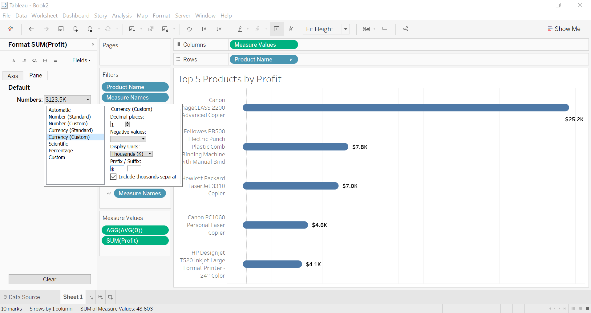
Go to the marks card > click on Label > select show mark labels > select ‘Line Ends’ >deselect ‘label start of line’
Putting labels at the right-end is much cleaner. I also made them bold for easy readability.
Open the Format pane > from Fields select ‘SUM(Profit)’ > go to Pane > from Numbers dropdown, choose ‘Currency (Custom)’, set decimal place as 1, set units to thousands and change prefix to $ since we are dealing with US data.
Now that we have the labels, the x-axis seems to be showing the same thing i.e. a repetition. Let us remove this.
Tableau Tip #4: Formatting chart area
If you look closely at the chart, you’ll notice grid lines. The vertical lines help in estimating the value of the bars, usually when an axis is present. But here, we have already added data labels so these lines do not hold much value. You could choose to keep them anyway but if this chart is used on a dashboard, these lines do not seem all that useful.
On the Format pane, go to Lines and then Columns. From Grid Lines, select ‘None’. If you want, you could also remove the Zero Line and Axis Ruler from here.
(I also center-aligned the row headers from the header formatting pane and reduced the font size a little bit).
Tableau Tip #5: Intuitive Colour
Tableau offers a variety of colours but for business use-cases, one should ideally stick to conservative/sober ones such as shades of blue, grey, and green among others.
Tableau gives blue colour as default. It is a decent choice in this case. You could experiment with other shades too. However, since we know we are showing the top 5 products by profit, green seems like a suitable colour (for bottom 5 products, say, it could be red). By giving this colour palette, the reader instantly associates green with good and red with bad so in a way, you are saving those bits of mental energy and time.
To change the colour, simply click on Color on the Marks card and change it to green:
End Notes
There we have it! 5 steps to a cleaner visual in Tableau! Compare this visual with the chart we started out with and note the difference in impact. So now you know:
- How to create rounded bar charts in Tableau
- How to format labels and axis with minimal repetition
- How to make subtle improvements in font and alignment
- How to use color more intuitively
Go ahead and try these out for the bottom 5 products too and remember, this is not a one size fits all approach. Each visual that you build depends on what you are trying to show and the charts you use. So always approach visualization from a user’s perspective and keep asking yourself how you can best convey what you want the user to grasp.
Let me know in the comments below any better ways to do this or how this exercise helped you!


I would suggest adding a couple of things to make your article a bit more readable: . the tableau version used in your article: not all versions contain the options mentioned . explain what is the AVG(0) field . tip #4 ends with "... Let us remove this." and then nothing . once the y-axis title is hidden, how to restore it?