This article was published as a part of the Data Science Blogathon.
INTRODUCTION
The purpose of data visualization is insight, not pictures ―Ben Shneiderman
Data visualization is a mix of science and art. The scientific part is over once we have done our analysis. But to present it in a lucid manner and to draw conclusions out of the visualization is an art. This article presents an example of how a plot can be interpreted in a fascinating way.
We will discuss here the history of the universal language of the world: Music. Just like our human civilization, music has also evolved through time. Today there are more than 20 genres of music. But did these genres exist in the past as well? Does the birth of a new genre depend on political, social, or technological events? Let us find out.
DATA SOURCE
The data used here is from a popular music app called Spotify. It contains information on about 170,000 songs that were composed between the years 1921 and 2020. The datasets named data_w_genres.csv and data.csv in this link have been used for the analysis.
METHODOLOGY
The dataset data_w_genres.csv contained information about artists and the genres in which they composed music. While the dataset data.csv contained information about songs, corresponding composer, and the year of its production. For our analysis, we required information on the songs, corresponding artist, year, and genre in the same dataframe. It should look something like the table below.

Therefore the following steps were followed to build this dataframe and plot the results:
1.Finding the most popular genre :
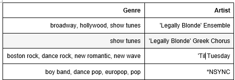
As seen above, each row of the genre column of data_w_genres.csv contained multiple genres. On a closer look, one could assess that these were all sub-genres of a particular main genre. Therefore, they could be replaced by one main genre using vectorized string operations. Even after classification into main genres, it was found that 13 genres accounted for 75% of data. The rest of the 25 % data accounted for more than 200 genres. Some of the genres contained less than 2 songs. Such widely spread data may not give us conclusive results. Thus, only the top 13 genres were considered for further analysis.
2. Artist dictionary:
This was followed by making a dictionary containing names of artists as the key and their corresponding genre as the value.
artist_dictionary={}
for index, row in genre.iterrows():
     artist_name=row["artists"]
     artist_genre=row["genres_main"]
     artist_dictionary[artist_name]=artist_genre
3. New genre column for data.csv:
Using the above dictionary, a genre column was created in data.csv using the following user-defined function.
def find_genre(column):
       music_style=[ ]
       for artist in column:
             if artist in artist_dictionary:
                music_style.append(artist_dictionary[artist])
       return music_style
data["genre"]=data["artists"].apply(find_genre)
4. Data Aggregation:
Now the rows of data.csv were grouped by artists, year, and genre. A new dataframe containing the mean value of popularity and song duration was made. The number of songs was also found and added to this dataframe.
 grouped=data.groupby( ['artists', 'genre', 'year'], as_index=False)
 group_mean=grouped ["duration_ms", "popularity"].mean()
 group_count=grouped ["name"].count()
 group_mean ["song_count"]=group_count ["name"]
For the plot, we require the song count, mean popularity, and the number of artists against each genre. This can be done by further aggregation:
grouped_2=group_mean.groupby ( ['genre','year'], as_index=False)
Using the grouped_2 dataframe, we find the number of artists in a genre in a particular year using aggregate function count. We also find the total songs composed by an artist and the mean popularity using aggregate functions sum and mean.
df_a=grouped_2['artists'].count()
df_b=grouped_2['song_count'].sum()
df_c=grouped_2['popularity'].mean()
Now we combine all the data in a single dataframe.
df_a['song_count']=df_b['song_count']
df_a['popularity']=df_c['popularity']
df_a=df_a.sort_values('year')
Finally, we get our targeted dataframe named df_a. Let’s move on to some showbiz!
5. Plotting:
We have used a python visualization library called plotly for presenting the music data. It has a plotly express module (imported often as px) which can plot complex data with a simple syntax. One of the most famous uses of this type of plot was made by Hans Rosling in his video below. We can see that the bubble plot elegantly turns vast data into comprehensible information.
Now let’s come back to our music store. Using px.scatter an animated bubble plot was generated.
First, we import the plotly express module and plotly.io module from plotly. This will help us to generate the plot and show the plot within the Jupyter notebook.
import plotly.express as px
import plotly.io as pio
While plotting, each bubble represents a genre and will be of a different color. There are various color schemes available on plotly express for this. Some of the names of color schemes are Plotly, G10, D3, Alphabet, etc. There are two methods to input colors. In the first method, one can choose a color scheme for the bubbles and input the name against the parameter color_discrete_sequence inside the px.scatter command. In the second method, one can use a dictionary to map each genre to a particular color. In this study, the latter method was used.
color_discret_map={'classical':'#AA0DFE', 'pop':'#3283FE', 'movies_and_broadway':'#85660D', 'jazz':'#16FF32', 'rock':'#565656', 'religiuos': '#1C8356', 'funk':'#782AB6', 'reggaeton':'#FA0087', 'country music':'#FE00FA', 'rhytm_and_blues':'#1CBE4F', 'folk':'#C4451C', 'rap':'#DEA0FD', 'kPop':'#B00068'}
For plotting we use the below command:
fig= px.scatter ( data_frame = df_a, x="popularity", y="song_count", color="genre", size="artists", size_max=60, color_discrete_map=color_discrete_map, hover_name="genre", animation_frame ="year", range_x=[0,90], range_y=[0,1500], title="SPOTIFY: TRENDS OF MUSIC FROM 1921 TO 2020", labels= { "popularity" : "popularity", "song_count": "song_count" } )
The attributes of the plot can be updated as follows:
fig.update_layout (title= {'x':0.5, 'xanchor':'center', 'font': {'size':20}}, xaxis= {'title': {'text': 'POPULARITY'} } , yaxis= { 'title': {'text': 'NUMBER OF SONGS'} }, legend= {'font': {'size':18}, 'title':{'font':{'size':18} } } )
The time duration of the animation can be adjusted using:
fig.layout.updatemenus[0].buttons[0].args[1]["frame"]["duration"] = 900
Finally, to show the plot :
pio.show(fig)
We get a plot as below:
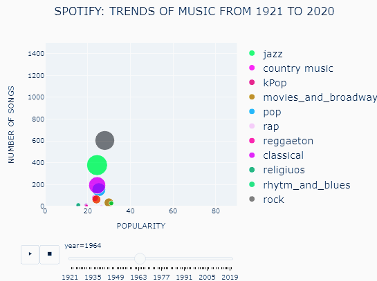
The x-axis describes mean popularity of songs assessed on a scale of 0 to 100. 0 means the song is least popular and 100 means it is most popular. The y-axis shows the number of songs produced in each genre. The size of the bubble describes the number of artists producing music in each genre. One can hover over the bubble to see the exact numbers.
In general, newer songs had more popularity than older songs because of the algorithm used for the calculation of popularity. Also, the popularity of all genres was similar for a given year. Hence this could not be used as a tool for comparison. On the other hand, the number of songs and artists reflected a better picture of how popular each genre of music was. The greater is the popularity of a genre, the greater will be the number of songs being composed and the number of artists working in that genre.
However, the plot could not depict data for some genres. Let’s find out why?
The px.scatter forms an initial grid using the input against the parameter animation_frame. In our case, the animation_frame is the “year” column. If a genre is missing against a year, for the subsequent years data for that genre would not be plotted. To overcome this error, a blank row for all genres was added to the dataframe for each year.
First, we create a list of years (years_df) and a list of the popular genres(genre_list_interest) .
 year_df= [ i for i range (1922,2021) ]
genre_list_interest=["rock", "classical", "pop", "jazz", "rap", "folk", "country music" ,"funk" ,"reggaeton" ,"movies_and_broadway", "religious", "rhytm_and_blues", "bollywood", "kPop"]
Now we create a blank row in our target dataframe df_a.
for genre in genre_list_interest:
     test_df=df_a[df_a["genre"]==genre]
     test_list= test_df['year'].unique().tolist()
     for year in years_df_a:
          if year not in test_list:
     dict_new_1 = { 'artists': 0, 'genre': genre, 'year': year, 'duration_ms': 0, 'popularity': 0, 'song_count':0}
             df_a=df_a.append(dict_new_1, ignore_index=True)
This solves the problem and we get an interactive animated bubble plot as given below.
RESULTS: STORYTELLING THROUGH EDA
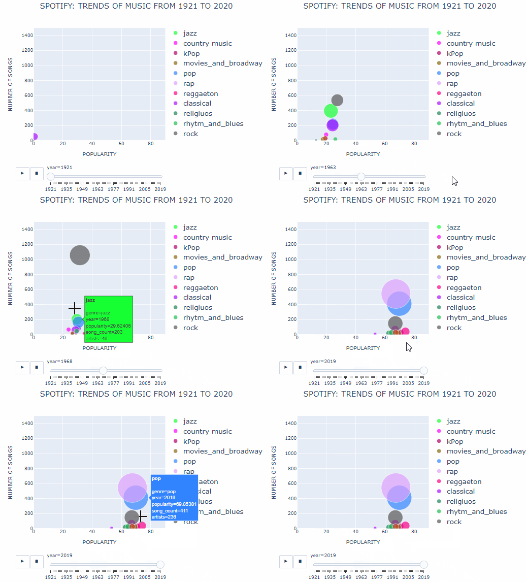
With no other forms of music to compete, classical music thrived during the 1920s. The number of classical songs produced grew almost 10 times and the number of artists working in this field almost doubled by the end of the decade. The 1920s was also the post-world war I period during which many Afro American migrants moved to the cities. They brought with them a new form of music called jazz to the cities. Soon this form of music became widespread due to its style of presentation. Jazz music was characterized by in-situ improvisation which classical music lacked.
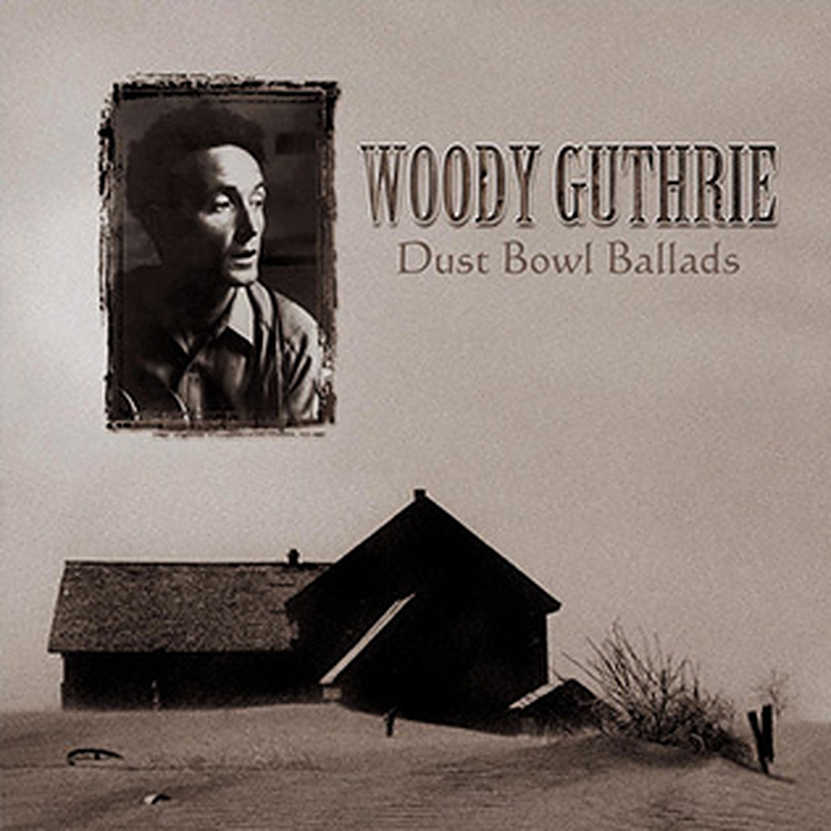
During the 1930s use of radio became widespread giving a new platform for artists to present their work. As a result, many new genres such as folk, rock, and pop music emerged during this time period. Genres such as folk music even surpassed classical and jazz music in terms of popularity. In 1930, about 200 folk songs were produced as compared to 100 and 50 songs produced in the classical and the jazz genre respectively. The rise of folk music was attributed to its simplicity and its ability to connect with the people. Folk songs such as Woody Gutherie’s “Dust Bowl Refugee” talked about the real-life struggle of the people during the dust bowl era.
The 1940s saw a replenished interest in the classical genre as it was used by many artists to boost the morale of the nation during wartime. For example, Myra Hess sometimes referred to as a war pianist, played afternoon concerts in London. She was honored by the king for her work during such difficult times.
After World War II ended in 1945, life was much more peaceful. This led to a surge in demand for entertainment. As a result, many Broadway shows and movies were produced during this time. Hence, music associated with this industry also found it’s niche.
In the next decade of the 1950s, the popularity of classical music declined while jazz music remained the favorite. Talented artists such as Miles Davis brought in more beauty with complexity into the jazz world. However, this did not go down well with the audience. Soon this style of music became bound only to the upper class of the society. The regular audience resorted to the lighter genres such as pop, folk, and country music. Jazz was further smothered by the boom of rock music in the 1960s.
In the 1960s, the babies of the post-world war II era had grown up to bring in a colossal change to society. This generation unlike its predecessor did not have to worry about survival. They brought in a “counter-culture” attitude. This led to a drastic change in fashion and music. Rock music became a trademark for this generation. With more than 1000 songs and 150 artists, this genre seemed undefeatable. Rock music stayed at the top spot even in the 1970s and the 1980s although other genres seemed to catch up in the late 1980s.
In the 1990s, Andy Hildebrand invented Autotune technology. As the name suggests it could tune an out of pitch voice digitally to make it sound perfect. This probably led to a boom in pop and rap music in the 1990s. The number of pop and rap songs almost tripled and the number of artists producing this type of music grew 4 times by the end of 2020.
Since the internet has made it easier for artists to reach their audience, a few new types of genres have also gained popularity. One such new entrant is pop music from Korea. Although it is in a different language, it has topped the charts of many English speaking countries. Hans Christian Anderson truly said, “Where words fail, music speaks”!



Good read Archana.