Introduction
A step-by-step guide to getting started with Seaborn!
If matplotlib “tries to make easy things easy and hard things possible”, seaborn tries to make a well-defined set of hard things easy too.
Seaborn’s Coolness:
Seaborn’s greatest strengths are its diversity of plotting functions. It allows us to make complicated plots even in a single line of code!
In this tutorial, we will be using three libraries to get the job done — Matplotlib, Seaborn, Pandas. If you are a complete beginner to Python, I suggest starting out and getting a little familiar with Matplotlib and Pandas.
If you follow along with this tutorial exactly, you will be able to make beautiful charts with these three libraries. You can then use my code as a template for any future visualization tasks in the future.
Let’s start our seaborn journey with the famous Pokemon Dataset. Before starting I strongly advise you to write your own base codes for each graph and try experimenting with graphs.
You can find the Pokemon dataset on Kaggle. However, to make your journey easy I have shortened and cleaned this version of the dataset.
You can download the dataset here: https://github.com/shelvi31/Seaborn-Experiments
My Super Saver: I would like to mention a resource that is always my super saver whenever I am stuck. https://python-graph-gallery.com/ .
Let’s start now:
We will start with importing of necessary libraries:
#importing libraries
import pandas as pd
import matplotlib.pyplot as plt
import seaborn as sns
Read the CSV file
import pandas as pd
data = pd.read_csv('Pokemon.csv', encoding = 'unicode_escape')
print(data.head())
I switched the utf8 codec error by defining a different codec package in the read_csv() command.
Our data looks something like this….
Output:

The columns’ name does not simplify its purpose clearly. It’s important to know about the dataset before actually working on it.
Here is the simplified description of the dataset for you.
This data set includes 150 Pokemon it’s about the pokemon games (NOT pokemon cards or Pokemon Go).
In this dataset, we have 150 rows and 13 columns.
Columns description:
# ID for each pokemon
# Name: Name of each pokemon
# Type 1: Each pokemon has a type, this determines weakness/resistance to attacks
# Type 2: Some pokemon are dual type and have 2
# Total: sum of all stats that come after this, a general guide to how strong a pokemon is
# HP: hit points, or health, defines how much damage a pokemon can withstand before fainting
# Attack: the base modifier for normal attacks (eg. Scratch, Punch)
# Defense: the base damage resistance against normal attacks
# SP Atk: special attack, the base modifier for special attacks (e.g. fire blast, bubble beam)
# SP Def: the base damage resistance against special attacks
# Speed: determines which pokemon attacks first each round
# Stage : Number of Generation
#Legendary : True if Legendary Pokemon , False if not
I have renamed the column names to give more sense to our plotting and for clarity of mind. Although it’s optional, I strongly advise you to do so to eliminate any possibilities for confusion.
data.rename(columns = {“#”:”No.”,”Type 1":”Pokemon_Type”,”Type 2":”PokemonType2",’Total’:’Sum of Attack’,”HP”:”Hit Points”,”Attack” : “Attack Strength”, “Defense”:”Defensive Strength”,”Sp. Atk”:”Special Attack Stenth”,”Sp. Def”:”Special Defense Strength”,”Stage”:”Generation”}, inplace = True)data.head()
My Output now looks:

Let’s start the visualization with the simple ones, the distributions graph.
Distribution Plots:
A distribution plot displays a distribution and range of a set of numeric values plotted against a dimension. Histograms allow you to plot the distributions of numeric variables.
I could have used “data.hist(figsize=(12,10),bins=20)” , but since not all the columns in this database have numerical values. Hence, I have to plot individual distribution plots.
plt.figure(figsize=(4,3))
sns.distplot(x=data[“Sum of Attack”],color=”Orange”,kde=True,rug=True);
plt.show()
Distribution Plot Output: Sum of Attack by Pokemon
Displot function of seaborn plots a histogram with a density curve. We can remove the density using the option kde=” False”.Control the presence of rugs using rug=” True”.
There are many alternative ways to plot histogram in python:
plt.figure(figsize=(3,3))
sns.histplot(x=data[“Sum of Attack”],color=”Green”);
plt.show()
One other way is: using plt.hist()
plt.figure(figsize=(3,3))
plt.hist(x=data["Sum of Attack"],color="Red",bins=20);
plt.show()
Thus, for many ways to plot distributions. All functions pyplot.hist, seaborn.coOutuntplot and seaborn.displot act as wrappers for a matplotlib bar plot and may be used if manually plotting such bar plot is considered too cumbersome.
- For discrete variables, a
seaborn.countplotis more convenient. - For continuous variables :
pyplot.historseaborn.distplotare used.
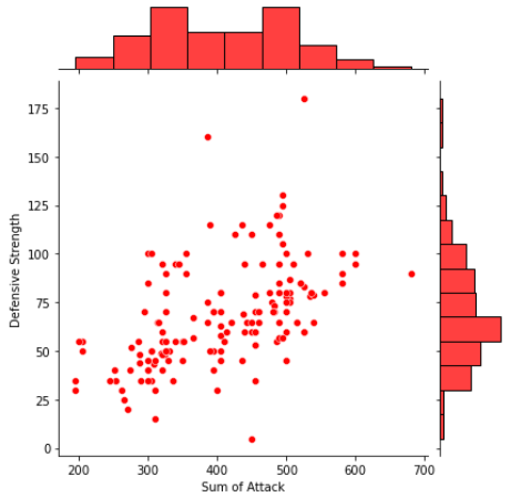
Joint Distribution Plots:
Joint distribution plots combine information from scatter plots and histograms to give us detailed information for bivariate distributions.
sns.jointplot(x=data[“Sum of Attack”],y=data[“Defensive Strength”],color=”Red”);
Density Plots:
Density plots display the distribution between two variables.
sns.kdeplot(x=data[“Sum of Attack”],y=data[“Defensive Strength”])
plt.show()

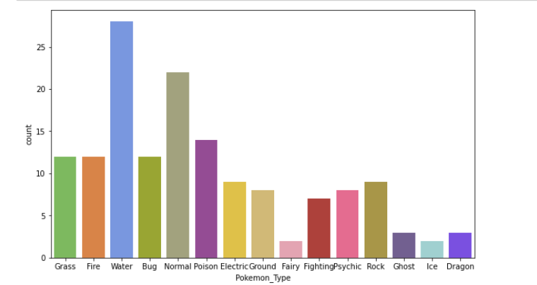
Bar Plot
Bar plots help us visualize the distributions of categorical variables: Countplot is a type of barplot.
plt.figure(figsize=(10,6));
sns.countplot(x=data.Pokemon_Type,palette=pkmn_type_colors);
plt.show()
Heatmap
Heatmap helps us visualize matrix-like data in the form of hot and cold spots. The warm colors indicated sections with the most visitor interaction.
plt.figure(figsize=(8,6));
sns.heatmap(data.corr());# Rotate x-labels with the help of matplotlib
plt.xticks(rotation=-45);

Scatter Plot:
A scatter plot (aka scatter chart, scatter graph) uses dots to represent values for two different numeric variables. The position of each dot on the horizontal and vertical axis indicates values for an individual data point.
Scatter plots are used to observe relationships between variables.
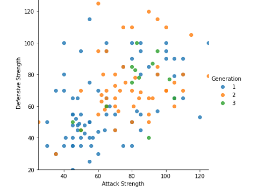
I have compared the Attack and Defense stats for our Pokémon with the help of scatterplots.
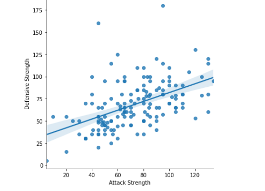
Seaborn doesn’t have a dedicated scatter plot function, which is why we see a diagonal line (regression line)here by default.
Thankfully, seaborn helps us in tweaking the plot :
- fit_reg=False is used to remove the regression line
- hue=’Stage’ is used to color points by a third variable value. Thus, allowing us to express the third dimension of information using color.
Here I have the Pokémon’s evolution stage as 3rd variable!
#Tweaking with scatter plotsns.lmplot(x=’Attack Strength’, y=’Defensive Strength’, data=data,
 fit_reg = False, #Deleting regression line
 hue=”Generation”); #Separating as per pokemon generation
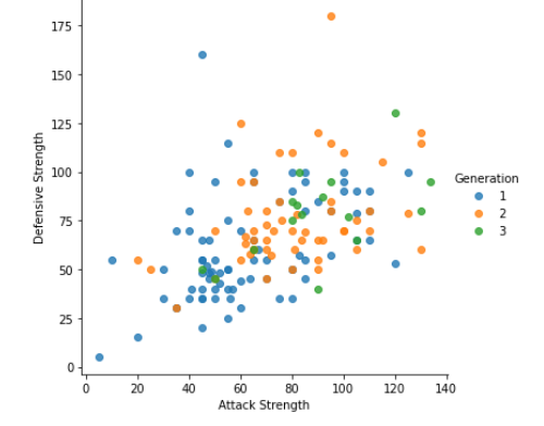
More of the density falls on 40–120 mark, I will alter the limits of axes with the help of matplotlib:
sns.lmplot(x=’Attack Strength’, y=’Defensive Strength’, data=data,
fit_reg = False, #Deleting regression line
hue=”Generation”); #Separating as per pokemon generationplt.ylim(20,130);
plt.xlim(25,125);
We can see a more focussed and better graph now!
Boxplot
A box plot is used for depicting groups of numerical data through their quartiles.
Box plots may also have lines extending from the boxes indicating variability outside the upper and lower quartiles, hence the terms box-and-whisker plot and box-and-whisker diagram
We can remove the “Sum of Attack” column since we have individual stats. We can also remove the “Generation” and “Legendary” columns because they aren’t combating stats.
plt.figure(figsize=(15,7));# Pre-format DataFrame
stats_data = data.drop([‘Sum of Attack’, ‘Generation’, ‘Legendary’], axis=1);

# New boxplot using stats_df
sns.boxplot(data=stats_data,
 showfliers=False); #Removing outlierssns.set_style(“whitegrid”)
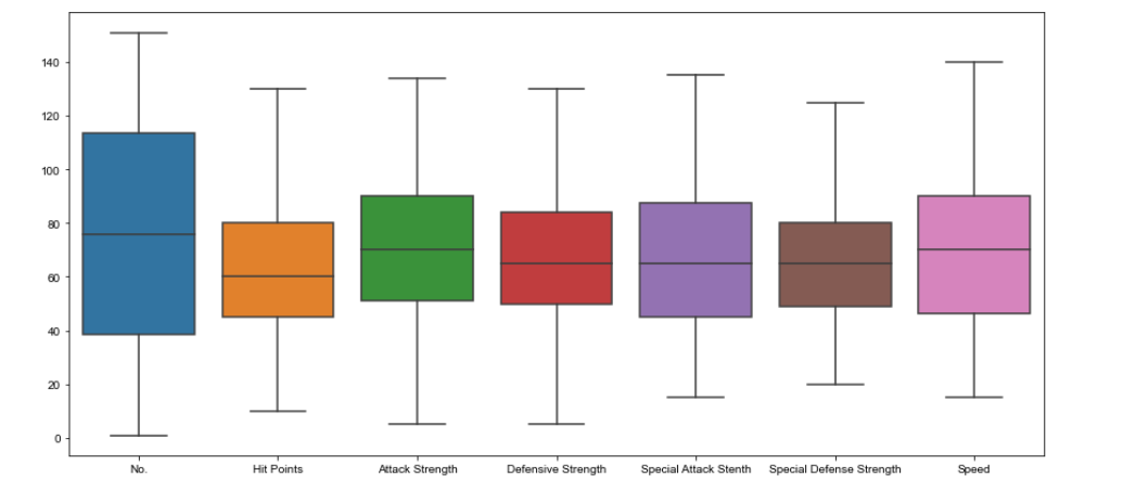
Remember to keep figsize before plotting the graph.
Violin Plots
Now I will Plot the violin plot.
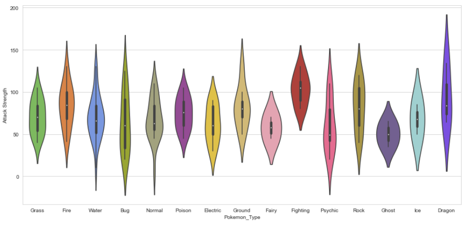
Violin Plots are alternatives to box plots. They show the distribution (through the thickness of the violin) instead of only the summary statistics.
Here I have shown the distribution of Attack by Pokémon’s Primary type
plt.figure(figsize=(15,7));
sns.violinplot(x=data.Pokemon_Type, y = data[“Attack Strength”]);

As you can see, Dragon-types tend to have higher Attack stats than Ghost types, but they also have greater variance.
Now, Pokémon fans might find something quite jarring about that plot: The colors are nonsensical. Why is the Grass-type colored pink or the Water-type colored orange? We must fix this immediately!
Fortunately, Seaborn allows us to set custom color palettes. We can simply create an ordered Python list of color hex values.
I have used Bulbapedia to create a new color palette.
# using Bulbapedia to create a new color palette:#Bulbapedia : https://bulbapedia.bulbagarden.net/wiki/Category:Type_color_templatspkmn_type_colors = [‘#78C850’, # Grass
 ‘#F08030’, # Fire
 ‘#6890F0’, # Water
 ‘#A8B820’, # Bug
 ‘#A8A878’, # Normal
 ‘#A040A0’, # Poison
 ‘#F8D030’, # Electric
 ‘#E0C068’, # Ground
 ‘#EE99AC’, # Fairy
 ‘#C03028’, # Fighting
 ‘#F85888’, # Psychic
 ‘#B8A038’, # Rock
 ‘#705898’, # Ghost
 ‘#98D8D8’, # Ice
 ‘#7038F8’, # Dragon
 ]
Making modification in violin plot as per pokemon type’s color:
plt.figure(figsize=(15,7));
sns.violinplot(x=data.Pokemon_Type,
 y = data[“Attack Strength”],
 palette = pkmn_type_colors);
Swarmplots
As you have seen Violin plots are great for visualizing distributions.
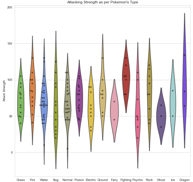
However, since we only have 150 Pokémon in our dataset, we may want to simply display each point. That’s where the swarm plot comes in. This visualization will show each point, while “stacking” those with similar values.
plt.figure(figsize=(12,5));
sns.swarmplot(x=data.Pokemon_Type,y=data[“Attack Strength”],palette=pkmn_type_colors);
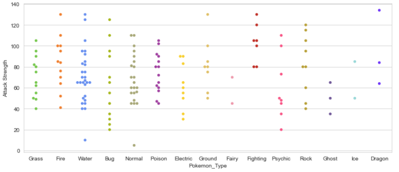
This looks good but for better visuals, we can combine these two! After all, they display the same information.
Overlying Plots
plt.figure(figsize=(10,10))sns.violinplot(x=data.Pokemon_Type, y = data[“Attack Strength”],
 inner=None,
 palette = pkmn_type_colors);sns.swarmplot(x=”Pokemon_Type”,
y=”Attack Strength”,
data=data,
color=’black’, #making points black
alpha=0.5);plt.title(“Attacking Strength as per Pokemon’s Type”);
Points to Note:
inner=None : Remove the bars inside the violins
alpha=0.5: makes points slightly transparent:Remember alpha value must be float,dont keep in “”
You can find the references for seaborn color here : https://python-graph-gallery.com/100-calling-a-color-with-seaborn/
Factor Plots
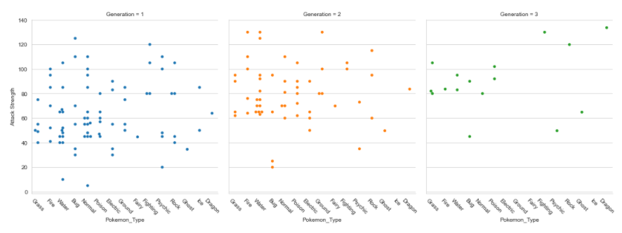
Factor plots make it easy to separate plots by categorical classes.
plt.figure(figsize=(5,15))
factplot= sns.factorplot(x="Pokemon_Type",y="Attack Strength",data=data,hue="Generation",col="Generation",kind="swarm");factplot.set_xticklabels(rotation=-45)
plt.show()
Quick notes:
- plt.xticks(rotation=-45) : Doesn’t work because it only rotates last plot
- Need to use: set_xticklabels
You can make more visualizations like the ones above, by simply changing the variable names and running the same lines of code.
I will leave that as an exercise for you to do, to get a better grasp on your visualization skills with Python.
That’s all for this article! I hope you found this tutorial helpful and can use it. Good luck in your data science journey, and happy learning!
Seaborn offers a multitude of graphs and features. You can always learn more with https://seaborn.pydata.org/.
The beautiful thing about learning is that nobody can take it away from you! — B.B. King
The media shown in this article are not owned by Analytics Vidhya and is used at the Author’s discretion.


Brilliant