This article was published as a part of the Data Science Blogathon.
“You can have data without information, but you cannot have information without data.”
– Daniel Keys Moran
The very existence of Data Science is due to the need for understanding data. Data Science is multi-disciplinary, and arguably the strongest pillar of data science is Statistics. Remove the programming and technical components from a Data Scientist, and you have a Statistician.
A statistical mindset is key to making sense of the data. Before diving into Machine learning algorithms, it’s paramount to know what you’re dealing with!
Statistics not only enables us to fathom the data we have but also gives better direction to the Analysis. This is popularly known as Exploratory Data Analysis in Data Science, which combines statistics with programming.
The knowledge of key statistical concepts, in order to truly interpret exploratory data analysis are:
- Levels of Measurement
- Measures of Central Tendency
- Measures of Dispersion
- Measures of symmetry
- Correlation
Let’s grasp these concepts by asking some key questions.
Levels of Measurement
“What type of data am i dealing with?”
A dataset is comprised of many different columns or features. The first and foremost step is to identify which level of measurement a feature belongs to. A feature can belong to the nominal, ordinal, interval, or ratio scales.
Nominal – Used for labeling categories in the data, based on the attributes of the data.
Example: Male or Female, O positive or B positive.
Ordinal – Assigning a rank/order to data
Example: Small, Medium, or Large
Both Nominal and Ordinal Scales are used for Qualitative/Categorical Features.
Interval – This shows the magnitude of difference between observations as a fixed unit, along with their order. How small or How Large an observation is when compared to another?
Example: Temperature
Ratio – Not only measures the magnitude of difference between observations, but also the proportions in these differences.
Example: Kilograms
Both Interval and Ratio Scales are used for Quantitative/Numerical features.
Knowing the level of measurement allows us to apply suitable analytical techniques to the data.
If a categorical feature has many categories, it can be binned into fewer, more meaningful ones. It is also not required to standardize such features. Categorical Data is best visualized through Bar charts, Pie charts, and Pareto diagrams.
Numerical Data is best visualized through Histograms, Line plots, Scatter plots, and Bubble plots. Such features need to be standardized, for further analysis and modeling.
Let’s explore the diamond dataset and identify categorical and numerical variables.
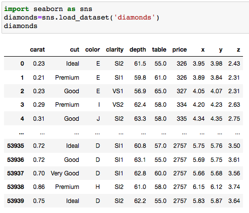
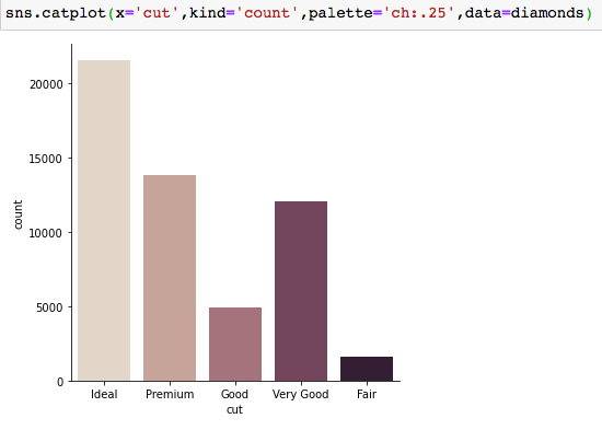
As we can observe, the features ‘cut’ and ‘clarity’ are ordinal categorical variables, labeling and ranking diamonds according to their quality and clarity respectively. Let’s visualize the ‘cut’ feature, by way of a bar chart using seaborn:
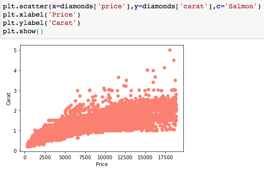
In the dataset, the variables ‘price’ and ‘carat’ are numerical variables, of ratio scale, as they have a true zero. Let’s visualize with a scatter plot:
Measures of Central Tendency
“What is one value, that describes my entire data?”
A measure of central tendency is a value around which most numerical values in the dataset tend to cluster.
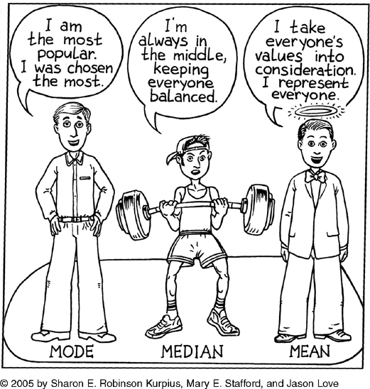
Mean, Median and Mode are the most commonly used measures of central tendency.
Mean or Average is the value most representative of the data. It is the sum of all observations divided by the total number of observations.
Median is the middlemost value, dividing the data into two equal parts. It is more representative of the data than the mean, in the presence of outliers.
The mode is the most recurring value in the data.
Measures of Dispersion
“How much does my data vary?”
A measure of dispersion shows the extent to which data points disperse/ vary from the average. Such measures enable us to test the reliability of an average.
Common measures of dispersion are Range, Interquartile range and their coefficient, Variance and Standard Deviation.
Standard Deviation is probably the most popular measure, independent of any unit of measurement.

Measures of Symmetry
“Which way is my data going?”
Measure the direction of the variation/dispersion of data points. They show on which side the data points in distribution are mostly concentrated. Data can be symmetrical or asymmetrical.
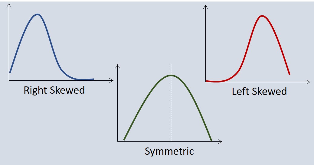
The Measures of Central Tendency, Dispersion, and Skewness are broadly termed as ‘Descriptive Statistics’.
Analyzing all of them allows us to identify the main characteristics and distribution of our data.
For example, even before plotting a variable on a graph, we can tell its type by simply looking at the mean, median, and mode.
If the Mean > Median > Mode, we have a positively skewed distribution i.e. outliers lie in the right tail of the distribution.
If the Mean < Median < Mode, we have a negatively skewed distribution i.e. outliers lie in the left tail of the distribution.
If the Mean = Median = Mode, we have a symmetrical/normal distribution, which is best for data analysis and modeling.
Let’s find these measures for the ‘price’ of diamonds. You can find them individually or use the ‘.describe()‘ method for this purpose.
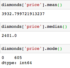
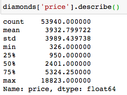
Here the Mean (3933) > Median (2401) > Mode (605) , so we have a positively skewed distribution.
Let’s plot a histogram to confirm:
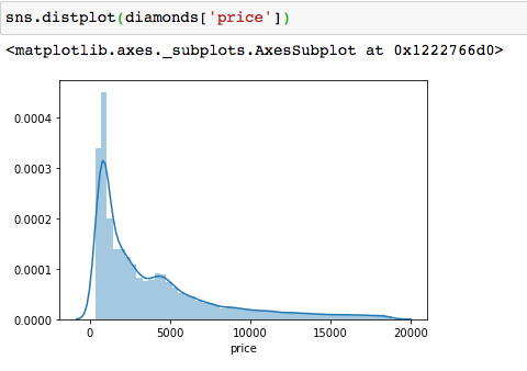
The tail of the distribution is on the right, and most of the
observations are concentrated to the left. Most of the diamonds are
priced below $2,000.
Moreover, inspecting descriptive statistics is the first step in Outlier Detection.
If the value of the mean is significantly different from the median, we immediately know that there is a presence of outliers in our data.
We can also visualize the above measures by way of box plots:
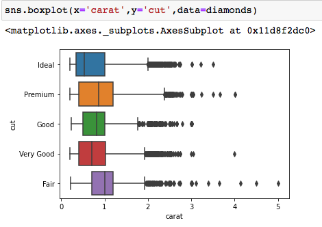
The dots are the outliers, whereas the box represents the interquartile range. The line in the box is the median. We can see that Premium quality diamonds have the highest carats compared to other qualities.
Correlation
“Is there any degree of association between these features in my data?
When trying to understand the relationship between two quantitative variables, Correlation analysis is favorable.
Correlation indicates the strength and direction of the relationship between two variables. The numerical value representing correlation is called the “Correlation coefficient”.
.png)
The Correlation coefficient lies between -1 and 1.
A value of 1 or close to 1 means a high positive correlation i.e. The value of one variable increases, with the increase in the value of the other.
A value of -1 or close to -1 means a high negative correlation i.e. The value of one variable decreases, with the increase in the value of the other.
A value of 0 means there is no relation between the two variables.
Correlation is best represented by way of scatter plots and heat maps.
Let’s see the correlation between ‘carat’ and ‘price’ of diamonds, by using the ‘.corr()‘ method:
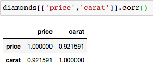
The correlation is 0.92, which is a high positive correlation. This means that when the carats increase, the price of the diamond increases. Let’s plot this using a heatmap:
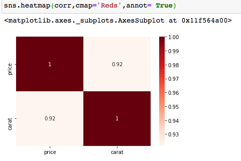
Correlation analysis helps us in Feature Selection. Features with high correlation, have the same impact on the dependent variable, and hence one of them can be dropped for better results.
Final Thoughts
A profound understanding of the concepts discussed above will enable you to not only judge your data, but also improve its quality by dealing with outliers, dropping redundant features, and normalizing the data distribution, resulting in significantly better-performing machine learning models and accurate insights!
The media shown in this article are not owned by Analytics Vidhya and is used at the Author’s discretion.


