This article was published as a part of the Data Science Blogathon.
Introduction

As we all know there are certain processes to analyze data. First, we define the problem then we mine the data and prepare the data for analysis. Before future engineering and model building, there is an important step.

Exploratory Data Analysis refers to the critical process of conducting initial research on data to discover patterns, detect anomalies, and check assumptions with the help of summary statistics and graphical representations. Exploratory Data Analysis is an important step before starting to analyze or modeling of the data. It provides the context needed to develop an appropriate model and interpret the results correctly.
Let look at a sample R implementation.
1. Data Discovery
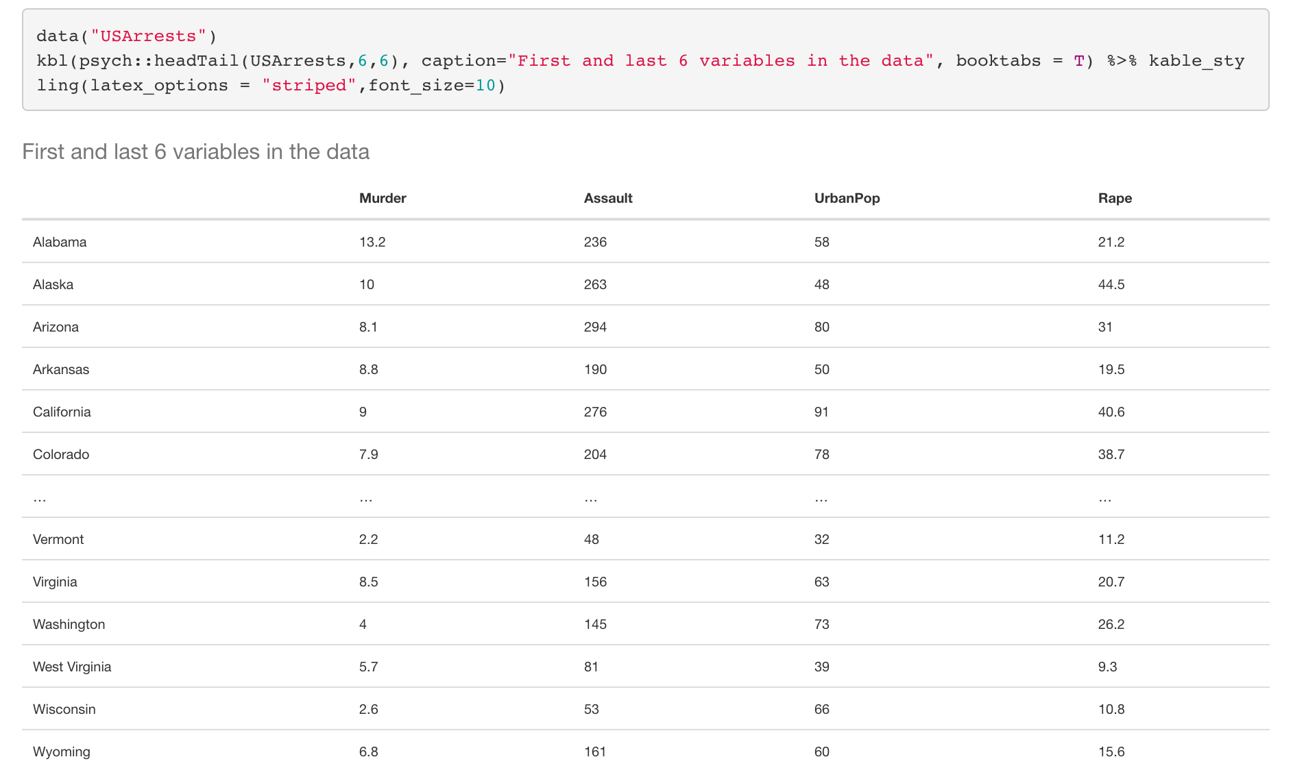
In this part, we discover the variable types and their summary statistics in the data. First, we upload the USArrests dataset in R. Then we print the dataset using “headTail” function which prints the first 4, and last 4 rows dataset in default.
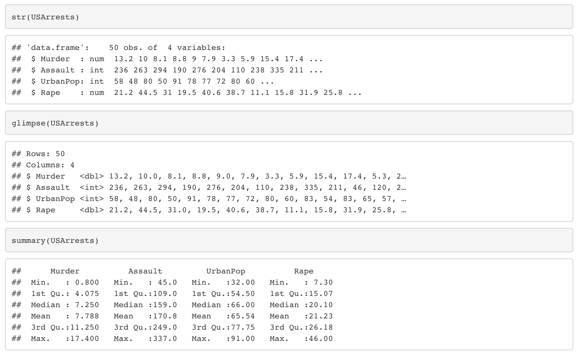
Then we look types of the variables and summary statistics of the variables.
“glimpse” and “str” functions give us types of variables.
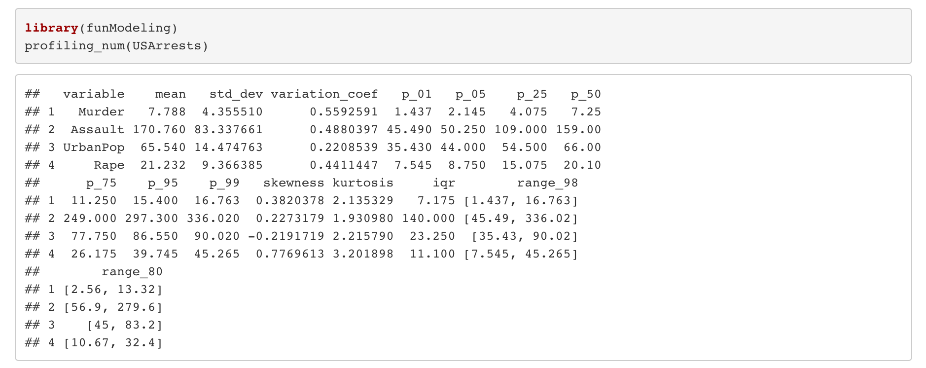
“profiling_num” function in funModeling library gives us detailed statistics like mean, standard deviation, skewness, kurtosis, interquartile range, etc.
Let interpret some results as an example:
- On average, murder in each city is 7.788.
- The standard deviation of the Assault is 83.34. It is high. A high standard deviation indicates that the data points are spread out over a large range of values.
Skewness is being non-symmetric of a variable.
- If skewness >0 –> right skewed distribution
- If skewness <0 –> left skewed distribution
- If skewness =0 –> symmetric distribution.
Thus, while the urban population is left skewed, Rape is right skewed.
Kurtosis shows whether the distribution is sharp or flattened.
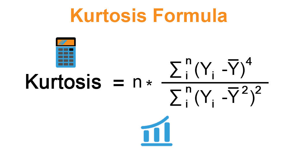
- If kurtosis >3 –> distribution is sharp
- If kurtosis <3 –> distribution is flattened
- If kurtosis =3 –> distribution is standard normal
Thus, while the urban population distributes sharply, assault distribute flattened.
2. Detect Missing values
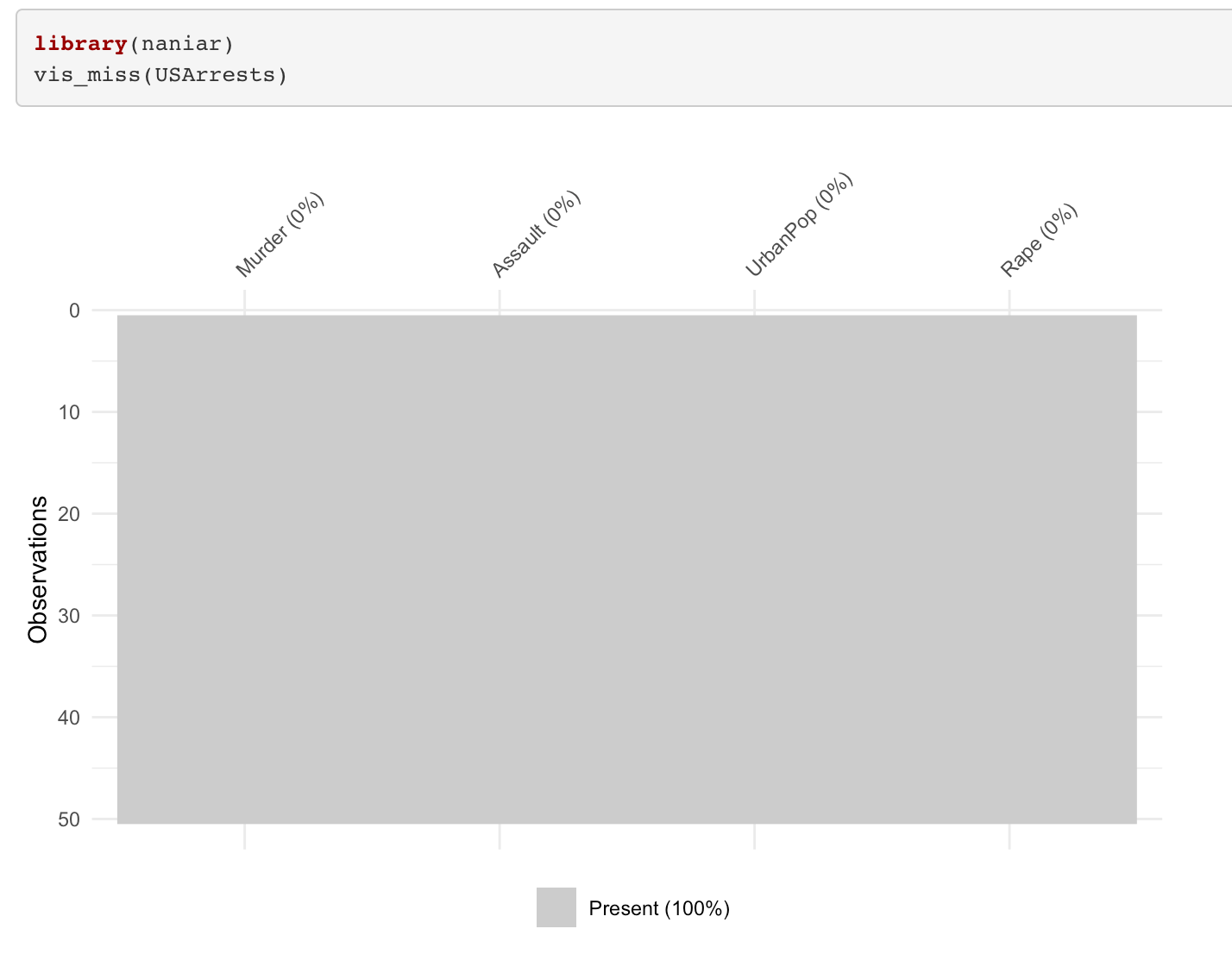
- As seen in the figure, in the data there are no missing values.
3. Detection of outliers
A combination of unusual values on at least two variables is a multivariate outlier. The effect of statistical studies can be affected by all kinds of outliers. They may distort the statistical analyses and violate their assumptions.
Let us show both multivariate and individual outliers.
“plot_outlier” function is very useful function in “dlookr” library. It shows Boxplots and histograms of all numeric variables with outlier and without the outlier. The reason for shows Boxplots is that they are very useful tools to visualize the outliers.
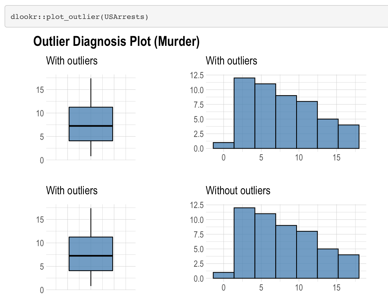
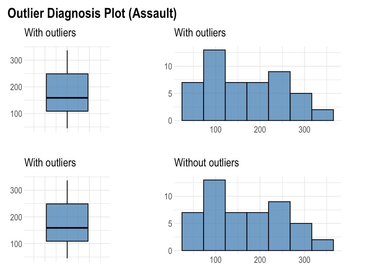
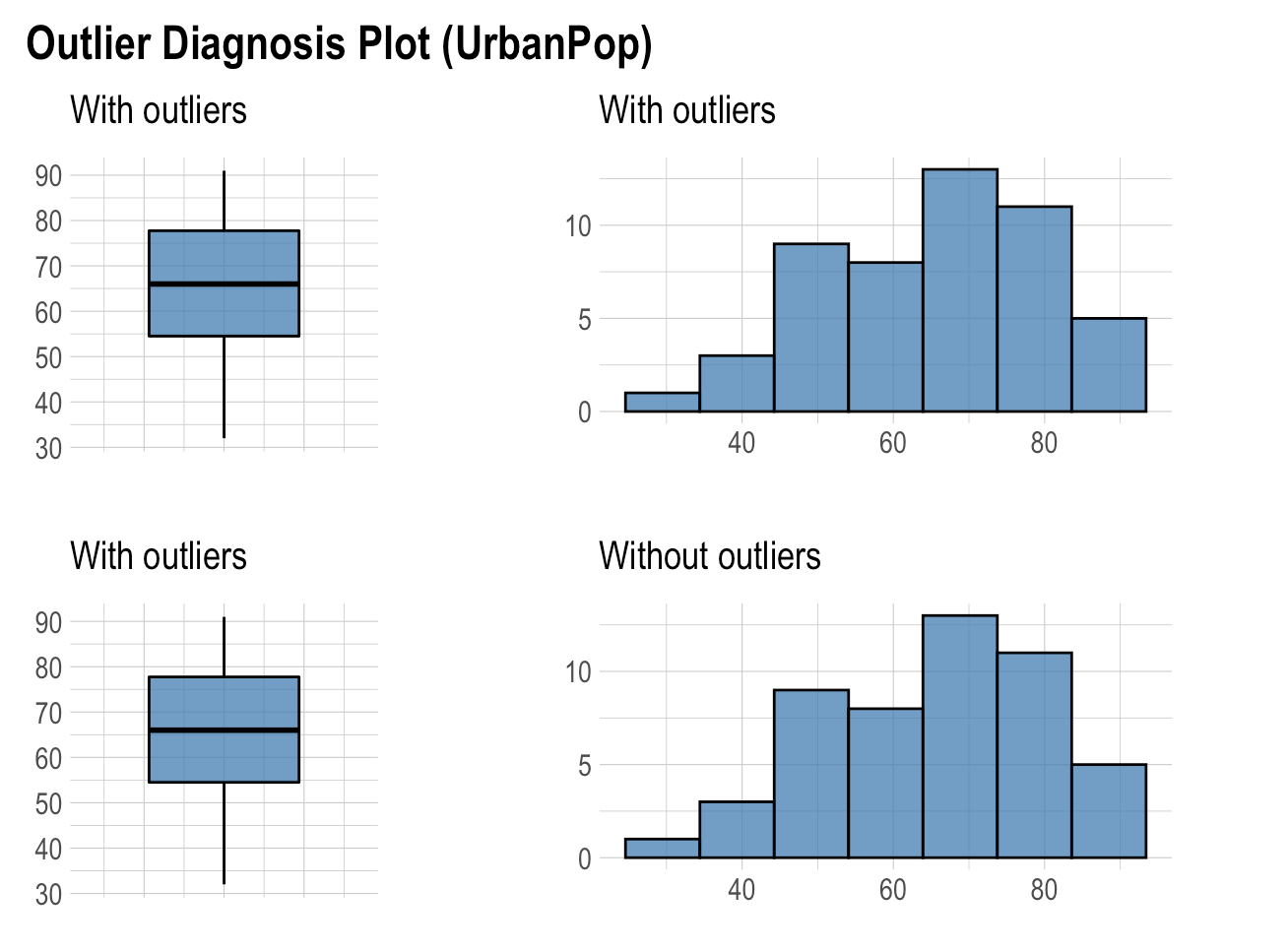
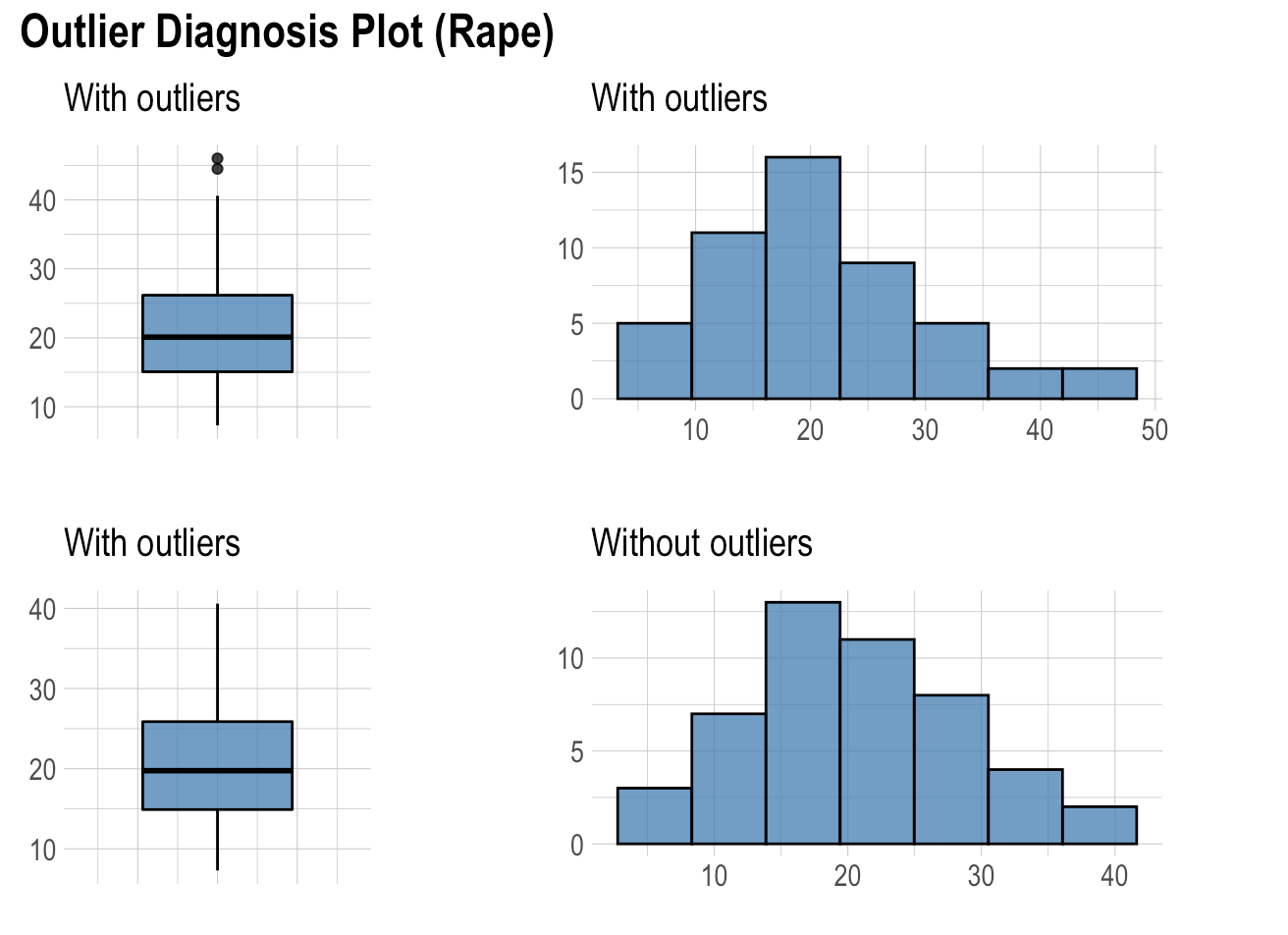
As seen in the plots only rape variables has outliers. Moreover, when we look at the histogram without outliers, its shape being more symmetric.
Let look at multivariate outliers. (it is very useful in multivariate analysis, just an example let us show it)
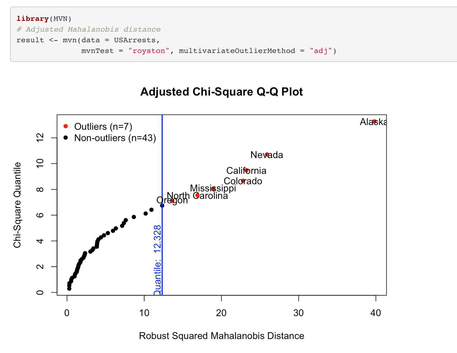
As seen there are 7 outliers in the data.
4. Assumption checking
To proceed with statistical methods, it is important to evaluate normality. This assumption allows us to construct confidence intervals and conduct hypothesis tests. For normality checking, there is no best method that is correct in all conditions. It is very convenient to use graphical approaches to decide on multivariate normality, in addition to numerical results. It can be helpful to combine them to provide more accurate choices.
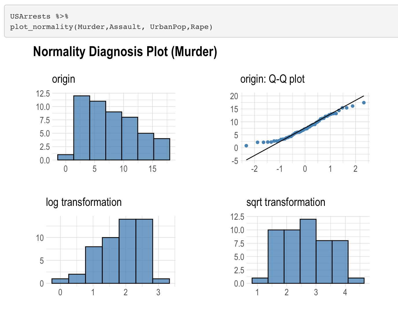
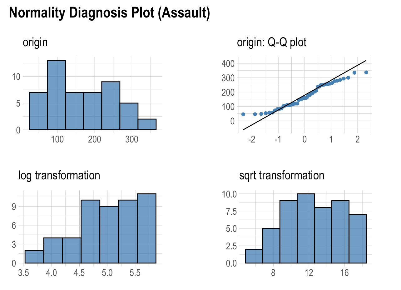
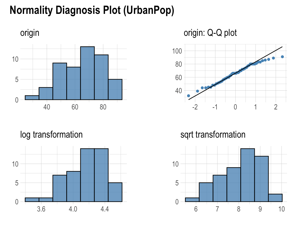
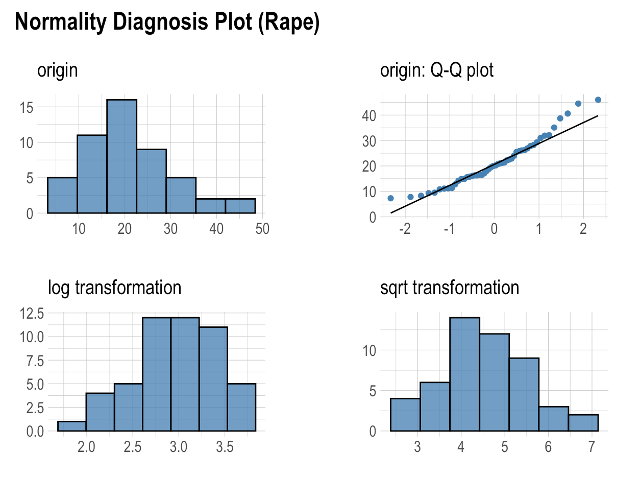
- None of the variables appear normal when looking at the histogram and Q-Q plot, and the histograms do not look normal after square root and log transformation.
4. Visualizations
In this part, we can look at different graphs of variables and the relationship between variables visually. Let us write some research questions.
4.1. In which city is the most murder?
For this question, we can use map or bar plot.
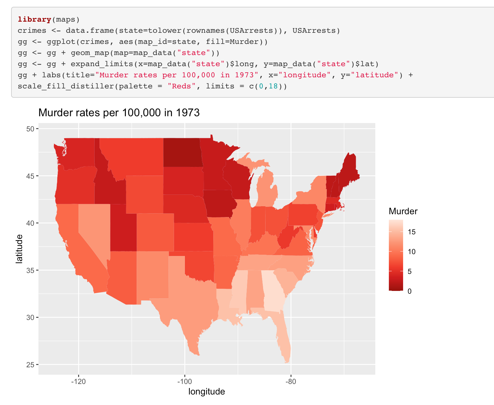
R code for the plot in the below is:
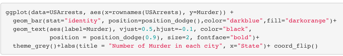
- As can be seen, the most murders were committed in Georgia.
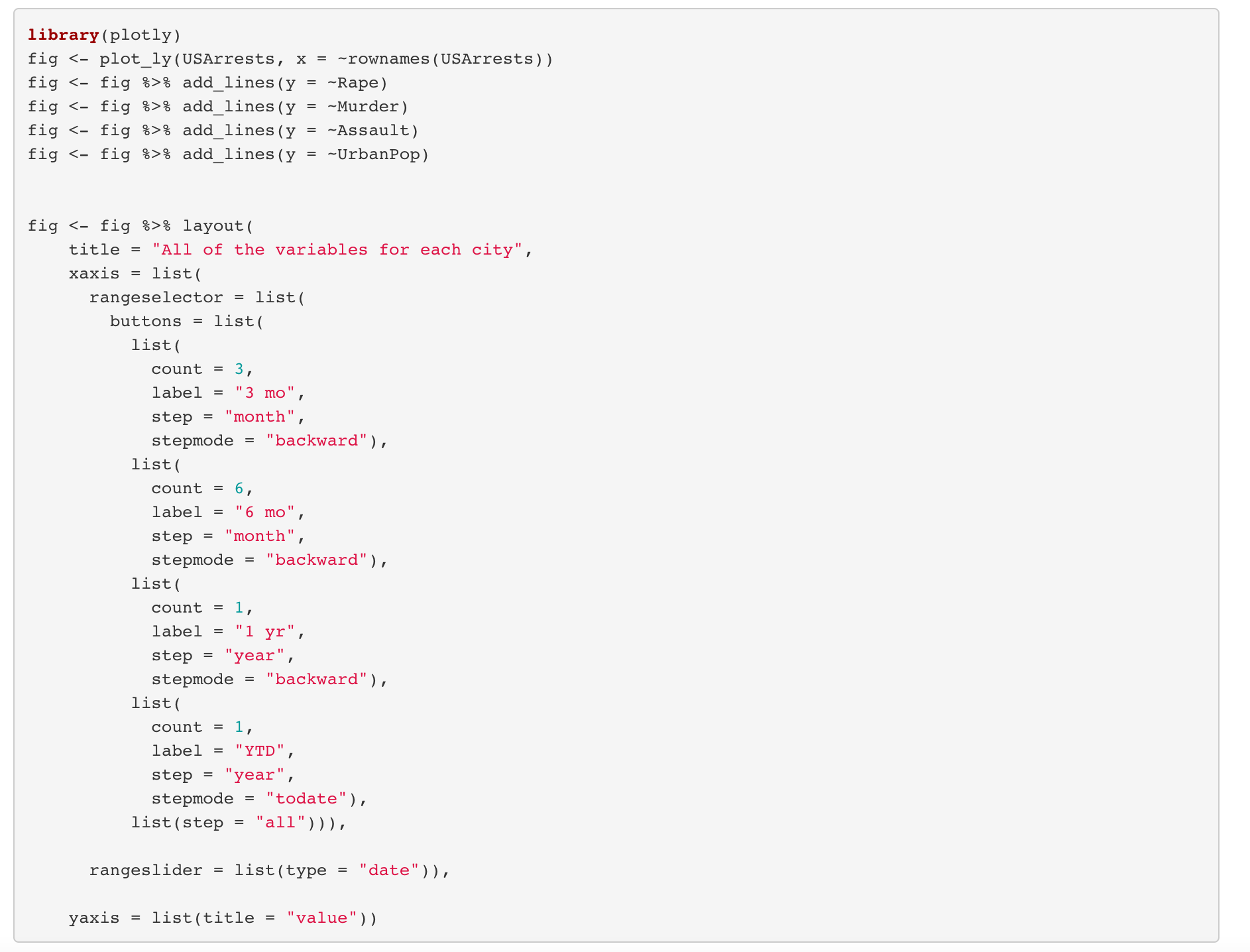
4.2. What is the values of all variables in each city?
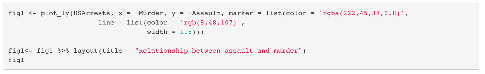
4.3. What is the relationship between assault and murder?
For this question, we can draw an interactive plot like seen in the above to see the state names.
R codes for the interactive plot is:
Or, we can drow it using ggplot.
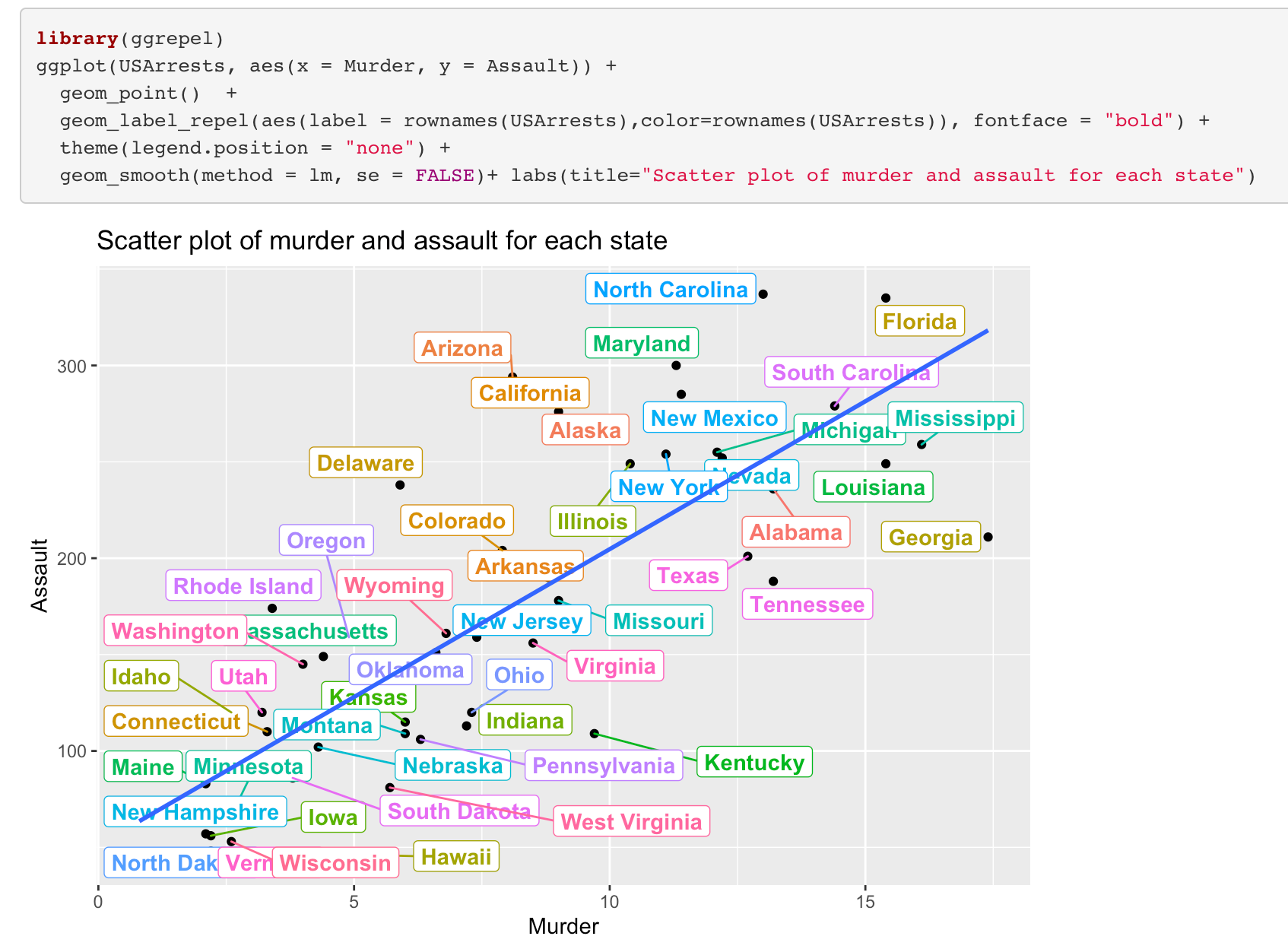
As seen there is a positive relationship between murder and assault.
4.4. What is the relationship between urban population and rape?
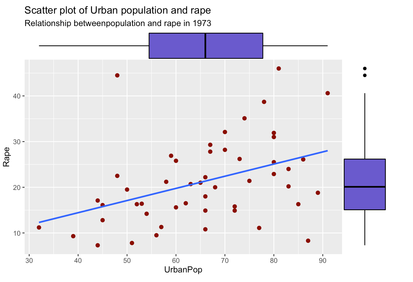
- Line and scatters shows the relationship between two variables and in the margins we see the boxplot of two variables.
- We can say that there is a positive relationship between the urban population and rape.
4.5. What are the relationships of the variables to each other?
Let look at correlation between variables. To look at this we can draw hat maps.
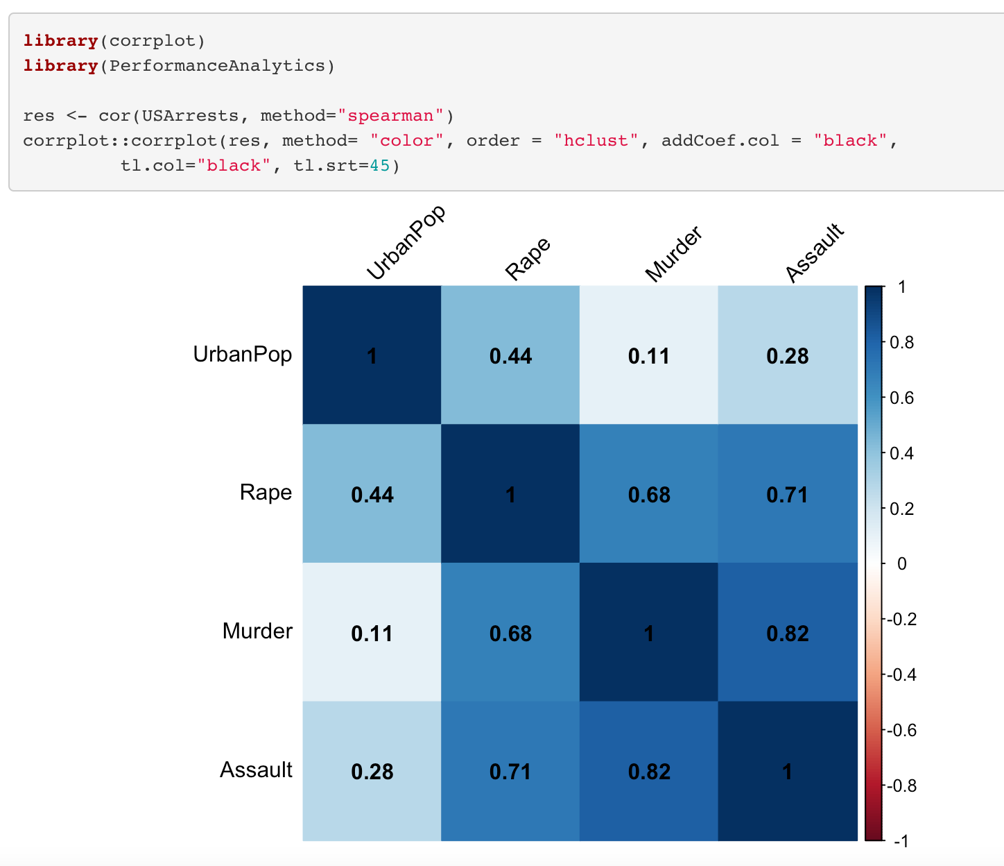
Positive correlations are shown in blue and negative correlations in red color. Color intensity is proportional to the correlation coefficients. When we look at the correlation matrix, it is seen that between some variables there is a strong positive relationship such as assault and rape, assault and murder.
Conclusion
To conclude, in this article, we examine the explanatory data analysis and which visualization types we can use for the explanatory data analysis. As stated above it is a very crucial step and it must be done before future engineering and model building to better understand data. You can access the codes from the link below.
https://github.com/iremtanriverdi/R_codes
The media shown in this article on Exploratory Data Analysis are not owned by Analytics Vidhya and is used at the Author’s discretion.


