Introduction
Tableau is a powerful Data Visualization software, and much of its popularity is due to its interactive visualizations & user-friendly interface.
With the Covid-19 Pandemic raging throughout the world, the availability of Vaccinations in recent months has been a sigh of relief. In today’s data-driven world, this also means the creation of new data, and in turn, a need for new insights.
Combining Tableau’s visualization prowess with the constantly growing Vaccination Data, in the form of a Dashboard, will help us get a bird’s-eye view of the current vaccination scenario.
Here’s a step-by-step guide on how you can build a Covid-19 Vaccination Dashboard in Tableau.
Data
The data has been taken from Our World in Data, which maintains, tracks & updates Covid-19 data in their Github repository on a regular basis.
This analysis uses data from the files ‘vaccinations.csv’ and ‘locations.csv’. The file ‘vaccinations.csv’ contains country-wise, region-wise & worldwide data relating to Total Vaccinations, Daily Vaccinations, People Vaccinated at least once, People fully Vaccinated, etc. The file ‘locations.csv’ contains country-wise data relating to Vaccination types/brands.
Data right from the beginning of vaccine administration in December 2020 to April 17, 2021, is in the scope of this analysis.
Note: I have slightly preprocessed the data, such as creating dummy variables, extracting the most recent dates, separating data into country-wise, region-wise, and worldwide sheets, for the purpose of better visualizations.
Planning the Dashboard
A key step for building an effective dashboard is planning in advance. A few important metrics I would like this dashboard to reflect are:
- Different Types of Vaccinations available & mostly used
- People Vaccinated, both Once and Fully
- Total Vaccinations administered till date
- Daily Vaccinations administered
This may require around 4-6 visualizations, using the most appropriate type for each metric.
Getting started
Step 1: Visualizing Covid-19 Vaccination Types/Brands and their Availability
We’ve all heard a few Vaccine brand names such as AstraZeneca, Pfizer …..but is that all? Let’s find out all the Vaccine brands available in different countries :
Open Tableau → Connect to the file ‘locations.csv’

Notice that I’ve created dummy columns beforehand for each vaccine brand above. For each brand, “1” means it’s available in the corresponding country, and “0” means it’s not.
In the original file, there is only one column called ‘vaccines’. It shows all vaccine brands per country.
Open a New worksheet
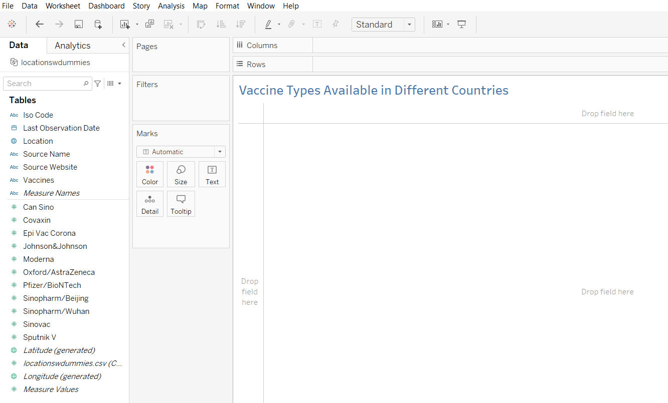
As you can see, all the vaccine brands are listed in the Measure fields in the Data Pane. Let’s drag them one by one to the Cards/Shelves.
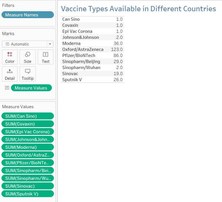
This shows the Sum of each column, which is the number of countries it’s available in this case.
A Horizontal Bar Chart would be most suitable to visualize this data. Head over to the Show Me option, and choose a Bar chart. The following chart is returned. You can Format the chart and Edit the axis as required.
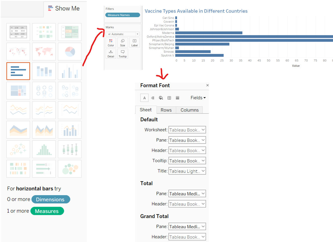
And our First visualization is ready:
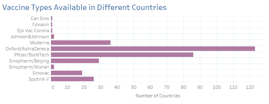
We can see that 11 Vaccine Types are available worldwide, with AstraZeneca being the most widely available brand in 123 countries, followed by Pfizer.
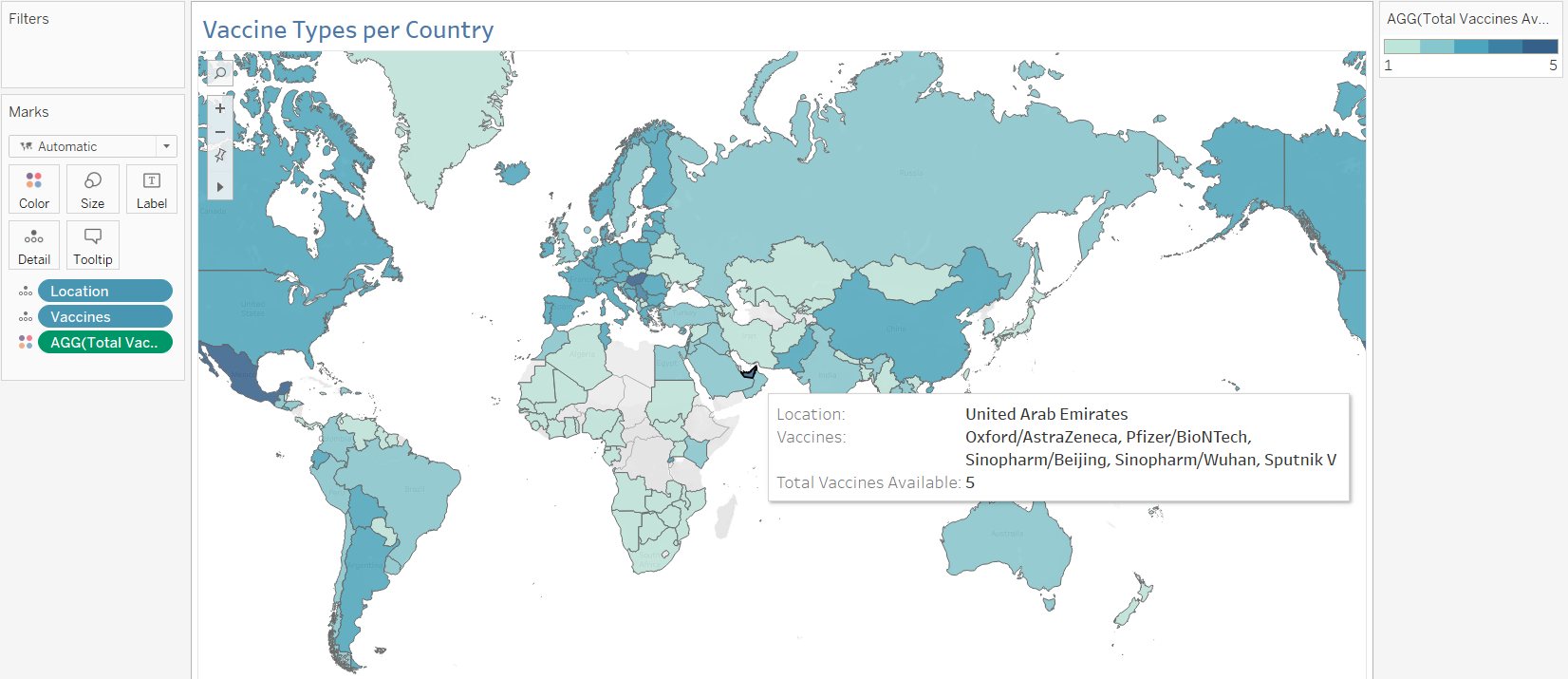
Let’s also visualize how they are available country-wise, by creating a Map showing Vaccine types and the number of total vaccines available in each of them.
Open a New Worksheet

In the Dimensions Area, the ‘Location’ field contains the country names. Make sure the symbol is a globe, and if not, set it by clicking on the current symbol and assigning “Country” as the Geographic Role.
Then, drag it to the empty space. Tableau creates a Map.
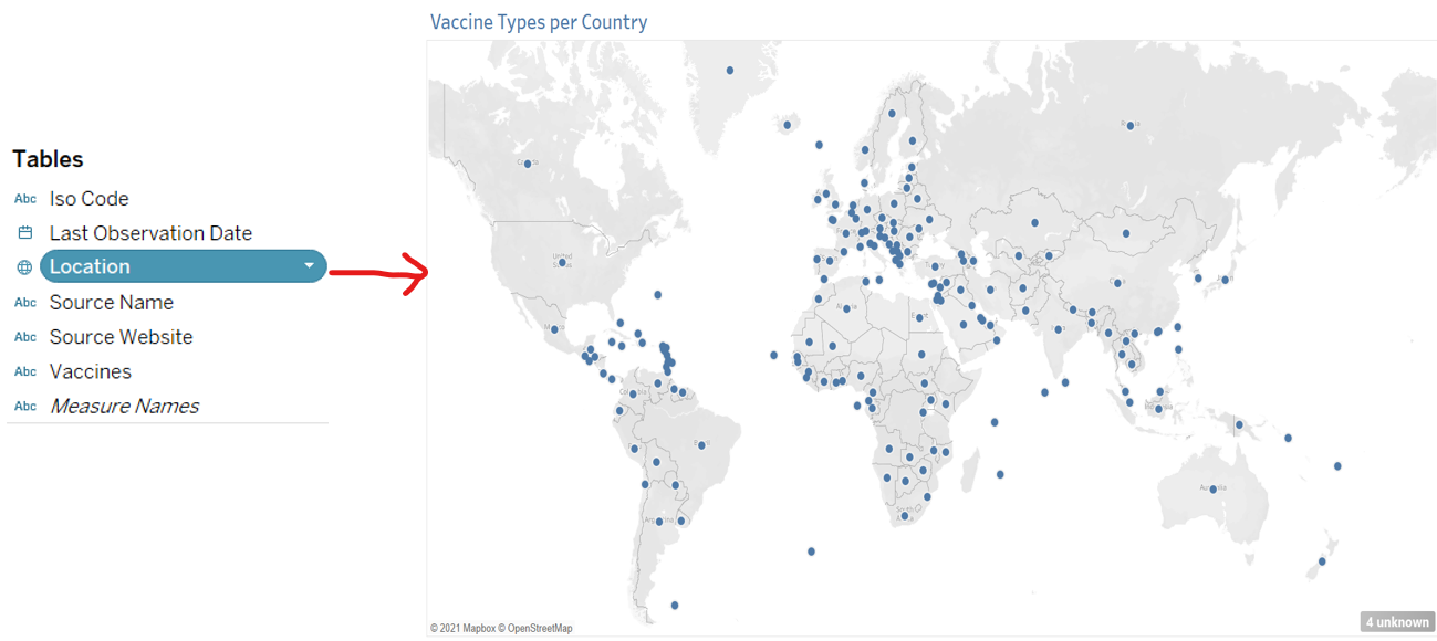
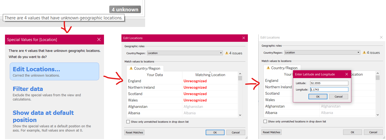
Notice at the bottom right of the Map, it shows 4 unknowns. This means that Tableau did not identify 4 locations. To fix this, click on the 4 unknown, and Edit Locations manually by entering the coordinates for Unrecognized values.
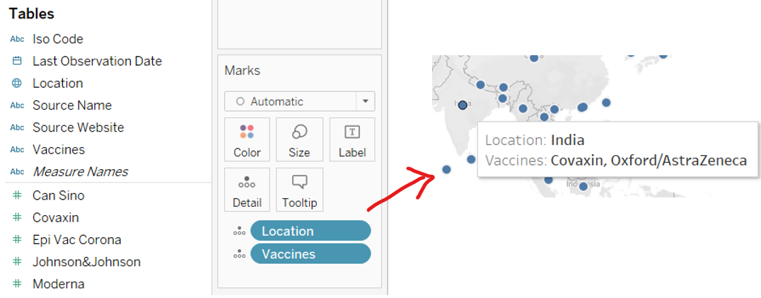
To show the Vaccine Types for each country, drag the ‘Location’ and ‘Vaccines’ to the Marks card. Now the map shows Vaccines Available in a country when you hover over it.
Let’s add the total number of vaccines per country to this map, and create a Heat Map. To do so, we need to create a calculated field, which counts the number of vaccines per country. Go to Analysis → Create Calculated Field → Sum up the vaccine columns for each country. After creating the field ‘Total Vaccines Available’, Drag it to the card and set the symbol to Color.
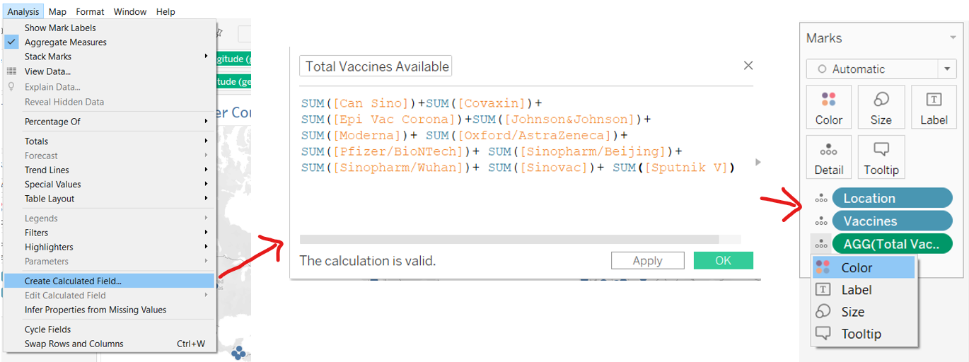
Our Heat Map is ready! The darker the country, the more vaccine brands available and vice versa.
Step 2: Visualizing the Total Vaccinations Administered Country-wise
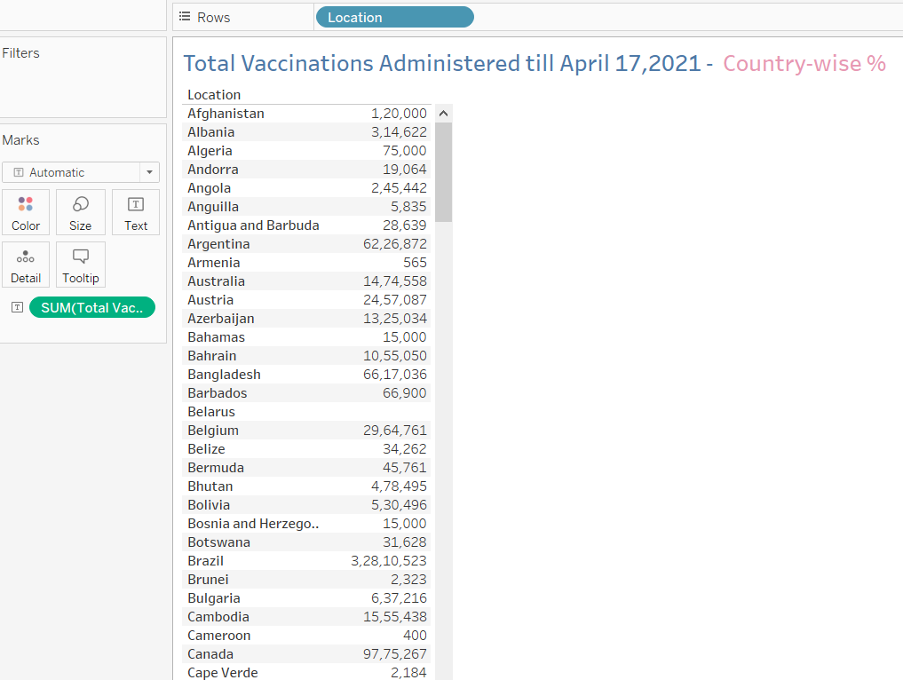
We already know which country uses what type of Vaccine. But how many doses are being administered in each country? Let’s create some Packed Bubbles to understand which countries have administered the most doses, out of the total vaccine doses administered in the world till April 17, 2021.
Open a New Worksheet → Data → New Data Source → ‘vaccinations.csv’
Note: In my file, I’ve created a new sheet with the most recent dates per country.
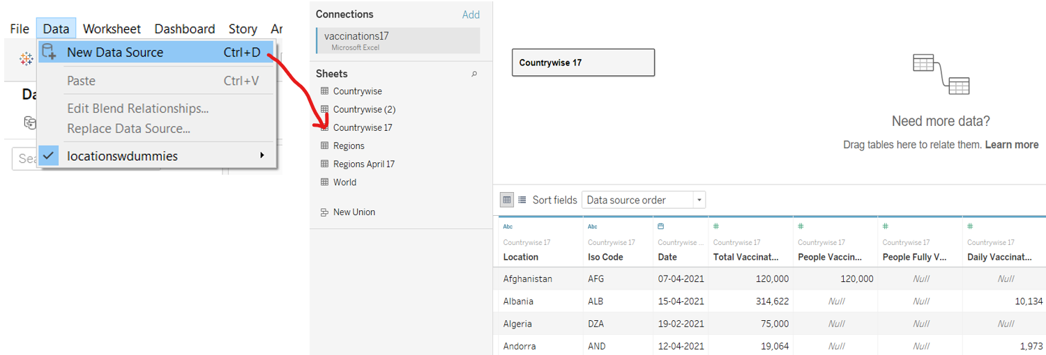
In the worksheet, Drag the ‘Location’ & ‘Total Vaccinations’ field to the workspace.
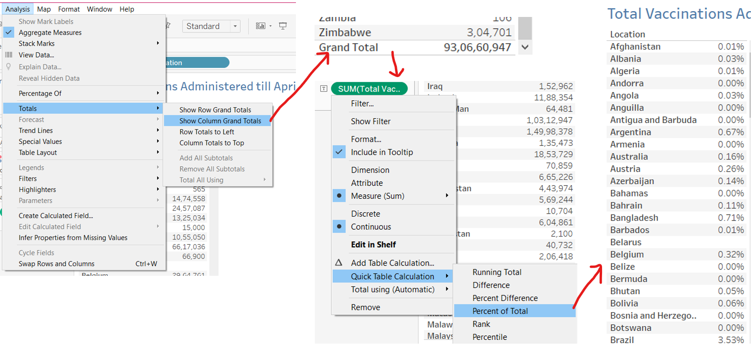
We want to express these figures as a % of the total vaccinations administered for meaningful comparison. Go to Analysis → Totals → Show Column Grand Totals. Now click on the ‘Total Vaccinations’ measure in the card → Quick Table Calculation → Percent of Total.
Go to the Show Me option, and select Packed Bubbles. To add color for each country to the bubbles, drag ‘Location’ once more to the card, and set it to Color.
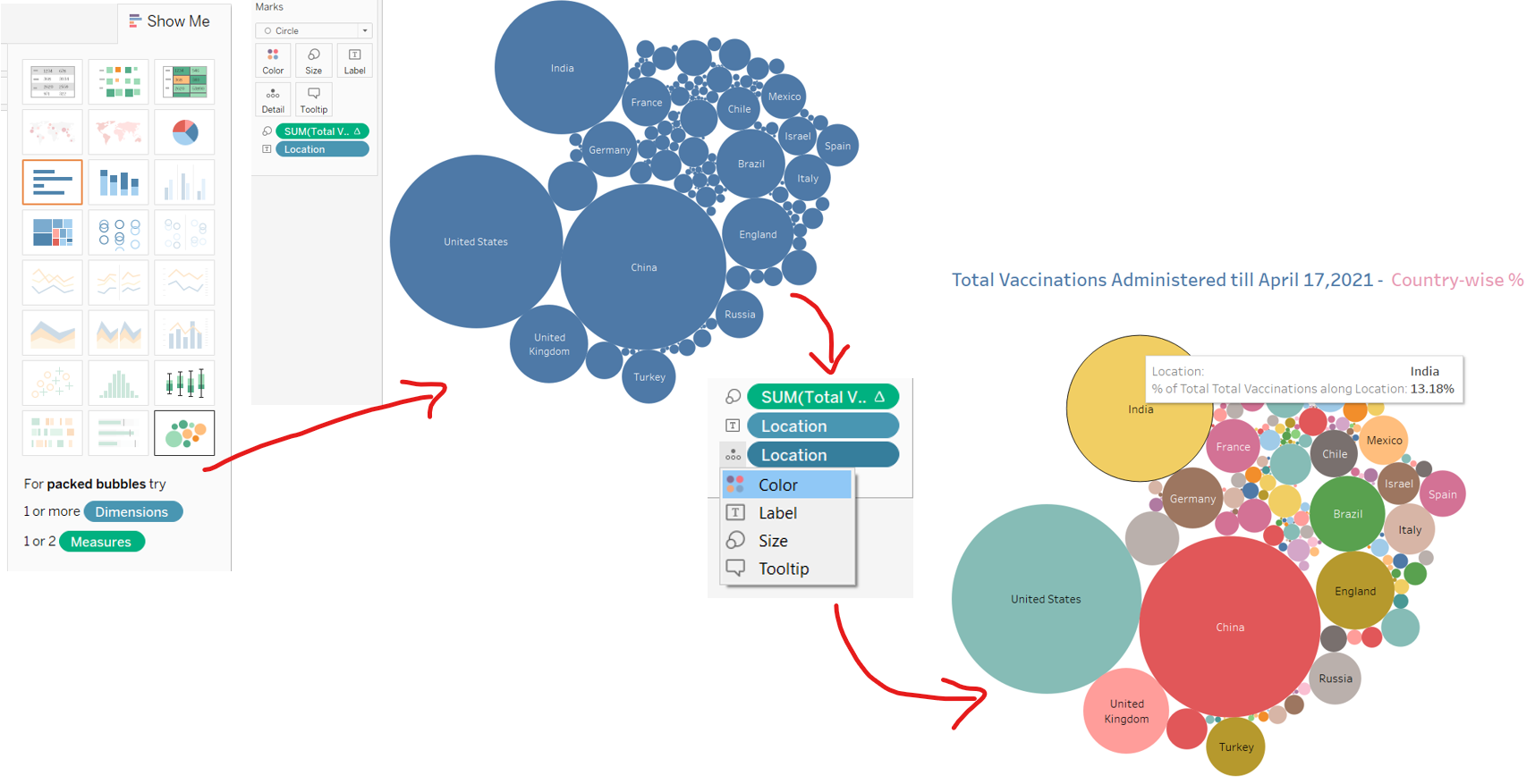
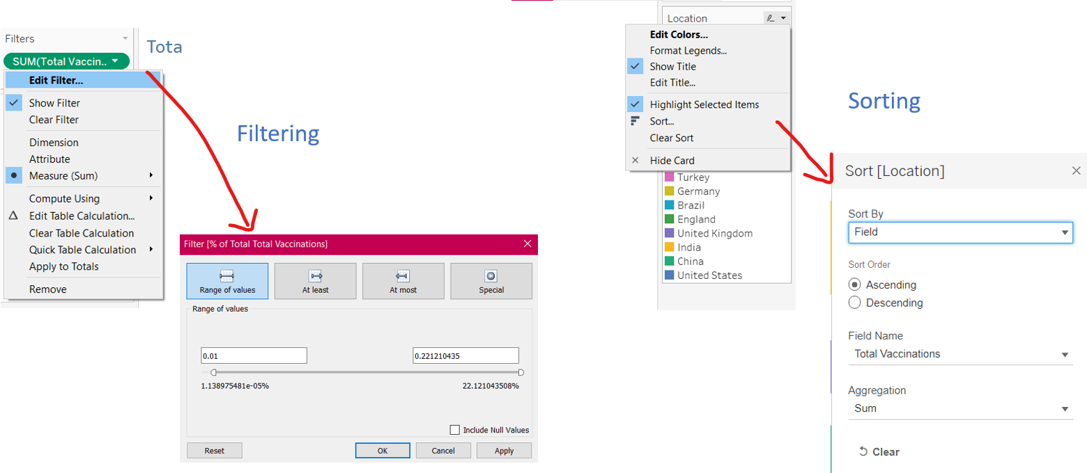
There are 182 countries in the dataset, so we have so many bubbles! Let’s modify the Filters to show only those countries that contribute more than 1% to the Total Vaccinations administered in the World. You can also sort the data according to your preference.
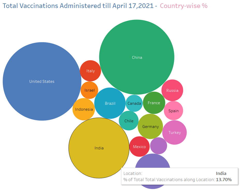
The Packed Bubbles are ready, and the bigger the bubble, the greater the country’s share in the Total Vaccinations administered worldwide.
Step 3: Visualizing the Daily Vaccinations Administered Worldwide
From the previous visualization, we know that the US, India, and China administer the most vaccines compared to the rest of the world. But how many vaccines are actually administered on a daily basis worldwide? Let’s create a Line Graph for this purpose.
In a new worksheet, I’ve established a connection to the ‘World’ sheet in my modified ‘vaccinations.csv’ file, where I’ve copied all the data relating to Worldwide figures, from the main file.
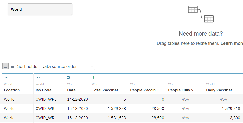
From the Data pane in the workbook, Drag the ‘Date’ field to the Rows shelf & ‘Daily Vaccinations’ field to the Columns shelf. Tableau displays the Year in the ‘Date’ field. Let’s change that to Day, by clicking on the + icon next to YEAR(Date) and selecting Day.
Now go to Show Me and select lines:
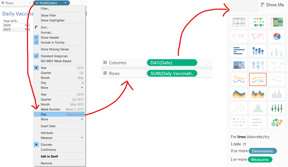
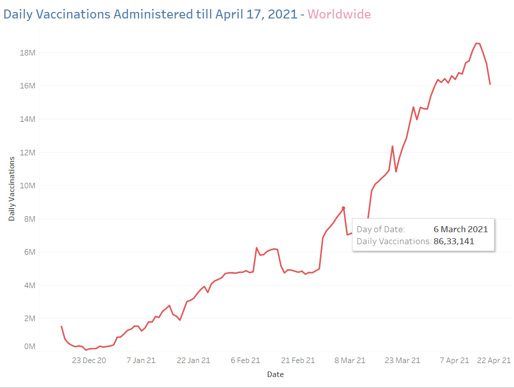
We’ve created a simple yet informative chart, which shows us the Daily Vaccination doses administered worldwide till April 17, 2021. Notice how the doses have started falling after April 13, 2021. A quick web search reveals a recent shortage of vaccines worldwide:
“The vaccine
shortage stems mostly from India’s decision to stop exporting vaccines
from its Serum Institute factory, which produces the overwhelming
majority of the AstraZeneca doses that COVAX counted on to supply around
a third of the global population at a time coronavirus is spiking worldwide.” – Business Standard
Step 4: Visualizing People Vaccinated Once vs People Vaccinated Fully
Let’s drill down deeper and explore how these vaccination figures break up into people who’ve been vaccinated only once and people vaccinated fully. What would be interesting to know is how this metric would differ country-wise and region-wise.
For a Country-wise analysis, a Symbol Map would be perfect.
In a new workbook, choose the same sheet in ‘vaccinations.csv’ as in Step 2.
Drag the ‘Location’, ‘People Vaccinated’ & ‘People Fully Vaccinated’ to create a table.
The column ‘People Vaccinated’ represents people who have been vaccinated at least once. This means that if a person receives their first shot, this figure goes up by 1, and if they receive their second shot, this figure remains the same. Therefore, we can calculate:
People Vaccinated ONLY once = People Vaccinated – People Fully Vaccinated
Let’s create a Calculated Field for People Vaccinated Once, and drag it onto the table:

A more comprehensive way would be to express these figures as a % of the Total people vaccinated per country. To do so, create two Calculated fields i.e. Vaccinated Once % and Vaccinated Fully %, by dividing these figures by ‘People Vaccinated’ :

Drag the created fields to the table and remove the older ones:
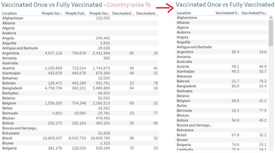
Finally, to create the map, go to the Dimensions in the Data Tab, and assign Country as the Geographic role for the ‘Location’ field. Go to Show Me, and choose Symbol Maps:
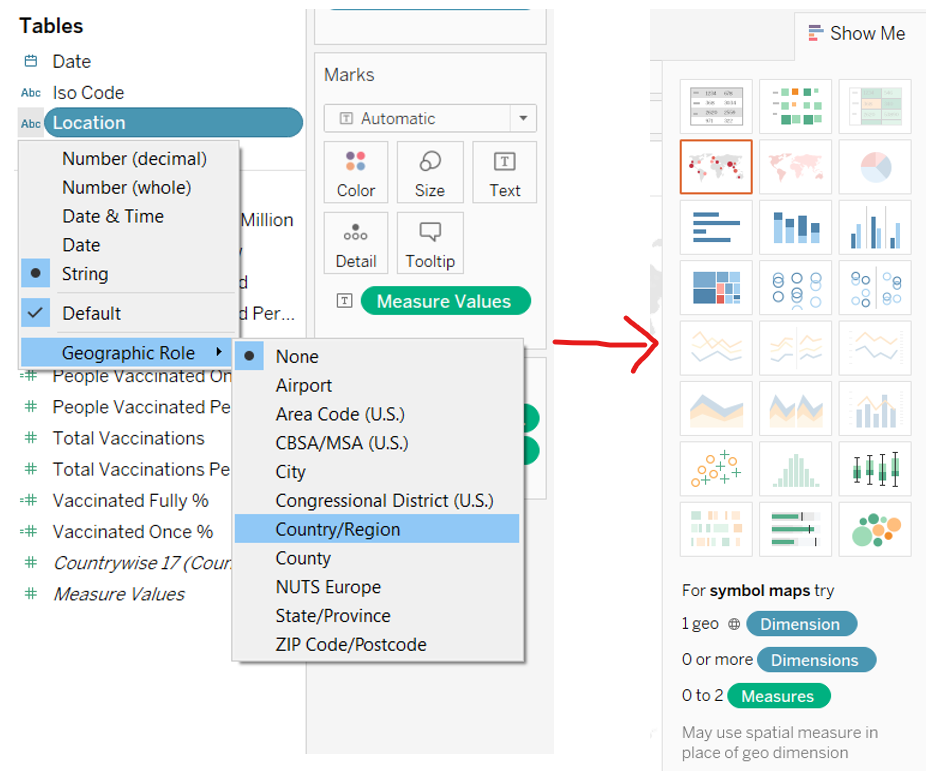
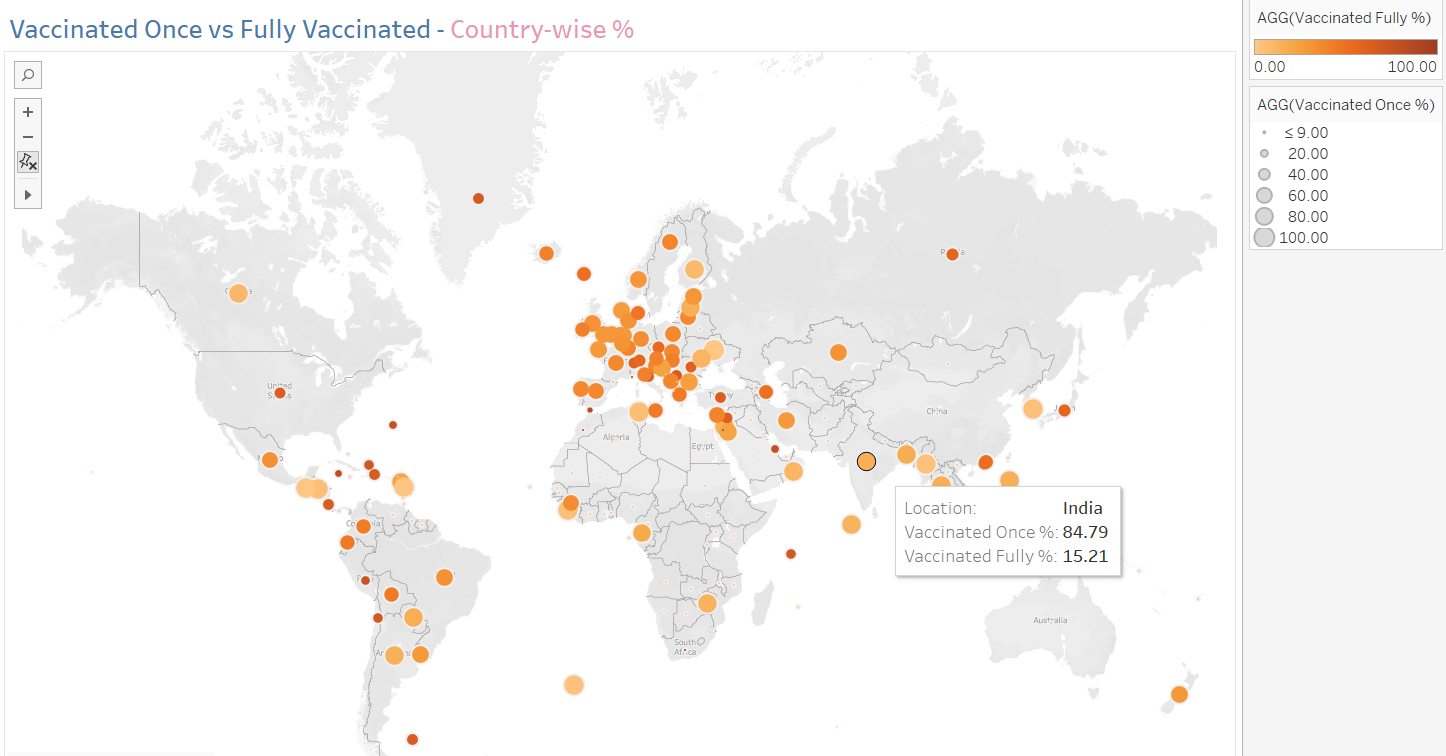
The Symbol Map shows People Vaccinated Once as the size of the circle, and People Fully Vaccinated as the color. A bigger and lighter circle, indicates more people have been vaccinated once and less fully. A smaller and darker circle, indicates more people have been vaccinated fully.
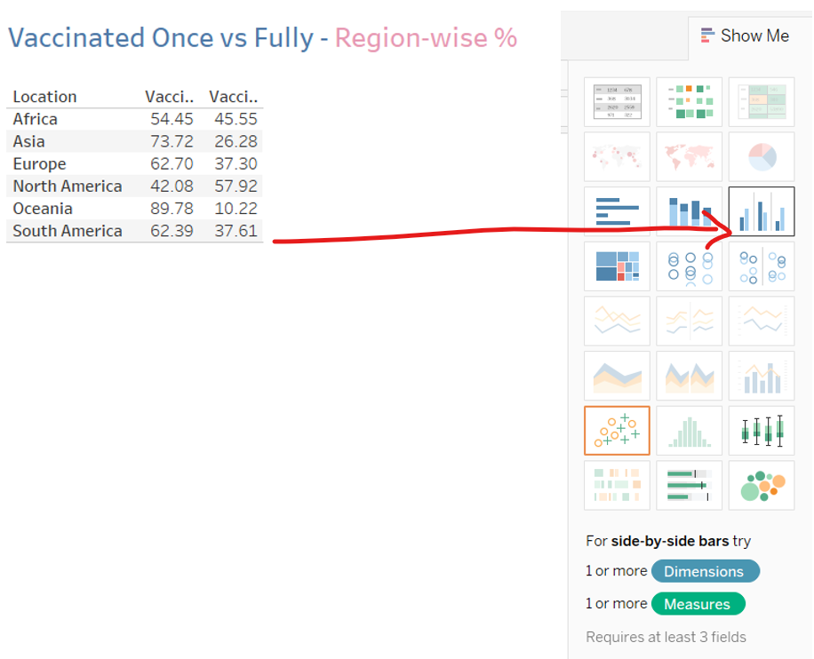
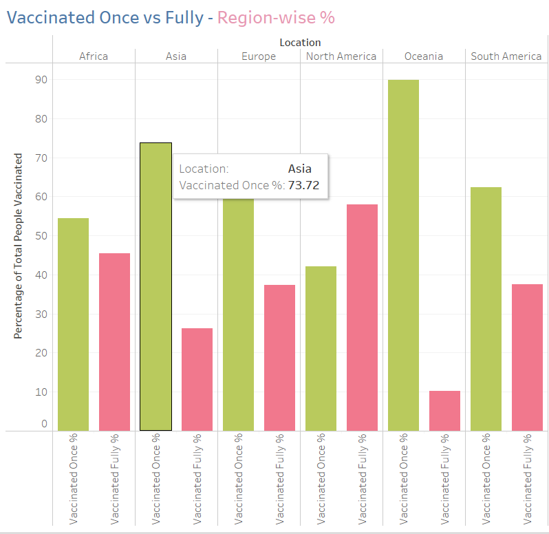
For a Region-wise analysis, a Side by Side Bar chart would be most appropriate, with one bar reflecting the People Vaccinated Once and the other bar reflecting People Fully vaccinated.
To do so, I’ve established a connection to a sheet where I’ve already copied the region-wise figures from the ‘vaccinations.csv’ file.
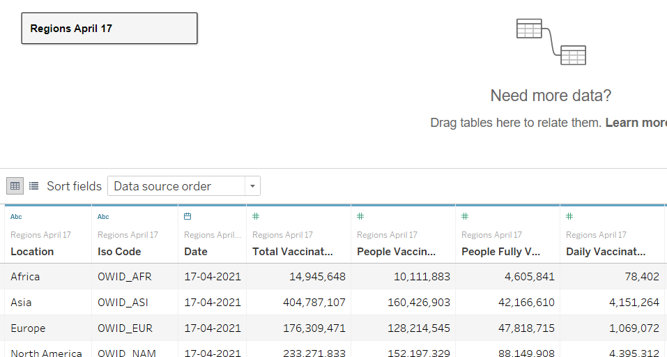
Follow the same steps as in the country-wise map above for creating the table and the Vaccinated Once % & Vaccinated Fully % fields. Go to Show Me, and choose the Side by side Bar chart:
Our final visualization is complete:
Step 5: Creating the Dashboard
Let’s consolidate all our worksheets into a Dashboard, which will allow us to compare different metrics at a glance.
To do so, click on the New Dashboard icon at the bottom of the Tableau screen, which opens a new dashboard:
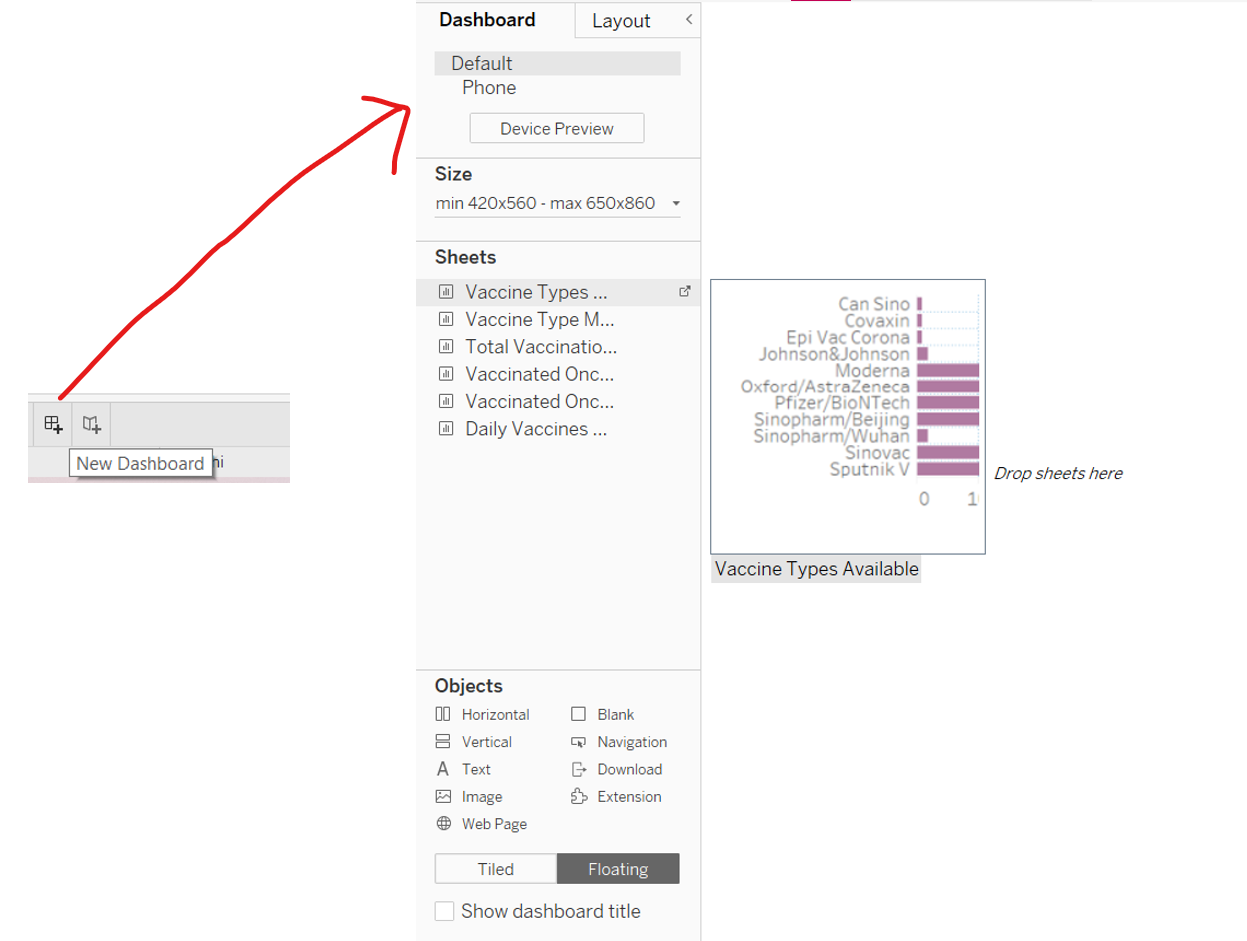
Here you can see the Dashboard Pane, where you can set the size of the dashboard and drag the sheets to the blank space from the Sheets pane. Let’s drag our sheets to start building the dashboard:
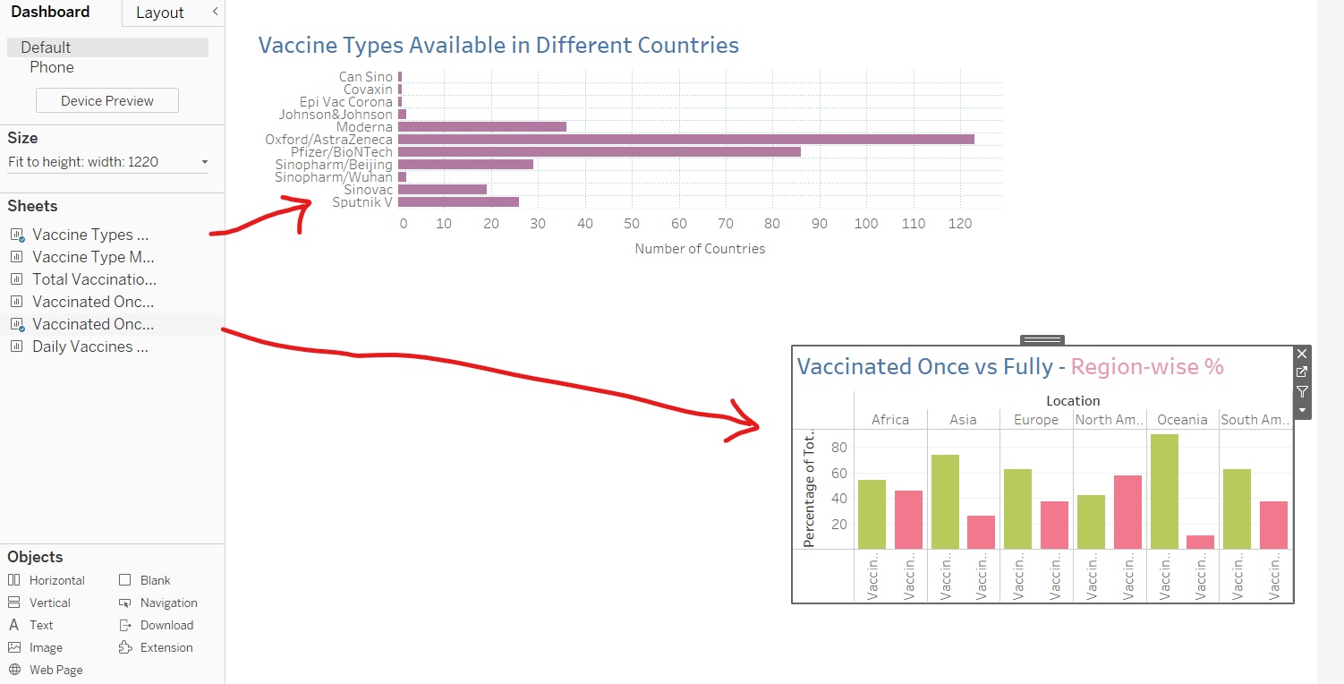
Adjust the Size and Position of the visualizations, and you can choose to keep or discard the Legends of any visualization. Finally, add a Title to the Dashboard.
The Covid-19 Vaccination Dashboard is complete:
.png)
View the interactive dashboard on Tableau here
Analyzing the Dashboard
The Covid-19 Vaccination dashboard provides many interesting insights such as:
- AstraZeneca and Pfizer are the most widely available vaccinations in the world
- Hungary, UAE, and Mexico have the greatest variety of Vaccinations available
- The US, China, and India account for a whopping 57% of the Total Vaccinations administered in the world to date
- People in the North American region are getting Vaccinated Fully much faster, with 58% of the People Vaccinated in these countries having received both doses. Asians have a large number of people getting their first dose of vaccination, but only 26% of the people vaccinated are fully vaccinated.
- Israel has the highest number of people fully vaccinated, with 93% of the people vaccinated having received both their doses.
- The daily vaccinations administered worldwide have dropped since the second week of April 2021 due to a worldwide shortage of Vaccinations. Mainly due to India’s decision to stop exporting vaccines and also the spike in coronavirus infections worldwide.
Conclusion
A tableau is a great tool for creating stunning visualizations and consolidating visualizations in the form of Dashboards. It is a no-code approach to Analytics. The Covid-19 Vaccination dashboard is an illustration of how you can leverage Tableau for gathering amazing insights, in the form of visually appealing and illuminating visualizations.
I’m a Data Science enthusiast and an MBA grad, with a passion for research & statistics. You can find me on:
LinkedIn: https://www.linkedin.com/in/ruhii/
Medium: https://ruhi-i.medium.com/
The media shown in this article on the Covid-19 Vaccination Dashboard are not owned by Analytics Vidhya and is used at the Author’s discretion.


Wonderful and useful information. It is very useful for everyone in this situation, who are worried to put vaccination. Hope everything goes fine. Stay safe in home.
Hi! would be possible to have a deeper info about the preprocess of the data? or could you please send me the preprocessed data? Thank you in advance