“ Numbers have an important story to tell. They rely on you to give them a clear and convincing voice ”- Stephen Few
Whenever we come across any datasets, we see thousands or even millions of rows of data that do not make any sense. But this data has a lot of hidden potentials that can be discovered by a specialist. These specialists generally use data visualization tools to analyze data and draw insights from the data. Excel, Tableau, Google Data Studio, PowerBI, Python libraries like Seaborn, Matplotlib, etc. are some commonly used tools. With the help of these tools, specialists present a dashboard to the stakeholders to understand the data and make relevant decisions.
What is a Dashboard?

“A dashboard is a type of graphical user interface that often provides at-a-glance views of key performance indicators relevant to a particular objective or business process” — Wikipedia.
Now, dashboards are of two types: Static and Dynamic.
Static dashboards are created once from predetermined data and do not change. They are created for a single purpose or for a specific user and so are limited.
Dynamic dashboards update automatically with real-time data. This means with any addition or deletion of data, the corresponding charts and graphs on the dashboard should change automatically, without much effort. Also, in contrast to static dashboards, the dynamic dashboard can be tailored to cater to different needs.
The Step-by-Step process of making an awesome interactive dynamic dashboard
Step 1: Get the data. You can use Kaggle for it. For this article, I’ll be using Amazon’s Top 50 Bestselling Novels 2009–2020 dataset available at https://www.kaggle.com/palanjali007/amazons-top-50-bestselling-novels-20092020
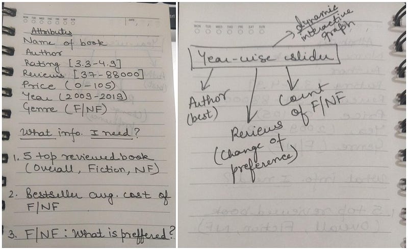
Step 2: Go through the dataset and make some hypotheses or list some questions that you want to get an answer to. For example, I made the following list, when I started to make a dashboard for this data.

Step 3: Now, you can make suitable graphs for the above questions/hypotheses and include the relevant ones in the dashboard.
A tutorial for making a Dashboard on Google Data Studio
Please Note: Make the step size of the slider (from the style tab of the slider) to 1 as data is in year format.
How is this Interactive and Dynamic?
The dashboard is interactive as one can see more information on the data point if they move the cursor over it. This makes the dashboard interactive and appealing to the audience.
With the change in original data, the dashboard gets updated by refreshing it making it a dynamic dashboard. Additionally, the slider located at the top right corner of the dashboard helps in tailoring the dashboard for different needs. Thereby enhancing the dynamic feature of the dashboard.
Making the dashboard more attractive
Once you’re done with the charts, now comes the designing part. This is one of the most important steps. The best dashboard is the one that has an optimum number of visualizations to tell a data story. You can make a dashboard attractive by adding more colors to it (make sure the data is visible), adding images, background, borders, etc.
Take a look at the dashboard that I designed on this dataset:
datastudio.google.com/embed/reporting/1dc905db-24a1-4d99-aa70-62a1279bd49c/page/7Oh2B
I encourage you to go on and try to make the dashboard on your own. You can get the data from the link I’ve mentioned above.
Hope you loved it!
The media shown in this article are not owned by Analytics Vidhya and is used at the Author’s discretion.


