Can you tell a story using data?
Let us look at one of the most popular data visualization tools currently in the market out there; and yes, it is none other than- Tableau
Read further to create your first ever dashboard using Tableau and also learn how I did my first capstone project in Tableau.
What is Tableau?
Tableau is a very powerful data visualization and analysis tool where you can create business-standard dashboards to not only visualize data but also draw insights from it.
Why Tableau?
- Tableau is a very convenient tool to quickly visualize your ideas. Just drag and drop and voila, you have a graph in front of you.
- It has an awesome interface that is very intuitive and easy to understand.
- You can connect to a number of data sources; more than 75 to be precise.
- It has built-in analytical tools and thus, you don’t need to spend time on calculations.
- Dashboards and stories built using Tableau are interactive.
All these reasons to use Tableau are going to make much more sense when we go about practically learning it. So let us dive right into it.
Downloading Tableau
Tableau is a paid software but it provides a 14-day free trial which you can start from here.
Another option is to use Tableau public (which I use, being a student currently). The limitation of using tableau public is that you cannot locally download the dashboards and they are published online. But, it is a good option when you are starting out.
Tableau Interface
Let us dive right into Tableau! This is how the landing window of Tableau looks like.
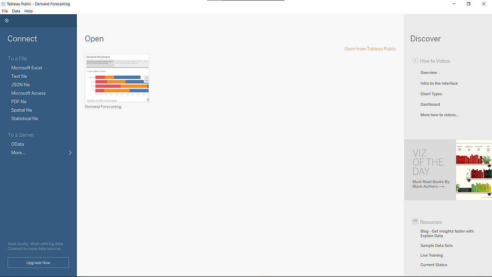
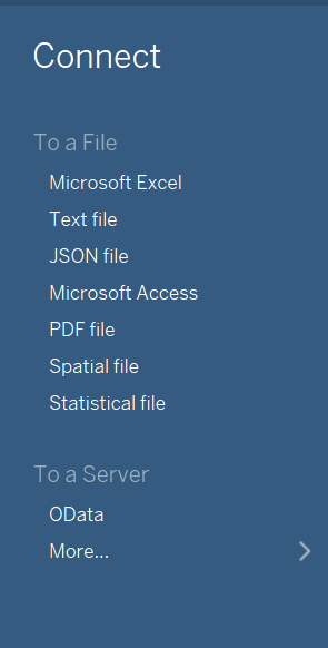
On the left, we have the connect option through which we can connect to our data source.
Next, we have the open option, if you want to open a project you have worked on.

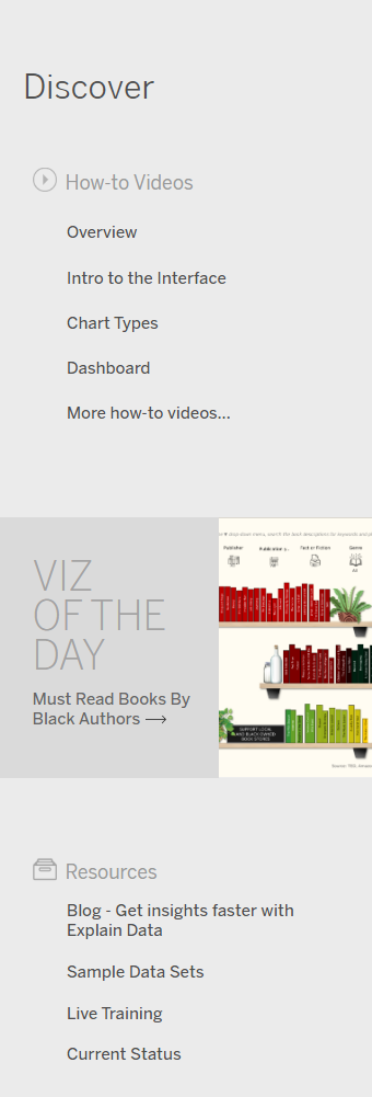
Lastly, we have some resources which might help you to learn more about Tableau.
Problem Statement
Your client is a meal delivery company that operates in multiple cities. They have various fulfillment centers in these cities for dispatching meal orders to their customers. The client wants to help these centers with demand forecasting for upcoming weeks so that these centers will plan the stock of raw materials accordingly.
The replenishment of the majority of raw materials is done on a weekly basis and since the raw material is perishable, procurement planning is of utmost importance. Secondly, staffing of the centers is also one area wherein accurate demand forecasts are really helpful. We have the below information with us in the form of 3 different datasets:
- Historical data of demand for a product-center combination
- Product(Meal) features such as category, sub-category, current price, and discount
- Information for fulfillment centers like center area, city information, etc.
You can download the required data from here.
We need to come up with a story in Tableau that talks about the level of demand in each center. This analysis needs to be granular enough to include product information as well. The client wants an end-to-end report to understand which fulfillment areas are doing well and which aren’t. You can also talk about center-meal combinations to add nuance to your final submission.
Don’t get intimidated by this problem as it might seem complicated at first. We are going to take baby steps and learn all the way long to creating this story in Tableau.
Hypothesis Generation
Even before loading your dataset, it is a good practice to come up with a set of hypotheses. It doesn’t have to be all right but what is important at this point is coming up with an exhaustive list without looking at the data. This will help you answer what you are looking for even better.
Some of the hypotheses I can think of are:
- The number of orders will be higher in metro cities as compared to small cities.
- Indian food contributes to the most sales.
- Orders will be more on the weekends.
Reiterating, these hypotheses need not be absolutely right and you will get to know this when you actually visualize the data.
Loading Data
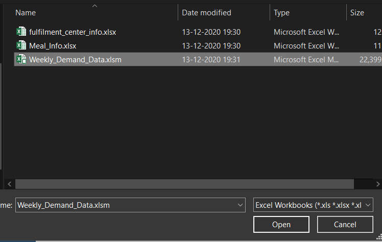
Loading or connecting to a data source is super easy in Tableau. Just click on the format of the data source you want to connect to and it will prompt a dialogue box where you can select the file and here, you are done!
So, as you might have read above, the project we are going to be working on is a Food Forecasting Analysis. So, to start with open the Weekly_Demand_Data excel sheet.
Create your first Visualisation!
As and when you open the excel sheet, you will be directed to the data source tab which looks like this.
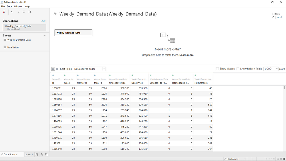
See how all the data has been populated into a table. You can see here what kind of data is available in your sheet.
Now, let us create our first visualization.
Click on Sheet 1, which is adjacent to the data source tab.

This is how a blank sheet looks like.
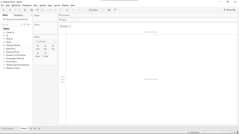
See how Tableau has categorized columns and variables as ‘dimensions’ (center id, id, meal id, and so on) and ‘measures’(base price, check out price, and so on).
As we need to create a story that talks about the weekly level of demand, let us start by looking at the number of orders over weeks.
A selectweek and num orders and you might be able to see that the ‘Show Me’ Tab pops up and a type of chart is highlighted.
The ‘Show Me’ tab of Tableau suggests the type of chart that will be appropriate for visualizing the dimensions and measures you have selected. But, it should not be trusted blindly. You should apply logic and your intuition to see whether the chart the Show Me tab is suggesting is going to fulfill your purpose of visualization.

See, here the suggestion is Gantt chart but my intuition says a line chart would be better for visualizing this.
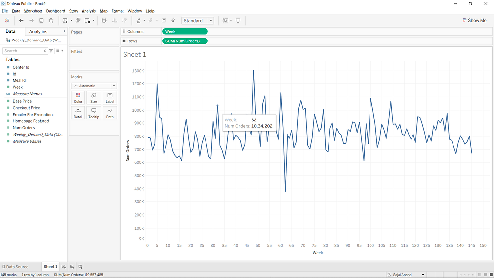
And, see how we have created our first visualization. When you hover over your mouse on the line chart, you have a tooltip that shows the week number and number of orders for that week.
Blending Data
Now, let us create visualizations from the other sheets also. For this, we will need to ‘blend’ the other two sheets with data to this data source.
Go to the new data source as shown below and in the same way as before load the other two sheets as well.
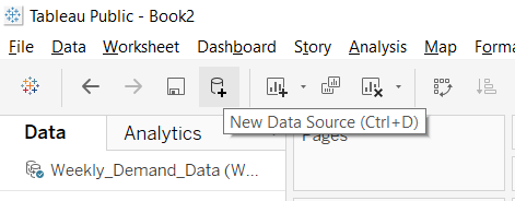
And you will have three data sources now.
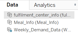
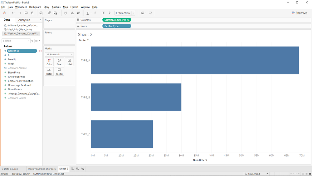
Now, let us see how blending data proves useful. Select ‘center type’ from the fulfilment_centre_info data sheet and ‘num orders’ from weekly_demand_data and here you can see a bar chart with rows and columns from different data sources and that’s exactly how data blending works.
(Make sure to click that link button beside the common variable to link two data sources. You can think of this as something similar to primary and foreign keys in DBMS.)
Pivot Structure in Tableau
If you are familiar with excel, you must know Pivot tables of Excel. You can create the same in Tableau also.
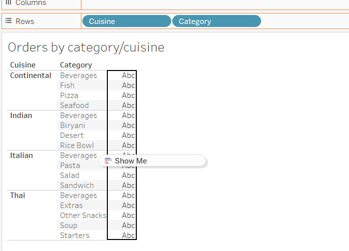
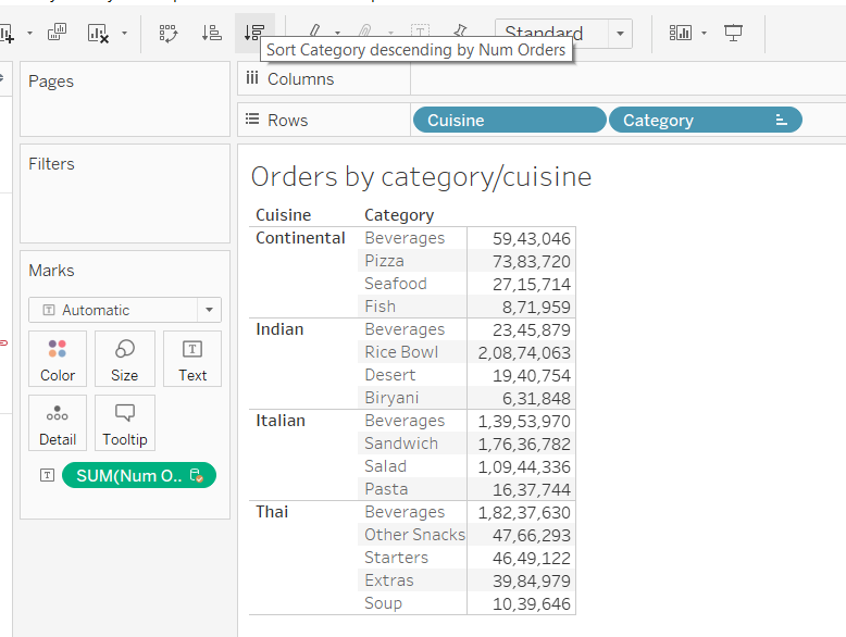
Let us see the number of orders by category and cuisine in a pivot structure. For this, take category and cuisine to the rows in a similar way but to make it a pivot structure, drag the number of orders to the table-like structure that has formed instead of taking it to the columns.
A better way of presentation would be presenting the number of orders in a descending or ascending order which can be done by clicking this button as follows.
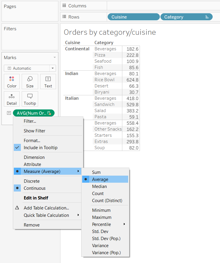
Another way you can present is taking the average number of orders, instead of the total number of orders in the following way.
Filtering
You can even apply filters to your visualizations in Tableau.
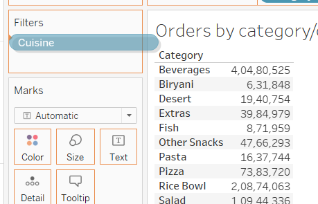
Continuing with the same pivot structure, let us remove cuisine from the rows and try applying a filter on categories and that filter be the food cuisine.
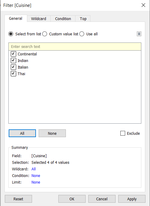
Drag cuisine to the filters. A dialogue box will open. Select all and click ‘ok’.
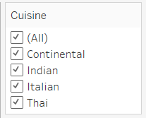
Next, click on the filter cuisine and select ‘show filter’.
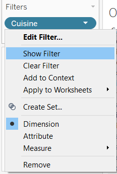
It will show up like this on the right and now whichever cuisine you select here, its data will show up in the pivot structure.
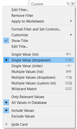
You can even convert this filter into a drop-down list as below.
Parameters
Parameters can be understood as controls that can help you decide what you want to see in the visualization.
Might sound haywire; look at this visualization, for instance.
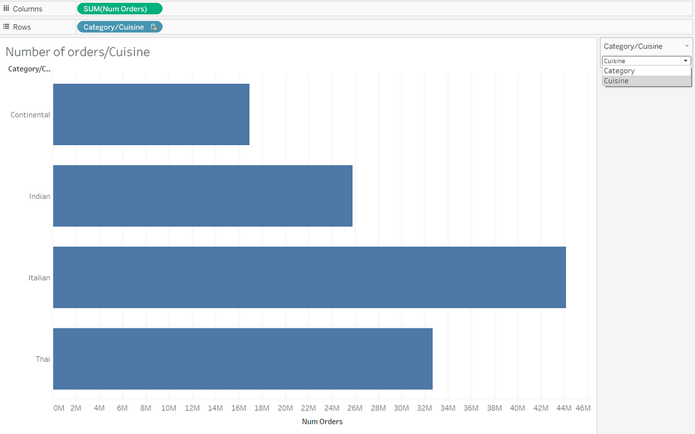
You see that drop-down on the right where you can choose whether you want to see the number of orders over categories or over cuisines. This is a parameter, a control.
Now let us see how we can create such a parameter.
In the sidebar, click on that little triangle and you will be able to see ‘create parameter’
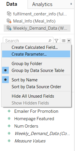
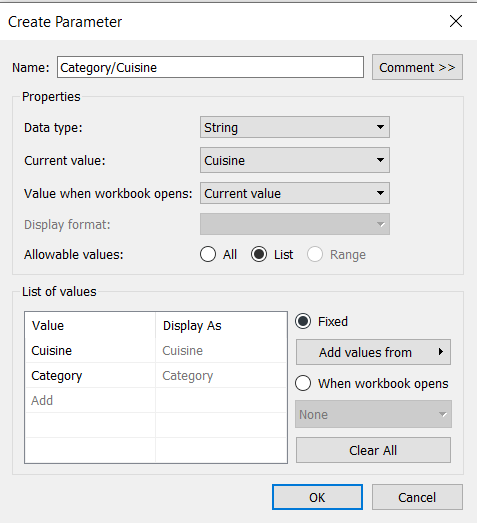
Name your parameter, select the data type as ‘string’ and fill in the allowable values as a list, which in our case are two values, Cuisine and Category, and voila, you have created a parameter!
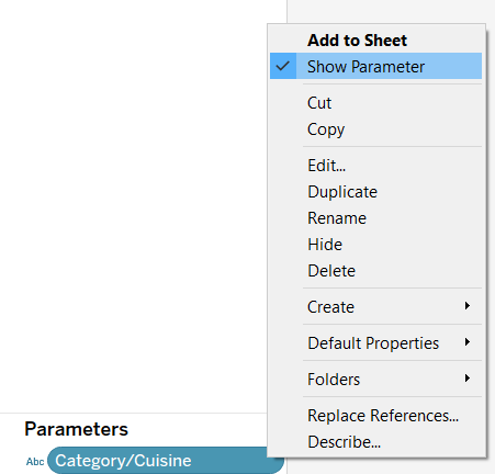
Finally, you need to select ‘Show Parameter’ and then you will be able to use that parameter in your visualization.
Sample Visualisations
Now, I encourage you to explore the dataset and try making more visualizations. This will help you learn better about Tableau and also help you understand the data better in order to solve the problem statement we stated above.
Some of the visualizations I created are shared below.
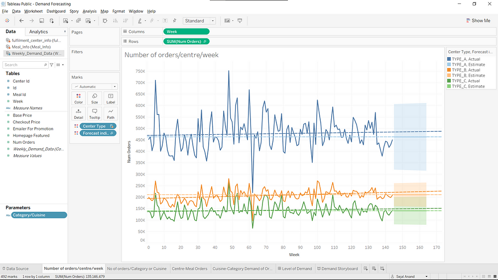
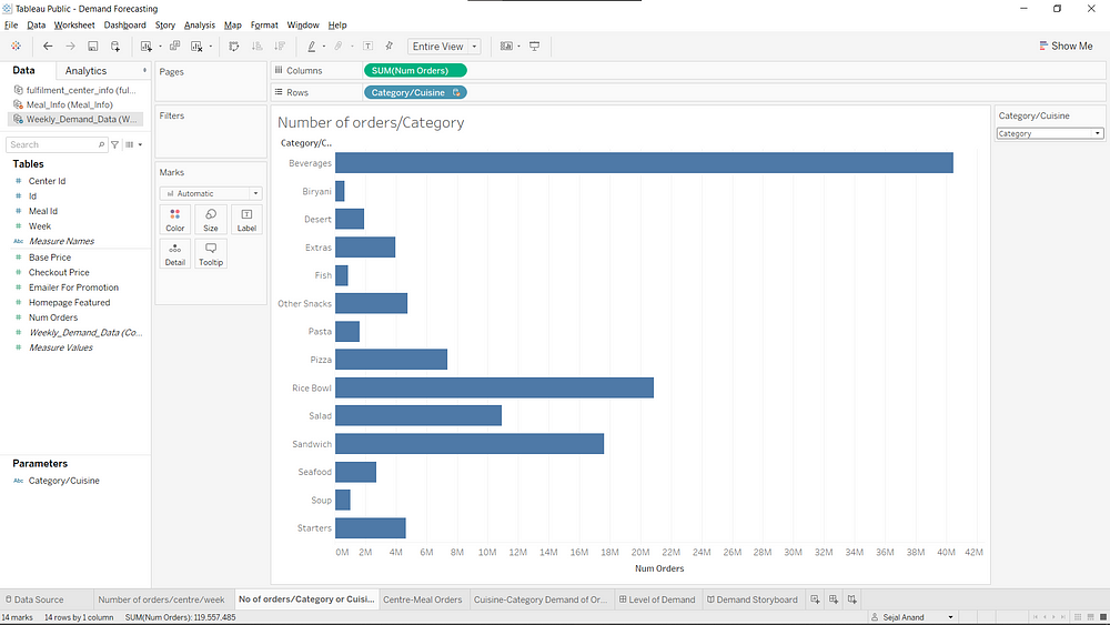
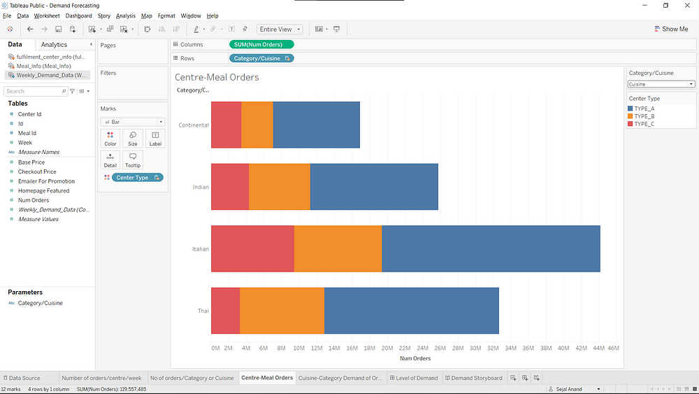
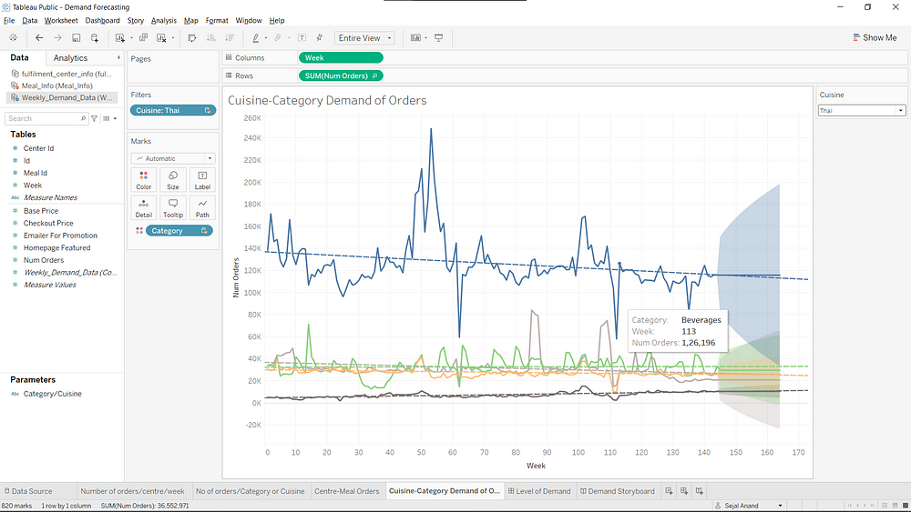
Stay tuned for Part 2 where we shall move forward and learn how to create dashboards and a story for our project.
I have to thank Analytics Vidhya and Pranav Dar for this awesome course on mastering Tableau which made me fall in love with Tableau. There’s much more in Tableau and if you want to learn in more detail, check it out here.
The media shown in this article are not owned by Analytics Vidhya and is used at the Author’s discretion.


wow Great Sejal beta...u r so intelligent Really very interesting and useful article written by you..All the best to get more and more.we r always proud of you
Hi, Thank you for sharing this informative article on Tableau. I had a query regarding parameters. Even though I created a parameter as shown in the article, there is no change in the data in the visualization. Despite switching between category and cuisine, nothing happens on the visualization itself. Would appreciate it if you could point out what I am missing here. Thanks!
A good blog always comes up with new and exciting information and while reading I have felt that this blog really has all those qualities that qualify a blog to be one.