Overview
- Introduction
- Introduction on the library lux
- Installation of lux
-
Setting up lux -widget in jupyter notebook
-
Importing Important Libraries
-
User-based data visualization
-
Automatic Encoding of visualization
- EndNote
“Visualization gives you answers to questions you didn’t know you had.”
– Ben Schneiderman
I wish these upper quotes make some impact on you, this quote has deep-down meaning if we think we know that many questions answer we will get from visualizing the entire situation, why I am writing this quote you will get an answer here.
Introduction
As you are reading this article then you are definitely in the field of data science, can you hear the sentence “a picture is worth a thousand words” then as a data scientist you will know that what the importance of these words in our data science world. In data science, life cycle visualization is associated, but there is a huge amount of python libraries and tools that will ease our work.
I definitely hear the term EDA which means Exploratory data analysis, why I am pointing this? because in machine learning EDA is the most important step, let’s discuss briefly EDA for basic understanding Exploratory data analysis (EDA) is used for analyzing the data by some visualization methods, by which we can able to summarize the whole data. Its main task is to provide a better understanding of variables and the relationship among them.
Suppose if you want to visualize any dataset in machine learning with the help of python tools then you surely go for some famous tools, such famous visualization tools are matplotlib, seaborn, bokeh, etc…, and when you start coding and if are a beginner you have to suffer lots of problems to build the visualization, it is not as much easy work. There are lots of functions that you can’t remember easily as a beginner, these tools don’t provide us an intelligent visualization. We want something new in the era of automation, so what will we do now? is there have any technique that makes work faster and easier?
Yes, it was possible because of some members group, because they made up so much amazing library that automates the visualization process in some lines of code, this library name is Lux,

Let’s discuss it,
Lux
A python library is used by a data scientist to explore the data and discover something meaningful, which will be used for a machine learning project. We can say that the lux library has some features which automate the whole visualization process in less time and effort.
If the user doesn’t have any idea about the visualization, then this library provides a clear idea about it. It provides faster experience or experimentation with data visualization.

The visualization displays in an amazing way, by these we can browse through a large collection of visualization within jupyter notebook.
We will use Jupyter notebook for the python environment, so we discuss the installation of lux:-
Installation of Lux
For installation, you have to open a command prompt or you can use jupyter notebook as well and use the following code:
pip install lux

If you faced any problem regarding installation then you ask me to comment or re the documentation. After the installation of lux, you have to open the jupyter notebook for further processes,
setting up lux -widget in jupyter notebook
We have to activate the lux -widget into jupyter notebook for using lux, execute this following code into jupyter notebook :
pip install --py luxwidget
pip enable --py luxwidget
Now, make sure you will check lux-widget is install or not for checking you execute this,
jupyter nbextension list
You can also use VSCode but VSCode only support lux-widget greater than 0.1.2.
Importing Important Libraries
# importing lux
import lux
#importing pandas
import pandas as pd
Lux is designed to tightly combining with pandas, which you can use without modifying the existing code, you have to trigger the logger to use the simple statistics,
lux.logger = true
Now, we read our dataframe with the help of pandas, we use colleges dataset for use:
df = pd.read_csv('college.csv')
If we print our dataset then see what’s new happens,
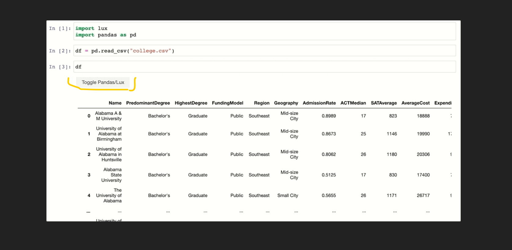
When the dataframe is df is executed then, lux automatically recommends a set of visualizations highlighting interesting trends and patterns in the dataset. As you can see that one amazing option was added at the top right corner, if we click on this there are lots of visualization graphs and plots are created.
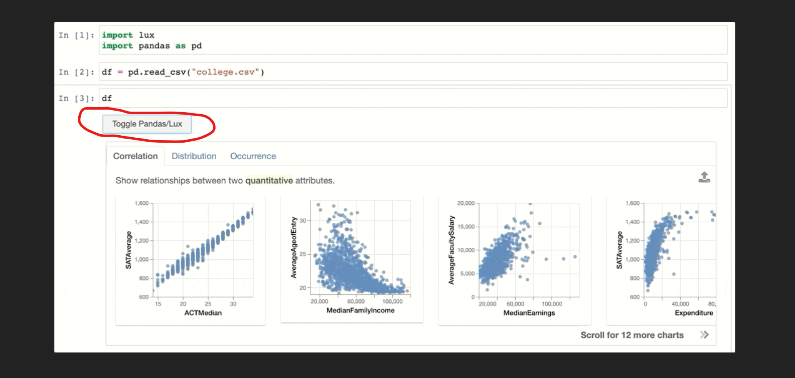
If you notice, in the above image there are 3 options that were associated with the plots and graphs. These options are very beneficial for the user as he/she can take their own exploration. Now, we will take a brief introduction to those tabs or options.
Correlation
This is the first tab we saw, in the output image, it is a set of relationships between the most correlated feature and least correlated feature. let we will see how our dataset features visualization create.
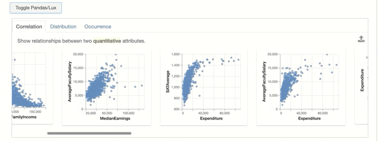
In the above image, notice the point that “Show the relationship between two quantitative attributes”. you understand that the plot 1 of 3 there is a correlation between two features, where the value of AverageFacultySalary is quite changed by the median earnings.
Distribution
It visualizes the histograms of the two computable features, it clear that how 1st feature changed with respect to the 2nd one.
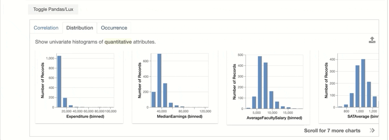
Occurrence:
It shows the set of bar plots.
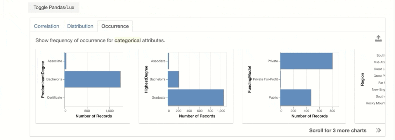
User-based data visualization
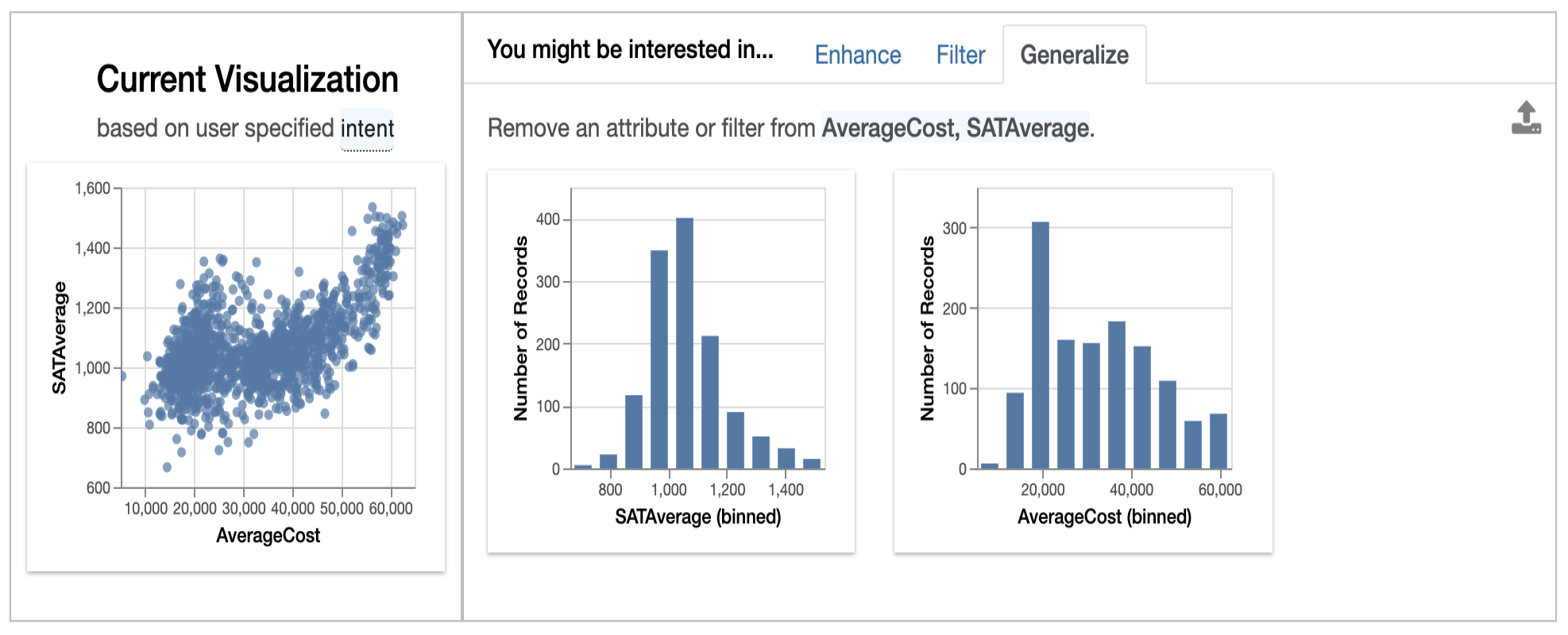
We can also perform data visualization on our choosable features, it mean we can visualize those pair of feature we wanted to be, you only have to set attributes and values which we are interested in the lux inbuild function intent.
Let us perform the user-based data visualization on our dataset:
df.intent = ["AverageCost","SATAverage"]
df
Suppose, imagine in the dataset we are interested in two features AverageCost and SATAverage, so we those features,
The current visualization generated based on what the user is interested in. Have you notice on the left side top, there are interesting tabs just like the above discussion, they are the set of recommendations. As we will discuss in brief below:
Enhance:
Basically, the mean of enhancing is to improve, so here it improves the current attribute by adding extra features.
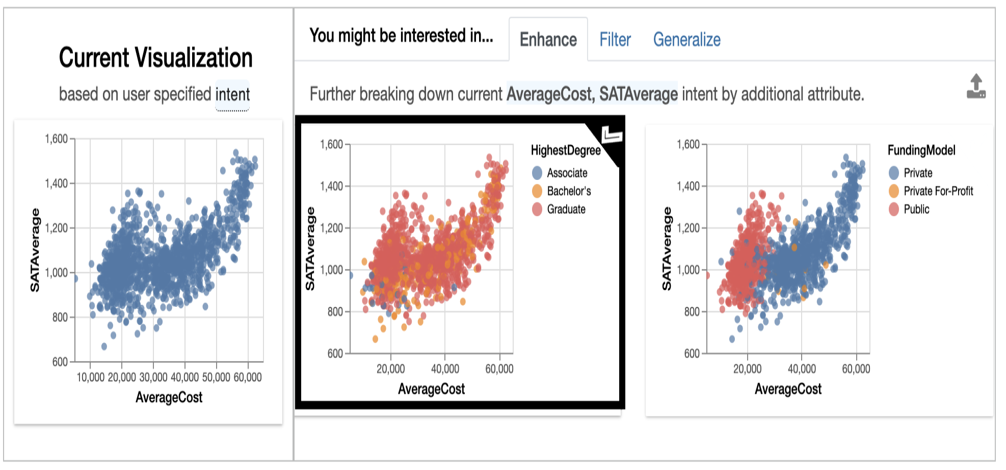
Here see that if we break the relation between SATAverage and AverageCost by the HighestDegree then there is a change in the data distribution of Associate, Bachelors, and Graduates.
Filter:
The filters the distribution of variables with user intent features.
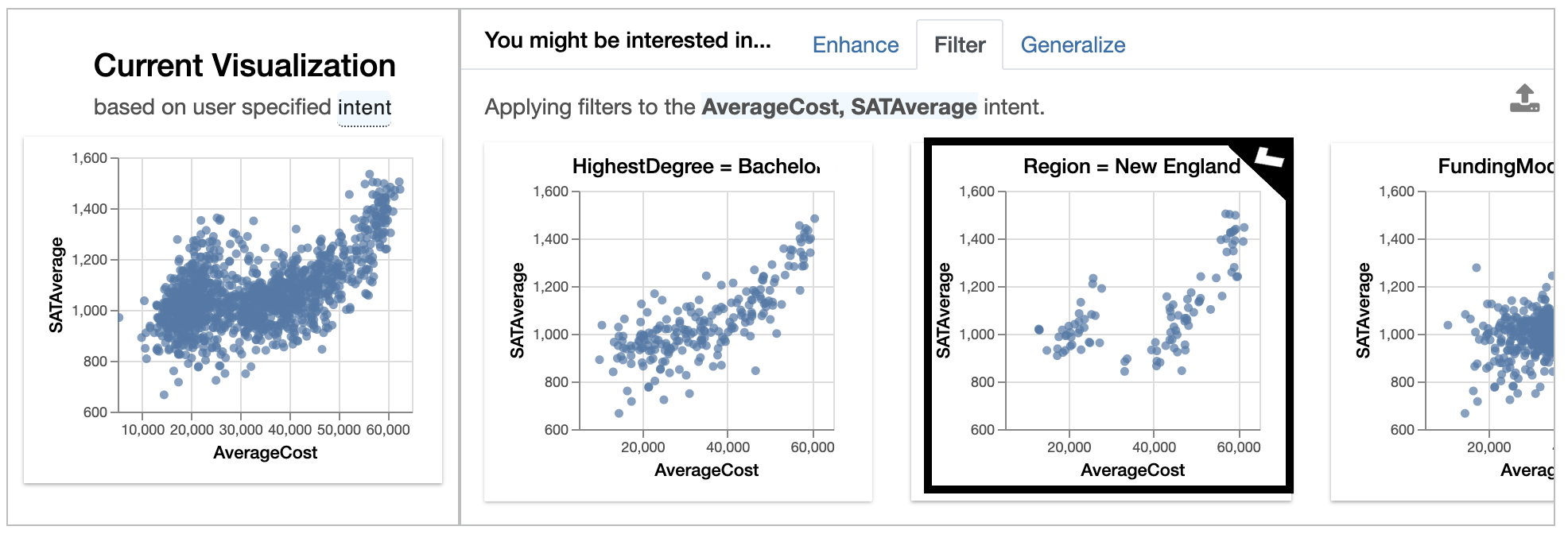
Here we apply the filter on the Region as you can see in the image.
Generalize:
It completely deletes the additional attributes and filters from the plots to display a more general model of features relationship.
Automatic Encoding of visualization
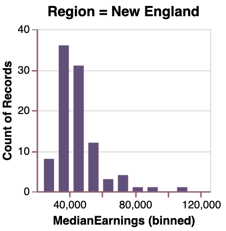
If you don’t know the intention behind the Lux, then it was that the user should always be able to visualize anything they want. The user can also create their own visualization with the Vis function.
from  lux.vis.Vis import Vis
Vis(["Region=New England","MedianEarnings"],df)
This visualization are can be stored into HTML files by writing the following code:
df.save_as_html('File_name.html')
EndNote
I hope now you have a detailed understanding of the lux library after reading this article, this was pretty much an amazing library was interact with. My friend suggested I take knowledge on lux, and then I wish to write an article on it. Hope it was helpful for you.
Thank You.
The media shown in this article are not owned by Analytics Vidhya and is used at the Author’s discretion.


Tremendous!...That's really nice✨🤟
LUX seems like a very interesting adjunct to pandas. But I get the following errors 1)Usage: pip install [options] [package-index-options] ... pip install [options] -r [package-index-options] ... pip install [options] [-e] ... pip install [options] [-e] ... pip install [options] ... ambiguous option: --py (--pypi-url, --python-version?) 2)NameError Traceback (most recent call last) in ----> 1 lux.logger = true NameError: name 'true' is not defined Thanks