Introduction

Make Interactive Visuals
Visuals interactivity creates a large difference between awfully befuddling viz and a top-notch visual. Notwithstanding, unnecessary Interactivity can take a top pick investigation and make it useless. This segment will show you how to utilize interactivity well. Whatever interactivity you have incorporated into your visual, make sure the watcher realizes they can communicate with it and comprehends where to search for the progressions their collaboration will achieve. The following methods can be used to make your visuals more interactive.
Always highlight your best work
Highlight related information across numerous perspectives lets you rapidly think about qualities. Consider your peruser: what are they going to be keen on? Which parts of your viz will they need to snap and feature? Moreover, would you add insightful profundity to your view by having something featured at first?
Legend featuring
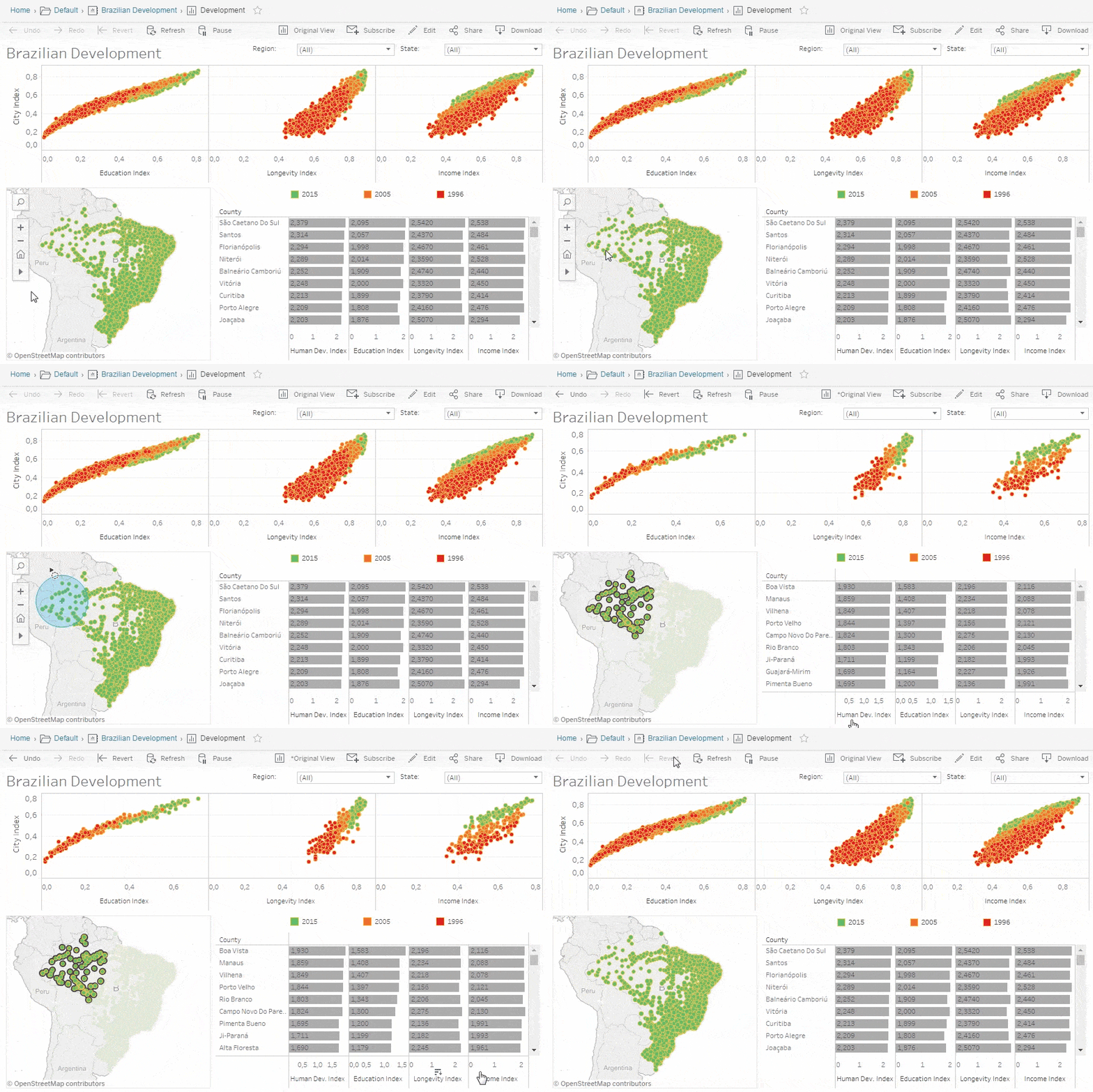
The most effortless approach to feature is with legend featuring. Check the below image after highlighting the colour of the legend.
Quick Filters
Tableau provides a set of amazing filters that let your audience understand the data deeply. We can utilize them to limit the extent of the viz or recognize changes and make correlations. Tableau provides a lot of options like radio buttons, sliders, checkboxes and many more.
Arranging your visuals properly
Sometimes, small change makes a large impact to understand data quickly. Let’s take an example of the below image:
Is something with the above graph? Did you find any difficulty reading this? Here labels are vertically oriented which is somehow weird and difficult to read. This problem can be tackled by just using one simple twist. Just swap the columns and rows. This makes labels on the horizontal axis and it makes it easier to read this graph. See the below image:
Don’t Use Pie Charts Always
For the most part, AVOID PIE CHARTS, and here’s the reason:
- The natural eye isn’t truly adept at assessing the region.
- You can just contrast cuts that are directly next to each other
All things considered, when attempting to make comparisons, attempt bars. Our eyes are vastly improved at contrasting tallness than region.
Formatting: Make your Visuals Shine
In spite of the fact that it appears to be straightforward, organizing your text styles, colours, tooltips, visual estimating and the direction of your perspectives can change everything. This is additionally the most nit-fussy piece of making a visual; customarily the best way to succeed is through preliminary and blunder. Have confidence in the event that you set your attention to it and follow these steps, you will have an incredible looking viz. So let’s start.
Colourful visuals
So let’s take an example – We humans like colourful things right? Like colour, television is way better than black and white right? So colours make things different and interesting. Colours are like a kind of bridge between the things being inspiring and boring. Here I am sharing some very useful tips to make your visuals more attractive
- Don’t try to use more than two palettes.
- In the case of scale, always use non-overlapping scales. Check images below for perfect non-overlapping scales
- See the below image, here the title colour is grey. Try to change it to some other colours like the white or light colour so that it doesn’t conflict with your visuals.
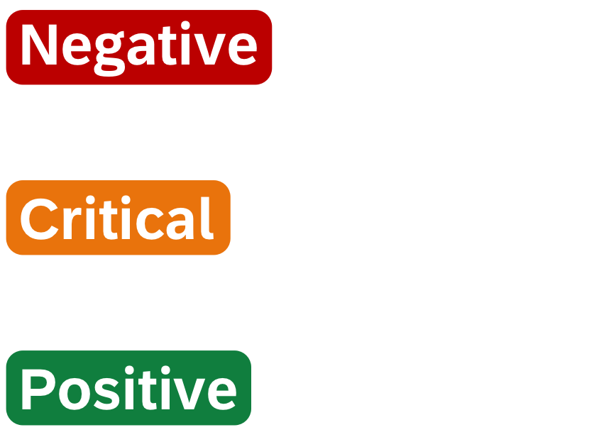
- Always choose semantically meaningful colours: Choose colours based on context. For instance, in numerous societies, Green is related to great or positive while red is related to awful or negative. Assuming there are no significant shadings, utilize the Tableau shading sets; they have been uniquely decided to coordinate and not conflict. Include Legend – if colour significance isn’t self-evident.

- If colour encoding is more than 12 distinct values- please avoid it.
Fonts
Fonts have the ability to impact your crowd, for instance, they impact your audience by emotional effects, first impressions and clarity of purpose. In spite of the fact that there are many fonts accessible in Tableau, for best execution on the web, there are not many that you will need to utilize. Some of the most used fonts are given below:
- Arial
- Tahoma
- Times New Roman
- Trebuchent MS or Verdana – tables/numbers
- Lucida Sans
- Calibri or Cambria – Only for tooltips
Tips:
- Always colour your fonts
- Generally speaking, labels and axes should be dark grey
- Should have 2-3 fonts different colours on the same page
- Compared to axes, Quick Filter titles should be a different colour
Tooltips
Tooltips are the content boxes that spring up when you drift over an item and they can have the effect of a client adoring your viz and not getting it. In Tableau 5.1 and related items, they can be organized in practically any way you can envision. If you wish to edit the tooltip, then go to edit and afterwards select Tooltip at the bottom.
Let’s see how we can improve the tooltip by taking an example. Check the below image:
How to improve this tooltip?
- First, change the font style. The font should be such that anti-aliased properly. Cambria, Calibri and Tanhoma are best
- Choose the title of your tooltip very wisely. Always choose the most important data as a title. In this case, the United States is mainly the subject of the tooltip, so it is bolded and made 16 pt. text style.
- Choose measures names that make sense. For example in the above example, Number of Records doesn’t make sense but Planes does similarly for Value and Average Price
- Units: Choose units for measures. For instance, in the above case, the Average Price should have some units like Dollar, rupees or whatever rather than not having something.
Make Intelligence Axes
Despite the fact that Tableau gives a decent template, axes are so imperative to the scientific experience that they require some additional consideration. Keep in mind, if your clients don’t have a decent edge of reference for the view they are taking a gander at, they will be flying visually impaired. You can play with axes in the following ways-
- Fixed axes: Fix axis to some particular value
- Axis gridlines: Choose axis gridlines properly. It shouldn’t have a dark colour.
- Axis Label: Choose Axis label. It helps the reader to understand viz more easily. Choose a label according to what makes sense and also include units as well.
Labelling Visualization
Mark Labels – These are the labels that are present on your data points. It can help you tell your story rapidly and briefly. It is much easier for your readers, to read labels more easily than hover the mouse to see the tooltip.
Dynamic Data Labels:
Final Note
You can check my articles here: Articles
Thanks for reading this article and for your patience. Do let me in the comment section about feedback. Share this article with your friends, it will give me the motivation to write more blogs for the data science community.
Email id: gakshay1210@gmail.com
Follow me on LinkedIn: LinkedIn


