Introduction
In the current scenario of the COVID-19 pandemic, many countries are now facing a vaccination shortage. When I surveyed about the current progress of tracking Coronavirus vaccinations around the world it came to know that more than 950 million times COVID-19 vaccine doses have been administered all over the world and it is about 12 doses for every 100 folks.
So it is necessary and useful to do some research regarding the country-wise forecasting of vaccination rate to determine when all the people in that particular country will be vaccinated.
HOW MANY PEOPLE WILL BE VACCINATED INCOMING 50 DAYS?
WHEN WILL WE ACHIEVE 100% VACCINATION RATE PER 100 PEOPLE?
To answer the above questions, a simple time series analysis to forecast the COVID-19 Vaccination Rate in various countries is described in this article. In this article, I am also sharing the Python code which I used for creating the forecasting model.
For doing the analysis yourself while reading the article, you can open a Jupyter Notebook and can do this simple coding for your time series analysis using Auto-Regressive Integrated Moving Average (ARIMA).
ARIMA is an acronym for ‘Auto-Regressive Integrated Moving Average’. Since this article is meant for beginners in time series analysis, it is better to start from simple analysis 🙂 Even though I said it is “simple”, it is a very useful class of models that aids in forecasting a large number of time series where it describes a given time series from the past values of that time series (that values are called lags and the lagged forecast errors (errors of past predictions)) and that described equation is utilized for forecasting values (predict future values).
The past values in the time series are called AR terms (Auto Regressive terms) and the forecasting errors are called MA terms (Moving Average terms).
The data for this analysis is extracted from the Our World in Data project at the University of Oxford. The first day in the time series is the day when the vaccination started in that particular country. Almost first 75 days of data is used in this analysis. The sample data that I used for the time series analysis using ARIMA can be downloaded from following GitHub repository.
Let’s start doing it…
import pandas as pd

#load dataset
df=pd.read_csv('share-people-vaccinated-covid.csv',index_col='Day',parse_dates=True)
print('Shape of data',df.shape)
df.head()
df
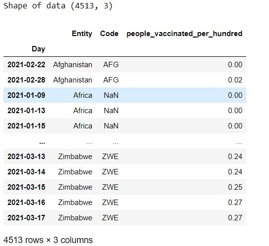
Since no IDs are there in the dataset for unique countries, we can add it as given below:
#Create new columns based on distinct values and count them
df = df.sort_values('Entity')
df['eid'] = (df.groupby(['Entity']).cumcount()==0).astype(int)
df['eid'] = df['eid'].cumsum()
ndf=df.loc[df['eid'] == 137]

#check dataframe of Wales
sndf = ndf.sort_values('people_vaccinated_per_hundred')
sndf
Get the values from the column where vaccination rate of Wales (or country of your choice) is stored.
val = sndf['people_vaccinated_per_hundred'].values
We want to make the time series stationary to make it not depend on the time at which the series is analyzed. A non stationary time series can have trend or/and seasonality. These factors affect the values of time series. So it is necessary to remove them before we start the time series analysis. To make a non-stationary time series to stationary, we can do differencing operation for stabilizing the mean of the series where we calculate the differences in a back to back manner (that is, difference between successive observations or substract past one from current observation value). This can aids in removing (or minimizing) trend and seasonality.
Sometime, Occasionally first order differencing of time series may not remove all the trend and seasonality and and it is required to difference the data one more time (second order differencing of time series) to get a stationary time series.
After analyzing Autocorrelation plot, I am doing second order differencing to make the time series stationary.
import numpy as np
from statsmodels.graphics.tsaplots import plot_acf, plot_pacf
import matplotlib.pyplot as plt
plt.rcParams.update({'figure.figsize':(9,7), 'figure.dpi':120})

# Original Series
fig, axes = plt.subplots(3, 2, sharex=True)
axes[0, 0].plot(val); axes[0, 0].set_title('Original Series')
plot_acf(val, ax=axes[0, 1])

# 1st Differencing
axes[1, 0].plot(np.diff(val)); axes[1, 0].set_title('1st Order Differencing')
plot_acf(np.diff(val), ax=axes[1, 1])
diffval = np.diff(val)

# 2nd Differencing
axes[2, 0].plot(np.diff(diffval)); axes[2, 0].set_title('2nd Order Differencing')
plot_acf(np.diff(diffval), ax=axes[2, 1])
plt.show()
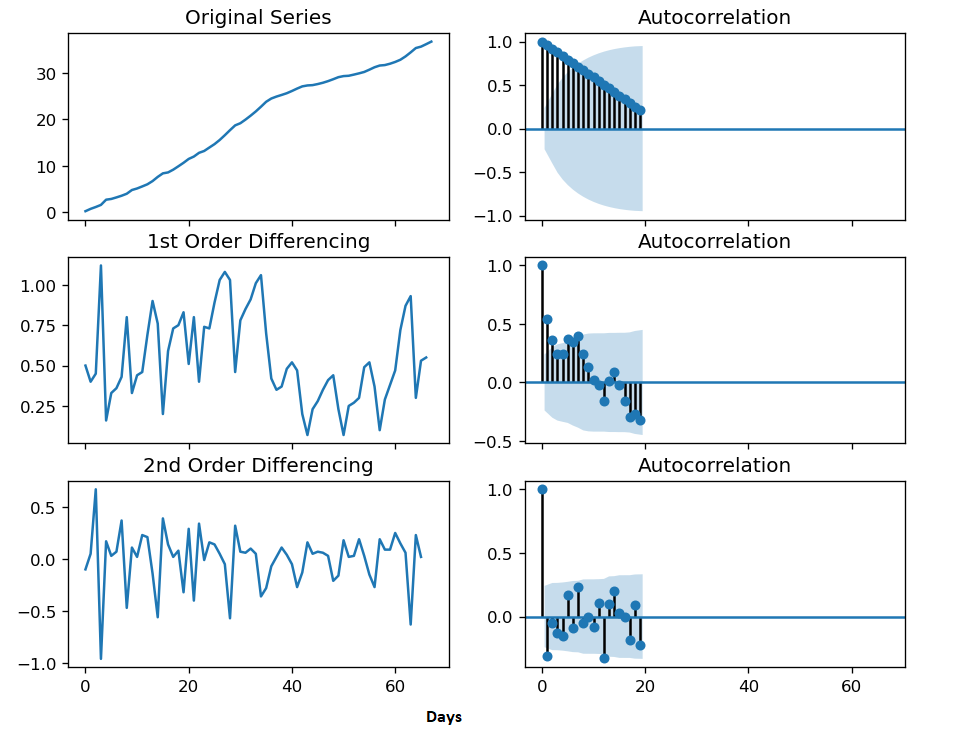
An ARIMA model without seasonality is represented as ARIMA(p,d,q), p is the count of AR terms, d is the count of differences needed (in this example, it is assumed d=2 is needed)to make the time series as a stationary one and q is the count of MA terms. Then we are finding the best ARIMA model to fit. Akaike’s Information Criterion (AIC), is observed here to identify the order of the best ARIMA model.
To find the optimal value of differencing (we assumed d=2 previously by plotting the time series), we can use Augmented Dickey–Fuller (ADF) test.
from statsmodels.tsa.arima_model import ARIMA
import pmdarima as pm
model = pm.auto_arima(val, start_p=1, start_q=1,
test='adf', # use adftest to find optimal 'd'
max_p=3, max_q=3, # maximum p and q
m=1, # frequency of series
d=None, # let model determine 'd'
seasonal=False, # No Seasonality
start_P=0,
D=0,
trace=True,
error_action='ignore',
suppress_warnings=True,
stepwise=True)
print(model.summary())
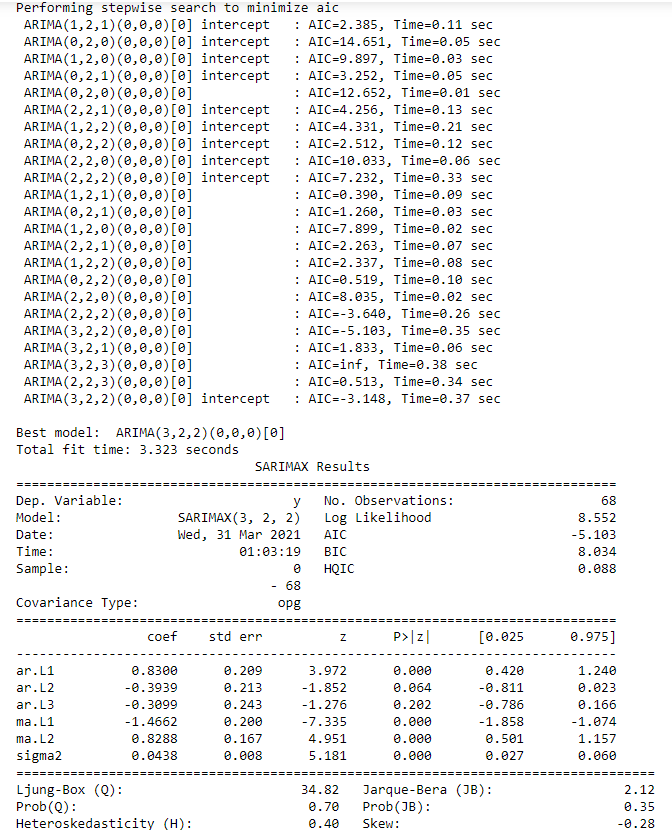
The best model chosen is : ARIMA (p,d,q) = ARIMA(3,2,2).
As we assumed, second order differencing has to be performed for making the time series stationary in this scenario.
As the next step, perform diagnostic check for the residual as given below:
model.plot_diagnostics(figsize=(7,5))
plt.show()
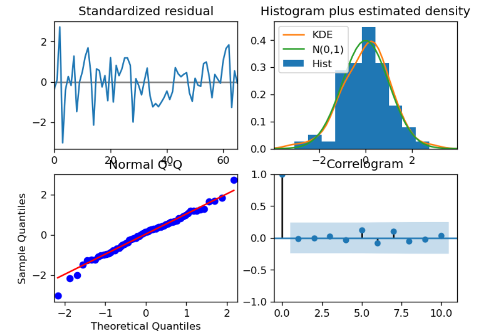
We almost finished all necessary steps. Then we can forecast the vaccination rate now.
# Forecast
n_periods = 50
fc, confint = model.predict(n_periods=n_periods, return_conf_int=True)
index_of_fc = np.arange(len(val), len(val)+n_periods)

# make series for plotting purpose
fc_series = pd.Series(fc, index=index_of_fc)
lower_series = pd.Series(confint[:, 0], index=index_of_fc)
upper_series = pd.Series(confint[:, 1], index=index_of_fc)

# Plot
plt.plot(val)
plt.plot(fc_series, color='darkgreen')
plt.fill_between(lower_series.index,
lower_series,
upper_series,
color='k', alpha=.15)
plt.title("Forecast of Vaccination Rate")
plt.show()
Below plot shows the forecast of vaccination rate (green line)in Wales based on the data we used.
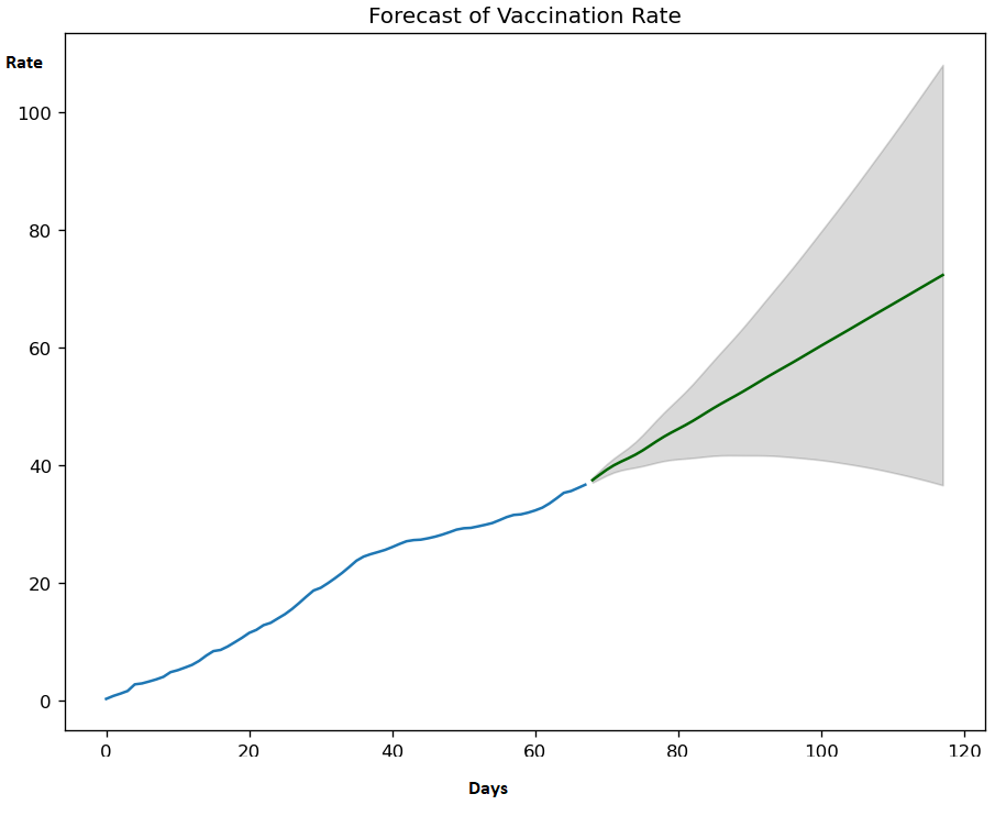
There may be many factors or features affecting the vaccination rate in a country. This simple time series analysis by ARIMA forecasting equation is only considering a linear relationship between the days and vaccination rate in which the predictors comprised of lags of the dependent feature (here vaccination rate) and lags of the forecasting errors.
The media shown in this article are not owned by Analytics Vidhya and is used at the Author’s discretion.

