This article was published as a part of the Data Science Blogathon.
Introduction
Machine Learning is the trending digital technology in today’s world, most of our industries are dependent on machine learning and artificial intelligence. Since the era of digitalization started, the curiosity of understanding digital technologies is increasing.
Yes, we are belonging to the part of this digitalization, because we are data scientists, we know that machine learning is trending in the world of data analytics because it helps us to predict the occurrence of data and calculate a large amount of data.
I have a question, How do you solve any problem? any guesses, By visualization of the problem, means first we have to visualize any problem take observations from that and then we reach to our conclusion.
So, we do the same in machine learning also, we firstly visualize the huge amount of data and then take observations from them. We want to explore machine learning and the benefits of integrating it with data visualization.

Data visualization is a technique that uses an array of static and impressive visuals within a specific context, to help people developing a better understanding of data. Data is displayed with the set of format the visualize patterns.
If you read articles about the list of the most trending data visualization techniques out there, we will use the bar_chart_race technique which was developed in python. But what makes them so popular? The main reason behind the bar chart’s popularity is its simplicity and how easy it is to interpret the visualization.
let’s discuss it:
Bar_chart_race
A bar chart race basically evolves from an ordinary bar chart over time. So you can think of a bar chart race as a time series bar chart.
Bar Chart Races are the trending animated bar plots, but there’s a very nice package `bar_chart_race` in Python based on Matplotlib making it very simpler and easier to making animated bar chart races.
For creating the interesting real-time bar chart, first, you have to install this in your system, let’s see below:
Installation
for installing bar_char_race, you need to open a command prompt or you can use Windows PowerShell also and execute the following code:
pip install bar_chart_race
or
conda install -c conda-forge bar_chart_race

After installation, our first step is Data Preprocessing:
Processing of Data
Generally, we are using the custom dataset for our problem, there are so many errors, null values, and other things which will lower our accuracy, for that we have to transform our data into the correct format.
You need to convert your data into wide-format where:
- The row represents the time period.
- Each column holds the value of the categories.
- Use the time component as the index.
Dataset
So, for creating the animated bar chart race I am using the population_by_country_2020 dataset, which will have the information of the most populated country by 2020.
If you want to use this dataset then click here
Dataset Description
year: years of the population change
Country (or dependency): The names of country
Population(2020): The countries population by the year 2020
Yearly Change: Data about the changing % of the population by the year.
Net Change: Net change in the population
Density: density of the population
Land Area: increase in land area by population
Migrants: migrants across the world
ft. rate:
Mid. Age: age depends on population
Urban population%:
country global rank:
Importing modules
#importing pandas
import pandas as pd
#importing bar_chart_race
import bar_chart_race
Now that we know how the properly formatted data looks, let’s start preprocessing our data. But first, let’s load our data and see how it looks like.
Reading dataset
After downloading the dataset, the next step is to read the dataset. Generally, the dataset we use for our problem is in the form of comma-separated values (CSV) for reading CSV file we will use the panda’s library
df = pd.read_csv('countries_population_from1995_to_2020.csv')
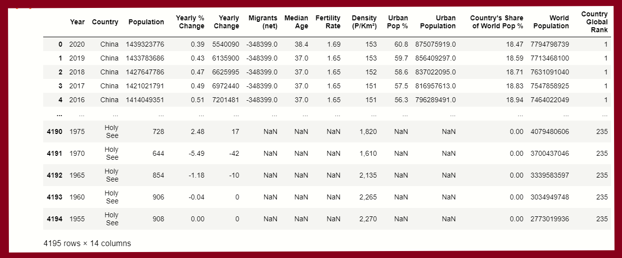
df

You can see that there are 4195 rows and 14 columns in our dataset
Step 1.
Now, we process our data because it is not in a good format. we have to drop some columns from those not required for our observations.
Required Columns:-
1. Year
2. Country
3. Population
These 3 columns are most important during observation, we drop the rest of them using pandas:
# Dropping unwanted columns
population = df.drop(columns=['Yearly % Change', 'Yearly Change', 'Migrants (net)', 'Median Age', 'Fertility Rate', 'Density (P/Km²)', 'Urban Pop %', 'Urban Population', 'Country's Share of World Pop %', 'World Population', 'Country Global Rank'], axis=1)
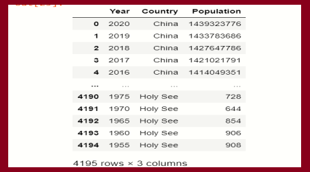
And when we display our new dataframe after dropping, seems like this:
# Display new dataframe
population

Step 2.
Now, we have to create a pivot table of our new dataframe:
df2 = population.pivot_table('Population',['Year'],'Country').head()
df2

Here we consider,
Value = Population
Index = Year, and
Column = Country
Now, our data is ready for the creation of bar chart race of population,
Creating chart
In this step, we use the python module bar_chart_race, let’s see below:
# using module function
bar_chart_race.bar_chart_race( df2 )
Output:-

In the function bar_chart_module(), having so many parameters by this parameter we can customize the observations of the bar chart:
let’s see the list of parameters:
bar_chart_race(
df = df2,
filename=None,
orientation='h',
sort='desc',
n_bars=10,
fixed_order=False,
fixed_max=True,
steps_per_period=10,
interpolate_period=False,
label_bars=True,
bar_size=.90,
period_label={'x': .99, 'y': .25, 'ha': 'right', 'va':'center'},
period_summary_func=lambda v, r: {'x': .99, 'y': .18,
's': f'Population{v.nlargest(39).sum():,.0f}',
'ha': 'right', 'size': 8, 'family': 'Courier New'},
period_length=500,
figsize=(6.5,5),
dpi=144,
cmap='dark12',
title='Population by Country',
title_size='',
bar_label_size=7,
tick_label_size=5,
shared_fontdict={'family' : 'Helvetica','color' : '.1'},
scale='linear',
writer=None,
fig=None,
bar_kwargs={'alpha': .7},
filter_column_colors=True)
Here we only pass our dataframe as a parameter, most of the parameters are default set we don’t need to do any changes. If you want to change the specific parameter, you can.
SO, this is the bar chart race visualization of countries_population_from1995_to_2020.
Endnote
Here we end our discussion on bar chart race. it was amazing interaction with this data visualization tool. I hope you enjoyed this article.
Connect with me on Linkedin: Profile
Read my other articles: https://www.analyticsvidhya.com/blog/author/mayurbadole2407/
Thank You☺😎
The media shown in this article on Creating a Bar Chart on Word Population are not owned by Analytics Vidhya and is used at the Author’s discretion.


Hi Mayur, Wonderful article to understand 'Bar chart race'. Thank you. Do you mind pasting the link to the dataset again please? The one given in the article is not working! Thanks for the help!
Hi Mayur, Thanks for the article. It is very helpful! Do you mind pasting the link to the dataset again, please? The link given in the article isn't working. Thank you.