Introduction
Besides tabular and time-series data, Data Scientists or Data Analysts can also draw information and insight from image data. This article will demonstrate satellite image analysis using Google Earth Engine, or referred to as Earth Engine. Satellite images are raster data just like any image. What makes them different is that satellite images have spatial attributes. Each pixel represents a location in the real world. Analyzing satellite images means we are going to get information on what is in our study area. The science focusing on studying this field is Remote Sensing.
Earth Engine is a platform to perform Remote Sensing, like satellite image analysis. It has many satellite images in its archive. I am not going to explain much about Earth Engine and Remote Sensing here because I have done it in another article here. If you are not familiar with Remote Sensing or Earth Engine, please find yourself a simple explanation in that article. That article actually performed how to apply Machine Learning for land cover detection on Landsat 8 images.
Introducing NDVI
This article aims to process images and return the Normalized Difference Vegetation Index (NDVI) using Landsat 8 images too. NDVI is an index commonly used in satellite image analysis to get basic information on vegetation distribution. Then, I will classify the NDVI values into 5 classes and map them. Finally, I will show how to export the result.
Landsat 8 images, just like other images, consist of pixels. Each pixel contains values. While the colorful image has 3 bands, usually red, green, and blue, Landsat 8 has 11 bands. Two of these bands used to generate NDVI are band 5 (NIR) and band 4 (Red). Figure 1 is the spectral curves showing spectral response to 3 objects. The green curve represents the spectral response to vegetation. We can see that vegetation reflects NIR the most and absorbs the red spectrum the most. Other objects have different characteristics. The water barely reflects the red spectrum and reflects all NIR. Soil reflects less NIR but reflects more red spectrum than vegetation does.
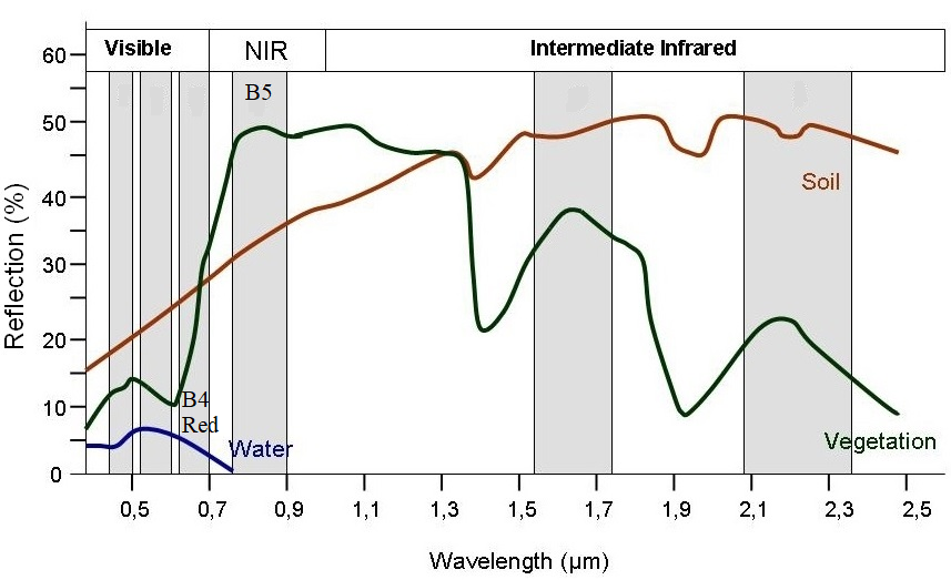
Fig. 1 Spectral curve (source: https://seos-project.eu/remotesensing/remotesensing-c01-p06.html)
NDVI equation is expressed as NDVI = (NIR – red) / (NIR + red). From the equation, we can see that NDVI intends to see the normalized difference between NIR and red spectrums. A higher difference or higher NDVI means that the object in the pixel is more likely to be vegetation, such as forest and crop. Lower NDVI value means that the object can be other objects, like water, soil, settlements, cloud, or shadow.
Loading images
Now, I will start the demonstration. Firstly, I decide the study are to analyze the image for NDVI. The red square in Figure 2 is drawn to set the boundary of the study area in Java, Indonesia. Then, I import Landsat 8 images collection. Landsat 8 images are available from 2013 until now. For this article, I load the images only from June 2020 until August 2020 and (extract their median values) because these months usually have less cloud cover in the study area. The loaded images are clipped using the red square and named “composite”.
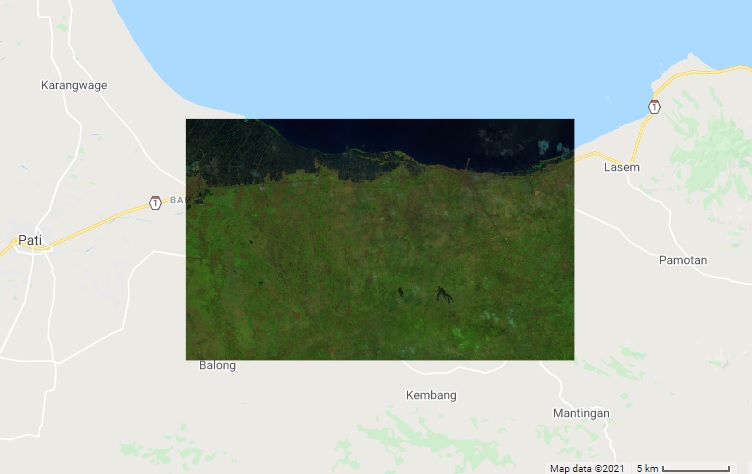
Otherwise, we will burden Earth Engine to analyze the images for the whole world. Now, we can visualize the image with composite bands 6, 5, and 4. This is the best composite to show vegetation in false color.
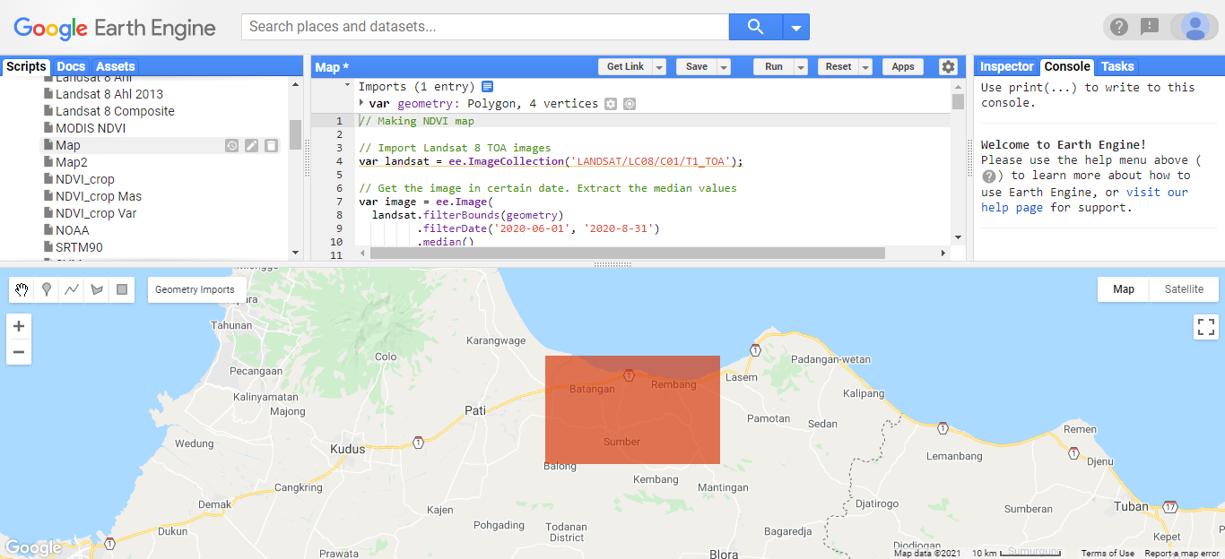
Fig. 2 Study area in red square
// Making NDVI map
// Import Landsat 8 TOA images
// Get the image in certain date. Extract the median values
var image = ee.Image(
  landsat.filterBounds(geometry)
         .filterDate('2020-06-01', '2020-8-31')
         .median()
);
// 1. Clip the image in a specified boundary.
var composite = image.clip(geometry);
var composite = composite.toFloat()
// Add map layers
Map.addLayer(composite , {bands: ['B6', 'B5', 'B4']}, "composite", false);
var landsat = ee.ImageCollection('LANDSAT/LC08/C01/T1_TOA');
Computing NDVI
The code below computes the NDVI. The equation has been explained above. The NDVI raster is displayed in green-yellow-black gradation. The green color represents a higher NDVI value, followed by the yellow color, and the black color represents the lower NDVI. Notice that the water body, like the sea, has black color. The land has mostly yellow color and a little green color. The pixel value can be identified using “inspector”.
// 2. Compute the NDVI
var nir = image.select('B5');
var red = image.select('B4');
var ndvi = nir.subtract(red).divide(nir.add(red));
var ndvi = ndvi.clip(geometry);
// Add map layers
Map.addLayer(ndvi, {min: 0, max: 1, palette: ['black', 'yellow', 'green']}, 'continuous NDVI',false);
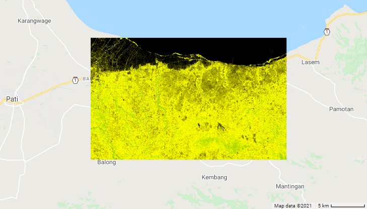
Fig. 4 NDVI
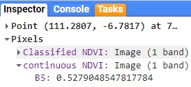
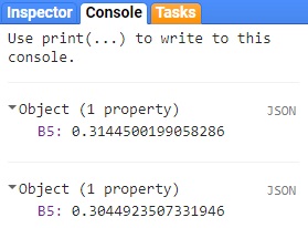
We can also compute the overall average and standard deviation of the NDVI values using the following code. The NDVI values are 0.314 ± 0.304.
// Compute the mean and stdev of NDVI
var mean_ndvi = ndvi.reduceRegion({
  reducer: ee.Reducer.mean(),
  geometry: geometry,
  scale: 30
});
var sd_ndvi = ndvi.reduceRegion({
  reducer: ee.Reducer.stdDev(),
  geometry: geometry,
  scale: 30
});
print(mean_ndvi);
print(sd_ndvi);
NDVI Classification
A better way to understand the NDVI result is by classifying the values. Here, I classify the NDVI values into 5 classes. Each class is symbolized with different colors. These classes are associated with the land cover.
// 3. Classify NDVI into 5 classes
var ndvi2 = ee.Image(1)
          .where(ndvi.gt(0.0).and(ndvi.lte(0.2)), 2)
          .where(ndvi.gt(0.2).and(ndvi.lte(0.4)), 3)
          .where(ndvi.gt(0.4).and(ndvi.lte(0.6)), 4)
          .where(ndvi.gt(0.6), 5)
var ndvi2 = ndvi2.clip(geometry);
// Add map layers
Map.addLayer(ndvi2, {min: 1, max: 5, palette: ['#654321','#FFA500','#FFFF00', '#00FF00', '#008000']}, 'Classified NDVI',true);
The next things to do are to add the map title and legend. The map title is “Map of NDVI”. The legend will describe the NDVI value range.
// Add map title
var mapTitle = ui.Panel({
  style: {
    position: 'top-center',
    padding: '8px 15px'
  }
});
var mapTitle2 = ui.Label({
  value: 'Map of NDVI',
  style: {
    fontWeight: 'bold',
    fontSize: '20px',
    margin: '0 0 3px 0',
    padding: '0'
    }
});
mapTitle.add(mapTitle2);
Map.add(mapTitle);
// Add map legend
var legend = ui.Panel({
  style: {
    position: 'bottom-right',
    padding: '8px 15px'
  }
});
var legend2 = ui.Label({
  value: 'Legend (NDVI)',
  style: {
    fontWeight: 'bold',
    fontSize: '18px',
    margin: '0 0 4px 0',
    padding: '0'
    }
});
legend.add(legend2);
// Creates the content of the legend
var content = function(color, label) {
      // Create the color boxes
      var box = ui.Label({
        style: {
          backgroundColor: '#' + color,
          // Set box height and width
          padding: '9px',
          margin: '0 0 4px 0'
        }
      });
      // Create the labels
      var labels = ui.Label({
        value: label,
        style: {margin: '0 0 4px 6px'}
      });
      return ui.Panel({
        widgets: [box, labels],
        layout: ui.Panel.Layout.Flow('horizontal')
      });
};
//  Set legend colors
var classcolor = ['654321','FFA500','FFFF00', '00FF00', '008000'];
// Set legend labels
var labelName = ['<=0','0 - 0.2','0.2 - 0.4','0.4 - 0.6', '>0.6'];
// Combine legend colou and labels
for (var i = 0; i < 5; i++) {
  legend.add(content(classcolor[i], labelName[i]));
  }
// Add legend
Map.add(legend);
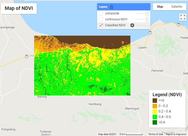
Fig. 7 Map of NDVI
From the figure above, we can more clearly see 5 classes of NDVI. Water is symbolized in brown color because of its lowest NDVI value. Settlements and aquaculture with NDVI values ranging from 0 to 0.2 are symbolized in orange color. Yellow and light green classes are crops. Crops in the green class have higher NDVI than crops in the yellow class. This can mean that crops in the green class have higher density, higher yield, or are healthier than those in the yellow class. We can find only a little vegetation with the dark green class. We can assume that there is only a little forest.
The last thing to do is that we may want to save the results. To do that, the 3 images can be exported to Google Drive to download later. Here is the code. After running the code, there will be three results to find in “Tasks”. Click the 3 “run” buttons on the right side and the exporting process will run.
// Export and save to drive
Export.image.toDrive({
  image: ndvi2,
  description: 'classifiedNDVI',
  scale: 30,
  fileFormat: 'GeoTIFF',
  region: geometry
});
Export.image.toDrive({
  image: ndvi,
  description: 'continuousNDVI',
  scale: 30,
  fileFormat: 'GeoTIFF',
  region: geometry
});
Export.image.toDrive({
  image: composite,
  description: 'Composite654',
  scale: 30,
  fileFormat: 'GeoTIFF',
  region: geometry
});
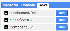
Fig. 8 Exporting results
Do the same thing automatically
The advantage of using Earth Engine is that we do not need to spend time and internet bandwidth to download the images data. Images require big memory space. Each Landsat 8 on a certain date is 1 GB in size. Another great advantage of using Earth Engine is that we can always re-run the script to another study area. We can just easily drag the red square to another study area (Sulawesi, Indonesia) and run the script again.
The exact same processes will repeat in no time. If we want to apply the same image processing in other locations using other GIS software, which is not a cloud-computing platform, we will need to repeat the same process which will take more time and is boring.
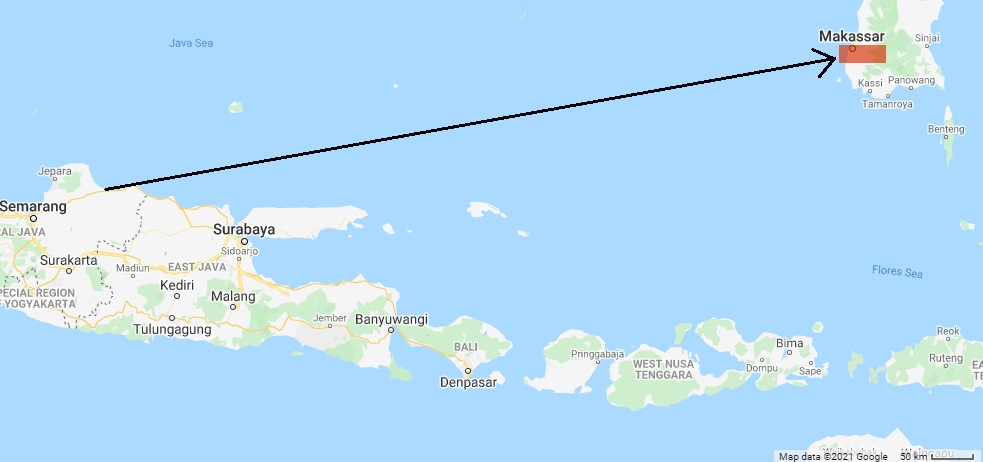
Fig. 9 Dragging the red square to another area
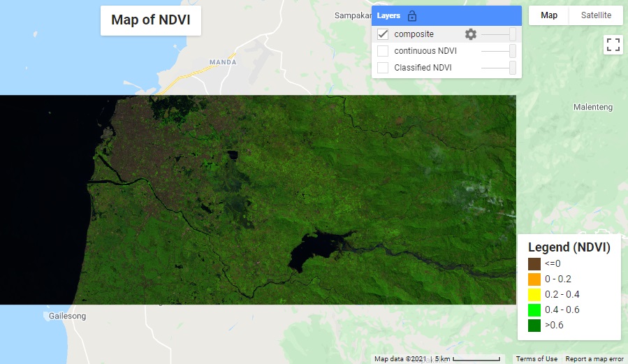
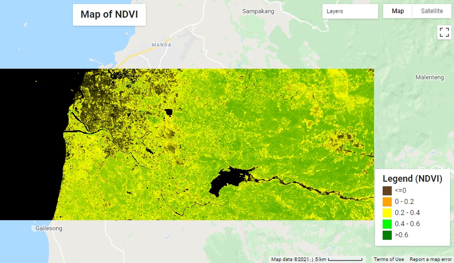
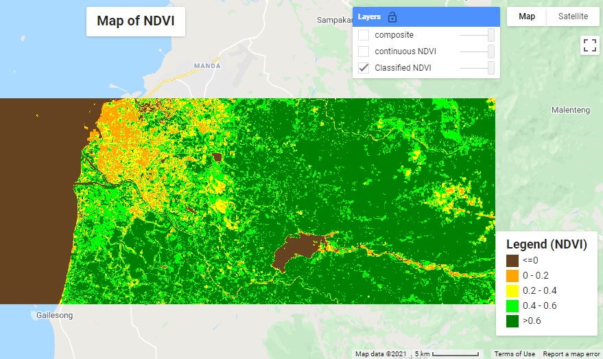
In the second area (Sulawesi), there are more areas categorized in dark green with NDVI above 0.6. These areas are likely to be forests. The rest is the same as the first area. Light green and yellow areas may represent crops or low vegetation. Orange areas are settlements and brown areas are water bodies. Some areas with the yellow and orange classes can be cloud cover. It can be forests under the cloud. The average and standard deviation of the NDVI values is 0.417 ± 0.413.
About Author
Connect with me here https://www.linkedin.com/in/rendy-kurnia/
The media shown in this article are not owned by Analytics Vidhya and is used at the Author’s discretion.


sir i am a Ph.D scholar working on soil quality using RS,ML,DL through r studio can you help me please,please