This article was published as a part of the Data Science Blogathon
Introduction
Have you ever got confused by reading those large data tables? Don’t worry, that happens with everyone (including me)!
Image source: Google Images
With around 2.5 quintillion data being generated each day including Text Messages, Emails, Videos, Images, etc. it becomes difficult to analyze all these data and find insights from those data. FYI, The cardinal number of quintillion is 1018
Thomas Redman has stated that:
“Where there is data smoke, there is business fire.”
After reading this article, you will know:
- What and Why of the Data Visualizations
- Different types of plots including Relational Plots, Regression Plots, Distribution Plots, Multi-plot Grids, Categorical Plots, and Matrix Plots.
- How to Choose a Plot?
So, let’s begin finding insights!
Table of Contents
- What is Data Visualization?
- Why Data Visualizations?
- Plot Types
- Relational Plots
- Regression Plots
- Distribution Plots
- Multi-plot Grids
- Categorical Plots
- Matrix Plots
- How to Choose a Plot?
- Summary
- Endnotes
What is Data Visualization?
Data visualization is the technique of translating information or data into a visual context, such as a map or graph, to make data easier for the human brain to understand.
Why Data Visualizations?
Image source: Google Images
Indeed, you’ve understood the meme very well. Still, let me throw some Statistics and Psychology on Why Data Visualizations?
Psychology
Our brain is uniquely built to recognize patterns and connections. Thus, presenting data visually accelerates our perception and helps to reduce cognitive load.
Statistics
Companies with the most advanced analytics capabilities are:
- 2x more likely to be in the top quartile of their financial performance.
- 2x more likely to use data very frequently when making decisions.
- 3x more likely to execute decisions as intended.
- 5x more likely to make decisions much faster than market peers. (Source: Bain & Company)
In simple words, it helps us understand data better and faster 🙂
Types of Plots
Enough of these theories now, right? Let’s get our hands dirty on Data Visualization techniques. We’ll be using the seaborn library for Data Visualizations and a couple of datasets. You may read seaborn docs here and can download all the datasets from here to follow along.
Please note that we’ll be using Figure-level Functions mostly instead of Axes-level Functions. Axes-level functions plot data onto a single matplotlib.pyplot.Axes object while the Figure-level function uses a seaborn object, usually a FacetGrid. There is one Figure-level function in each category of the plot which can be used to plot all the axes-level functions. Refer to the following diagram.
For example, relplot() is the figure-level function for the Relational Plots. It can be used to plot both the scatterplot() and the lineplot() but the default behavior is scatterplot(). We can set the parameter kind=’line’ to plot a line chart. The Same applies to the other plot types.
I highly recommend you to read more about this
Grab the datasets? Let’s begin by importing the necessary modules.
Importing Modules
import seaborn as sns
import pandas as pd
import matplotlib.pyplot as plt
%matplotlib inline
sns.set_theme(style='darkgrid', color_codes=True)
Let’s dive deep into the different types of plots.
Relational Plots
This type of plot is usually used to show the statistical analysis. It helps us to understand how variables in a dataset relate to each other and how those relationships depend on other variables.
We will be using the relplot() function for Relational Plots. The default behavior of this function is to draw a bar plot. We can use kind=’line’ to draw a line plot.
Note: One can also use the lineplot() and the scatterplot() functions to draw a line plot and a scatter plot respectively but these are the Axes-level functions.
Line Plot
A line plot is nothing but the different data points connected with a line. Line plots are generally used to track the changes over a period of time. Sometimes, it is also used to compare the changes over a time period for different groups.
covid_country_wise_data = pd.read_csv('/content/drive/MyDrive/AV-Article/Datasets/covid_country_wise.csv', index_col=0)
covid_country_wise_data.head()
sns.relplot(x='Date', y='Confirmed', data=covid_day_wise_data.iloc[::10, :], kind='line', height=4.5, aspect=2)
plt.ylabel('Rate', fontsize=14)
plt.xlabel('Date', fontsize=14)
plt.title('Daily Confirmed COVID-19 Cases Globally', fontsize=16)
plt.xticks(rotation=90)
Note: .iloc[::10, :] in the data parameter denotes that we’re plotting the line chart at an interval of 10. If we omit this, the date values on the x-axis will be overlapped. You may try it on your own.
Output:
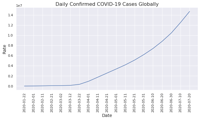
Inference
- COVID cases start rising exponentially from April.
Line Chart Use Cases
- Stock prices over a period of time.
- Total views on this article over a period of time.
Scatter Plot
A scatter plot uses dots to represent values for two different numeric variables. Generally, it is used to observe relationships between two variables.
insurance_data = pd.read_csv('/content/drive/MyDrive/AV-Article/Datasets/insurance.csv')
insurance_data.head()
sns.relplot(data=insurance_data, x='bmi', y='charges', hue='smoker', height=5, aspect=1.5)
plt.xlabel('BMI')
plt.ylabel('Charges')
plt.title('BMI vs Charges Based on Smoking Habit', fontsize=16)
hue parameter is used to separate the data based on the different categories present in a provided column (smoker in this case). This can be used while performing classification by passing a target variable as hue.
height and aspect are the parameters to set a figure size in Figure-level functions, width = height * aspect. Note that we can’t use matplotlib figsize to set a figure size in Figure-level functions.
Output:
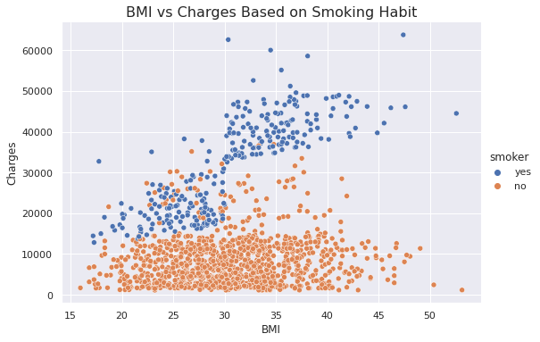
Inference
- Persons with higher BMI tend to pay more charges compared to lower BMI.
- Smokers tend to pay more charges compared to non-smokers.
Understandable, right?
Scatter Plot Use Cases
- Weight and Height Distributions.
- Beach visitors based on the temperature.
Regression Plots
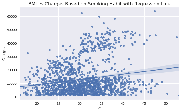
This type of plot is mainly used to fit the linear regression line onto the scatter plots which can solve your linear regression problem just in a moment. We’ll be using regplot() and lmplot() in this section. Both functions draw a scatter plot of two variables x and y, then fit the regression model and plot the resulting regression line.
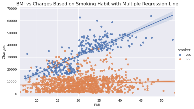
regplot() is an axes-level function that does not provide hue as a parameter while lmplot() is a figure-level function that provides hue as a parameter.
Reg Plot
plt.figure(figsize=(10, 6))
sns.regplot(x=insurance_data['bmi'], y=insurance_data['charges'])
plt.xlabel('BMI')
plt.ylabel('Charges')
plt.title('BMI vs Charges Based on Smoking Habit with Regression Line', fontsize=16)
Output:
Inference
- Shows the linear relationship between BMI and Charges.
LM Plot
sns.lmplot(data=insurance_data, x='bmi', y='charges', hue='smoker', height=5, aspect=1.7)
plt.xlabel('BMI')
plt.ylabel('Charges')
plt.title('BMI vs Charges Based on Smoking Habit with Multiple Regression Line', fontsize=16)
Output:
Inference
- Shows the linear relationship between BMI and Charges based on smoking habits.
Let’s add one more parameter!
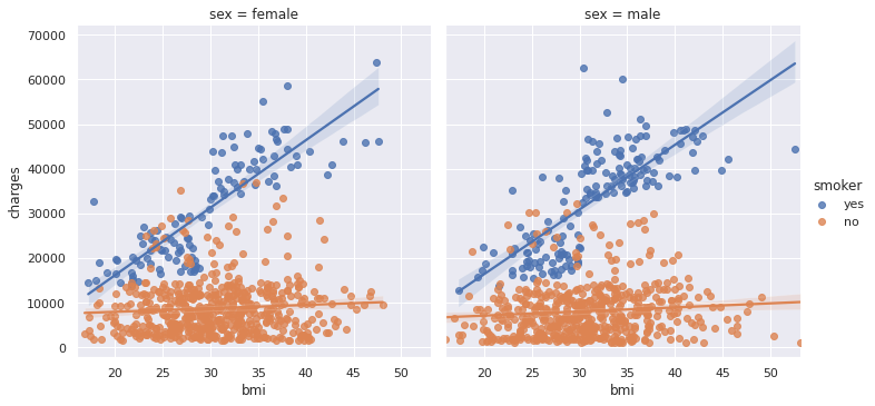
sns.lmplot(data=insurance_data, x='bmi', y='charges', hue='smoker', col='sex')
Output:
Inference
- Shows the linear relationship between BMI and Charges based on smoking habits separately for a male and a female.
Looks Interesting? Try the following code on your own and interpret the results! Note that we’re adding one more parameter.
sns.lmplot(data=insurance_data, x='bmi', y='charges', hue='smoker', col='sex', row='region')
Let me know the inference in the comments section!
Distribution Plots
This type of plot is mainly used to see how the variables are distributed, which is considered as an early stage in Data Analysis. This type of plots helps us to perform the Univariate Analysis which can answer the following important questions:
- What ranges do the observations cover?
- Are they skewed or not?
- Are there any outliers?
- Do the answers to the above questions vary across the different subsets of the data?
As shown in the first diagram of the Types of Plots section, distplot() is a Figure-level function with histplot() as default behavior, which is the most common approach to visualize a distribution. We can use the kind parameter to visualize different distributions.
Histograms
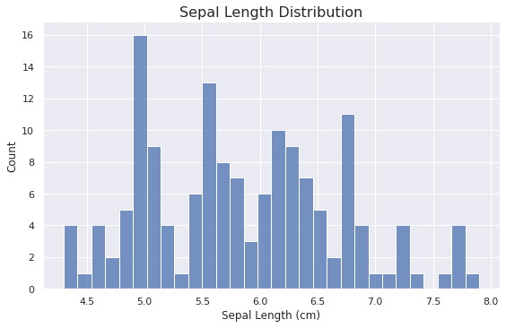
Histograms are used to perform a Univariate or Bivariate Analysis on the datasets.
sns.displot(data=iris_data, x='Sepal Length (cm)', aspect=1.6, bins=30)
plt.title('Sepal Length Distribution', fontsize=16)
Output:
Inference
- Most flowers are having sepal length in the range of 5.5 to 6.8
Let us add our favorite parameter i.e. hue 🙂
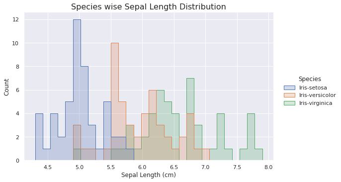
sns.displot(data=iris_data, x='Sepal Length (cm)', hue='Species', aspect=1.6, element='step', bins=30)
plt.title('Species wise Sepal Length Distribution', fontsize=16)
Output:
Inference
- Most setosa flowers are lying in the range of 4.9 to 5.1
- Only setosa flowers have a sepal length less than 5.
- Only virginica flowers have a sepal length greater than 7.
KDE Plot
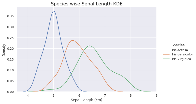
A Kernel Density Estimation (KDE) is analogous to the Histograms but KDE represents the data using a continuous probability density curve in one or more dimensions.
sns.displot(data=iris_data, x='Sepal Length (cm)', hue='Species', kind='kde', aspect=1.6)
plt.title('Species wise Sepal Length KDE', fontsize=16)
Output:
Inference
- Setosa flowers are having a highest density and it is less skewed.
- Virginica flowers are having a lowest density and it is highly skewed.
Multi-plot Grids
This type of plot helps us to show the relationship between two variables by plotting two or more separate graphs. This is one of the favorite choices of Data Scientists as this provides Univariate and Bivariate Analysis in a single figure.
Joint Plot
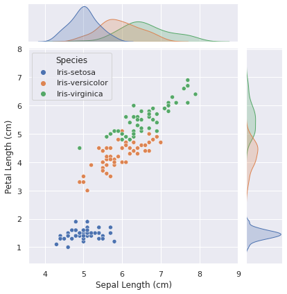
It combines the functionality of a scatter plot and a histogram or a KDE plot.
We can use the jointplot() function to draw a joint plot. It draws a scatter plot in the middle which helps us in Bivariate Analysis and KDE Plot at the top and the right side which helps us in Univariate Analysis.
sns.jointplot(data=iris_data, x='Sepal Length (cm)', y='Petal Length (cm)', hue='Species')
Output:
Inference
- The sepal length of Setosa flowers lies in the range of 4-6.
- The petal length of Setosa flowers lies in the range of 1-2 and it is easily distinguishable from the other species of flowers.
- Petal length distribution for Setosa flowers is less skewed while it is highly skewed for Versicolor and Virginica flowers.
Pair Plot
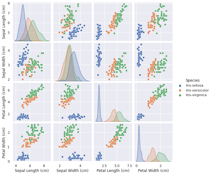
It helps us to plot pairwise relationships in a dataset.
The simplest invocation uses scatterplot() for each pairing of the variables and histplot() for the marginal plots along the diagonal if we do not provide hue parameter and kdeplot() if we provide hue parameter.
We can use the pairplot() function to draw a pair plot.
sns.pairplot(data=iris_data, hue='Species', height=2)
Output:
Inference
- Same as above.
- Setosa flowers distribution is less skewed for Sepal Length, Petal Length and Petal Width while it is highly skewed for Sepal Width.
Categorical Plots
In the relational plots, we focused on cases where the main relationship was between two numerical variables. If one of the variables is categorical, it may be helpful to use a more specialized approach to visualization i.e. Categorical Plots.
There are numbers of axes-level functions such as barplot(), countplot(), etc. to draw a categorical plot but we’ll be using catplot() which is a figure-level function that gives unified higher-level access to different axes level functions.
Let’s get started!
Bar Plot
A bar plot represents an estimate of central tendency for a numeric variable with the height of each rectangle.
sns.catplot(data=flight_delays_data, x=flight_delays_data.index, y='HA', kind='bar', aspect=1.75)
plt.ylabel('Delays')
plt.title('Month wise Delays of the HA Airline', fontsize=16

Inference
- Highest Delay in August.
- Lowest Delay in November.
Count Plot
This type of plot helps us to show the count of each category of the categorical variables. It can be thought of as a histogram for categorical variables.
sns.catplot(data=insurance_data, x='smoker', hue='sex', kind='count', aspect=1.5)
plt.xlabel('Smoker')
plt.title('Gender wise Total Smoker and Non Smoker', fontsize=16)

Inference
- More male smokers compared to female smokers.
Swarm Plot
This can be thought of as a scatter plot for the categorical variables. It shows all the data points in a figure which helps us to identify the outliers.
sns.catplot(data=insurance_data, x='smoker', y='charges', kind='swarm', aspect=1.5)
plt.title('Swarm Plot - Charges Based on Smoking Habits', fontsize=16)

Inference
- Most non-smokers lie in the charges range of 100-1400.
- More outliers in the case of non-smokers compared to smokers.
- Smokers’ charges vary more than non-smokers’.
Box and Whisker Plot
This is one of the most used plots in the field of Data Science. It shows the distribution of quantitative data in a way that facilitates comparisons between variables or across levels of a categorical variable. It helps us to detect outliers more easily compared to the swarm plots.
Please refer to the following diagram.
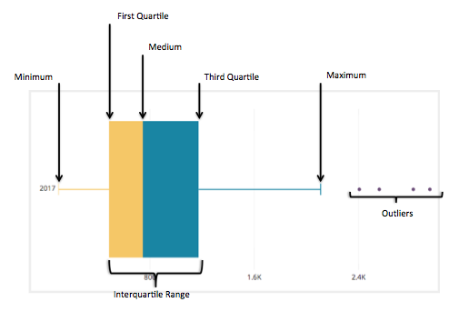
Image Source: Google Images
sns.catplot(data=insurance_data, x='smoker', y='charges', kind='box', aspect=1.4)
plt.title('Box Plot - Charges Based on Smoking Habits', fontsize=16)

Inference
- Same as in above.
Violin Plot
A violin plot is almost similar to the box and whisker plot except that it uses KDE instead of actual data points.
Note: Violin plot is influenced by sample size since it uses KDE underlying. Using it for a small sample size is not advisable.
Try this on your own!
You should try adding our favorite parameters including hue, col in a swarm plot, box and whisker plot, and a violin plot as we previously did in the Regression plots.
Matrix Plots
This type of plot is used to find quick conclusions from the dataset by plotting data in the form of a matrix.
Heat Map
A heatmap is a graphical representation of data in which data values are represented as a color-encoded matrix. This can be used to see the relationship between two variables. It can also be used to plot a correlation matrix.
We can use the heatmap() function in seaborn to plot a heatmap.
plt.figure(figsize=(14, 8))
sns.heatmap(data=flight_delays_data, annot=True, center=0, linewidths=.5)
plt.xlabel('Airlines Code')
plt.title('Heatmap of Airline and Month wise Delays', fontsize=16)
annot=True: Write the data value in each cell.
center=0: Plots data with diverging colormap.
linewidth=.5: Each cell will be divided by 0.5
You may try different combinations of these parameters and other parameters mentioned in the documentation on your own.
Output:
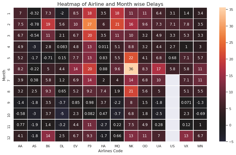
Note: White cells for the US airline denotes missing data and negative delay denotes that the flights come earlier than the mentioned time.
Inference
- NK airline is having the highest delay compared to other airlines with the overall highest delay in June.
- AS airline is having a negative delay.
- The first six months noted higher delays compared to the last six months.
- and many more! Let us discuss this in the comment section.
How to Choose a Plot?
Please refer to the following diagram to choose a plot according to use cases from various available plots.

Please do not hesitate to credit me, if you use the above image elsewhere in the future.
Summary
In this article, you have understood some amazing Data Visualization techniques.
Specifically, you learned:
- What and Why of the Data Visualizations
- Different types of plots including Relational Plots, Regression Plots, Distribution Plots, Categorical Plots, Matrix Plots and Multi-plot Grids.
- How to Choose a Plot?
Endnotes
This completes today’s discussion. Thank you for reading this article!
I hope you enjoyed the article and it’s worth spending your 10 minutes.
Please feel free to put up your questions in the comments down below. I would love to answer those.
Did I miss something important or want to share your thoughts? Comment down below and I’ll get back to you.
About the Author
I am Harsh Dhamecha, an aspiring Data Scientist. Currently, I am pursuing a Bachelor of Technology in Computer Science with a specialization in Artificial Intelligence. I love sharing my knowledge through the articles.
You may also look at another article I have written on the Generative Adversarial Networks(GANs).
Still reading! Special thanks to you 🙌
The media shown in this article on Data Visualization Techniques are not owned by Analytics Vidhya and are used at the Author’s discretion.


