This article was published as a part of the Data Science Blogathon
Introduction
How many times you have used Pandas library for your Data Science tasks? Almost every time! Pandas is an essential library for data manipulation and generating insights from the dataset in the form of summary tables, visualizations, and much more.
PandasGUI is a Python-based library that facilitates data manipulation and summary statistics to be applied on the dataset using GUI. That means that all the operations will be performed via the graphical user interface (GUI), but pandas will be used to execute them under the hood.
In this article, I will walk you through all the features of this library, how it generates interactive plots, and how to access the automatic Python code generated for all the operations performed via GUI!

Installation
PandasGUI is a Python package and can be installed via the pip package manager. Note: I would recommend using Python 3.8 and above for installation. Also, make sure to create a separate environment (virtual environment) and install the library in that environment.
Creating virtual environment (conda)
Run these commands in your terminal
conda create -n nameofenv python=version
conda activate nameofenv
Installing pandasgui
pip install pandasgui
It will take a bit to install the library because its dependencies are quite heavy.
Setup
First thing first, load the library. We are interested in the show() function of the pandasGUI library that initializes the application.
from pandasgui import show
This function can be used in two ways:
- You can directly instantiate the pandasGUI show function which will open up the application without any dataset.
- You can pass the dataframe to the function and the application will be populated with the rows and columns of the dataset. This way, you can load multiple datasets at the same time bypassing all the dataframe objects to the show() method.
For now, we will load the application without any dataset,
show()
And you will get a screen like this:
Various features
Now, we will explore all the features of this application step by step.
Loading the Dataset
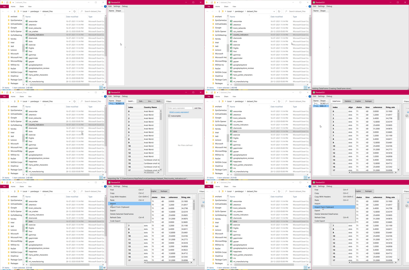
To load a dataset into the application, you have various options:
- Pass the dataframe object into the show function
- Add it manually using the Edit menu’s “Import” option
- Import dataframe from the clipboard using Edit menu’s “Import From Clipboard”
- Use Debug menu’s “Browse Sample Datasets” to load any sample dataset for testing.
- Drag and drop the CSV files into the application
See the GIF below:
On-Screen operations
Apart from the various tabs and menus offered by the pandasGUI application, there are some of the operations which you can apply directly by triggering the GUI elements displayed:
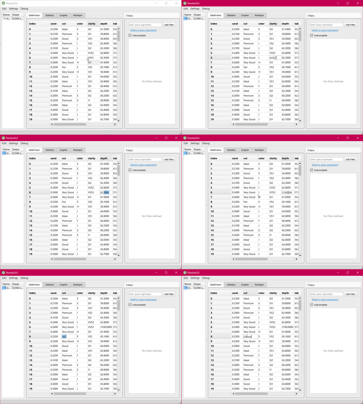
1. All the cells of the dataset shown are editable. You can click on any of the cells and make your edits. It is very similar to what you do in excel sheets. Any value can be directly changed.
2. Right-click on the column headers will give you an interactive column menu containing options for sorting the column by ascending, descending order, moving the column to extreme ends or within the range, parsing the column containing dates as a string to pandas datetime format, and deleting the column option.
Column Header Options
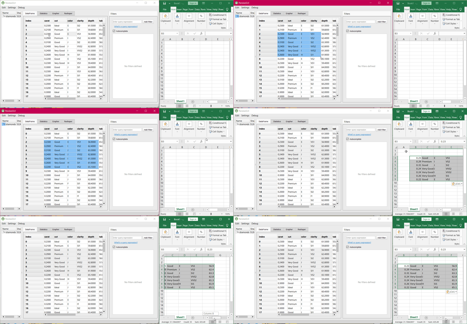
3. By dragging and selecting any portion of the dataset, you can copy that section and paste it into any cell of the excel sheet. It will be automatically converted to a tabular format as shown in the application itself.
4. Right-click on the dataframe name on the left panel pop-up the option to delete the dataframe from the application.
Filters
Applying filters to a dataset is one of the most important tasks in any data science task. It helps in isolating a segment of the dataset and work on that isolated section. In pandas, you usually use comparisons, threshold values with columns, or whole datasets to filter data. In pandasGUI, you can do the same type of filtering using the Filters tab on the right.
Just type out the expression for filtering and only the data that satisfies the condition will be displayed. See an example below:
Filtering data by “cut=ideal”
You can apply multiple filters and enable/disable them using the checkbox on the left. See the example below where multiple filers are applied:
An example where multiple filters are applied to the dataset
Note: All the filters are applied using “pandas.dataframe.query()” method under the hood.
Statistics Tab
Statistics play an important role in a descriptive view of all the features of the dataset. These contain parameters such as percentiles which helps in getting insight into how the data is spread, mean, which is affected outliers, can still tell us about the center of data and standard deviation tells about how much the column data varies inside. A column with 0 standard deviations will be of no use as this would mean that all the values of the column are the same which is simply not helpful for predicting the target value.
To conclude such insights, click on the statistics tab and you will get a summary of data type, count, the number of unique values, mean, standard deviation, and min-max. For string type values, numerically calculated parameters such as mean will be null.
Statistical Summary
Grapher Tab
Graphs and visualizations is a very powerful tool in presenting a summary of the data using visual elements. For instance, Distribution graphs can help in determining whether the column values align with normal distribution/bell-shaped curve which simplifies our task for determining the population parameters and concluding facts based on samples.
Box plots help in determining the spread of data, how many values should be considered as outliers. It also represents where 50% of the data lies. Other types of plots such as histograms, bar charts, scatter plots, line plots, contours have their own advantages, and therefore, plotting data is important.
To plot such visualizations using pandasGUI, simply switch to the Grapher tab and you will get an initial screen like this:
Grapher tab initial screen
You can choose from histograms, scatter plots, bar charts, box plots, violin plots, scatter 3D, heatmap, contour plots, pie charts, splom, candlestick, candlestick, and word clouds. All these plots are created using the Plotly library at the backend and therefore, the plots are interactive in nature.
Let’s plot some data. To do the plotting, simply select any type of plot, and then drag the column name from the left panel to the parameters of the plot mentioned adjacent right to it. See the example below:
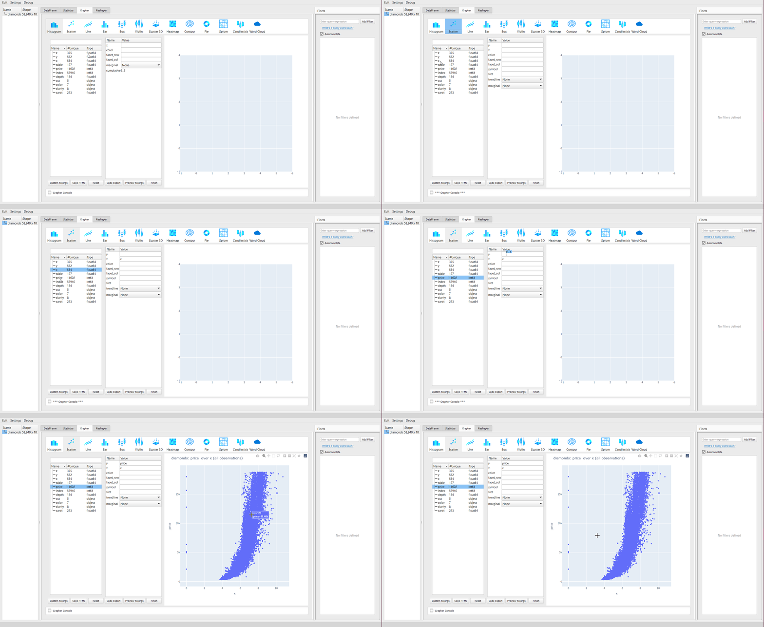
Scatter plots
You can see that as “x” increases, the “price” increases exponentially. The plot is interactive in nature due to the plotly backend. The parameters such as “x”, “y”, “color” change as per the plot to be displayed. For instance, you will not get “x”, “y” parameters for the word cloud.
Let’s plot a word cloud for a different dataset, Google Play store app reviews, that contain textual information about the app’s feedback:
Word cloud for Google Play store app reviews
Other common options are available for each plot are available at the bottom of the column and parameters panel. These include:
Custom kwargs: As the plotting is done plotly, you can add all the kwargs supported by plotly express. The current arguments may be limited for best use-case but you can pass your custom arguments using this option. For example, the default name of the column “x” can be changed to something else using the “labels” argument:
Custom kwargs
Save HTML: Using this option, you can save the plot generated into an HTML file. This file can be used independently without the need for any backend. The HTML file displays the graph interactively using JavaScript.
Reset: This option clears all the parameters values.
Code Export: You can export the code for plotting the graph using this option. The code will lack the custom keywords provided but the basic code will be helpful to get you started with the plotting.
Preview kwargs: It displays all the current arguments used to plot the graphs.
Finish: Whenever you want to rerun your plotting codes, you can click on this option. This is useful in cases when you have applied the custom arguments and you want to reload the graph with those arguments applied.
Reshaper Tab
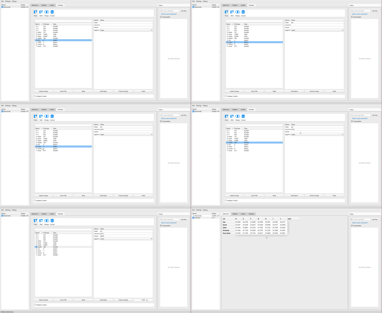
Summary tables such as Pivot tables play a crucial role to summarize data based on aggregation functions such as mean, median, sum, etc. You can simply create these tables using the reshaper tab. This tab offers Pivot tables, melt tables, merging and concatenating tables. Simply drag the column names from the left panel to the parameter required and click on finish.
You will get a new dataframe with the summary selected. Let’s create a pivot table for summary for “cut” as the index, “color” as the new column, and aggregated mean values “depth” of diamonds dataset:
Set Preferences
Like any other application, you can change the default settings of the pandasGUI using the setting’s menu set preferences option. You can change the theme of the application to dark mode, disable the editable on-screen features, set auto_finish to True, change render mode, change default aggregation function from mean to other function, and format the title.
Preferences settings
Export Dataset and Code
After you are done with all the data exploration and manipulation, you can access the pandas equivalent code for all the operations performed using the edit menu’s export code option. This code will be formatted in the order of the operation with appropriate comments for every operation performed.
Code Generation by PandasGUI
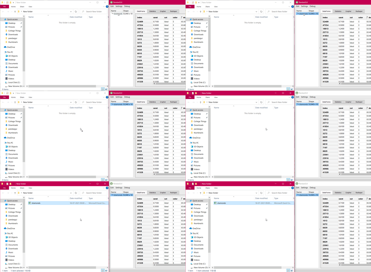
In the same edit menu, you have the option of exporting the modified dataframe. You can opt for that option or more easily, you can drag and drop the dataframe name to any folder and a CSV file for that dataframe will be created.
Conclusion
In this detailed article, I introduced you to PandasGUI. It is a very powerful tool to perform data manipulation and exploration via the graphical user interface. We started with the installation of the library, loading the dataset, then explored all the on-screen functions, looked at each tab in greater detail, and then saw some of the miscellaneous functions.
If you want to read/explore every article of mine, then head over to my master article list which gets updated every time I publish a new article on any platform!
For any doubts, queries, or potential opportunities, you can reach out to me via:
1. Linkedin — in/kaustubh-gupta/
2. Twitter — @Kaustubh1828
3. GitHub — kaustubhgupta
4. Medium — @kaustubhgupta1828


I was diagnosed of Parkinson's Disease a couple of years ago, I had severe fatigue, difficulty with mobility and sleeping. I was given medications which helped but only for a short while. So i decided to try alternative measures and began on Parkinson's HERBAL TREATMENT from Kykuyu Health Clinic, It made a tremendous difference for me (Go to their website www. kykuyuhealthclinic. com ). I had improved walking balance, muscle strength and improved vision
Is there a way where I can include pandasgui application in a website ?