This article was published as a part of the Data Science Blogathon
Introduction
Data visualization is the most important step in the life cycle of data science, data analytics, or we can say in data engineering. It is more impressive, interesting and understanding when we represent our study or analysis with the help of colours and graphics. Using visualization elements like graphs, charts, maps, etc., it becomes easier for clients to understand the underlying structure, trends, patterns and relationships among variables within the dataset. Simply explaining the data summary and analysis using plain numbers becomes complicated for both, people coming from technical and non-technical backgrounds. Data visualization gives us a clear idea of what the data wants to convey to us. It makes data neutral for us to understand the data insights.
Data visualization involves operating a huge amount of data and converts it into meaningful and knowledgeable visuals using various tools. For visualizing data we need the best software tools to handle various types of data in structured or unstructured format from different sources such as files, web API, databases, and many more. We must choose the
best visualization tool that fulfils all our requirements. The tool should support interactive plots generation, connectivity to data sources, combining data sources, automatically refresh the data, secured access to data sources, and exporting widgets. All these features allow us to make the best visuals of our data and also save time.
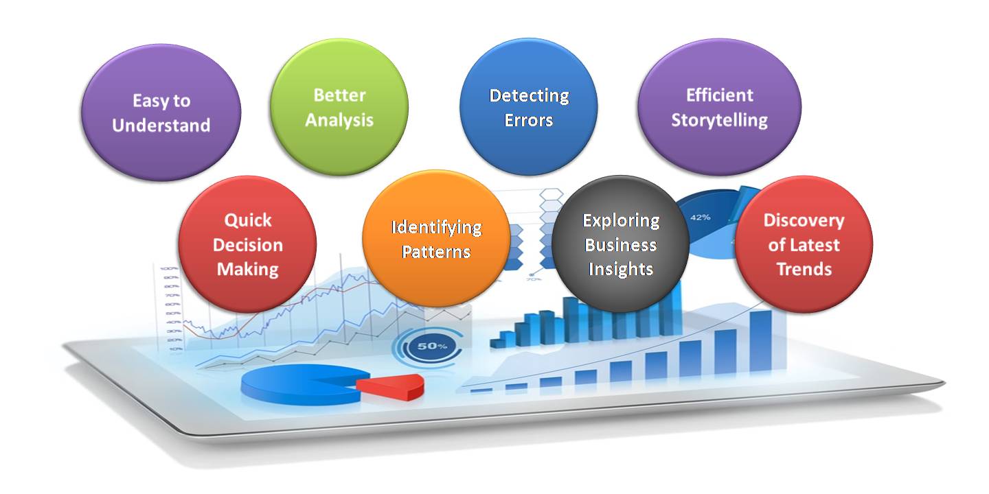
Advantages of Data Visualization:
- Easy to understand: Managers and decision-makers use data visualization tools to create plots easily and rapidly consume important metrics. These metrics show the clear cut growth or loss in business. For example, if Sales are
significantly going down in one region, decision-makers will easily find out from the data what circumstances or decisions are at present and how to respond to the factors encountered. Through graphical representations,
we can interpret the vast features of data very clearly and cohesively, which allows us to understand the data and to draw conclusions from those insights and see business outlook. - Quick Decision Making: The Human mind can process visual images faster than texts and numerical values. Hence, seeing a graph, chart, or other visual and graphical representations of data is more pleasant and easy for our
brain to process. To read and grasp text, and then convert this into a visualization of the data that might not be entirely accurate becomes difficult and time consuming to understand for the team of decision-makers. It is a good human ability that easily interprets visual data; data visualization completely proves to improve the speed of decision-making
processes. Data visualization always helps to shorten business meetings and efficient decision making. - Better Analysis: Data visualization plays an important role for business stakeholders to analyze reports of business regarding sales, marketing strategies, and product interest. Better analysis can put our focus on the areas that require more attention to improve the strategies that increase profits and make the business more productive.
- Identifying patterns: Huge amount of sophisticated data will give several opportunities for insights after we visualize them. Visualization permits business users to acknowledge relationships and patterns between the data, also providing bigger meaning to it. Exploring these patterns helps users concentrate on specific areas that need attention within the data, to establish the importance of these areas to drive their business forward.
- Detecting Errors: Visualizing our data helps quickly determine any errors within the data. If the data tend to counsel the incorrect actions, visualization facilitates detecting inaccurate data sooner so it will be off from the
analysis. - Exploring business insights: Within the current competitive business atmosphere, finding data correlations using visual representations is essential to characterize business insights. Exploring these insights is very important
for business users or executives to line up the correct path to achieving the business goals. - Efficient Storytelling: Data visualizations are acknowledged because of the method of displaying data to produce insights that will support better decisions i.e., telling the story behind the data. It can offer factors, raise and
draw attention to crucial insights and visually beat the other’s business. - Discovery of Latest Trends within the Market: Using data visualization, we’ll be able to discover the most recent trends in your business to produce a quality product and determine issues before they arise. Staying on high of
trends, we’ll be able to place a lot of effort into augmented profits for our business.
Data Visualization with Pandas:
Pandas library in python is mainly used for data analysis. It is not a data visualization library but, we can create basic plots using Pandas. Pandas is highly useful and practical if we want to create exploratory data analysis plots. We do not need to import other data visualization libraries in addition to Pandas for such tasks.
As Pandas is Python’s popular data analysis library, it provides several different functions to visualizing our data with the help of the .plot() function. There is one more advantage of using Pandas for visualization is we can serialize or create a pipeline of data analysis functions and plotting functions. It simplifies the task.
Let’s understand how we can visualize data using Pandas with practical implementation and also all other features.
To visualize the data we will create a DataFrame that has 4 columns consists of random values using the Numpy random.rand() function. The IDE we are using is Google Colab. Let’s create each type of plot one by one.
Creating the Dataframe:
Python Code:
#importing packages
import numpy as np
import pandas as pd

#creating a DataFrame
df = pd.DataFrame(np.random.rand(10, 4), columns=('col_1', 'col_2', 'col_3', 'col_4'))
# Since this is a randomly generated dataframe the values will differ everytime you run this code for everyone.

#displaying the DataFrame
print(df)
This is the DataFrame which we will use throughout all the visualizations. We are going to use the .plot() function of DataFrame and series to plot graphs. For DataFrame and Series .plot() function is a convenience to plot all of the columns along with labels.
Line plot:
Line plot can be created with DataFrame.plot() function.
df.plot()
We have got the well-versed line plot for df without specifying any type of features in the .plot() function. We can plot graphs between two columns also. Let’s see another example:
df.plot(x="col_1", y="col_2")
In this example, we have plotted a line graph between two columns only by providing the arguments for the x and y-axis.
We can also generate subplots for individual columns. Let’s see an example:
df.plot(subplots=True, figsize=(8, 8));
The subplot of the line graph is generated for each column in DataFrame.
Bar plot:
Now, we will create bar plots for the same dataframe. Bar plot can be created with DataFrame.plot.bar() function.
df.plot(kind="bar")
We can see that the bar plot is generated for all the columns. Let’s specify some features in the plot.
df.plot.bar(stacked=True);
In this bar plot, the bars are stacked.
df.plot.barh(stacked=True);
In this bar plot, the bars are set horizontally.
Histogram plot:
Now, let’s generate a histogram for the df. Histogram plot can be created with DataFrame.plot.hist() function.
df.plot.hist()
Now, let’s create a histogram with some other features.
df.plot.hist(stacked=True, bins=20);
This is a stacked histogram.
df.plot.hist(orientation="horizontal", cumulative=True);
Here, we have added a cumulative frequency in the histogram.
Let’s create a histogram for each column individually.
df.diff().hist();
The histogram is created for each column in the form of subplots.
Box plot:
Now, we will create box plot. Box plot can be created with DataFrame.plot.box() function or DataFrame.boxplot().
df.plot.box()
Or we can also write like this
df.boxplot()
The above written both the line of code will generate the same box plot.
Now, generating the box plot in a horizontal form.
df.plot.box(vert=False, positions=[1, 2, 3, 4]);
The box plots are generated in the horizontal format.
Area plot:
Now, we will create a area plot. Area plot can be created with DataFrame.plot.area() function.
df.plot.area()
This is the area plot for dataframe df. This plot is stacked.
Now, we will create unstacked area plot.
df.plot.area(stacked=False)
This area plot is unstacked as we have specified in the plot function.
Scatter plot:
Now, let’s generate a scatter plot. A Scatter plot can be created with DataFrame.plot.scatter() function. As we know scatter plot takes two-positional required arguments i.e. x and y to plot the graph. So, we will give the values of the x and y-axis as the name of columns.
df.plot.scatter(x='col_1', y='col_3');
This is the scatter plot between col_1 and col_3 of dataframe df. Let’s apply some styles.
ax=df.plot.scatter(x="col_1", y="col_3", color="red", marker="*", s=100)
df.plot.scatter(x="col_2", y="col_4", color="orange", s=100, ax=ax)
In this plot the data is spread with respect to col_2 and col_4 and the we have added some styles also like color, marker and size of scatters. Let’s see another style of scatter plot
df.plot.scatter(x="col_2", y="col_4", c='col_1', s=100)
The c keyword is given as the name of a column to provide colours for each point.
Pie chart:
A Pie plot can be created with DataFrame.plot.pie() function or Series.plot.pie(). To generate a pie chart we will create series data as a pie chart is created only for one column. Let’s create a series named pie.
pie = pd.Series(np.random.rand(5))
pie
pie.plot.pie();
A Pie chart can be created for DataFrames also but it will generate individual pies for each column of DataFrame in the form of subplots. Let’s Create a pie chart for the dataframe also:
First, we will create a dataframe with three columns and then generate the pie chart for each column.
#creating a DataFrame
df2 = pd.DataFrame(np.random.rand(6, 3),
                   columns=('col_1', 'col_2', 'col_3'))
#displaying the DataFrame
df2
This is the dataframe df2 for the pie chart. Now. let’s generate the chart.
df2.plot.pie(subplots=True, figsize=(15, 15))
These are the subplots of the pie chart for each column in the DataFrame df3.
This brings us to the end of this article. In this article, we discussed how we can visualize data with data analysis library Pandas without importing any additional data visualization library. Hope you enjoyed reading this article. Do let me know your comments and feedback in the comment section.
Thanks for reading.
For more articles click here.
The media shown in this article are not owned by Analytics Vidhya and are used at the Author’s discretion.


