
Ever wondered how your smartphone responds to the motion of your body while playing your favorite game, or maybe watching a 360-degree picture on it? What is that under the hood that makes this happen?
In recent years, there has been a rapid increase in the usage of smartphones equipped with sophisticated sensors such as accelerometers and gyroscopes. Accelerometers embedded in smartphones are used to detect the orientation of the phone. The gyroscope (also called gyro in short) tracks the rotation or twist which adds an additional dimension to the information provided by the accelerometer. While the accelerometer measures the linear acceleration, the gyro on the other hand measures the rotational angular velocity. The information provided by these sensors supplements each other in the process of motion sensing.
Apart from supporting advanced gaming, accelerometers and gyroscopes have many other applications. One such application is Human Activity Recognition(HAR), using data collected from an accelerometer of a smartphone. This information can be further consumed by health and fitness monitoring applications.
Get Personalized Learning Path! Set your goal and timeline. Get a path—under 2 mins.
There are several publications, research articles, and blogs wherein the authors have used machine learning-based techniques for HAR. The performance of such methods largely depends on the quality of the engineered features. Handcrafting features for any specific application require excellent domain knowledge. Besides feature engineering is quite a tedious task and without domain understanding, you may not be able to obtain state-of-the-art (SOTA) results. This is where deep learning comes to our rescue!
In this article, we are going to employ Long short-term memory (LSTM), an artificial recurrent neural network architecture for the human activity recognition task, which will learn complex features automatically from the raw accelerometer signal to be able to differentiate between common human activities.
About data
Smartphones contain tri-axial accelerometers that measure acceleration in all three spatial dimensions. In this article, we shall be using the raw accelerometer signal data sourced from WISDM Lab, Department of Computer & Information Science, Fordham University, NY (Link to the dataset). Note that the file is the raw data file — WISDM_ar_v1.1_raw.txt
This data is collected from 36 different users as they performed some day-to-day human activities such as — walking, sitting, standing, jogging, ascending and descending stairs for a specific period of time. In all cases, data is collected at a frequency of 20 samples per second, that is one record every 50 milliseconds.
The dataset has 6 columns – ‘user’, ‘activity’, ‘timestamp’, ‘x-axis’, ‘y-axis’, and ‘z-axis’.
‘user’ denotes the user ID, ‘timestamp’ is the Unix timestamp in nanoseconds, and the rest are the accelerometer readings along the x, y, and z axes/dimensions at a given instance of time. Our target variable(class-label) is ‘activity’ which we intend to predict.
Here is a glimpse of our dataset –
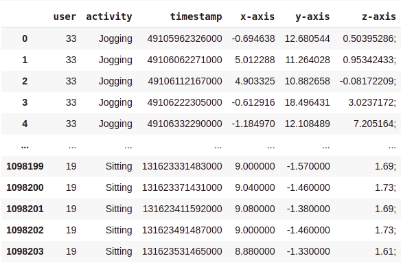
As you can see, there are over a million rows!
Before we start training our models, the dataset needs to be clean and organized.
Data Cleaning & Preprocessing
- drop null values.
- change datatype of the ‘z-axis’ column to float.
- drop the rows where the timestamp = 0.
- sort data in ascending order of ‘user’ and ‘timestamp’ columns.
# importing libraries
%matplotlib inline
import numpy as np
import pandas as pd
import matplotlib.pyplot as plt
import seaborn as sns
import warnings
warnings.filterwarnings('ignore')
# reading raw data file
columns = ['user','activity','timestamp', 'x-axis', 'y-axis', 'z-axis']
df_har = pd.read_csv('WISDM_ar_v1.1/WISDM_ar_v1.1_raw.txt', header = None, names = columns)
# removing null values
df_har = df_har.dropna()
df_har.shape
# transforming the z-axis to float
df_har['z-axis'] = df_har['z-axis'].str.replace(';', '')
df_har['z-axis'] = df_har['z-axis'].apply(lambda x:float(x))
# drop rows where timestamp is 0
df = df_har[df_har['timestamp'] != 0]
# arrange data in ascending order of user and timestamp
df = df.sort_values(by = ['user', 'timestamp'], ignore_index=True)
Here is how our data looks like post-cleaning and sorting —

Now we are left with 1085360 rows.
Exploratory Data Analysis
Analyzing class label distribution —
sns.set_style(“whitegrid”)
sns.countplot(x = ‘activity’, data = df)
plt.title(‘Number of samples by activity’)
plt.show()
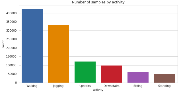
It can be seen, there is a significant class imbalance here with the majority of the samples having class-label ‘Walking’ and ‘Jogging’. ‘Sitting’ and ‘Standing’ activities have the least representation in the dataset.
Now let’s see how the individual users are contributing to each activity.
sns.countplot(x = ‘user’,  hue = ‘activity’, data = df)
plt.title(‘Activities by Users’)
plt.show()
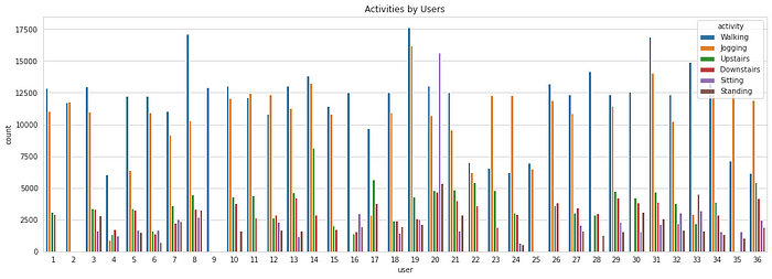
It can be observed that not all the users are performing all the activities. The time for which they perform each activity is also disproportionate. Regardless, this won’t be affecting us as we have a sufficiently large number of data samples, and it is assumed that all the users are alike.
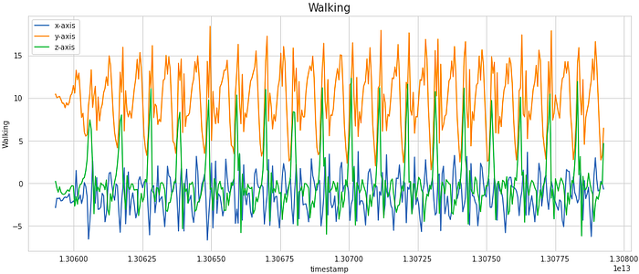
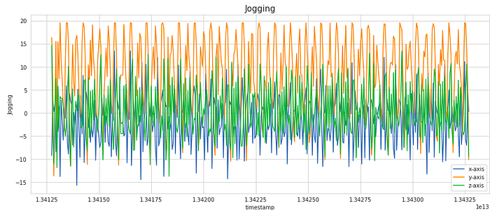
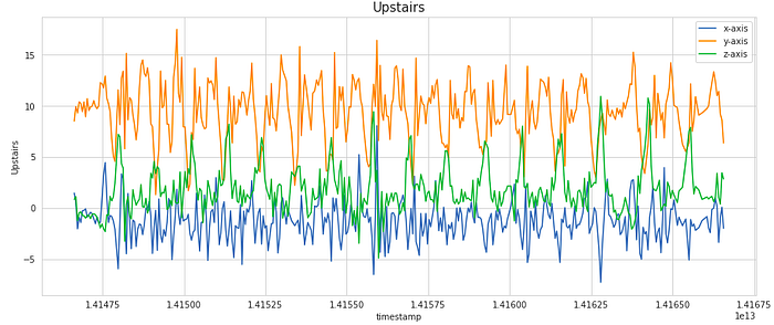
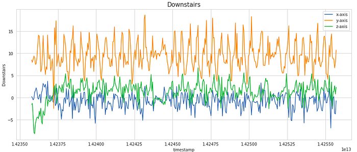
We can also go a step ahead and visualize how the signal values in each of the x, y, and z dimensions vary with time.
activities = [‘Walking’, ‘Jogging’, ‘Upstairs’, ‘Downstairs’, ‘Sitting’, ‘Standing’]:
for i in activities:
    data36 = df[(df[‘user’] == 36) & (df[‘activity’] == i)][:400]
    sns.lineplot(y = ‘x-axis’, x = ‘timestamp’, data = data36)
    sns.lineplot(y = ‘y-axis’, x = ‘timestamp’, data = data36)
    sns.lineplot(y = ‘z-axis’, x = ‘timestamp’, data = data36)
    plt.legend([‘x-axis’, ‘y-axis’, ‘z-axis’])
    plt.ylabel(i)
    plt.title(i, fontsize = 15)
    plt.show()
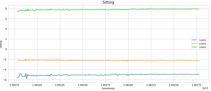
For visualization, we have considered a subset of 400 samples. This is equivalent to 20 secs of activity (as the frequency of data collection was 20 Hz). As we notice, the signal shows periodic behavior for activities like Walking, Jogging, Upstairs, and Downstairs while it has the very little movement for stationary activities like Sitting and Standing. These signals can be modeled as time-series data.
This brings us to the heart of the article – training an LSTM network.
Preparing Data
The LSTM model expects fixed-length sequences as training data. We shall use a familiar method for generating these. Each generated sequence (or window) contains 50 records corresponding to 2.5 secs of activity (recall that the frequency of the data collection as mentioned in the source website is 20 Hz).
random_seed = 42
n_time_steps = 50
n_features = 3
step = 10
n_classes = 6
n_epochs = 50
batch_size = 1024
learning_rate = 0.0025
l2_loss = 0.0015
segments = []
labels = []

for i in range(0,  df.shape[0]- n_time_steps, step):

    xs = df['x-axis'].values[i: i + 50]

    ys = df['y-axis'].values[i: i + 50]

    zs = df['z-axis'].values[i: i + 50]

    label = stats.mode(df['activity'][i: i + 50])[0][0]

    segments.append([xs, ys, zs])

    labels.append(label)

#reshape the segments which is (list of arrays) to a list
reshaped_segments = np.asarray(segments, dtype= np.float32).reshape(-1, n_time_steps, n_features)

labels = np.asarray(pd.get_dummies(labels), dtype = np.float32)
Note that here we have considered overlapping windows (with 80% overlap) of data. Because our activity is continuous, this overlap ensures that each subsequent window carries some information from the previous window.
At this stage, if you check the shape of the transformed data –
reshaped_segments.shape
Output:
(108531, 50, 3)
108531 sequences of 200 rows, each containing x, y, and z data. Our original raw dataset has drastically reduced size after the transformation. Note that the class label assigned to a sequence (window) is the activity that occurs most frequently in that window.
Splitting data into train and test sets –
from sklearn.model_selection import train_test_split
X_train, X_test, y_train, y_test = train_test_split(reshaped_segments, labels, test_size = 0.2, random_state = random_seed)
Building Model Architecture
from keras.models import Sequential
from keras.layers import LSTM, Dense, Flatten, Dropout
model = Sequential()
# RNN layer
model.add(LSTM(units = 128, input_shape = (X_train.shape[1], X_train.shape[2])))
# Dropout layer
model.add(Dropout(0.5))
# Dense layer with ReLu
model.add(Dense(units = 64, activation='relu'))
# Softmax layer
model.add(Dense(y_train.shape[1], activation = 'softmax'))
# Compile model
model.compile(loss='categorical_crossentropy', optimizer='adam', metrics=['accuracy'])
Let’s see the model summary –
model.summary()
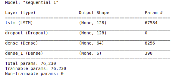
As you can see, we have got more than 76k trainable parameters. Because of so many trainable parameters, the model tends to overfit easily. That is why a dropout layer is recommended to avoid overfitting.
Block diagram of the model architecture –
Now comes the training part. We will train our model for 50 epochs and keep track of accuracy and error on the validation set.
Model Training & Evaluation
history = model.fit(X_train, y_train, epochs = n_epochs, validation_split = 0.20, batch_size = batch_size, verbose = 1)
Plotting training and validation accuracy and cross-entropy loss against a number of epochs –
plt.plot(np.array(history.history['loss']), "r--", label = "Train loss")
plt.plot(np.array(history.history['accuracy']), "g--", label = "Train accuracy")
plt.plot(np.array(history.history['val_loss']), "r-", label = "Validation loss")
plt.plot(np.array(history.history['val_accuracy']), "g-", label = "Validation accuracy")
plt.title("Training session's progress over iterations")
plt.legend(loc='lower left')
plt.ylabel('Training Progress (Loss/Accuracy)')
plt.xlabel('Training Epoch')
plt.ylim(0)
plt.show()
.png)
Our LSTM model seems to learn well with accuracy reaching above 96% and cross-entropy loss is well below 0.2 for both training and validation data.
Now let’s assess the performance of the trained model on the test dataset –
loss, accuracy = model.evaluate(X_test, y_test, batch_size = batch_size, verbose = 1)
print("Test Accuracy :", accuracy)
print("Test Loss :", loss)
Output:
Test Accuracy : 0.9619938135147095
Test Loss : 0.13234397768974304
Thus, we have got over 96% accuracy on the test data with cross-entropy loss equal to 0.13.
Now let’s observe the confusion matrix to see how our model performs on each class label.
Confusion matrix
predictions = model.predict(X_test)
class_labels = ['Downstairs', 'Jogging', 'Sitting', 'Standing', 'Upstairs', 'Walking']
max_test = np.argmax(y_test, axis=1)
max_predictions = np.argmax(predictions, axis=1)
confusion_matrix = metrics.confusion_matrix(max_test, max_predictions)
sns.heatmap(confusion_matrix, xticklabels = class_labels, yticklabels = class_labels, annot = True, linewidths = 0.1, fmt='d', cmap = 'YlGnBu')
plt.title("Confusion matrix", fontsize = 15)
plt.ylabel('True label')
plt.xlabel('Predicted label')
plt.show()
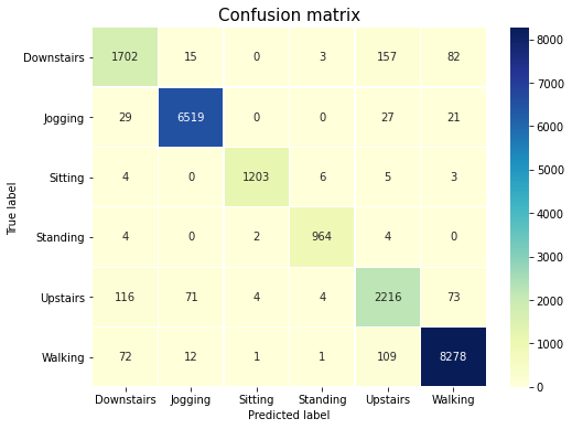
As it can be noticed from the confusion matrix, the two most common activities in our dataset i.e. Walking and Jogging are correctly classified with very high accuracy. Although Sitting and Standing are minority classes, yet our model is accurately able to differentiate them. The accuracy is not as high as the other classes for Upstairs and Downstairs activities. This is expected as these two are very similar activities so the underlying data may not be sufficient to accurately different them.
Conclusion
We started with the raw accelerometer signal data consisting of just 4 relevant features – reading of accelerometer along x, y, and z axes and the timestamp at which the readings were taken. We trained a simple LSTM network on the raw time-series data. LSTM model learns complex features automatically from the sequential data to be able to predict the class label with high accuracy.
By coupling the tri-axial accelerometer data with the data from the tri-axial gyroscope, it can be possible to distinguish between similar classes like Standing and Sitting, as well as recognize other activities with even higher accuracy.
References
- Jennifer R. Kwapisz, Gary M. Weiss, and Samuel A. Moore (2010). Activity Recognition using Cell Phone Accelerometers, Proceedings of the Fourth International Workshop on Knowledge Discovery from Sensor Data (at KDD-10), Washington DC.
- Davide Anguita, Alessandro Ghio, Luca Oneto, Xavier Parra and Jorge L. Reyes-Ortiz. A Public Domain Dataset for Human Activity Recognition Using Smartphones. 21st European Symposium on Artificial Neural Networks, Computational Intelligence, and Machine Learning, ESANN 2013
- Human Activity Recognition using LSTMs on Android — TensorFlow for Hackers (Part VI) by Venelin Valkov.
- Using Deep Learning for Mobile Health Data by Burak bhimmetoglu.
About the Author
Pratik Nabriya is a skilled Data Professional currently employed with an Analytics & AI firm based out of Noida. His key skills include Machine learning, Deep learning, NLP, Time-Series Analysis, SQL, Data manipulation & Visualisation and is familiar with working in a Cloud environment. In his spare time, he loves to compete in Hackathons, and write blogs & articles at the crossroads of Data & Finance.


Hello, Thanks for the excellent explanation, I would like to ask why did you take the widow size as 50? according to which criteria? please clarify. Thanks