Introduction
Hello all, In this tutorial, we will be discussing some advance statistical terms and methods which play a crucial role in Feature engineering, data preprocessing steps, and are also asked in interviews. I would like to request you first if you haven’t looked at our previous two articles on Statistics, please give it a read that will help you build your basics strong. Have a look at Basic statistics for data science and practitioners can have a look at Intermediate statistics for data science.

Table of Contents
- Chebyshev’s InEquality
- Quantile-Quantile(Q-Q) Plot
- Bernoulli Distribution
- Log-Normal Distribution
- Power Law Distribution
- Box-Cox Transform
- End Notes
1) Chebyshev’s InEquality
Consider a random variable X, that follows the Gaussian Distribution(Normal) then according to the Empirical formula we can tell the percentage of data points lying in any standard deviation. But If some random variable suppose Y does not belong to the Gaussian distribution, and we want to find the way what percentage of a data point belonging to the first standard deviation then For finding this we basically use Chebyshev’s Inequality.
According to Chebyshev’s Inequality,
Pr(μ-kσ < X 1 – (1/k^2)
k is specifying for what range of standard deviation we have to find out the percentage of data points lying under it.
For example, k = 2, and Y does not follow the Gaussian distribution.
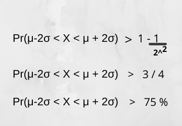
If my random variable does not follow Gaussian distribution then more than 75 per cent of data points belonging to the Y random variable will be falling in a range of the second standard deviation.
2) Q-Q(Quantile-Quantile) Plot
Quantile plots play a very vital role in graphically analyzing and comparing two probability distributions by plotting their quantiles against each other. It is also used in feature transformation to check if a particular feature is normally distributed or not. It is perfectly normally distributed then all the points exactly lie on a straight line. X == Y.
Steps to draw Q-Q Plot
- Sort the data features values and make percentiles from 1 to 100.
- Assume any normally distributed feature or random normally distributed variables.
- Simply draw the percentiles on a normally distributed plot. If all points lie online then it is normally distributed.
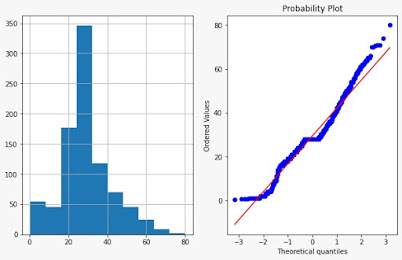
If all the points separate away at the top(end) of the line or lie above the line, then it is right-skewed data. And if at the start of a line points lie below the line then it is left-skewed data.
Plotting Q-Q Plot using Python
we can simply plot Q-Q plot using the scipy library because it provides a feature for probability plotting. We are considering the popular Titanic dataset and plotting the Q-Q plot as well as its histogram of the Age column.
import pandas as pd
import matplotlib.pyplot as plt
import scipy.stats as stat #probability plot
import pylab
data = pd.read_csv('titanic_train.csv',usecols=['Age','Fare','Survived'])
def plot_data(df,feature):
    plt.figure(figsize=(10,6))
    plt.subplot(1,2,1)  #1st plot
    df[feature].hist()
    plt.subplot(1,2,2)  #2nd plot
    stat.probplot(df[feature], dist='norm', plot=pylab)
    plt.show()
plot_data(data, "Age")
Limitation of Q-Q Plot
If the number of samples is small then it is hard to interpret the Q-Q plots, which means that if a dataset is very small then the Plotting Q-Q plot will not give any sense.
3) Bernoulli Distribution
Bernoulli Distribution is the distribution that always has an output as 2. for example I toss a coin the output can be head or tail. And suppose if random variable gets tail, its success or value as 1, and If head then failure.

This is called as probability mass function, there is one more function Probability density function which we studied in Basic Statistics. The difference in both is that when we use PDF its output is a continuous value, and when we use PMF the output is a discrete value(fixed set of values).
How do you compute mean, median, mode variance, and Standard deviation in PMF?
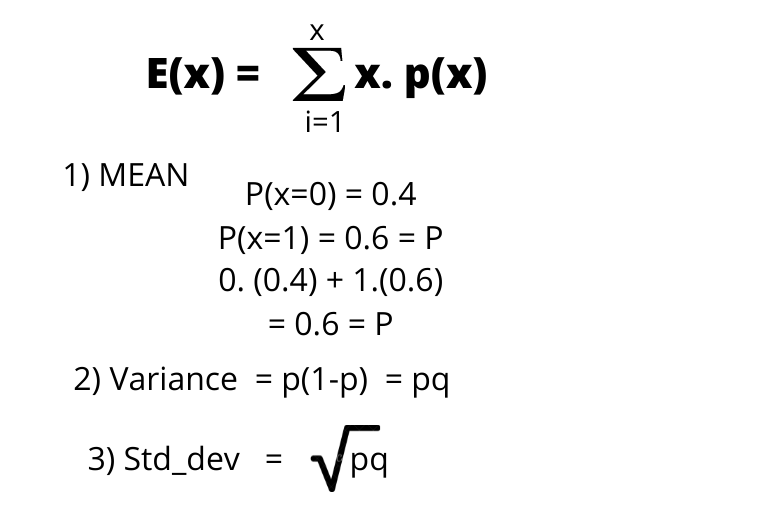
- To compute the mean of this kind of distribution, the mean will always be equal to P.
- The Median is 0 is q>p. median is 0.5 if p=q. median is 1 if q0.5 then p will be median else q is median.
- If p>q then p is the mode, else q will e mode.
- Variance is the product of failure and success(PQ)
- standard deviation is a square root of variance.
Numeric Example of Bernoulli Distribution
We saw that 0 is always to failure, and success is assigned as 1 like we want to find how many students in the class like attending presentations so like is success and dislike is a failure. so, we can take the probability of the weighted sum of values in our Bernoulli distribution.
μ=(percentage of failures)(0)+(percentage of successes)(1)
μ=(0.25)(0)+(0.75)(1)
μ=0+0.75
μ=0.75
we have already seen the general formula for mean and you can also estimate using the above example which is the probability of success into the probability of failure(p. (1-p) = 1). A similar weighting technique can be used to find the variance of the Bernoulli distribution of the random variables.
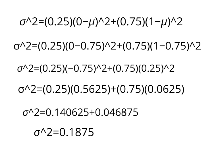
If you square root the variance we will get standard deviation which is 0.4330
4) Log-Normal Distribution
A random variable X will belong to log-normal distribution if log(x) is normally distributed. Usually, data follows Gaussian distribution, but there are some chunks of data that also follow Log-normal distribution, Binomial Distribution, etc. so there is a need to study all the kinds of distribution. The log-normal distribution is also known as right-skewed distribution because at the start it looks like normal distribution and at the end the right tail is long.
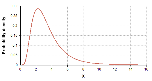
Examples can be an income distribution, and most of the time when we are working with sentiment analysis they usually follow a log-normal distribution. one common use of log-normal is in analyzing stock prices.
A Normal Distribution can be converted to log-normal distribution by taking a natural log of data points. Normal Distribution may carry some problems that can be solved using log-normal distribution. The normal distribution can have negative values but log-normal only includes all positive sets of values.
5) Power Law Distribution
Power Law distribution is a relationship between two quantities wherein a relative change in one quantity results in a proportional change in another quantity.
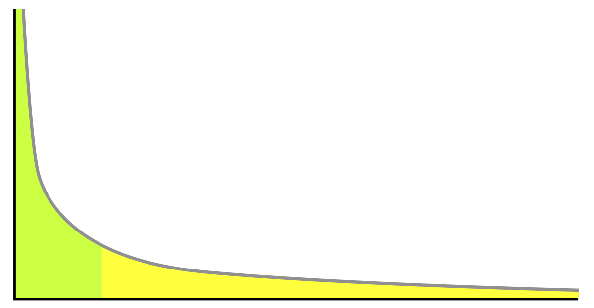
It basically reflects the 80-20 rule. let us understand with an example what it means to say.
- 80 per cent of sales are coming from 20 per cent of overall products.
- 80 per cent of window crashes are only due to 20 per cent of overall bugs.
One distribution is an example of Power-law distribution is Pareto distribution. the height of the starting point is basically defined by the alpha parameter. as height increases, alpha also increases. And there is only a slight difference between Pareto distribution and log-normal distribution.
The situation can occur in datasets commonly, and most of the time. we work with this as right-skewed data and, we forgot about the property of power-law distribution so, we need to check this to get some amazing results from such distributions.
6) Box-Cox Transform
Box-Cox Transform is basically a technique to transform any random variable from Pareto distribution(Power-law) to Gaussian Distribution. Box and Cox is the name of two scientists who collaborated and published this technique. When our feature is right-skewed then most practitioners use this particular technique to bring variables to normal distribution for easy analysis. Hence it is a feature transformation technique.
Now let us understand how does it work.

The exponent here is a variable called lambda that varies over a range of -5 to 5, and in process of searching, we examine all values of lambda. finally, we choose the optimal value which results in the best approximation to a normal distribution for your variable. There are two techniques to find this, one is a maximum likelihood and the second is bayesian statistics.
Remember the point that Box-Cox transform is strictly applicable to numbers greater than zero. negative number and zero are not allowed.
Box-Cox using Python
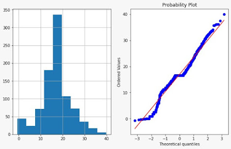
Scipy provides us with a feature to apply the box-cox transformation. We will apply it to the same Age variable whose distribution we have seen above using a Q-Q plot.
data['Age_boxcox'],parameters = stat.boxcox(data['Age'])
# print(parameters)  #0.7964531473656952
plot_data(data,'Age_boxcox')
End Notes
These are some important Statistics terms placed under advanced concepts because understanding this can seem a little bit tricky. But I hope that after reading this article you are having a sort of idea of how to use it in analysis and identify the kind of distribution while doing Exploratory data analysis. If you have any doubt, please feel free to drop them in the comment box.
About the Author
Raghav Agrawal
I am pursuing my bachelor’s in computer science. I am very fond of Data science and big data. I love to work with data and learn new technologies. Please feel free to connect with me on Linkedin.
If you like my article, please give it a read to others too. link


