This article was published as a part of the Data Science Blogathon
Introduction
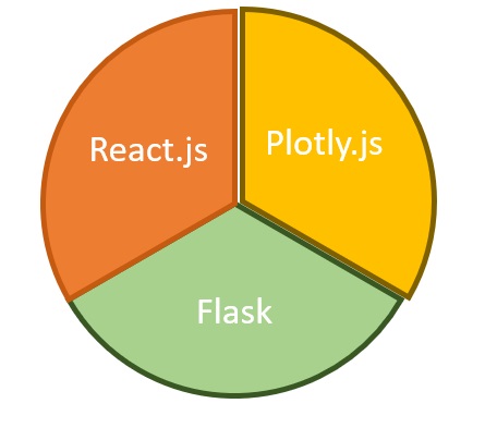
Dash is an open-source web framework for creating analytical dashboards and data visualizations. It helps data analysts to deploy dashboards and serve these dashboards to the main web application. Dash constitutes of three technologies:
1. Plotly.js- It is used for creating beautiful charts and different visualizations.
2. Flask- It is a web framework used for providing the dashboard as a web service request.
3. React.js- It is used to provide user interfaces for the dashboard.

You don’t need to have prior web development knowledge for developing dashboards using Dash. Rapid dashboard development can be achieved through the dash.
Setting up the local environment:
Let us start with making a new directory and create a python virtual environment in it.
Open the command prompt and make a new directory named as PracticeDashboard using the following command.
c:> mkdir PracticeDashboard && cd PracticeDashboardc:>PracticeDashboard python -m venv venvc:>PracticeDashboard venvScriptsactivate.bat
The above commands first create a PracticeDashboard directory and then creates a virtual environment at that location. The last command activates the virtual environment.
A virtual environment is a python environment such that a python interpreter, scripts, and libraries are installed in it. These libraries are isolated from any other libraries installed in them. This is beneficial as any version changes in the system don’t hamper the virtual environment and hence several virtual environments can work separately without any hindrance. Therefore it is important to create a separate virtual environment and activate the same.
After the virtual environment is activated, now install the required libraries.
(venv)$ python -m pip install dash==1.13.3 pandas==1.0.5We have installed two libraries:
1. Dash- Dash is an open-source python library developed by Plotly under MIT license. It is freely available for building beautiful dashboards quickly.
2. Pandas- Pandas is a python library used for data manipulation operations. It acts as a wrapper on two other libraries: matplotlib for data visualization and NumPy for performing mathematical operations on datasets.
Dataset
We will be using the stock exchange dataset. You can simply download the dataset and save the CSV file in the folder PracticeDashboard. The folder looks like this:
PracticeDashboard
|
|-----venv
|----indexData.csv
The dataset includes the prices of indexes tracking stock exchanges around the world. The columns include the id, index name, date of observation, opening price of the stock, the closing price of the stock, the highest and lowest price of the stock observed, etc.
Building the Dashboard

Image Source: Google images
The first step is to initialize the dash application. Create an empty file app.py in the project directory. Copy the code given below:
#This library is used to initialize the dash application.
import dash
# This library is used to add graphs,other visual components.
import dash_core_components as dcc
# This library is used to include html tags.
import dash_html_components as html
#For data manipulation and mathematical operations.
import pandas as pd
#Reading the csv file.
data = pd.read_csv("indexData.csv")
#Manipulating the date.
data["Date"] = pd.to_datetime(data["Date"], format="%Y-%m-%d")
data.sort_values("Date", inplace=True)
#Initialising application.
app = dash.Dash(__name__)
We have imported four libraries :
- dash- It is used to initialize the dash application.
- dash_core_components: It is used for making beautiful charts, other visual components such as selectors, dropdowns, dates, and other visualizations.
- dash_html_components: It includes various Html tags for designing the dashboards.
- pandas- It is used for mathematical operations and queries to be performed on the dataset.
To initialize the application the last line is added. It is similar to Flask initialization.
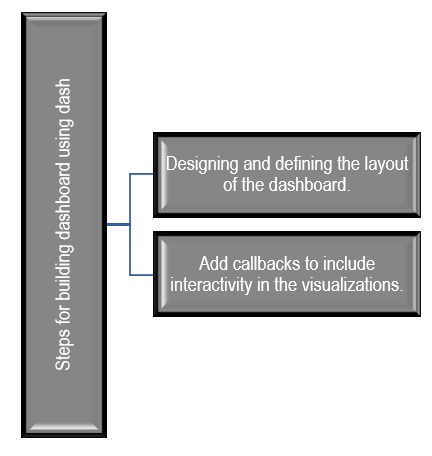
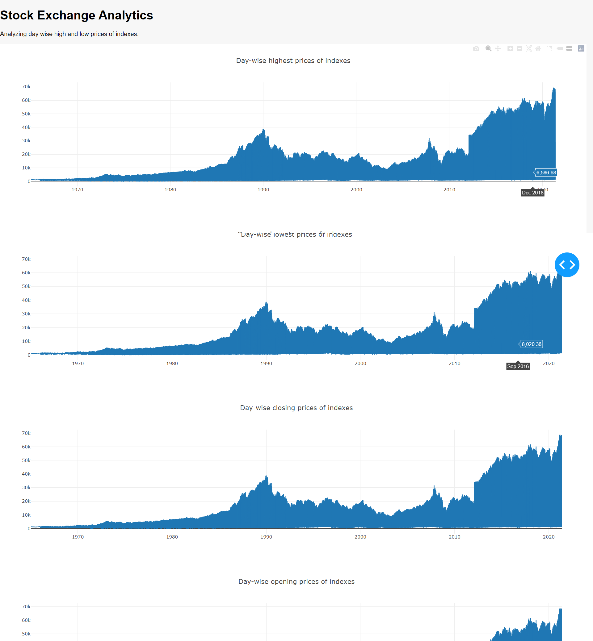
The next step is to define the layout of the application using dcc components. We will use the app.layout property.
app.layout = html.Div(
children=[
html.H1(children=”Stock Exchange Analytics”,),
html.P(
children=”Analyzing day wise high and low prices of indexes.”,
),
dcc.Graph(
figure={
“data”: [
{
“x”: data[“Date”],
“y”: data[“High”],
“type”: “lines”,
},
],
“layout”: {“title”: “Day-wise highest prices of indexes”},
},
),
dcc.Graph(
figure={
“data”: [
{
“x”: data[“Date”],
“y”: data[“Low”],
“type”: “lines”,
},
],
“layout”: {“title”: “Day-wise lowest prices of indexes”},
},
),
dcc.Graph(
figure={
“data”: [
{
“x”: data[“Date”],
“y”: data[“Close”],
“type”: “lines”,
},
],
“layout”: {“title”: “Day-wise closing prices of indexes”},
},
),
dcc.Graph(
figure={
“data”: [
{
“x”: data[“Date”],
“y”: data[“Open”],
“type”: “lines”,
},
],
“layout”: {“title”: “Day-wise opening prices of indexes”},
},
),
]
)
Finally, the following two-line will help the application to run:
if __name__ == "__main__":
    app.run_server(debug=True)
Now open the console and go to the project directory and run the command as follows:
python app.py
The live development server gets started at localhost:8050.

Making the dashboard interactive:
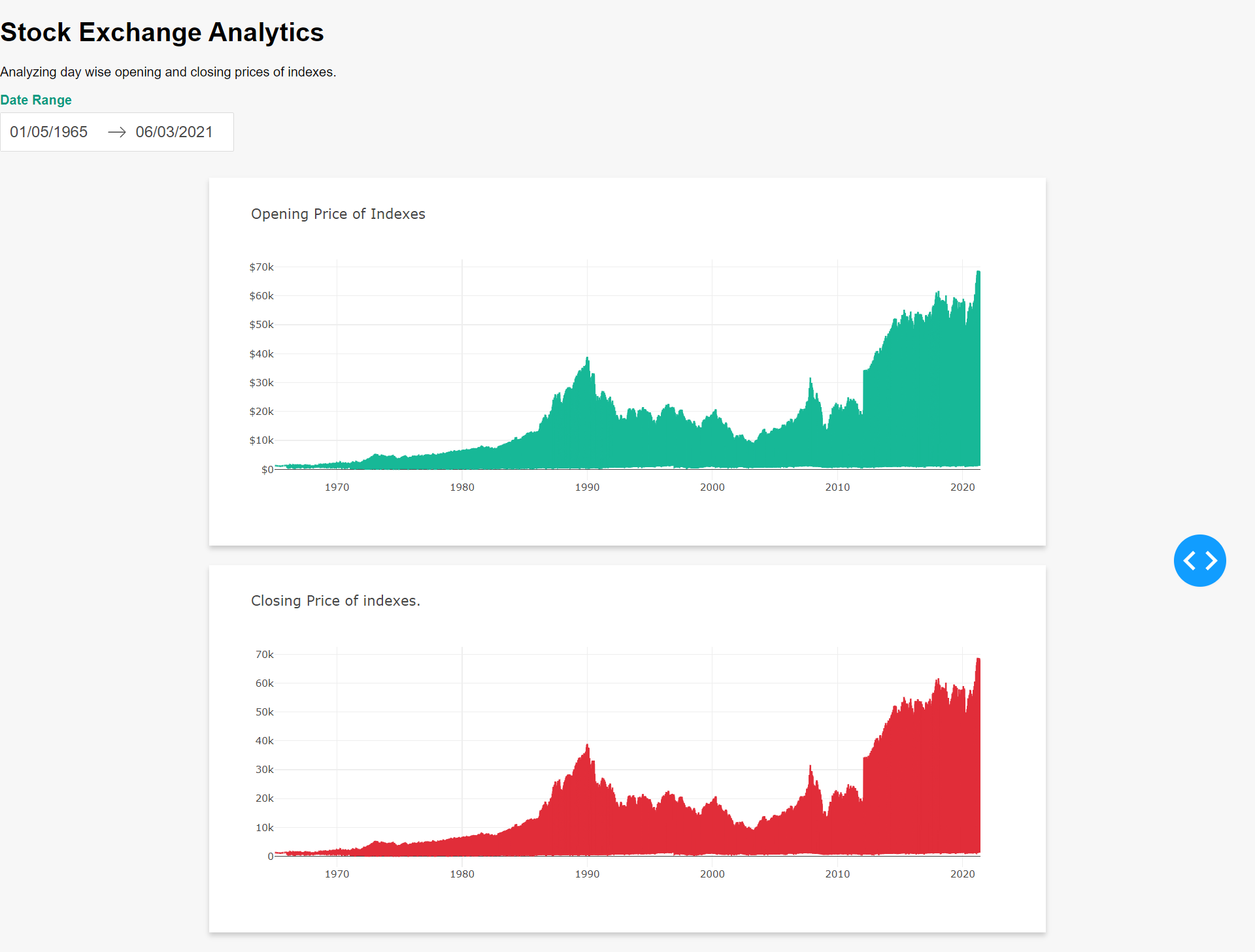
To make the dashboard interactive we will add a date range picker so that the graph automatically changes with the range of the dates. We will add an Html date picker to select the dates range on the top. So app.layout gets changed to the following:
app.layout = html.Div(
    children=[
        html.H1(children="Stock Exchange Analytics",),
        html.P(
            children="Analyzing day wise opening and closing prices of indexes.",
        ),
        html.Div(
            children=[
                html.Div(
                    children="Date Range",
                    className="menu-title"
                    ),
                dcc.DatePickerRange(
                    id="date-range",
                    min_date_allowed=data.Date.min().date(),
                    max_date_allowed=data.Date.max().date(),
                    start_date=data.Date.min().date(),
                    end_date=data.Date.max().date(),
                ),
            ]
        ),
The dcc component for the graph gets changed from the previous version of the dashboard. The figure component is not required as the graph will be generated from the callback function. The changed code is shown below:
 html.Div(
    children=[
        html.Div(
            children=dcc.Graph(
                id="open-price-chart", config={"displayModeBar": False},
            ),
            className="card",
        ),
        html.Div(
            children=dcc.Graph(
                id="close-price-chart", config={"displayModeBar": False},
            ),
            className="card",
        ),
    ],
    className="wrapper",
),
    ]
)
The call back function for generating the graph is as follows:
@app.callback(
[Output(“open-price-chart”, “figure”), Output(“close-price-chart”, “figure”)],
[
Input(“date-range”, “start_date”),
Input(“date-range”, “end_date”),
],
)
def update_charts( start_date, end_date):
mask = (
(data.Date >= start_date)
& (data.Date <= end_date)
)
filtered_data = data.loc[mask, :]
open_price_chart_figure = {
“data”: [
{
“x”: filtered_data[“Date”],
“y”: filtered_data[“Open”],
“type”: “lines”,
“hovertemplate”: “$%{y:.2f}”,
},
],
“layout”: {
“title”: {
“text”: “Opening Price of Indexes”,
“x”: 0.05,
“xanchor”: “left”,
},
“xaxis”: {“fixedrange”: True},
“yaxis”: {“tickprefix”: “$”, “fixedrange”: True},
“colorway”: [“#17B897”],
},
}
    close_price_chart_figure = {
        "data": [
            {
                "x": filtered_data["Date"],
                "y": filtered_data["Close"],
                "type": "lines",
            },
        ],
        "layout": {
            "title": {
                "text": "Closing Price of indexes.",
                "x": 0.05,
                "xanchor": "left"
            },
            "xaxis": {"fixedrange": True},
            "yaxis": {"fixedrange": True},
            "colorway": ["#E12D39"],
        },
    }
    return open_price_chart_figure, close_price_chart_figure
The screenshot of the dashboard is shown below:

Conclusion
Dash provides a fast and quick way of creating beautiful and interactive dashboards without extensive knowledge of web development. It combines web development and analytics and provides a useful mechanism for serving dashboards as a web response. Interactivity and styles can be easily incorporated into the dashboards as shown by the second version of the dashboard.
And it doesn’t go without saying:
Thanks for reading!
The media shown in this article are not owned by Analytics Vidhya and are used at the Author’s discretion.


