This article was published as a part of the Data Science Blogathon
Table of Contents
- Introduction
- About the Dataset
- Let’s Go
- 2D Scatter Plot
- 3D Scatter Plot
- Pair Plot
- Histogram
- Univariate Analysis using PDF
- CDF
- Mean, Variance, and Standard Deviation
- Median, Percentile, Quantile, IQR, MAD
- Box Plot
- Violin Plot
- Multivariate Probability Density Contour Plot
- Final Note
Introduction to Exploratory Data Analysis
Exploratory Data Analysis (EDA) is a critical step in machine learning before developing any model because the original dataset may contain information that is redundant or worthless for training our model, lowering the performance of our model. If you work as a data scientist or a machine learning engineer, you should be able to deliver some useful insights from the data to the company/client given a dataset. Because their business choice is based on your results, there is no room for error in your research. As a result, you’ll need to know what EDA is and how to execute it correctly. Simply apply the EDA techniques that we’ll explore in this blog to ask questions and retrieve responses from the dataset.
We’ll go over several Exploratory Data Analysis (EDA) plotting tools. Now you might be wondering what EDA is and why it is essential, so let me explain. In Data Science or any machine learning task, you must first analyze the data using statistics and linear algebra in order to gain some insightful information or to discover some patterns and anomalies in the data that could impair your model’s performance, and I am sure no one enjoys seeing their model perform poorly.

Photo by Volodymyr Hryshchenko on Unsplash
About the Dataset for Exploratory Data Analysis
We must always remember what our object/task is when performing analytics on the dataset. Given a photograph of a flower from the Iris family, we must determine whether the flower is Setosa, Versicolor, or Virginica, which is essentially a classification task. If we were to look at these flowers for the first time without any domain expertise, we would be unable to tell which class each flower belongs to, yet a botanist could readily classify them using his domain knowledge.
Let’s Go
We’ll start with the most fundamental data exploration by counting the number of data points and features in the dataset. The pandas shape method can help with this.
What are the columns in our dataset?
import pandas as pd
iris=pd.read_csv('Iris.csv')
print(iris.shape)
print(iris.columns)
How many data points for each class are present? (or) How many flowers for each species are present?
iris["species"].value_counts()
setosa        50
virginica     50
versicolor    50
Name: species, dtype: int64
2-D scatter plot
iris.plot(kind='scatter', x='sepal_length', y='sepal_width') ;
plt.show()
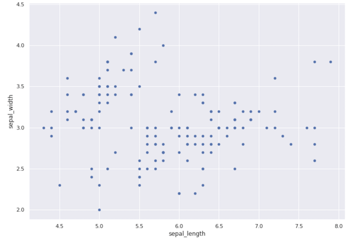
Scatter Plot
Always inspect what the x-axis, y-axis, and scale of these axes are when making a plot. One thing to keep in mind is that the plot’s origin is not (0,0). This graph doesn’t tell us much; it merely shows us the sepal length and width range.
sns.set_style("whitegrid");
sns.FacetGrid(iris, hue="species", size=4)
   .map(plt.scatter, "sepal_length", "sepal_width")
   .add_legend();
plt.show();
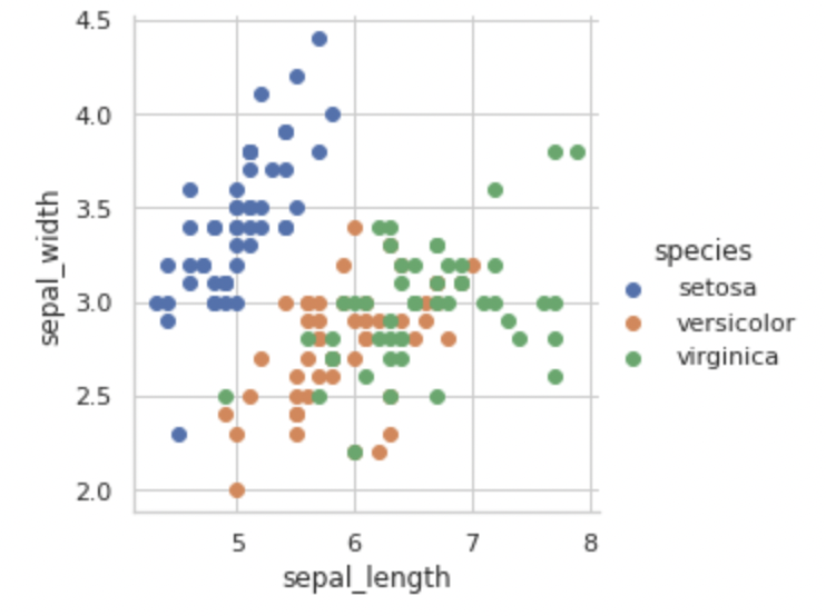
Setosa class can be easily distinguished from the other two classes based on sepal length and sepal width alone by just drawing a line ‘y = mx + c’ as shown below.
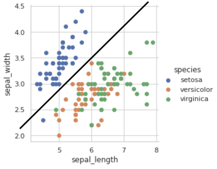
3D Scatter Plot
Let’s try to construct a 3D scatter plot now that we’ve seen a 2D scatter plot. We’ll use the plotly library for this because it allows us to interact with the plot in some way.
import plotly.express as px
df = px.data.iris()
fig = px.scatter_3d(df, x='sepal_length',
                    y='sepal_width',
                    z='petal_width',
                    color='species')
fig.show()
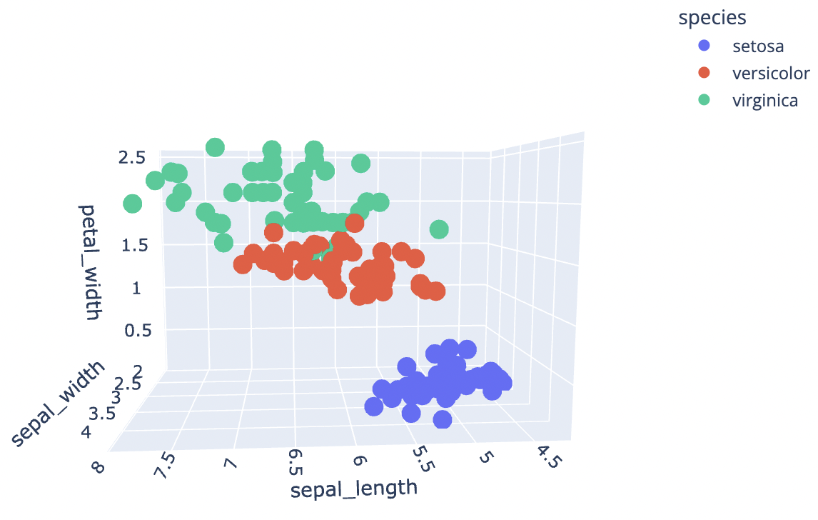
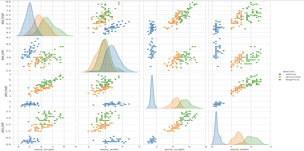
Pair-Plot
sns.pairplot(iris, hue="species", size=3);
plt.show()
Pair Plot
It’s a 4×4 matrix in our case, with non-diagonal entries being pair-plots and diagonal elements being PDFs for each feature, as we’ll see later in this article.
Some of the observations we can make from this plot are:
Limitations of Pair-plots:
10C2 = 45 unique plots for ten features.
We have 100 plots with 100C2 = 4950 unique features.
We have 1000 plots with 1000C2 = 499500 unique features.
Histogram
So far, we’ve talked about how to plot 2D scatter plots, 3D scatter plots, and other types of plots, but what about 1D plots? The goal is to use the NumPy library to plot one feature on the x-axis and zeros on the y-axis.
import numpy as np
iris_setosa = iris.loc[iris["species"] == "setosa"];
iris_virginica = iris.loc[iris["species"] == "virginica"];
iris_versicolor = iris.loc[iris["species"] == "versicolor"];
#print(iris_setosa["petal_length"])
plt.plot(iris_setosa["petal_length"], np.zeros_like(iris_setosa['petal_length']), 'o')
plt.plot(iris_versicolor["petal_length"], np.zeros_like(iris_versicolor['petal_length']), 'o')
plt.plot(iris_virginica["petal_length"], np.zeros_like(iris_virginica['petal_length']), 'o')
plt.show()
sns.FacetGrid(iris, hue="species", size=5)
   .map(sns.distplot, "petal_length")
   .add_legend();
plt.show();
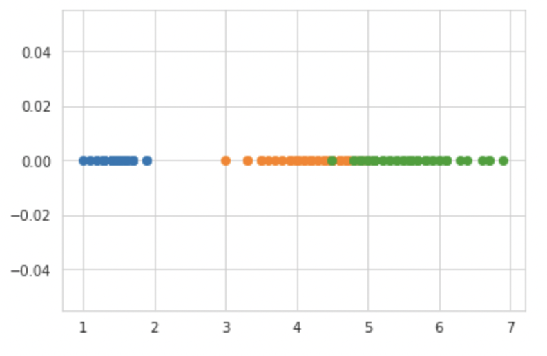
This plot is also known as a density plot since it shows the number of points in a given area. If I were to create a very simple model based just on this plot, I could write if petal length <= 2 then categorize it as Setosa, but there would be some uncertainty in determining the threshold value for classifying Versicolor and Verginica due to some overlap. The Probability Density Function, or PDF, is the smooth curve that we observe here. As of now, you can think of it as a smooth version of a histogram.
Univariate Analysis using PDF
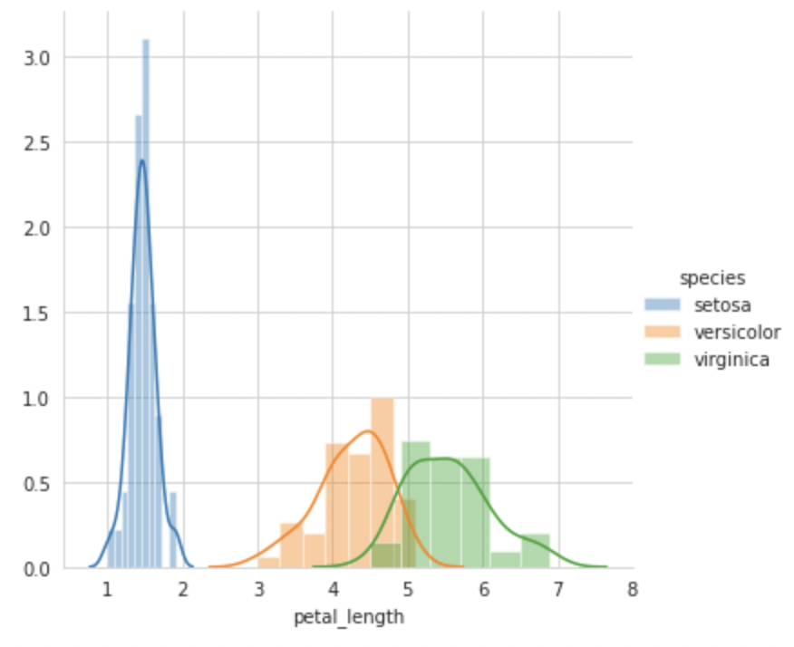
Based on these four plots, we can conclude that petal length is a better feature than any other for classifying flowers into Setosa, Versicolor, or Verginica, as there is a considerably bigger difference between each PDF.
CDF (Cumulative Distribution Function)
#Plot CDF of petal_length
counts, bin_edges = np.histogram(iris_setosa['petal_length'], bins=10,
                                 density = True)
pdf = counts/(sum(counts))
print(pdf);
print(bin_edges);
cdf = np.cumsum(pdf)
plt.plot(bin_edges[1:],pdf);
plt.plot(bin_edges[1:], cdf)
counts, bin_edges = np.histogram(iris_setosa['petal_length'], bins=20,
                                 density = True)
pdf = counts/(sum(counts))
plt.plot(bin_edges[1:],pdf);
plt.show();
CDF Plot
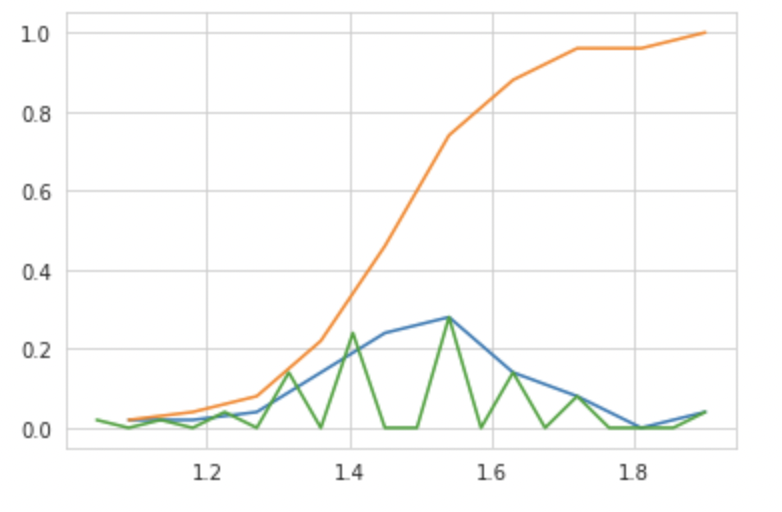
Another method is to count the values of each histogram of x-axis values cumulatively to obtain the CDF at that particular x-axis value, or to put it another way, the Area under the Curve of PDF is nothing more than the CDF.
=> Differentiate CDF ⇒ PDF
=> Integrate PDF ⇒ CDF
How is CDF useful?
We may use the basic if-else condition to determine the correctness of classification of each flower kind using simply CDF.
Mean, Variance, and Standard Deviation
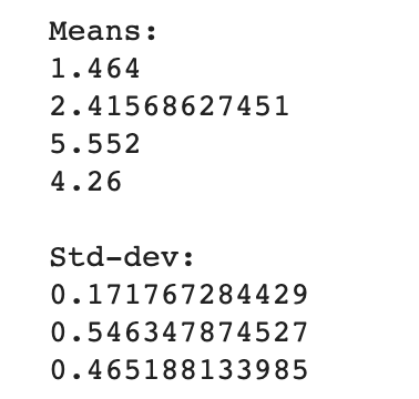
Variance: It is basically how far are the points from the mean value.
Standard Deviation: square root of variance – It tells us what is the average deviation of the points from the mean value.
WARNING: Outliers in the dataset can affect the Variance and Standard Deviation.
#Mean, Variance, Std-deviation
print("Means:")
print(np.mean(iris_setosa["petal_length"]))
#Mean with an outlier.
print(np.mean(np.append(iris_setosa["petal_length"],50)));
print(np.mean(iris_virginica["petal_length"]))
print(np.mean(iris_versicolor["petal_length"]))
print("nStd-dev:");

print(np.std(iris_setosa["petal_length"]))

print(np.std(iris_virginica["petal_length"]))

print(np.std(iris_versicolor["petal_length"]))
Median, Percentile, Quantile, IQR, MAD
Because at least one outlier can readily alter the mean, variance, and standard deviation, we have notions like Median, Percentile, and others to cope with outliers.
#Median, Quantiles, Percentiles, IQR.
print("nMedians:")
print(np.median(iris_setosa["petal_length"]))
#Median with an outlier
print(np.median(np.append(iris_setosa["petal_length"],50)));
print(np.median(iris_virginica["petal_length"]))
print(np.median(iris_versicolor["petal_length"]))
print("nQuantiles:")
print(np.percentile(iris_setosa["petal_length"],np.arange(0, 100, 25)))
print(np.percentile(iris_virginica["petal_length"],np.arange(0, 100, 25)))
print(np.percentile(iris_versicolor["petal_length"], np.arange(0, 100, 25)))
print("n90th Percentiles:")

print(np.percentile(iris_setosa["petal_length"],90))

print(np.percentile(iris_virginica["petal_length"],90))

print(np.percentile(iris_versicolor["petal_length"], 90))

from statsmodels import robust

print ("nMedian Absolute Deviation")

print(robust.mad(iris_setosa["petal_length"]))

print(robust.mad(iris_virginica["petal_length"]))

print(robust.mad(iris_versicolor["petal_length"]))
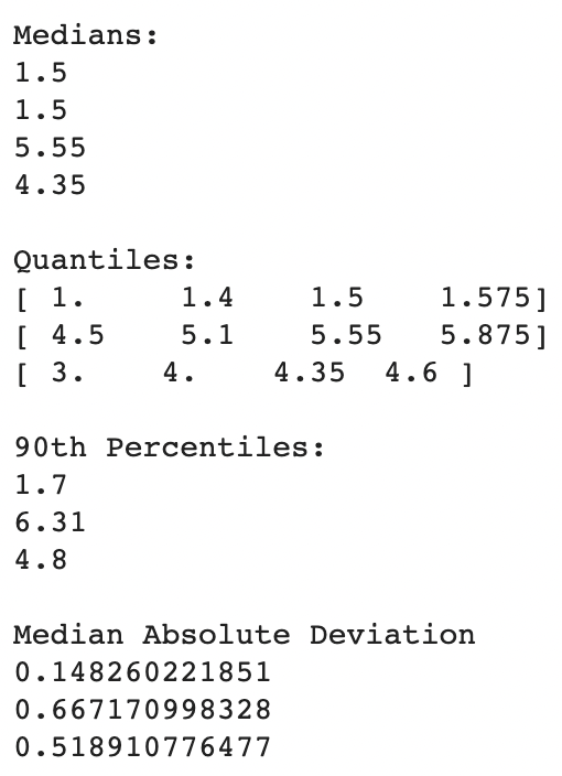
The existence of outliers has no/very little effect on these values.
How is Median calculated:
Arrange your numbers in numerical order.
Count how many numbers you have.
If you have an odd number, divide by 2 and round up to get the position of the median number.
If you have an even number, divide by 2. Go to the number in that position and average it with the number in the next higher position to get the median.
Let’s start with a definition of Quantiles and Percentiles. Percentiles are a unit of measurement that divides organized data into hundredths. A given percentile in a sorted dataset is the point where that percent of the data is less than where we are now. The median is what the 50th percentile is. It signifies that half of the data has a lower value than the median. Quartiles are a type of percentile that divides data into fourths. The 25th percentile corresponds to the first quartile, Q1, and the 75th percentile corresponds to the third quartile, Q3. The median is also known as the 50th percentile and the second quartile.
The Interquartile Range (IQR), also known as the midspread, middle 50%, or spread, is a statistical dispersion measure that equals the difference between the 75th and 25th percentiles, or upper and lower quartiles.
Let me now discuss the MAD, or Median Absolute Deviation, which is the standard deviation’s equal. It also determines how far the data points deviate from the central tendency of the data without being influenced by outliers.
Box Plot
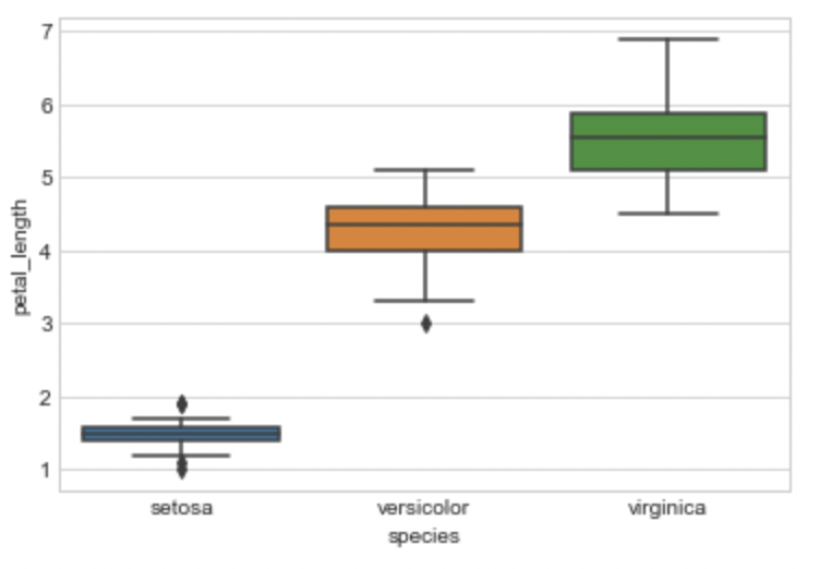
sns.boxplot(x='species',y='petal_length', data=iris)
plt.show()
Box Plot
I’m charting the box plot for the petal length of each iris flower species here. Let’s try to comprehend the box plot immediately. The IQR is represented by the box, with the 25th percentile at the bottom, the 50th percentile in the middle, and the 75th percentile at the top. The box’s horizontal length makes no difference. The Whiskers are the two lines above and below the box. To calculate these whiskers, the Seaborn library multiplies IQR by 1.5. The majority of the points are located in this area. The outliers are the spots outside the whiskers.
Violin Plots
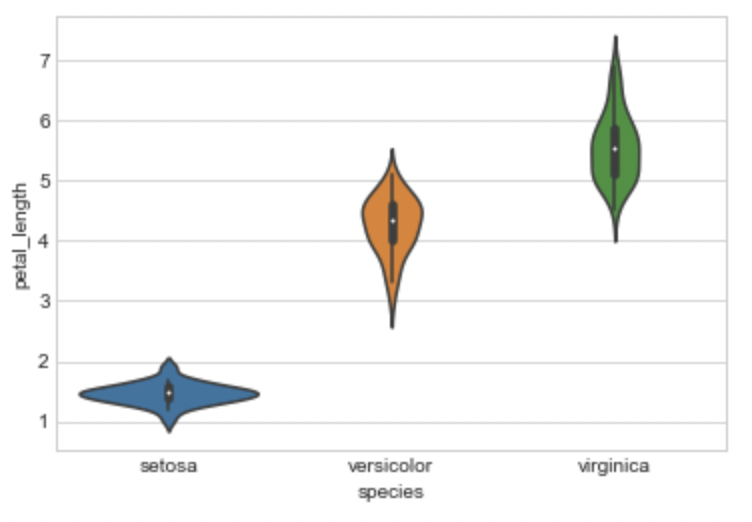
sns.violinplot(x="species", y="petal_length", data=iris, size=8)
plt.show()
Violin Plot
The benefits of the box plot and the PDF are combined in a violin plot, which then simplifies them.
Multivariate Probability Density Contour Plot:
sns.jointplot(x="petal_length", y="petal_width", data=iris_setosa, kind="kde");
plt.show();
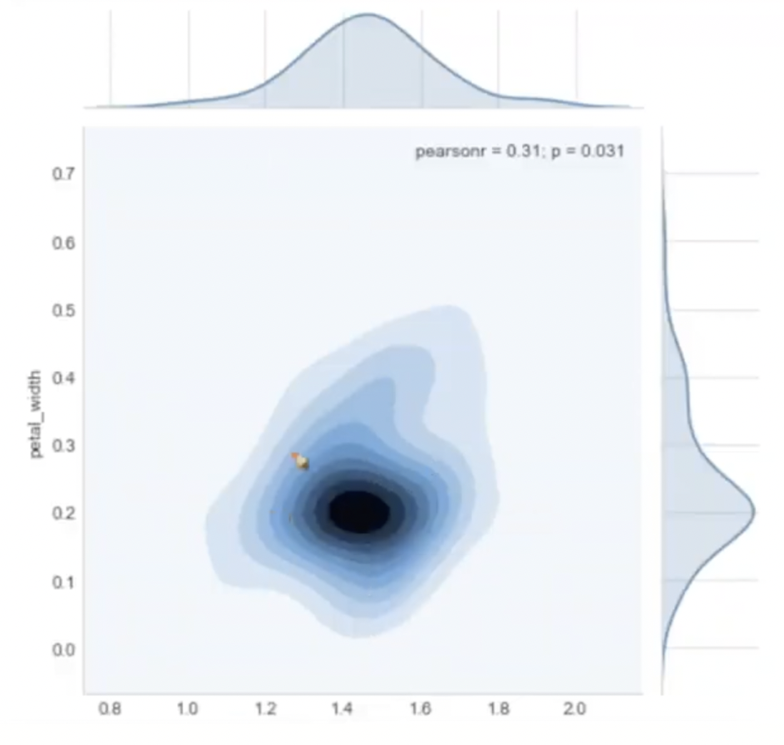
Contour Plot
The darker color denotes the presence of more points in this area. It can offer us a sensation of density in a 2D plane in some ways.
Final Note On Exploratory Data Analysis
Explain your findings/conclusions in plain English
Never forget your objective (the problem you are solving). Perform all of your EDA aligned with your objectives.
These plots can be divided into 3 categories:
Univariate: Analyzing the data using one variable. Eg. PDF, CDF, Box plot, Violin plot
Bivariate: Analyzing the data using two variables. Eg. Pair plot, Scatter plot
Multivariate: Analyzing the data using more than 2 variables. Eg. 3D scatter plot.
Please note that this is just the beginning of EDA, as you start practicing it more often, the more confident you’ll become at it and slowly you’ll have more EDA tools at your disposal to play with.
References
Thanks for Reading!🤗
If you like reading my blogs, consider following me on Analytics Vidhya, Medium, Github, LinkedIn.


