This article was published as a part of the Data Science Blogathon.
Table of contents
- Introduction
- What is Microsoft Power BI?
- Microsoft Power BI Concepts
- Data sources in Microsoft Power BI
- Import Excel Data to Microsoft Power BI
- Query Editor
- Inbuilt visuals
- Conclusion
Introduction
There is so much data collected in businesses and industries today. This creates the need to extract important information from this available data and turn it into insights. Data visualization makes it possible to represent the data in form of visuals thus easily identifying trends and patterns. There are tools and services that allow the import, editing, and visualization of this data, and this is where Microsoft Power BI comes in.
What is Microsoft Power BI?
Microsoft Power BI is a cloud-based business analytics service that provides interactive visualizations and BI capabilities.
BI, i.e. Business Intelligence, consists of strategies and technologies used to analyze data to provide historical and predictive views of the data.
Microsoft Power BI lets end-users create their own charts, dashboards, and reports.
It has several key features or versions which include: Power BI Desktop, Power BI Service, Power BI Mobile Apps, Power BI Gateway, Power BI Embedded, Power BI Report Server, Power BI Premium, and Power BI Visuals Marketplace.
Microsoft Power BI Concepts
These are the core building blocks of Microsoft Power BI. They include datasets, reports, and dashboards. A dataset is a collection of related data that is to be imported and manipulated. A report consists of visuals like charts and maps that Microsoft Power BI helps create from the datasets. A dashboard is a collection of report pages as a single tile.
Data sources in Microsoft Power BI
Data is very important in Microsoft Power BI because it is this data when imported and modified, is used to create visuals for Business Intelligence.
Microsoft Power BI supports the import of data from many data sources. Some of the common data sources include Excel Workbook, Power BI datasets, Power BI dataflows, Blank Query, SQL Server, Text/CSV, Analysis Services, Web, etc.
To access these data sources, click Get Data and see the contents of the drop-down menu.
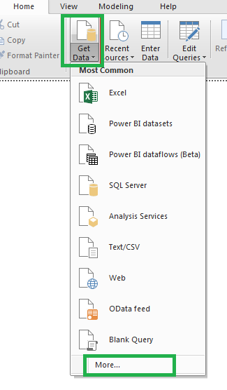
To view more data sources, click More… and a pop-up displays the sources grouped under File, Database, Azure, etc.
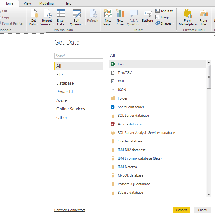
Import Excel Data to Microsoft Power BI
Excel is a spreadsheet characterized by rows and columns and it is used to organize data while allowing its manipulation and arithmetic operations.
- . To import Excel data, click on Get Data, then select Excel from the drop-down menu.
- . Select your Excel file then click Open.
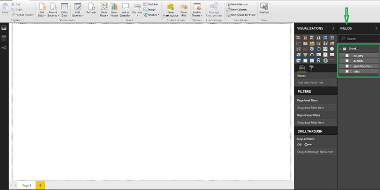
- . A navigator box opens. Click on the checkbox to select the data to be used for visualization. Then click Load to continue.
- . The data will be added on the Fields pane shown by the arrow below.
Query Editor
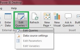
Query Editor allows a user to edit and perform the transformation of data files before it is used for visualization. It allows a user to modify data by performing actions like removing null values, pivoting and unpivoting columns, editing rows and columns, splitting and merging columns, replacing values in rows, and even reversing rows.
To access the Query Editor, click on Edit Queries.
There are more ways to modify data. See below for some instances:
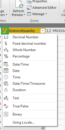
To ensure each data type/column is in the right format, click on the left corner of the title of the column. A drop-down opens where a data type can be set to Text, Date/Time, Percentage or Whole Number, etc.
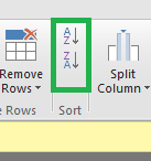
To categorize columns in ascending or descending order, click the icons shown below.
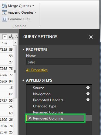
You can undo a step by clicking on the x icon in Query Settings under Applied Steps.
Inbuilt visuals
These are the readily available visuals found on the Visualizations pane of the report page of Microsoft Power BI. Some of the visuals include:
Line and clustered column chart
A Line and clustered column chart is a combo chart that combines the Line chart and Clustered column chart into one visual. The two charts usually have a shared X-axis. It visualizes two measures with different scales.
Pie chart
A Pie chart visualizes data in a circular chart which is divided into slices. Each slice is proportional to the size it represents. The total value of a pie chart is 100%.
Line chart
A line chart consists of a sequence of data points that are joined together to make a line. A line chart can have one or more contours. They represent a data trend or pattern and they are displayed in different colors. A line chart is represented on the X and Y-axis and shows trends over time.
Area chart
It consists of a line chart whereby the region between the axis and the line is filled with colors to show volume. This chart shows the degree of change over time.
Stacked column chart
A stacked column chart visualizes data in form of rectangular bars on a chart. Each bar represents a value and it is made up of smaller bars that represent different categories.
Treemap
A treemap displays data in a hierarchical tree-like diagram of nested rectangles. The bigger the rectangle the more the quantity of the item it represents. The rectangles are organized from largest (top left) to smallest (bottom right) and they are also colored.
Waterfall chart
This chart displays a running total (i.e. total of values of each phase before getting to the overall total) as values are increased or decreased. The columns are filled with color hence easy to notice the climbs and falls.
Conclusion
In this article, we learned about data visualization and its importance. We discussed what Microsoft Power BI is, its use, and its versions. We covered the different data sources supported. There is a short tutorial on how to import Excel data. We discussed the Query Editor and the inbuilt visuals provided. In closing, we have covered how to get started with it.


