This article was published as a part of the Data Science Blogathon
Introduction
This article will introduce you to the Spotfire Business Intelligence tool for creating interactive visualization, performing data analysis, and data science. Spotfire a major player in the BI space is a product from TIBCO. The latest version is Spotfire 11. Spotfire Beginner-friendly and intuitive UI helps new users to quickly adapt. Spotfire 100+ data connectors enable to fetch data from multiple sources into Spotfire Analysis. Spotfire Data function is used to integrate Spotfire Analysis with R-Programming by TERR (Tibco Enterprise Runtime for R) and Python.
Content
1. Installation and Spotfire UI
2. Data Loading and Transformation in Spotfire
3. Data Exploration using Visualization
4. Data Analysis
5. Dashboard Deployment
Spotfire Installation & UI
You can sign up here https://www.tibco.com/products/tibco-spotfire# for installing Spotfire trial version
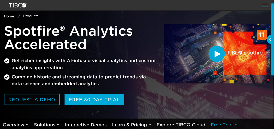
A 30-day trial period is offered for new users to explore the tool. There is also a provision to extend the trial period by requesting https://www.tibco.com/trial-license-extension-request.
After installing the trial version of Tibco Spotfire Analyst, we may load data into Spotfire Analyst, explore data using interactive graphics, and publish findings/insights as a Dashboard into Spotfire Server for end-users/consumers to consume. When you run Spotfire Analyst, you’ll find that it’s connected to Spotfire Server, where you can publish your Dashboard.
Locally saved Spotfire analysis has .dxp as an extension. Spotfire consumers/end-users will access Spotfire Analysis using Web browsers (using Google Chrome, Firefox, and IE)
Spotfire UI
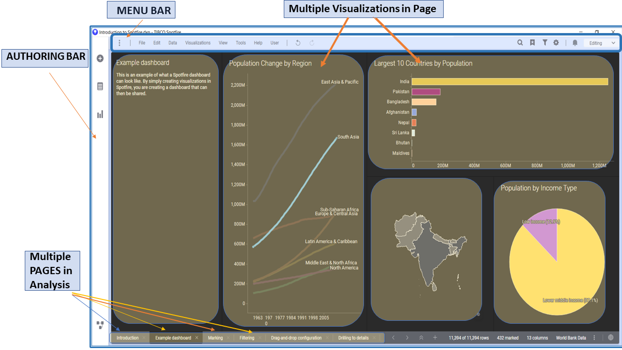
A Spotfire Analysis file might have multiple pages with one or more visualization on each page
Data Loading and Transformation in Spotfire
Options for loading data, adding visuals, and applying data transformation may all be conveniently accessed from the Authoring Bar.
Authoring Bar option: “Files and Data”
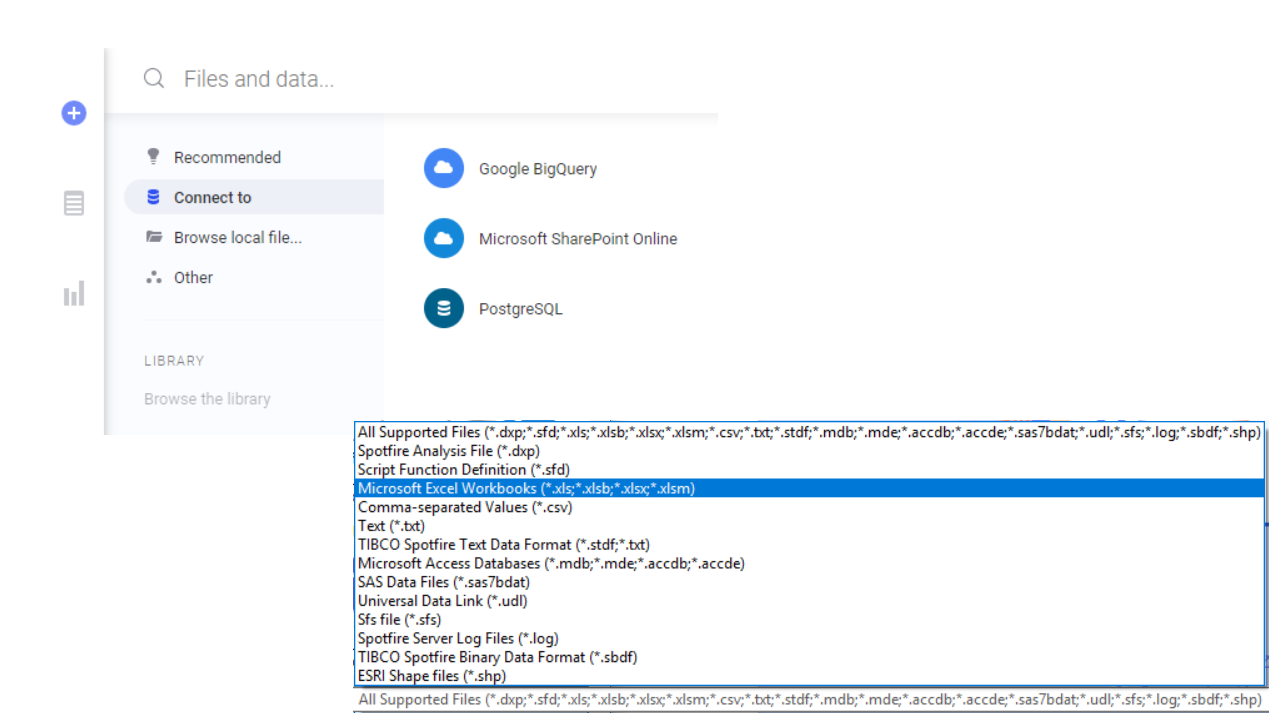
The “Files and Data” option is used to import data from multiple sources into Spotfire.
– Local/Direct Files : Excel, CSV, TXT, MDB, SAS7bdat, and more..
– Spotfire file format : SBDF (Spotfire Binary Data File),STDF (Spotfire Text Data Format)
– Relational Database : Oracle, MySQL, PostgreSQL and more
– Data from Cloud : AWS Redshift, GCP BigQuery, and more
Data loaded into Spotfire is referred to as “Data Table” each with its unique name.There are one or more columns in a “Data Table”
Authoring Bar option: “Data in Analysis”
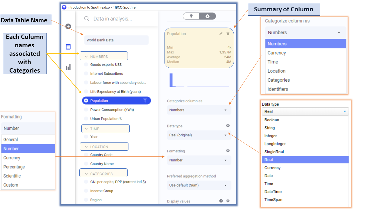
Once the data is imported, we can utilize the “Data in Analysis” option to view columns available in the Data Table and explore its attributes and distribution.
By default, Spotfire associates each column to a particular Data type, Category, and formatting.
Authoring Bar option: “Data Canvas”
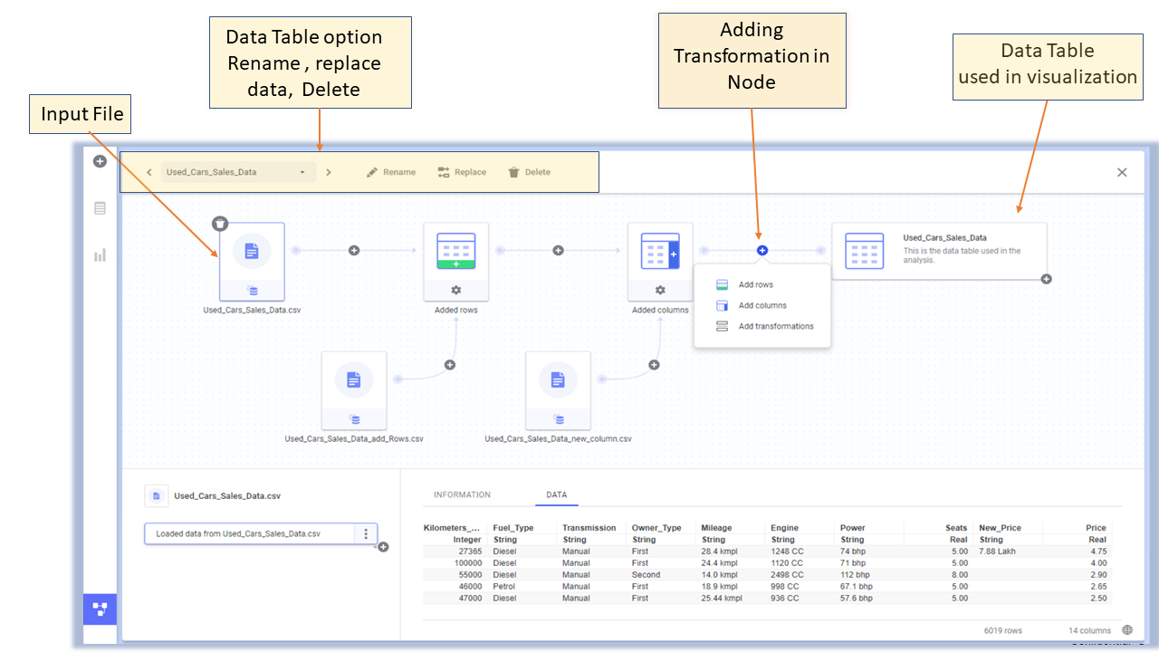
Nodes are used to add new transformations. A few examples of transformation are
– Adding rows to the existing Data table
– Adding New columns to Data Table
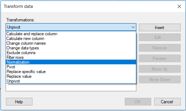
– Replace Value in column
– Creating Calculated column from an existing column
– PIVOT/UNPIVOT
Data Exploration in Spotfire
Authoring Bar option: “Visualization Types”
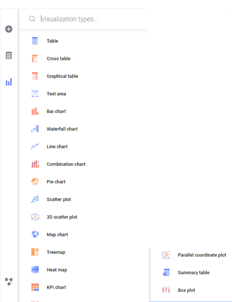
Spotfire supports multiple visualization types and has the provision to Import custom visuals as Mods (Modules) from Spotfire version 11.
To add a visual to the current page, click the relevant chart icon from the “Visualization types” option in the authoring bar. We have around 15+ visuals ready to use in most Spotfire versions.
Multiple Visuals in Spotfire Page
Each Spotfire Page can have multiple
visuals in it. Markings establish interaction between visuals
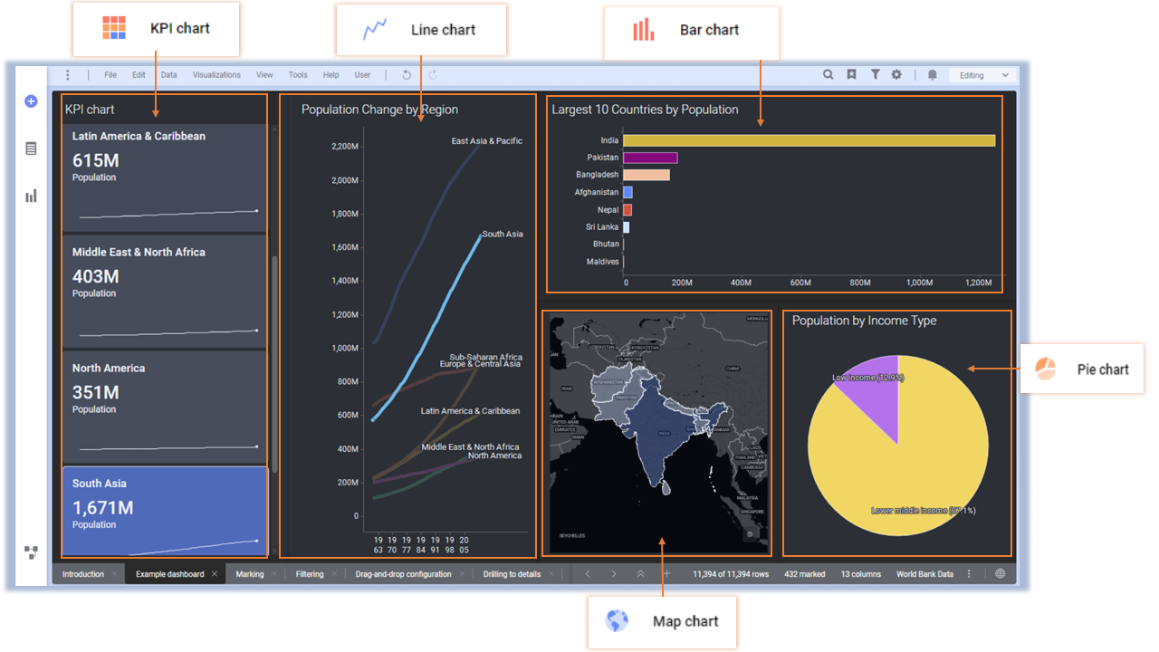
Markings: Marking is selecting a part of data in visual. Markings highlight specific data in all visualizations. The
Marked rows can be used in other visuals. This way Interaction between visuals
is established.
Filtering
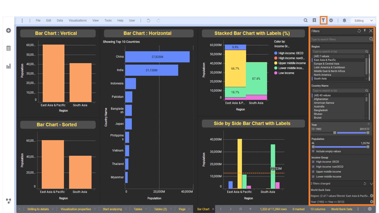
Data seen in Visual can be filtered by using the “Filters” option in the Menu Bar.
In Filter Panel, Spotfire associates each column with a type of filter. Filtering applied on a column affects related visuals.
Filter types
– Range filter
– Text Box Filter
– Check Box
– Radio Filter
– List Box Filter
– Hierarchy Filter
E.g. Use Range filter for column Year to filter for period 2000 to 2012
Visual properties
Once the visualization is added to a page. Simply Right-click in the visual area to see related properties.
E.g. we can use Right-click options to change visual types of Bar Chart into Horizontal, Vertical orientation, Side by Side bar, Stacked bar, Sorting Bar values, duplicating a visual, switching visual to another type
To view all the properties of a visual, Right-click in the visual area and choose option Properties, List of options that control a visual is displayed
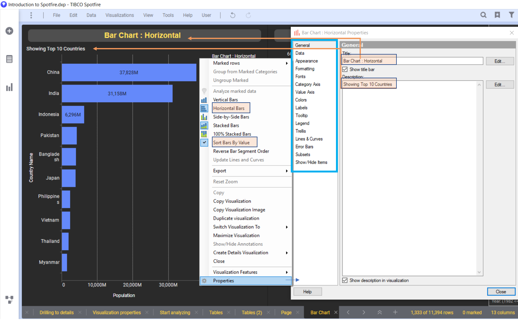
Properties of Visualization
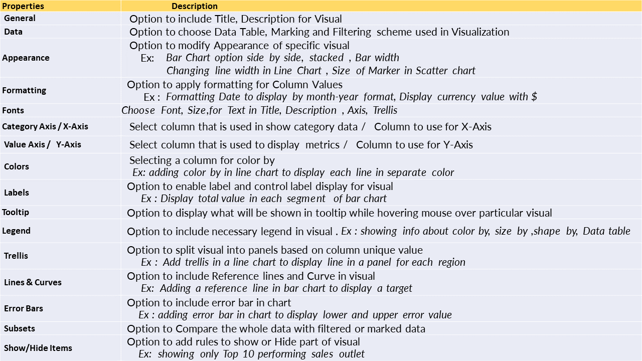
Apart from the above list, We have a few properties that are specific to a particular visual.
E.g. Map Charts have Positioning properties to add Geocoding data
Example of Trellis option
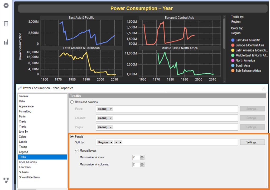
Trellis option enables the creation of visuals for different categories of data. The above visual properties show trellis by “Region” with 2X2 layout. So a separate chart is created for each category of “Region”.
Visualization Types
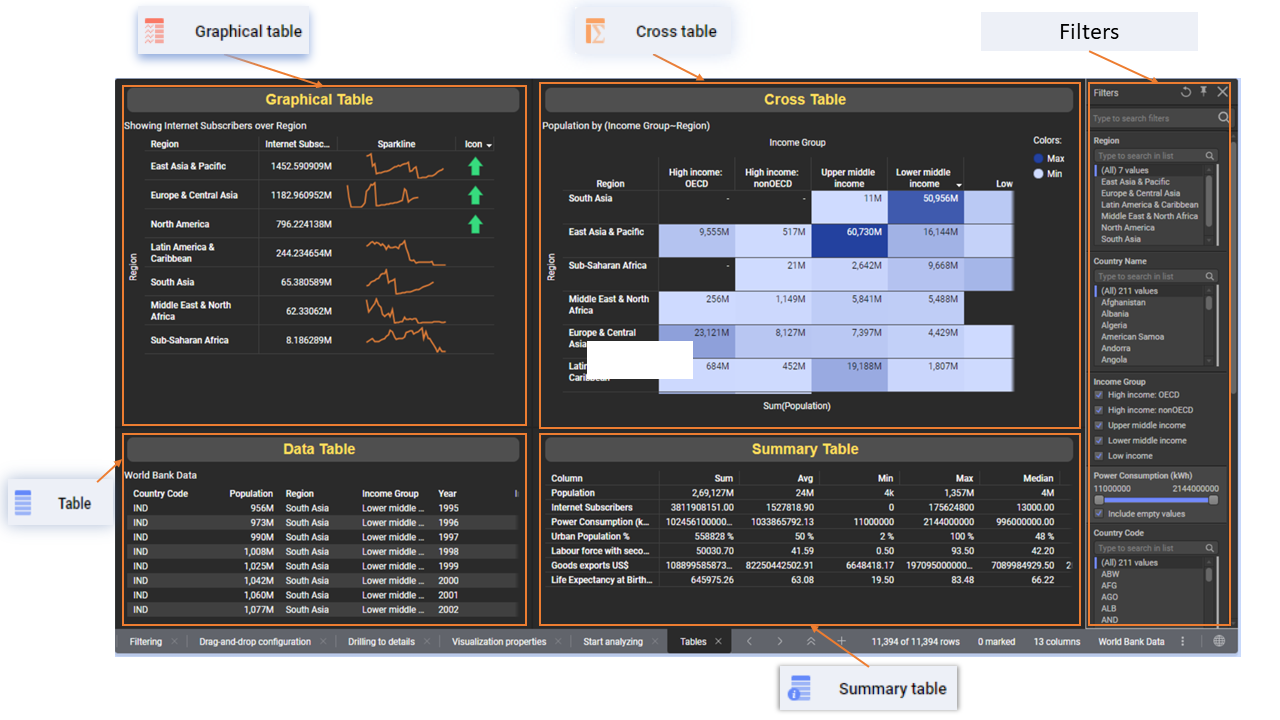
Data can be projected in raw form using “Table” visual.
Cross Table: Display data aggregation with grand totals for each row and column with color hue
Graphical Table: Table with advanced feature to add sparkline, Icon, Aggregation, and Bullet chart
Summary Table: A
table that is used to display the statistical value of numeric columns
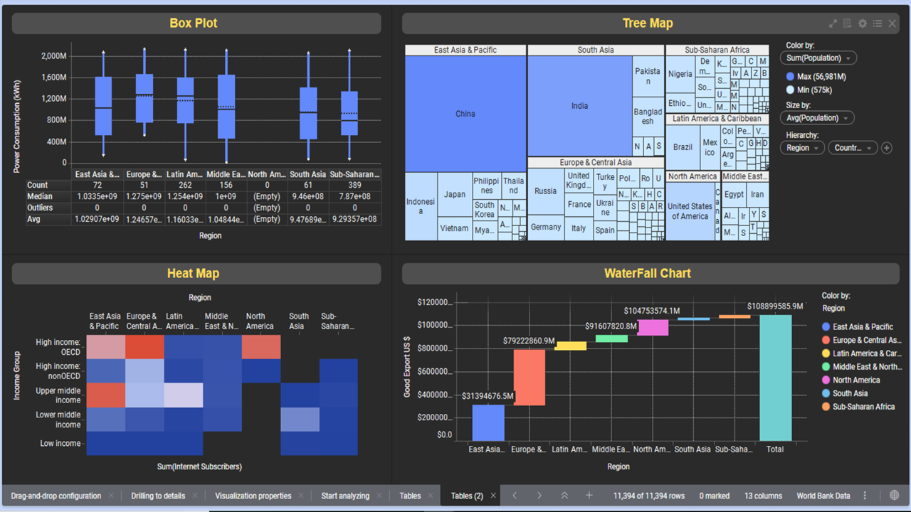
TreeMap: Uses rectangular area to visualize data. Size/Split of the rectangle is controlled using size by and hierarchy option
Box Plot: Shows the minimum, median, maximum, first, and third quartiles of a numerical column, which is useful for examining the distribution of a category and identifying outliers.
Heat Map: Numerical values are colored based on aggregated function
Waterfall chart: Display running total of a value in a bar segment
Data Analysis
Major Data Analysis options are integrated into Spotfire, In the backend Spotfire use TERR Statistical server for executing data analysis task
E.g. Regression Analysis, Classification modelling, Clustering, Line similarity, Data Relationship can be accessed from the Tools option in Menu Bar.
Forecasting
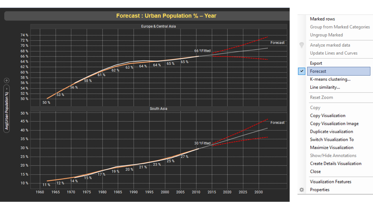
The forecasting option is available in the Line chart. Do a Right-click in a line chart and click option forecast, By default forecast is applied for 12 months ahead, forecast period can be adjusted from Line & Curves option. We can make visible Fitted, Forecast, and Confidence Interval Lines in Forecast
Regression Model
Data Table loaded into Spotfire Session is used to create a Regression model. Navigate to option Tools > Regression Modelling. Select Data Table, Response column, Predictor columns option for creating Regression model.
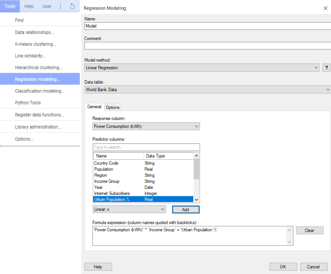
Regression model computations will be performed in TERR and the model’s results will be sent back to the Spotfire environment. In Spotfire Regression, the model can be evaluated, exported, and used to predict new data
Report Deployment
Spotfire Report can be easily deployed in Spotfire Server by saving it as a Library item using the File> Save as > Library Item option. Each published report in the Library has a unique URL that may be shared with End-Users/Consumers of the report.
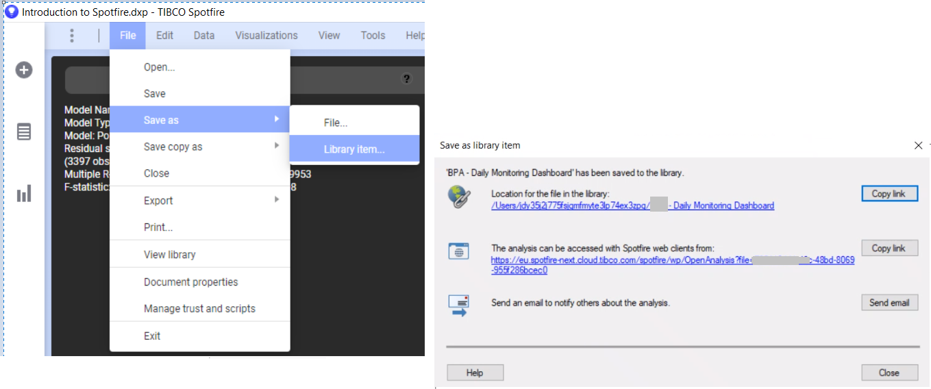
Consumers/End-Users can view by accessing URL of a report from web browsers and have provision to export Data table, export report as Image and reload data from the browser
Conclusion
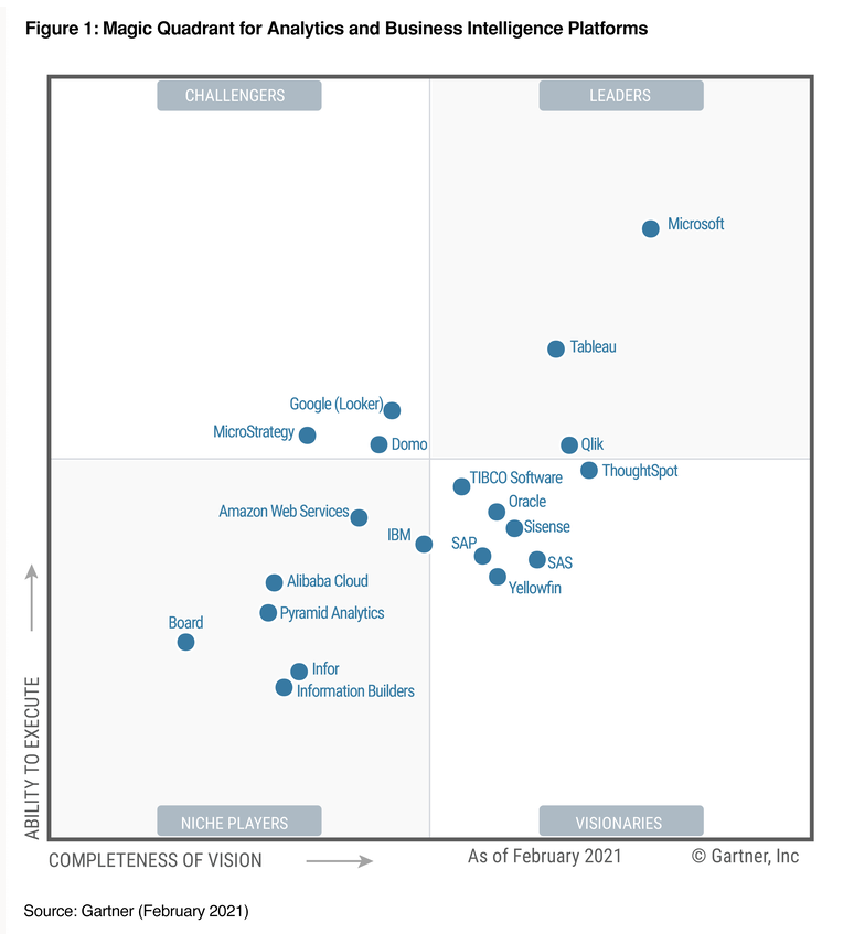
In 2021 Gartner Magic Quadrant for BI platform places TIBCO Software in visionary space. TIBCO Spotfire Automation Services allows for alerting, pre-loading, and scheduling of reports. Spotfire integration with TERR/Python allows for the creation of end-to-end analytics. Spotfire Advanced Analytics feature, integration of NLP search into the Dashboard positions it as a unique BI platform. Hope this article has helped you understand Spotfire Basics as well as its ability to handle complex Analytical use cases
Reference:
- Tibco Spotfire: https://www.tibco.com/products/tibco-spotfire
- Tibco Spotfire Docs : https://docs.tibco.com/products/tibco-spotfire-analyst
- https://www.gartner.com/reviews/market/analytics-business-intelligence-platforms/vendor/tibco
- https://www.gartner.com/reviews/market/analytics-business-intelligence-platforms/vendor/tibco/product/tibco-spotfire
- https://info.microsoft.com/ww-Landing-2021-Gartner-MQ-for-Analytics-and-Business-Intelligence-Power-BI.html?LCID=EN-US


