This article was published as a part of the Data Science Blogathon.
Introduction on Power BI
As part of our discussion, we will discuss the features of Power BI, its benefits, and a detailed description of how to use it for presenting data using an example and creating reports. Business today generates enormous amounts of data, but without the ability to analyze it, all the data is useless. Business intelligence plays an imperative role here. This article will discuss the business intelligence tool Power BI, enabling easy access to data and informed decision-making.
What is Power BI?
It is a collection of applications and services that help organisations gather data from different sources, like files, databases, the Power Platform, Azure, and online services, and manage and analyze it.
Applications:
- The platform is used primarily to create interactive dashboards and business intelligence reports by collecting and analyzing data.
- The users can produce and share clear and insightful snapshots of their business.
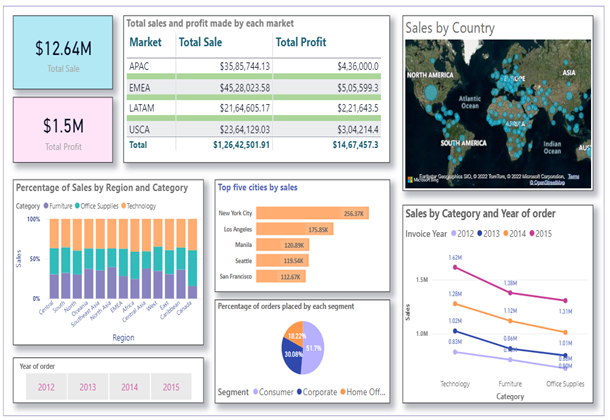
- Example: The Global Superstore Dashboard provides a 360-degree view of overall store sales. It is possible to view both high-level and detailed information analyses on the same screen. We create a dashboard that provides a clear insight into the data and provides accurate mathematical analysis for a commoner to understand using different BI visualisations.
Components
The following components are:
Power Query
Power Query is one of the most important parts of Power BI. You can use it with Excel or with Power BI Desktop. Power Query is capable of erasing information from multiple sources and extracting data from various data sets, like Oracle, SQL Server, MySQL, and others. Also, you can extract data from text documents, CSV documents, or Excel documents.
Power Pivot
Power Pivot is information displaying and estimation engine. Using Power Pivot, you can set or create connections between tables and calculate values from pivot tables. The language used by Power BI Pivot is Data Analysis Expression (DAX).
Power View
Power View is a leading component for information perception. Using the tool, you can configure and retrieve information sources that provide the basis for analysis. Slicers can give a better breakdown of data, and clients can overlay information and interact with it using a user-friendly interface.
Power Map
Power Map is used to visualize geospatial information in 3D. When the representation renders in 3D mode, it adds another aspect. In Power Map, one property is the 3D length of a section, and another is a heatmap view. Power Map works with Bing Maps for the most accurate representation based on the longitude or geography of a country, state, city, or road address.
Power Q&A
It is a custom language engine for queries in the information models. Using the Power BI website, you can ask for clarification on pressing issues and receive answers after the information model has been collected and updated.
Power BI Desktop
It is a tool that integrates Power Query, Power Pivot, and Power View. It has features for creating queries, models, and reports. Utilizing Power BI Desktop, it is easy to develop BI skills and create compelling visualizations. There are three views in Power BI Desktop: Report argument, Data view, and Model view. Power BI Desktop has a Query Editor, accessed through a separate window. The results of the Power BI desktop can be published on the Power BI Website. Power BI allows the creation of dashboards and sharing them with others and the easy creation of reports directly on the Power BI website. Slicing in the Power BI Website is done using an internet browser.
Power BI Website
The results of the Power BI desktop can be published on the Power BI Website. Power BI allows the creation of dashboards and sharing them with others and the easy creation of reports directly on the Power BI website. With Power BI Website, slicing is performed using an internet browser.
Power BI Mobile App
It are available for three operating systems: Android, iOS, and Windows. The applications allow you to view reports and dashboards intuitively on the Power BI site. It is possible to highlight a piece of the reports, write a note, and send it to others.
Advantages of Power BI
Here are some of those benefits:
1) It is affordable and relatively inexpensive.
2) It can provide business intelligence for everyone(not just IT workers).
3) It brings data to life by providing interactivity.
4) It provides security.
5) It can derive data from many different sources.
6) It has artificial intelligence capabilities.
7) It has real-time collaboration capabilities.
8) Power BI Apps: Easy way to share reports and dashboards.
Data Visualization
Data visualization allows decision-makers to gain better insights and realize the benefits of accelerating decision-making, analyzing data more effectively, and making sense of complex data. Let’s analyze the Global Super Store dataset containing about 50000 values. This dataset consists of all orders placed by customers through different markets and vendors between 2011 and 2015.
Data Loading
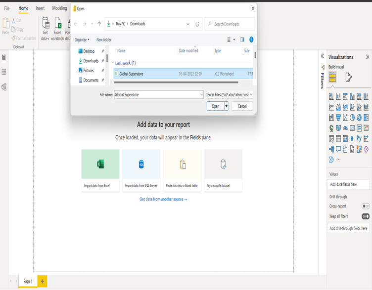
Power BI lets you pull data from multiple sources like Excel, Text/CSV, JSON, XML, SQL server database, oracle database, access database, IBM DB2 database, Hadoop, Azure, etc. It will take the data from whichever source it comes from and convert it into another format so that you can achieve the desired result.
Steps: Home > Get Data > Select Data sources > Open the file > Load
Data after
loading is visible under the Fields tab.
Data Transformation
Standardization of data is necessary to meet any requirements. Data transformation options include the following:
- Remove extra columns
- Unpivot the columns
- Changing the column names
- Modify the column type, if necessary
- Filtering data is possible based on your preferences
- Review the fields you will add to the Power BI report
Steps: Home > Transform Data > Make desired changes
Data Visualization
Our report will provide actionable insight into sales by country, category, and subcategory using visualizations like a bar chart, pie chart, line chart, tables, stacked column chart, and maps.
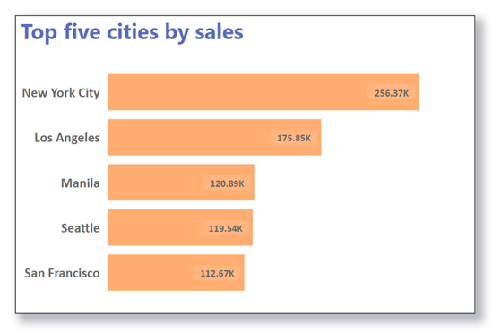
Using Stacked Bar Chart to List the top 5 Cities by Sale
By selecting Sales and City on the Stacked Bar Chart, we can see the Sales Distribution by City. Since there are many cities, we can change the parameters in the visualization to show the top five cities by sales.
Filter Type: Top N
Show Items: 5(Shows top 5 items)
By Value: Sales by city
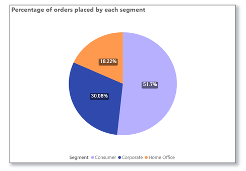
Pie Chart Visualization of the Percentage of Orders Placed by Segment
To make the following chart, we need to pull the pie chart from the visualization tab, insert the ‘segment’ column in the legend and the ‘count of order ID’ in the values:
Line Chart Visualization for Sales Analysis by Category and Invoice Year
We can create this line chart by pulling the line chart from the visualization tab and inserting the ‘Categories’ column on the X-axis, ‘Sales’ on the Y-axis, and ‘Invoice year’ on the legend:
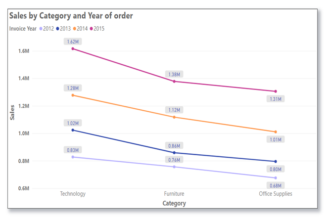
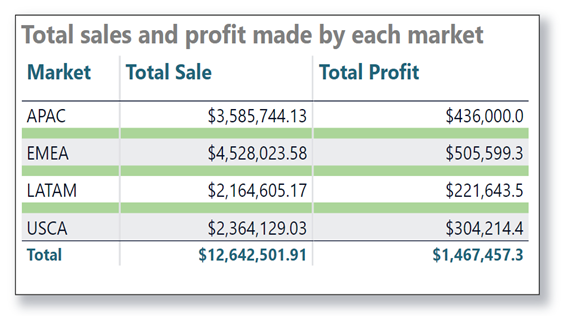
Table Visualization Displaying Total Sales and Profit Made by Each Market
Prepare a table with three columns called ‘Market,’ ‘Sale,’ and ‘Profit.’ Below is the table showing the total sales and profit for each of the four “markets”:
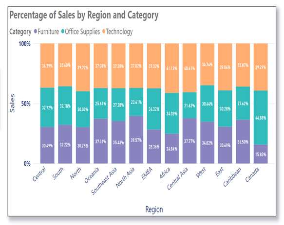
Stacked Column Chart to Display Percentages of Sales by Region and Category
This chart is formed by pulling the stacked chart from the visualization tab, inserting a ‘Region’ column on the X-axis, a ‘Sales’ column on the Y-axis, and a ‘Category’ column on the legend.
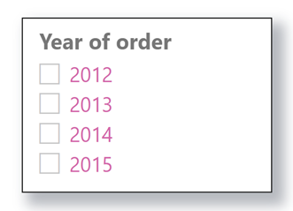
Slicer
As shown below, we can get the actual sales based on the year using a slicer.
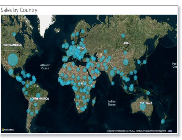
Viewing Sales Figures by Country on a Map
To analyze the sale in different countries, we can pull the map feature from the visualization tab and organize it as follows:
Location: Country
Bubble size: Sales
Conclusion
In this article, we discussed Power BI, its features, and its benefits for presenting data using an example of the Global Superstore dataset. We also discussed creating reports and dashboards using different visualization techniques, like bar charts, stacked column charts, maps, slicers, tables, etc. Users can use this powerful analysis tool to get information and insights and generate reports quickly. It offers enormous potential by providing access to business intelligence and supporting a culture of information-driven decision-making. In addition, it allows users to view and analyze all of their information at one time through live dashboards and reports.
The media shown in this article is not owned by Analytics Vidhya and is used at the Author’s discretion.


Very well explained.
Well Written Article There is a great future scope and career growth for the one who opts this technology especially for Business Analysts. Business Development Manager to mention a few