This article was published as a part of the Data Science Blogathon.
Introduction
You might be wandering in the vast domain of AI, and may have come across the word Exploratory Data Analysis, or EDA for short. Well, what is it? Is it something important, if yes why? If you are looking for the answers to your question, you’re in the right place. Let’s get started! Also, I’ll be showing a practical example of an EDA I did on my dataset recently, so stay tuned!
What is Exploratory Data Analysis (EDA)?
Exploratory Data Analysis is the critical process of conducting initial investigations on data to discover patterns, spot anomalies, test hypotheses, and check assumptions with the help of summary statistics and graphical representations.
This is a lot of jargon, let’s get it simplified!
Now what I’m going to say may seem absurd but bear with me, EDA means getting to know your data. Meaning to get familiarity with the dataset you’ll be working on. Understanding any underlying patterns by visualizing the data via graphs etc. These graphs include Bar, Scatter, Pie, Box plots, and many many more!
EDA also means to explore the data, which in other words means the same thing as visualizing the data and understanding it, so you can make decent Machine Learning models (AI-BASED APPLICATIONS).
Further, data cleaning is also a part of EDA, this means that most of the datasets you get in real life are very unorganized. They have missing values and even wrong values. That needs to be fixed so you can create an optimal AI application.
Is it Necessary?
Undoubtedly it is! It’s essential— if you just go ahead and start coding an AI application without understanding the data you’re working on — you can end up in a huge mess! Believe it or not — understanding the data is the language you use to communicate with the AI application. If you don’t understand it — it’s useless.
So you must get a hang of your data, find some underlying patterns, spot a few oddities so you know what you are facing, and actually, code your AI application keeping the structure of your dataset in mind.
How do you EDA?
Nice question, but in the end, the answer is simple. We use the Python programming language. Even R does the job, but Python is common among young practitioners and professionals as well!
Python supports many libraries to help you to play with your dataset.
For instance — Pandas to see your dataset, and get info and descriptions about the dataset. Fix missing values or wrong values. In particular, it offers Data Structures & Operations for manipulating numerical tables and time series data as well. You could do different computations based on the data (Rows AND Columns), create and delete rows, and much much more.
To visualize the dataset we use the matplotlib library in Python which allows us to create several types of graphs — from a basic 2-D bar graph to 3-D spectrograms! It has it all and it truly is FASCINATING!
A Practical Example!
Now I’ll show you a practical example of an EDA I did recently on a dataset I got from Kaggle. Let’s get coding 🚀
Note: All the code is available on my Github. You can access it from there, give it a star, download it, and experiment as much as you’d like.
The first thing you do when are going to do an EDA is to download the dataset you’ll be working on, I’ve done the same as shown below: Here I used a link to download the dataset, which is my project repo on Github. This saves time and is easy for others to download as well. While doing such projects, where your code will be readen by others — it’s crucial to make it readable and easily understandable.
After you’ve done downloading the dataset, you could see the dataset in a tabular form via the Pandas library as shown below: Here is a snippet that shows the first 5 rows and the second one to show the last 5 rows in the dataset.
Python Code:
import pandas as pd

heart_data = pd.read_csv('heart.csv')

print(heart_data.head(5))

print('__________________________________')

print(heart_data.tail(5))
Great, what now? Well now you need to understand the dataset, and that is possible via the dataset website, in this case, Kaggle, this tells you about the meanings of the columns, i.e anemia, etc.
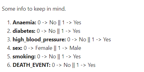
Once we’re done with understanding the dataset columns, we can get going with data cleaning and exploring via the Pandas library — I’ll get to visualizing in a minute or so.
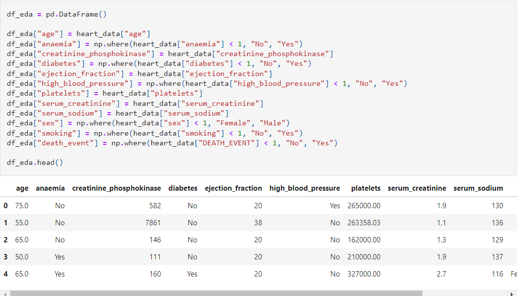
In the following snippet, I created a copy of a dataset and changed the numerical values, i.e 0 and 1 to Yes or No. The main reason I created a copy is that when in the future you’ll be creating a Machine Learning model — strings don’t work so you’ll be using the original dataset with the numerical values. Numbers are much better and keep the application optimized. But as a human, I understand words better — hence when I will explore the data — these strings will be more understandable. A very vague way to explain — but bear with me😅
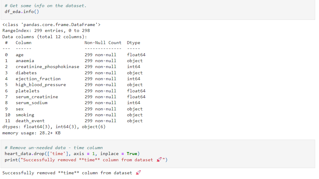
The following snippet further shows some of the awesome stuff you could do with the Pandas library. Firstly, I got some info about the dataset columns. Like the first column says age, and this shows us that there are 299 filled(NO MISSING) values. The data type is float64 — in other words in decimal form, i.e 64.5.
The second code snippet is where I dropped the time column as I didn’t require it.
Some more cool stuff! You could check out my GitHub repo for further info about the code.
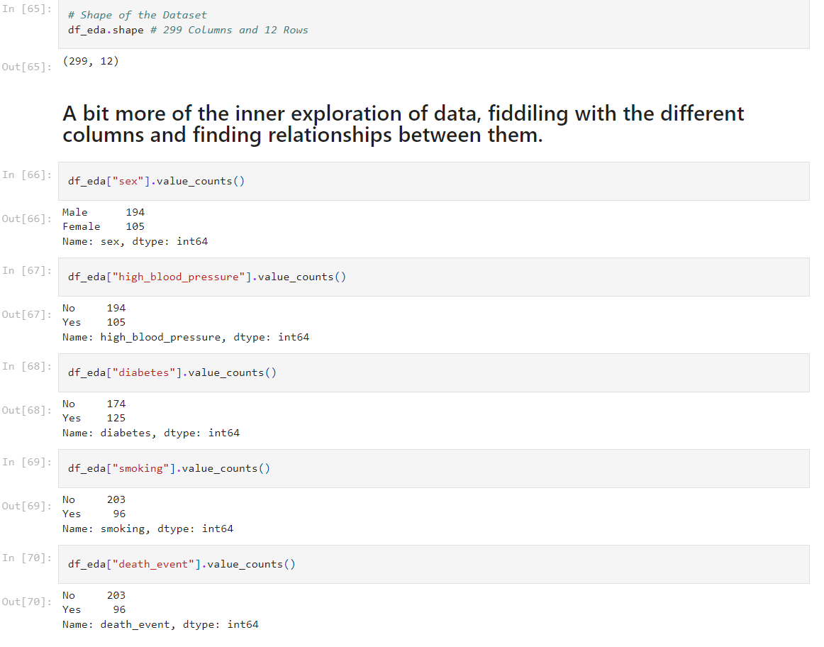
Now let’s get visualizing, we shall use the Matplotlib & Seaborn library to do this!
This code snippet shows the frequency of the sex column, in other words, the value of each gender candidate. In this case, we observe that around 190 candidates are males, and around 110 are females. A very intuitive way to get to know your data. I believe above we did the same thing via Pandas only — but this is much easier to both remember and seems a bit more fun as well!
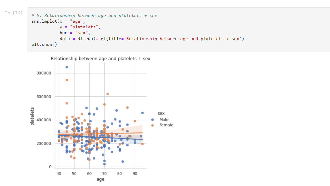
Another awesome plot! Known as the Lmplot — simple but very informative! In this case, we observe that between ages 60–70, there is a high correlation of platelets (DEFINED BELOW). Also, this tells us that platelets seem to be more common in males, rather than females. The average value of platelets seems to be 250,000–300,000 in both genders.
So this one graph was able to tell so much about our data, and this is a very basic plot. There are very complex ones as well — which I won’t be covering today. I want to keep this as simple as possible! But one thing is really simple is to give this blog a clap and follow me 😁
Platelets — platelets are colorless blood cells that help blood clot. Platelets stop bleeding by clumping and forming plugs in blood vessel injuries.
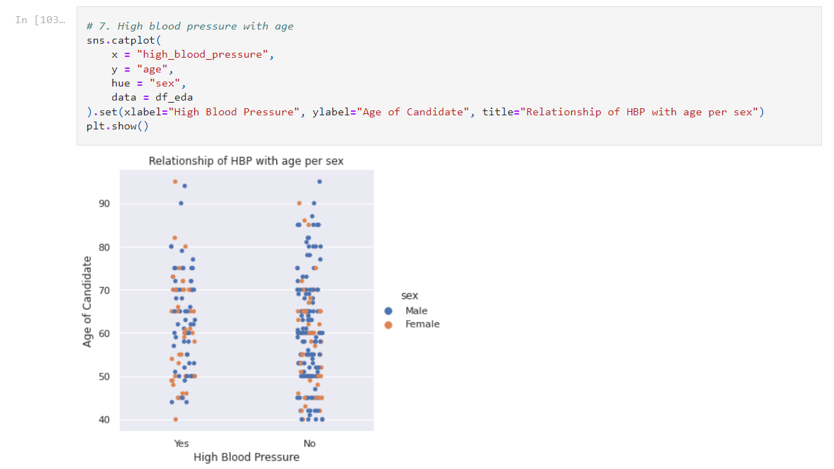
The following snippet visualizes a catplot. We can observe the High Blood Pressure with the age of each gender. This shows us that most of the candidates didn’t have their blood pressure too high. Now you could also add something to show the death rate in this graph as well! Try it yourself. It might be a bit complicated but no harm in trying. You could use another graph like a line graph in this graph!
A slight note to take is that there are only 299 data entries — which isn’t too much but perfect for practicing your EDA skills, so this may not be very good for making an AI application though it’s very doable.
There are a few other graphs I’ve made in this notebook which you can access here and be sure to give it a start (:
Conclusion
Congrats on your first-ever EDA project! I hope you understood all of what I said and enjoyed your read!
Just to put all of this in a nutshell we can say that very Python gives a variety of tools to help us get to know our data. Basic graphs like lmplots tell us so much about data! You can even create correlation graphs and 3-D spectrograms! Your imagination is your limit!
Key Takeaways
1. Exploratory Data Analysis is all about getting to know and being familiar with your data.
2. Exploratory Data Analysis is crucial to building Machine Learning Models (Predictions, Classifications, etc.), as the data is the language, and we need to know the underlying patterns – so we can take those patterns into account while choosing a Machine Learning Algorithm (Linear Regression, Support Vector Machines, Neural Networks, etc.), which in result will make out ML model much more optimized and accurate.
3. Python and R are the languages you could use, though I myself use and recommend Python, due to its variety of libraries and a very large community.
4. You don’t need to create fancy graphs, even a simple thing like a Lmplot will tell you a lot about your data.
5. The only way to properly learn Data Science, Data Analysis, Exploratory Data Analysis, and Machine Learning is to keep on practicing. Pick the datasets you want to explore and begin, don’t keep watching tutorials or reading books, articles, etc. Practice is the key to perfection, at least as a 13-year-old, I do the same – and I learned Data Science just by Practice and with a bit of Youtube as well.
You might want to read the following blogs:
- Machine Learning Explained to a 13-year-old: https://medium.com/codex/what-is-machine-learning-explained-to-a-13-year-old-4b0e16ffb1d7
- How to get started with AI, explained to a 13-year-old: https://medium.com/codex/how-to-get-started-with-ai-explained-to-13-year-old-f57c9a58dfed
I hope you got the answers to all your questions and you finally get to know what the hell is EDA. I’d recommend picking any of the millions of datasets available and doing some EDA on them. One I’d suggest is the following dataset containing info about flight prices. It’s a great dataset to get your hands dirty!
I hope you enjoyed my article on exploratory data analysis! It was nice talking with you, and I’ll come back some other time!
Muhammad Anas — reach out to me on Twitter!
The media shown in this article is not owned by Analytics Vidhya and is used at the Author’s discretion.


